When a murder occurs, sometimes the graphic designer is at fault. Other times, it’s the game designer. Sometimes, perhaps, both. See above.
Your Graphic Design 101 course surely taught you the fundamentals of graphic design. For example, design an information hierarchy that guides the visual hierarchy. Present information in the order that people will need it. Emphasize important information with color and font, de-emphasize less crucial details such as flavor text. Match the style to the mood and the theme overall.
The medium matters
How such principles play out varies by medium. For example, a movie poster presents information quite differently from a magazine. The reason is affordances: a movie poster is a vast amount of space on a wall, whereas a magazine is a random-access small-format collection of spreads. Hence, each offers different opportunities and constraints than the other.
_poster.jpg)
Games are no exception, presenting their own opportunities and constraints. Designing a collection of cards is different than designing a movie poster. In fact, designing game cards is different from designing game boxes. And designing big game packages is different from designing small game packages.
Some advice exists
Fortunately, a quick search turns up a little bit of guidance. Some valid pieces of advice out there:
- Don’t confuse graphic design with art and illustration.
- Don’t overload your cards, especially with unnecessarily redundant information.
- Use thematic, readable fonts. Make important information big and top-left. Include meaningful clip-art.
- Don’t let the thematic background interfere with the usability of the necessary information in the foreground.
Do a 1-minute design sketch
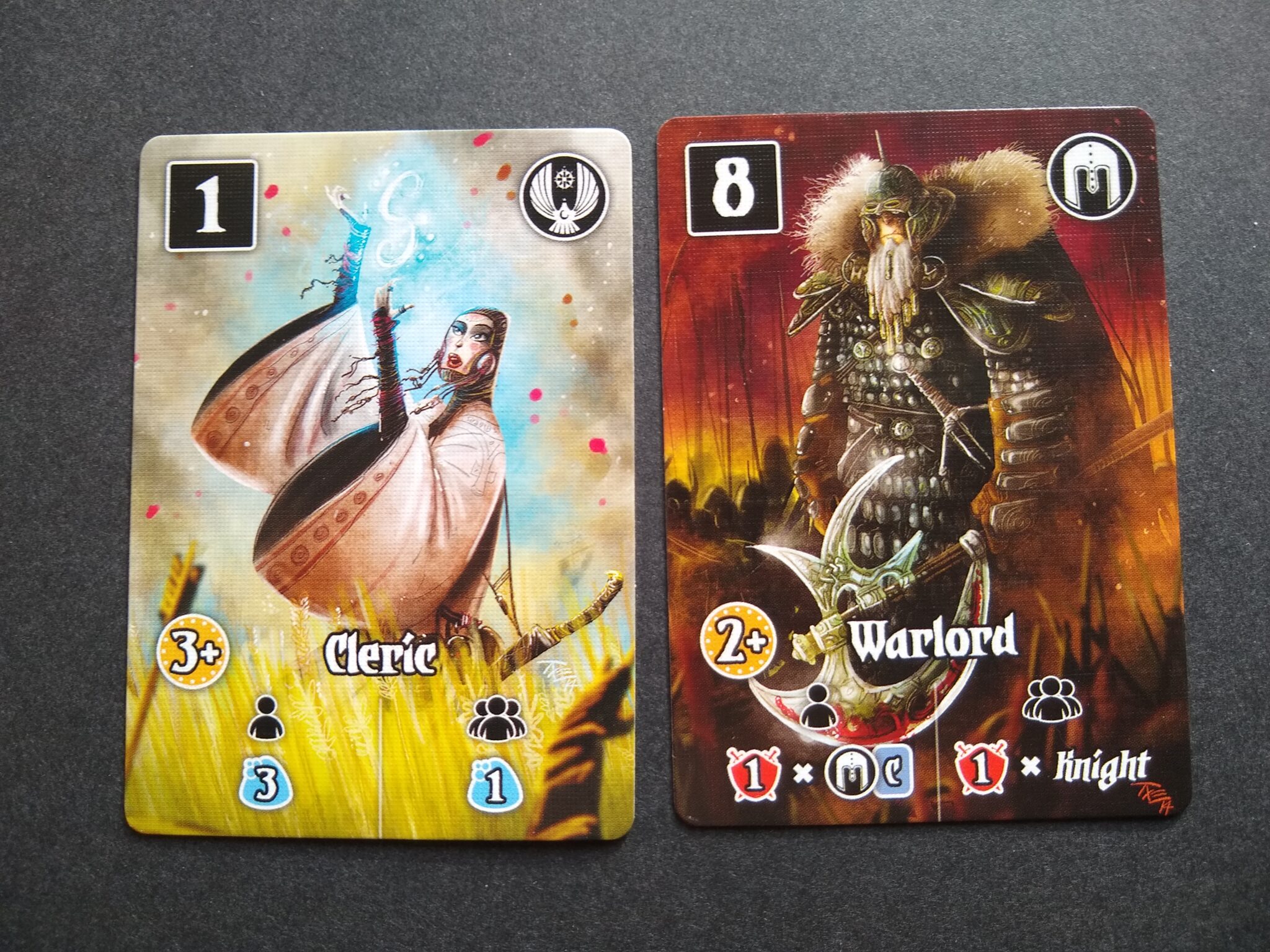
All sound advice. So let’s apply it. Let’s say that you have a deck of 1.75″x2.5″ mini-cards, each of which has a cost, title, illustration, and effect when played. The cost is only needed when purchased, the title and illustration are flavor, and the effect will be 1 of 8 different effects. The theme is dark fantasy. What should the card look like? Go.
Time’s up. See, it’s not trivial. The fundamentals only go so far, with a lot of room for variance, innovation and exploration.
That’s where exemplars come in. As with all other aspects of this blog, it pays to deep-dive into specific aspects of game design.
Mental note: Thousands of compilation books exist for art, architecture, advertising, brochure layout, and every other kind of design. Why don’t we have one for tabletop games? Sheesh, I should just publish one.
The curious case of framing (popouts)
Key to the question of laying out cards is how to frame each piece of information. I like to call this designing the “popouts” (nobody else uses this word as far as I can tell) because the purpose of a frame is to make important bits of information pop out.
Popouts are key to the design of effective cards because:
- The frames, combined with illustrations and flavor text, carry much of the load for theming.
- The edge-to-area ratio is huge on cards, so the risk of skew at the manufacturer chews up a lot of precious space.
- The medium is tiny, which limits the space available for frames.
- The font is commensurately small, so textures easily interfere with readability.
- Players need to glance repeatedly at cards, so there’s a big role for icons, each of which is essentially a tiny popout.
Exemplars
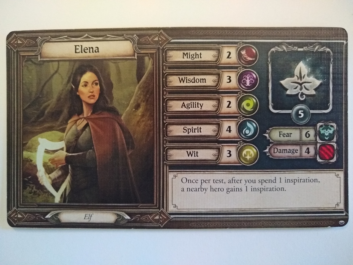
Lord of the Rings: Journeys
I’ve previously complimented Lord of the Rings: Journeys for its effective use of thematic motifs (bulletpoint #1, above) right down to the icons (#5) that indicate player stats. The component below technically serves the role of a player mat, but it’s the same size as a card, so it involves many of the same affordances. (The exception is that the mat stays on the table, affording more than a glance #5, though iconography still plays a big role to enhance “glanceability.”)
Noteworthy: Consistency of linework resembling fine metalworking, wrt appearance of glossy icons resembling jewels. Muted naturalistic colors in most areas. Erosion of textures behind the text, with increasing variance in value near edges of popouts. Thematic illustration in landing spot for storage of leaf tokens. Serif font, even in smallest text.
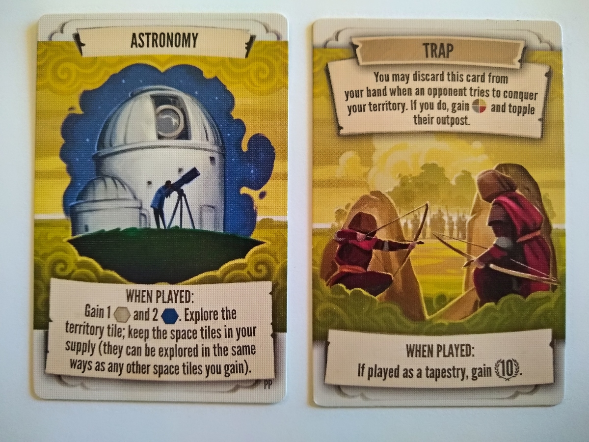
Tapestry
I also enjoy the popouts on Tapestry. The frames communicate historical documents, consistent with the theme (#1). The change in background of the top popout on the right side (“TRAP”) communicates that the card is a different category of card. The popouts nave only a very subtle amount of texture in the body (#4)–it’s less visible than the actual texture of the card itself–but plenty of character in the space budgeted for popout edges (0.1″).
Noteworthy: Very neutral, space-efficient font (probably Univers). Conservation of space through use of meta-symbol for scoring. Negligible texture. Use of thematic edges in place of linework. Sans-serif font, and upper-case for title.
Innovation
The original Innovation cards had an exceptionally clean aesthetic. With raster art carrying 0.000% of the thematic weight, graphic design and vector illustrations served extremely well (#1)–so much so that I much prefer this older version of the game to the newer one that I purchased and then gave away. A crucial challenge with this game is that the larger icons need to be readable from across the table, so they are 0.75″ large, further complicating the space challenges (#2, #3).
Noteworthy: Absurd amount of text, but still playable, mainly because players eventually memorize. No textures whatsoever. Frames consist of medium-weight white border. For each effect, the controlling icon is set off with a colon–which usually implies a cost, but not in this case. Within the text, each miniature icon (e.g., a level indicator) has a white border around a flat black popout containing the icon or numeral. Serif caps for card title, sans-serif for the effects. Latest version replaced this stylization with new shapes; iirc, also upended the color-blindness icons below, with a new strategy.
Birds of a Feather
The recent Kickstarter for Birds of a Feather showcased its really clean graphic redesign. Its tidy little icons convey card category succinctly (#5), and they avoided texture on the bottom popout to enhance readability (#4). One innovation is the variance in popout silhouette, which further conveys the bird’s habitat category.
Noteworthy: Clever frame consisting of terrain silhouette. Solid pastel backgrounds make for adequate contrast with white text due to low value. Unfortunate red icon on rightmost card (top-left) seems out of place and presumably will get fixed before manufacturing. Unclear what distinguishes double-feather from single-feather in iconography; if it’s related to scoring, Wingspan’s solution (below) seems preferable. Sans-serif font. Appearance of Latin name would seem to connote ornithological connection, but cf. ornithological aesthetics.
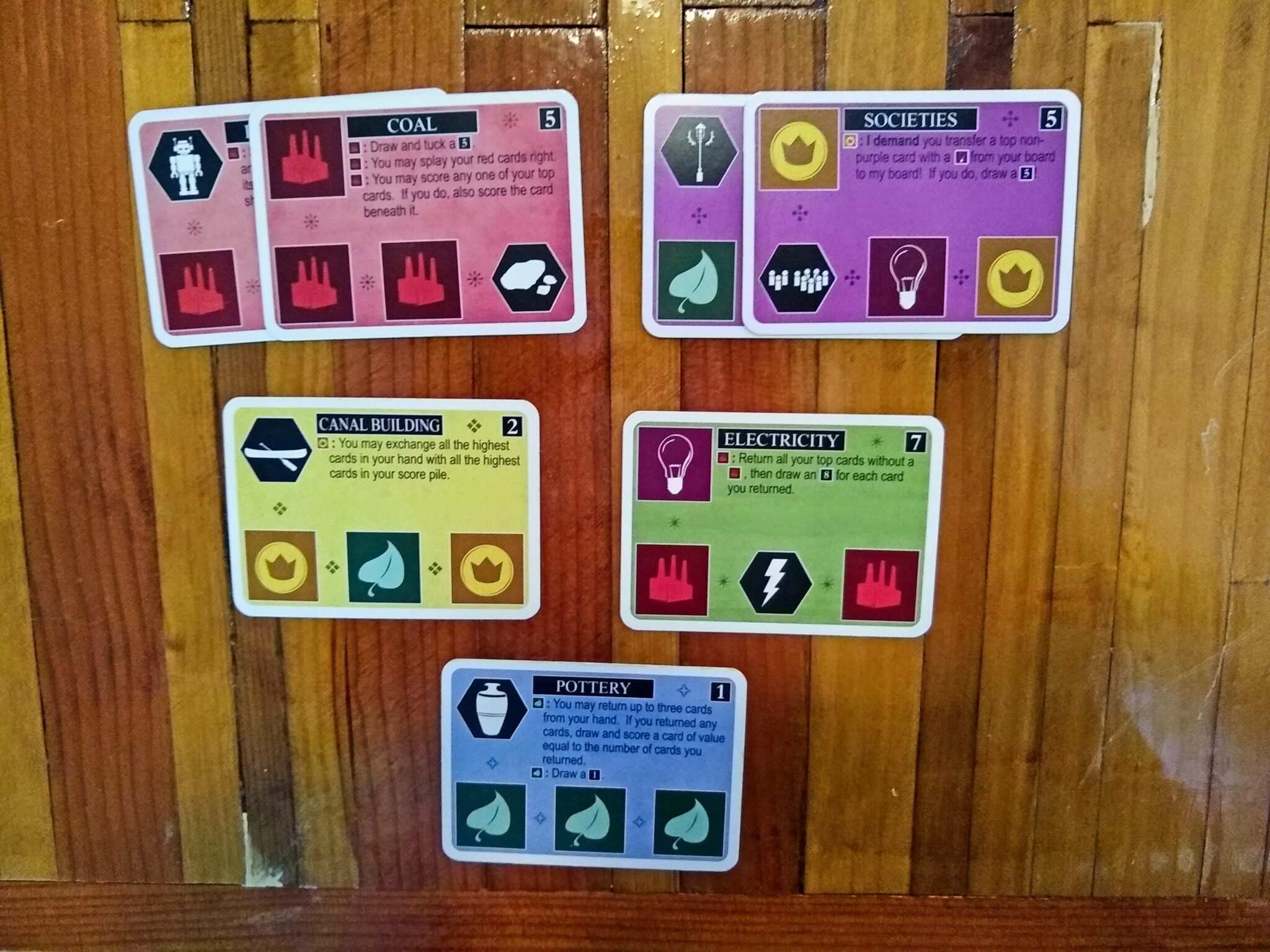
Red Rising
Red Rising’s 14 suits presented a challenge of its own. Here, the puzzle was how to help players distinguish these suits without relying solely/entirely on color. Stonemaier solved this problem using textures in the borders.
Noteworthy: Victory point symbol differs subtly from that of Tapestry, unsure if there’s a rationale. Really stylized font for the card title. Note explicit statement of card color beneath title, in case the player misses the border and/or texture; this text has no frame, as players rarely need to read it. The blue stripe on left links to scoring (explained in detail at bottom of card).
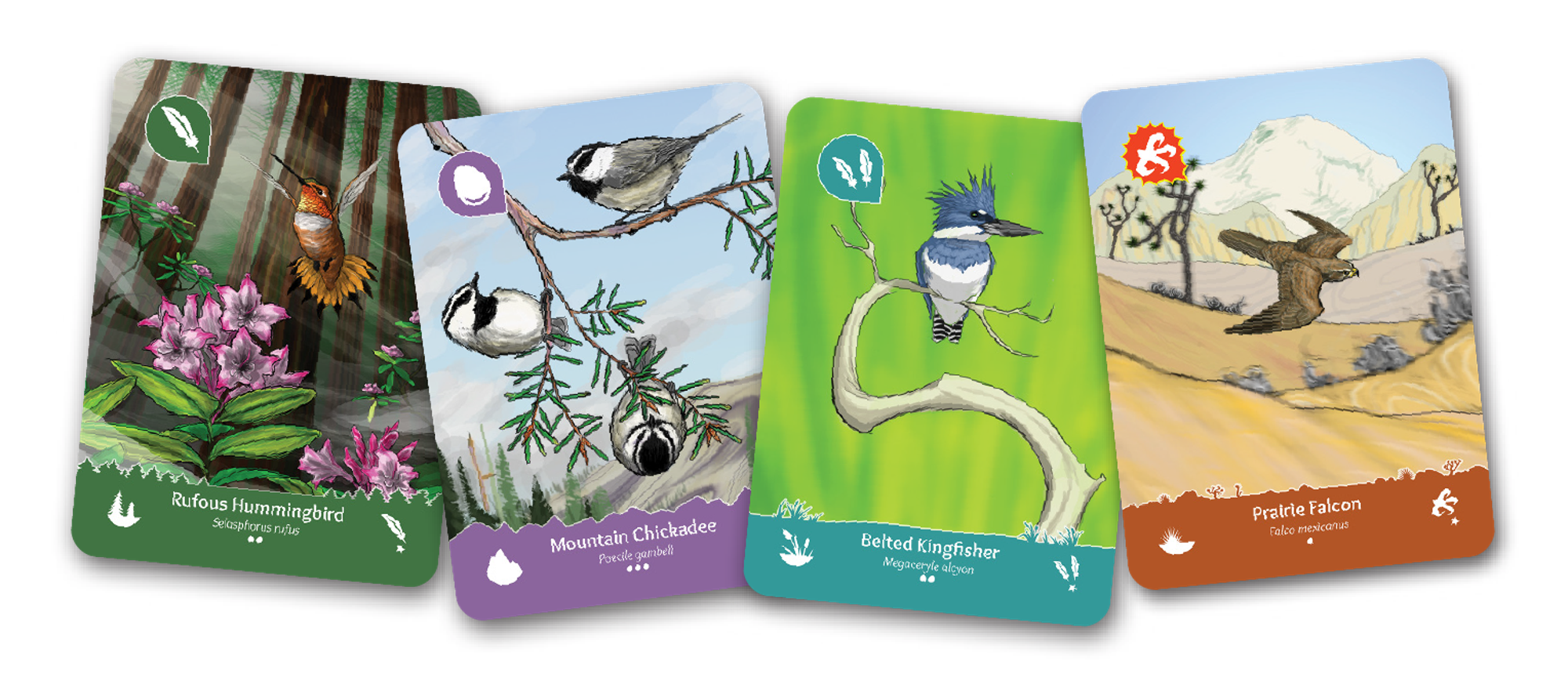
Wingspan
Wingspan objective cards illustrate that you don’t always need framing. The bird art is the centerpiece of this game, illustrated in the style of digital watercolor. The title of each card has a compatible popout (#1). Nothing else really has a frame (unless you count those horizontal separator lines). These cards are also a great example of publishers don’t need to invest much art into objective cards–a whole topic of its own.
Noteworthy: Watercolor extends beyond right edge of title frame. No accident; leaning into the aesthetic. Negligible amount of constraint here on space, so it’s doubly noteworthy that Stonemaier omitted more illustrations. All terrain icons have the same silhouette, differing primarily in line and hue; nonetheless, they adequately differentiate in a color-blindness simulator.
Valeria
Valeria also illustrates the optionality of framing. Daily Magic relied heavily on icons for the card (#5), which have really distinguishable shapes and colors. In particular, the coin, magic and power icons have nice, voluminous hollow interiors for displaying a count.
Noteworthy: Icons appear against a very busy background. Resource counts appear as thick bold serif with a black stroke against medium-low-value icon with distinctive silhouette. Icon, in turn, has a white stroke and a moderate drop-shadow. Ditto the categorical icons in top left. Highly stylized font interferes slightly with readability but not with usability due to its primary role as flavor text.
Notes to self
- When space is ample (e.g., LOTR)
- Linework in spaces between popouts
- Option of serif or stylized fonts
- When space is tighter (e.g., Tapestry)
- Cuts into the margin of popouts can convey theme
- “Out-dentations” can also convey information (e.g., Birds of a Feather)
- Sans-serif font
- To make icons pop, especially when small (e.g., Innovation, Valeria)
- Stroke with white
- Drop-shadow or scrim if against an image
- Omitting frames (e.g., Wingspan, Red Rising)
- Minimalist investment in rarely-referenced cards
- Conserve space by not popping out rarely-referenced text