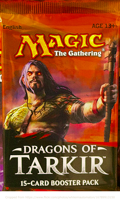
Cramming great art, game stats, regulatory disclaimers and a UPC onto a mini-package presents an interesting challenge. By “mini,” I mean the size of one card deck or smaller. Take the Magic expansion pack, above, for example. It being an expansion, it needs the name of the base game as well as the expansion.
In preparation for designing the “final” box of my own for Gnomadic Gardeners, I asked the relevant BGDL, BGG and Reddit communities for suggestions of small boxes that they aesthetically appreciate. I also drew on a post by Jamey Stegmaier. He did an experiment in which he showed a photo of box sides to gamers and asked which most effectively enticed them to play.
Great examples
Here’s a quick rundown of some great examples, as well as why I value each example.
- Oink Games was frequently mentioned. All of their mini boxes have very clean vector art, with large areas of monocromatic space. The rear of each boxes includes a clever tagline, textual game summary, stylized representations of the components, and the usual game stats + legalities + UPC.
- Button Shy was also frequently mentioned. Their mini wallets generally have hand-drawn art. I suspect they don’t have anything printed on the sides of the wallets. They don’t need UPC’s for games only sold via their web presence.
- Arboretum is an exceptionally elegant example of a box that uses line art.
- Fox in the Forest Duet has one of the prettiest covers.
- Furnace has a ton of white space. Jamey noted that the absence of game information on the bottom led few people to want to play it during the experiment mentioned above.
- Marvel Infinity Gauntlet (Love Letter) is a really great back, illustrating how to cram the maximal amount of corporate and branding content alongside the usual information (see Oink, above).
- Modern Art seems to have an odd-shaped card box, and I’m not sure whether it’s mini, but it exemplifies some great side-box art.
- Ohanami does a great job of connecting the art on the left side of the box with the front of the box.
- Regicide likewise links the side and front art. It’s got a super striking front illustration presented as vector art. The back exemplifies how to describe a cooperative engine-builder.
- Star Realms was mentioned by a few people as a great game where the box aesthetics were an afterthought. Its back, in particular, is a great example of what a box looks like without any effort to gloss up the appearance.
- Tussie Mussie seems to have been re-licensed and reprinted by Quined, who has a great illustration that links the sides and the front. It doesn’t seem to have any game info on the sides, though.
- X-Files CCG did a spooky thing where they reflected faces from the front of the box onto the sides. It’s also almost monochromatic.
Notes to self
- Front
- Art
- Title
- Designer name only if famous
- 1-line game summary (very high level… just competitive/coop, player count, deck-builder, etc.) if interesting
- Publisher info only if famous
- Sides
- Art
- Title
- Player count and time
- Omit minimum player age
- Back
- Omit title
- Witty theme-led hook
- A few sentences about the game’s hooks
- Pictures of a few cards if possible
- Illustration from the game (popout if possible — see Infinity Gauntlet)
- Contents (components)
- Player count, time, minimum ages
- Legalities regarding choking hazard
- Publisher name, credits
- Omit UPC if only available from publisher’s web store