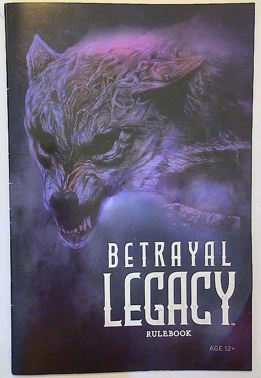
So a game needs to look like an adventure. A spooky adventure. Maybe even horror-themed. What should it look like? Let’s take a look at a few examples, including Betrayal Legacy (above).
Inspiration for DMD
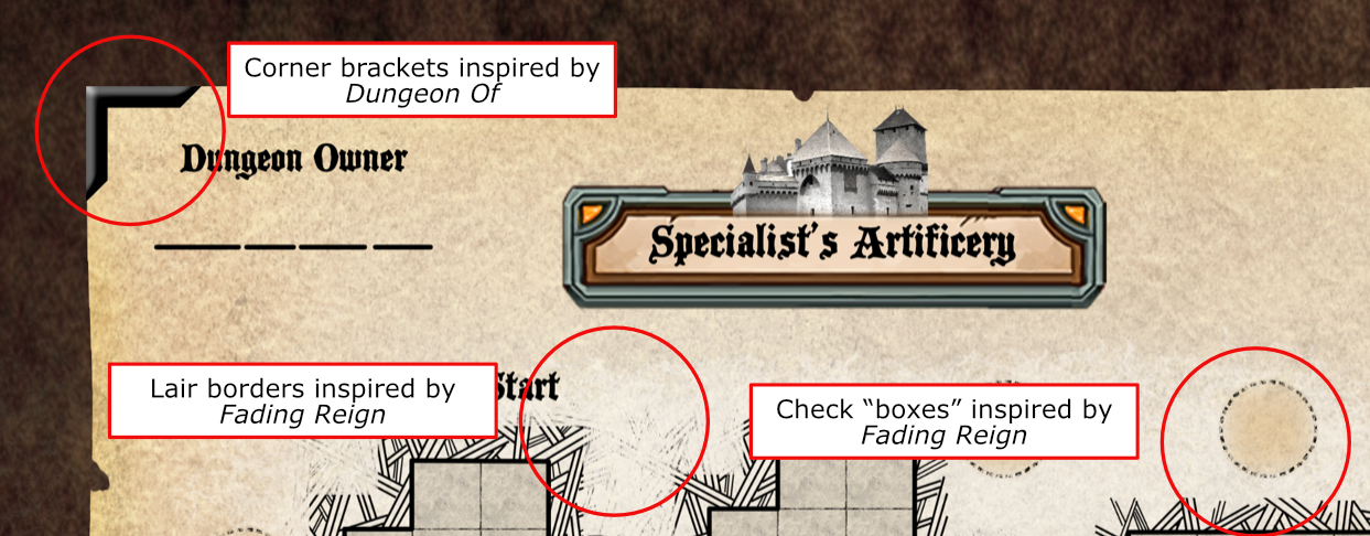
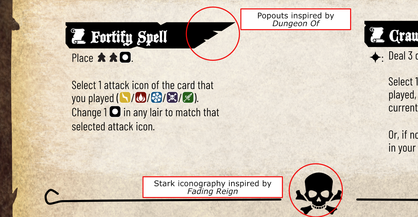
That’s DMD, as in Dungeon Maker Deluxe. Interesting designs don’t pop out of nowhere. Sure, it’s possible to follow basic graphic design principles, but having examples helps. Some of the inspirations for Dungeon Maker Deluxe came from Fading Reign and Dungeon Of. To take a few examples:
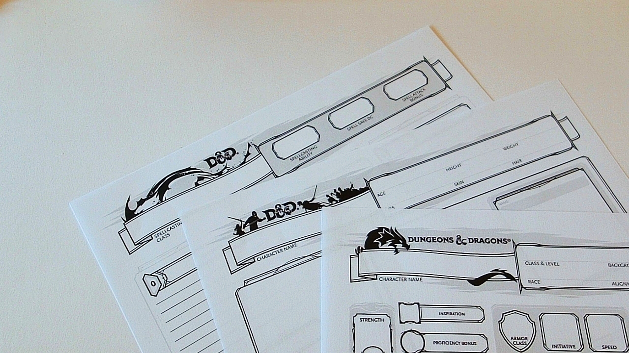
Examples from D&D
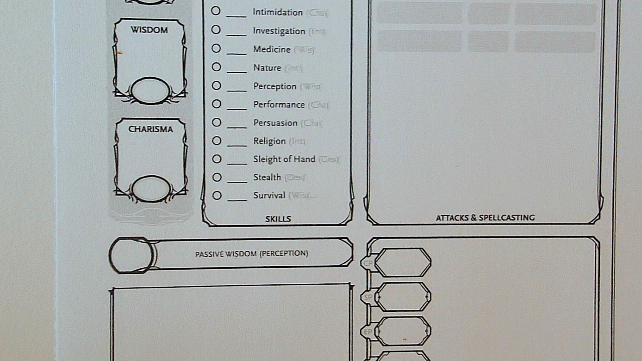
The venerable Dungeons and Dragons character sheet is of particular interest to me right now because I’m designing a game that requires providing the player with a character sheet. D&D’s character sheet prints extremely clearly in black and white.
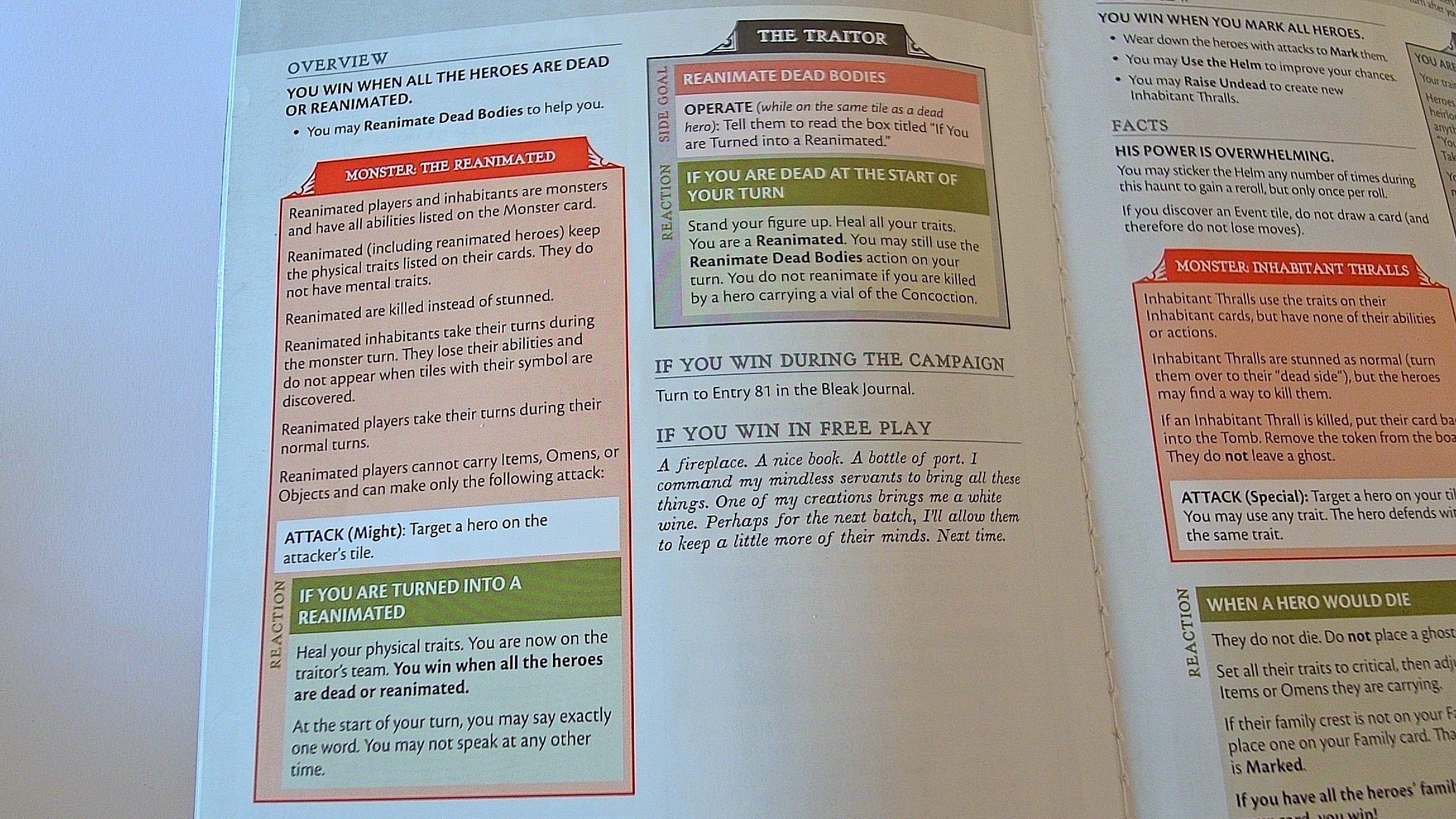
Examples from Legacy Betrayal
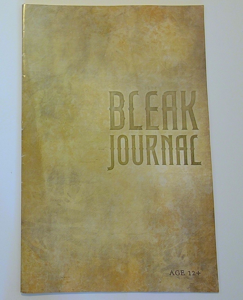
Another source is the Betrayal Legacy series. (Hmmm, also owned by Hasbro these days? Like D&D? Like Waterdeep?) This game includes several booklets, of which my favorite is the Bleak Journal.
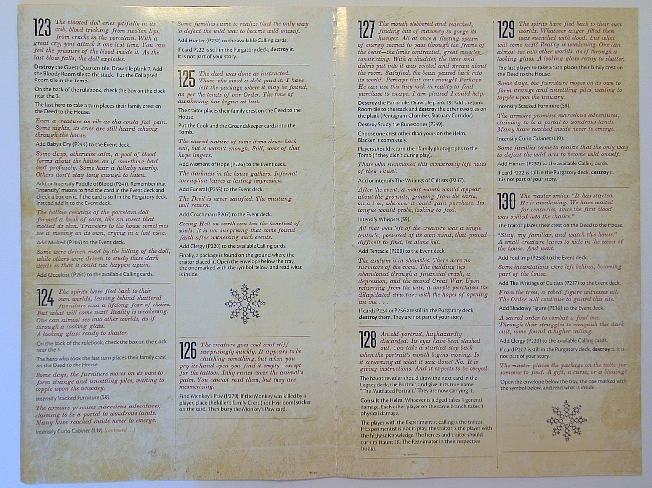
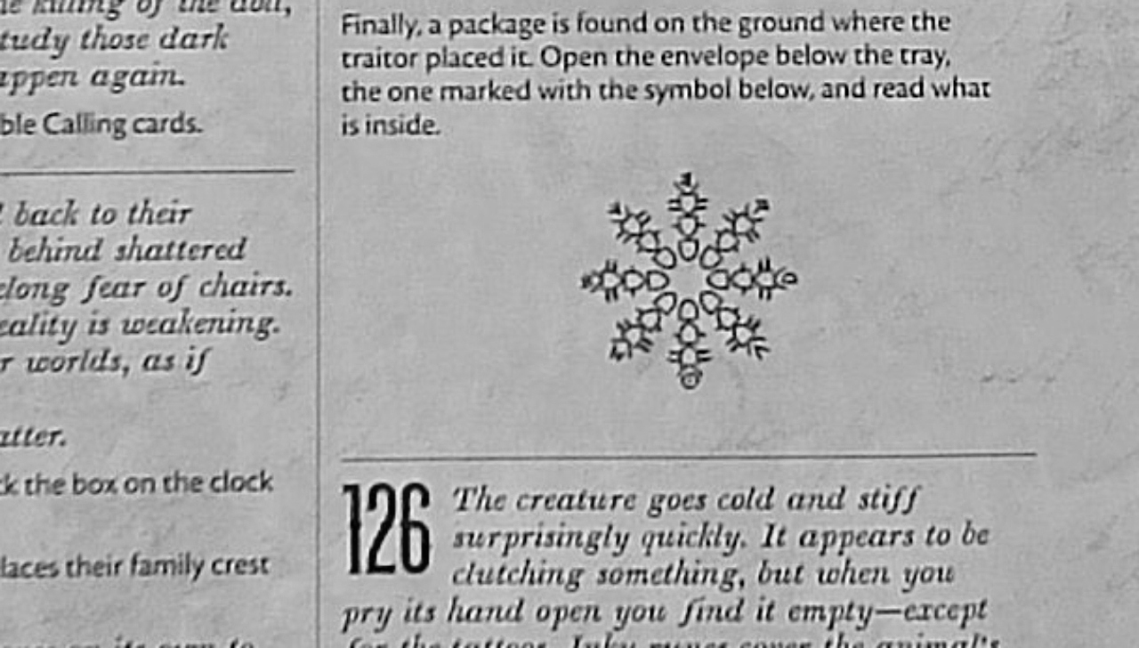
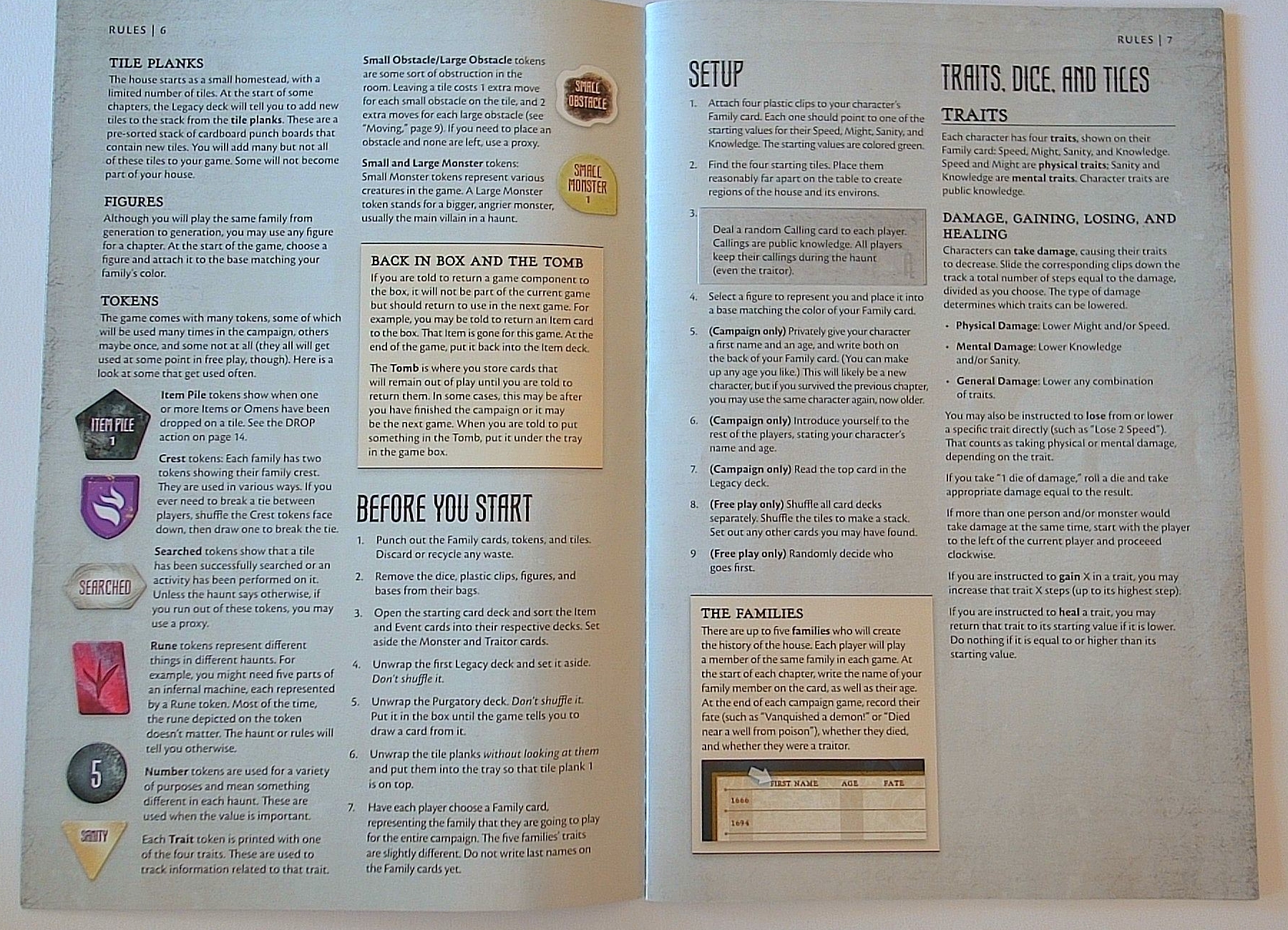
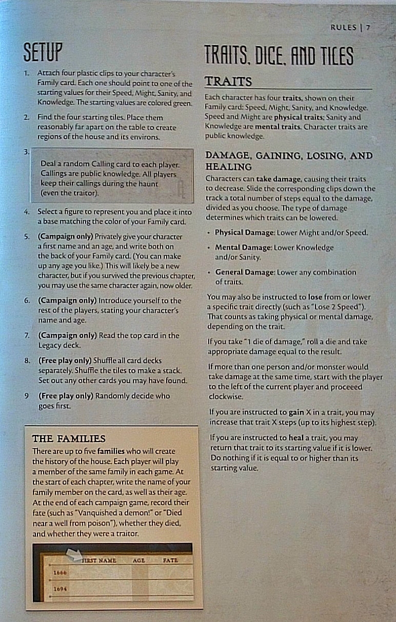
Two-column layout similar to Bleak Journal. These are 6″x9″ booklets.
Headings in large display font matching episode numbers in the Bleak Journal. Thematic.
Different font used for subheadings, but also thematic. Good contrast to the top-level font.
Small font matches the smallest sans-serif body text of the Bleak Journal.
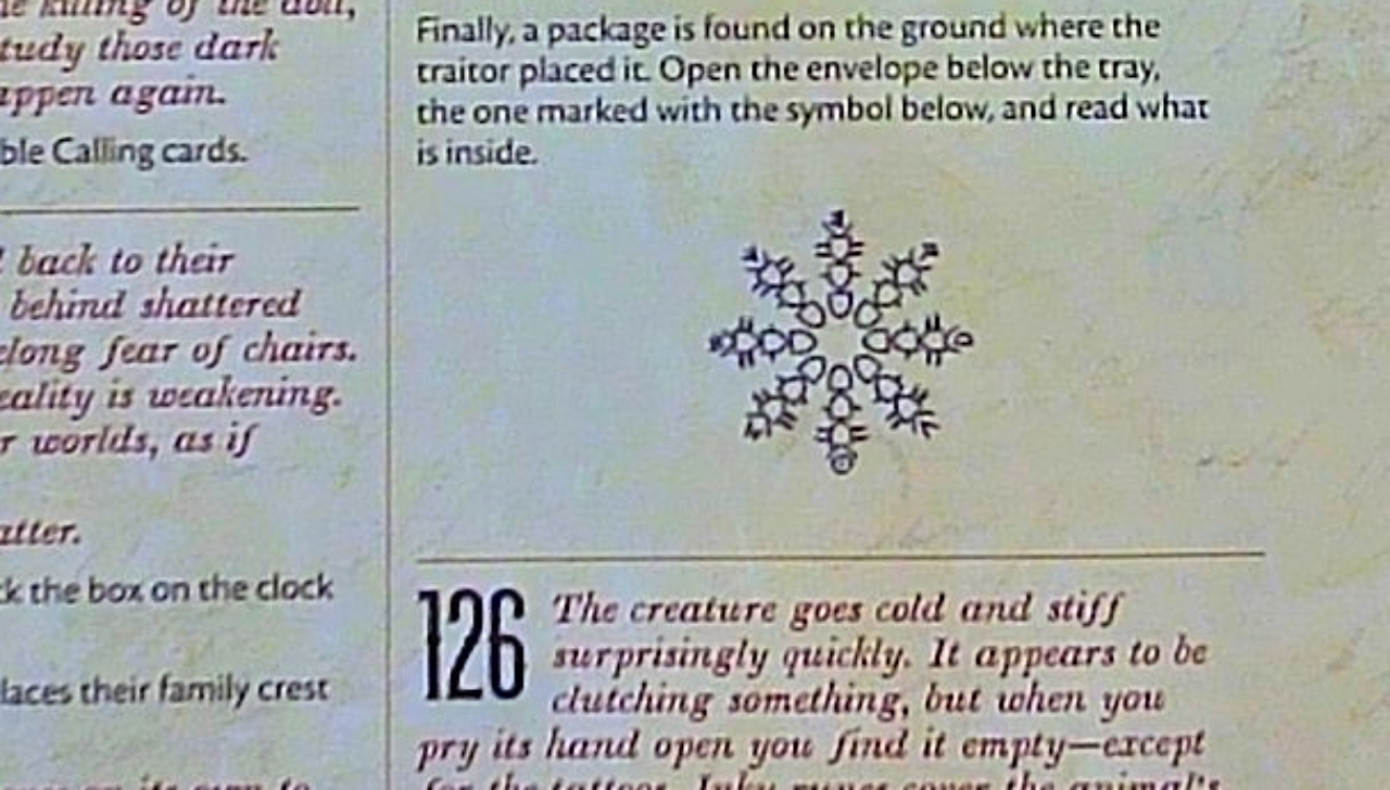
Popouts are simple grey boxes (in case of legacy stickers) or yellow boxes. None of the cool line art of D&D.
Page numbers are a simple “RULES | #” in the top corner. Nothing thematic there.
The third booklet (see image at top of this article) leans into more colorful and thematic popouts. Not much consistency with the other booklets, but very useful for differentiating what information each player needs to read.
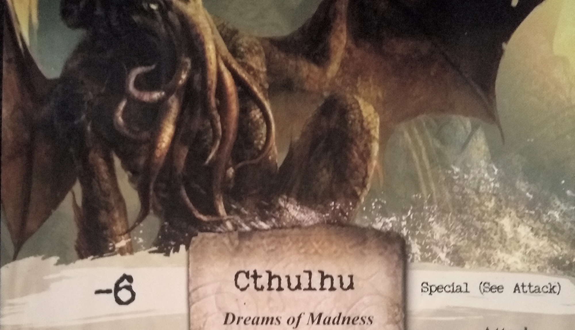
Arkham Horror
I don’t have many photos of Arkham handy, and none of the rulebook.
Notes to self
The examples above have strong points. And they have areas where the theme really doesn’t come through. Some of the best here that I’d like to replicate elsewhere:
- Simple grain texture background that prints well in black-and-white
- Popouts filled with white and edged with simple lines that again print well in black-and-white
- Large font sizes for episode numbers (3x body text line height) – can the same left float be achieved?
- Use a different, somewhat hand-written or italicized font for flavor text, in a lighter value than the rule text.