In graphic design and other visual art, a “motif” communicates a feeling without drawing conscious attention. Yet such motifs contribute to thematic presence, amplifying immersiveness.
Scythe as an example
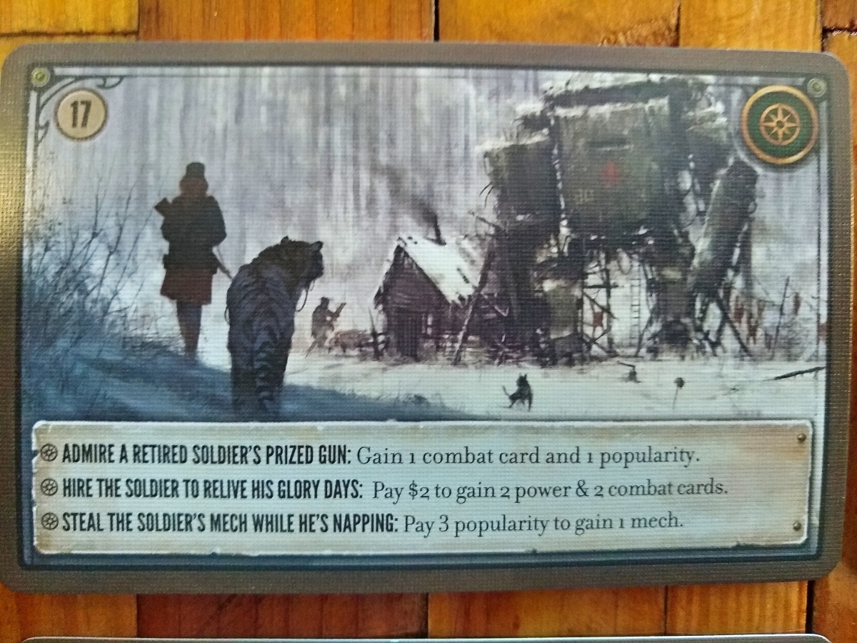
The Scythe encounter card above illustrates effective use of motif. Its corners include small circles evocative of metal rivets, a reference echoed by the apparent metal plate and small screws on the lower popout’s right edge. Another motif appears in the upper left corner’s linework, which has an Art Nouveau feel. These stylistic flairs correlate well with the “1920’s+” setting in a post-WWI world ruled by powerful steampunk machines.
A good motif echoes throughout the components of a game. For example, similar screws and linework appear on the objective cards and player mats.
A grungy, distressed texture pervades most popouts. An exception is the circular popouts where the mechs sit on the player mats; these are perfect circles, with no rivets or screws, and a semi-transparent fill. This allows the player to see the art behind, thereby making double use of the space.
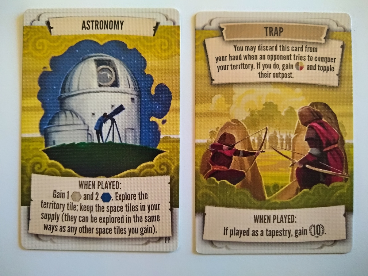
Tapestry as another case
I’ve previously mentioned that the Tapestry automa card backs differ from those of the tech and tapestry decks. As with Scythe, Tapestry makes use of stylized line work for the cards, with clouds as a recurring motif evocative of imagination and innovation. The automa cards primarily differ in being black and white — they still carry the same evocative linework in the corners.
In addition, Tapestry uses popouts evocative of parchment–either laid out like flattened banners or slightly curled upward. The tapestry cards below and the player mat below illustrate the flattened banner style (on the top and bottom popouts). The Arts track below illustrates the curled style of popout (top left corner).
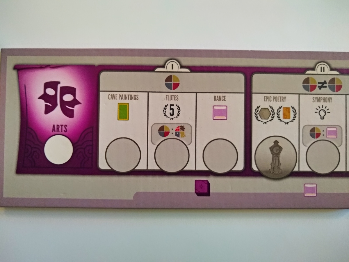
Interestingly, the Arts track also illustrates the use of clean, post-modern styling on the popouts of the action spaces. These spaces have smooth rounded rectangles containing perfect little rectangles and tidy little circles.
As a general rule (with some exceptions), I think Stonemaier generally does not nest heavily-stylized popouts inside heavily-stylized popouts. Instead, they seem to alternate clean popouts with stylized popouts. This is also apparent in the civilization mat above: the larger block has clean lines and a simple shadow, the popouts within it have the banner style, and the mini-popouts in the lower banner (four slots for player tokens) again have tidy little lines.
Of course, the smaller a popout becomes, the less room there is for stylizing without sacrificing readability.
I don’t think this pattern of alternation always holds. The Scythe player mats are a counter-example, and I’m sure that others exist.
Non-Stonemaier examples
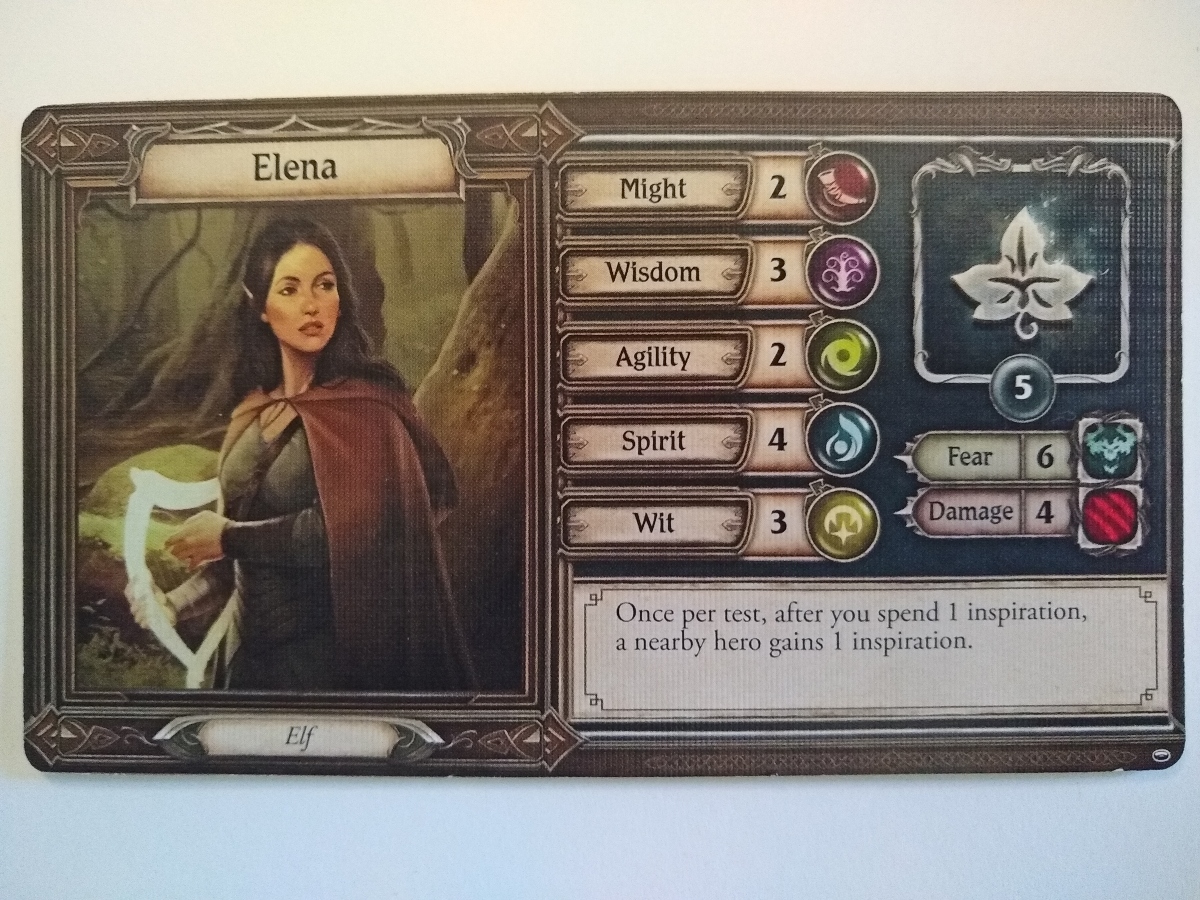
I’m not sure, but it seems like Stonemaier might be an exception in terms of alternation of nested clean popouts in stylized popouts. Nesting is more common on player mats than on cards, so finding examples takes a bit of searching. I found 3 examples, however, in Lord of the Rings: Journeys, Merchants of the Dark Road, and the family-edition Settlers of Catan below).
Motifs in LOTR include the Elven linework and some sort of jewelry-like fastenings on the attribute labels. Borders appear to be brushed metal like you’d find in old jewelry (or possibly heavily eroded stone). The attribute iconography at first seems to be out of place, with its smooth edges and relatively saturated colors. However, keeping these edges clean is essential for readability as in the Stonemaier example above. From a motif standpoint, moreover, the attribute icons have a semi-transparent rendering (notice the light in the bottom left corner of each, not just on the top side, consistent with light flowing through the icon). The effect is as if these are polished, unfaceted gemstones set, thus carrying the jewelry motif through to the smallest popouts.
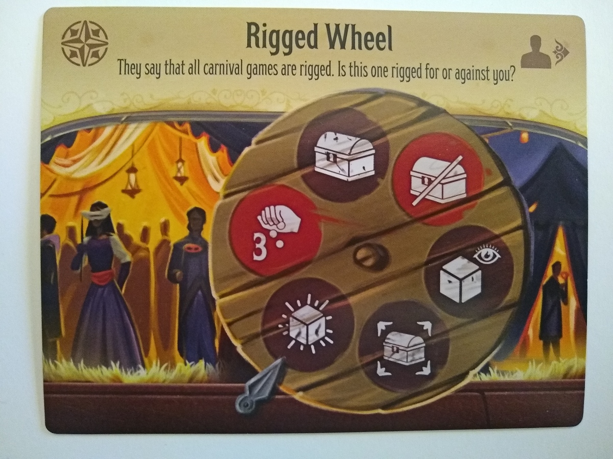
I’ll say less about Merchants. The card below exemplifies a larger popout, stylized as a wooden wheel, containing six smaller popouts that are stylized as burn marks or stains. Wood and light (as in the illustration) are the dominant recurring motifs in this game.
The dev cards of the family edition of Catan are incredibly tiny. I’m impressed that they managed to make them thematic all the way to the inner border without sacrificing scannability. It helps that the game doesn’t have many distinct dev cards, so players rarely will need to read the tiny text.
Notes to self
- Motifs can manifest as symbols, linework, textures, skeuomorphism, borders, and many other graphic aspects & elements.
- Perfect consistency isn’t necessary or common.
- For example, Scythe only places right-hand screws on many components.
- For example, LOTR uses slightly different linework depending on the specific cards.
- Alternation of nesting between stylized and clean popouts is possible.
- I’ve literally never heard or read of anybody complaining that Stonemaier does this.
- This can save space and improve readability of smaller popouts and symbols.
- Driving theme right into the smallest elements is also possible.
- For example, LOTR does an excellent job of this with the jewelry theme, through to the gemstone-like attribute icons.