Designing a big box presents different challenges than a small box. There’s less pressure to squeeze tons of information into a tiny (let’s face it, insufficient) amount of space. On the other hand, a big box raises the bar in terms of how much information and emotion the illustrations and graphic design must convey. More square inches means more power. And–as all Spiderman nerds know–with great power comes great responsibility.
When Chris Matthew posted a draft illustration (above) for An Age Contrived, it immediately captured my attention. I asked him a few questions about the creation and evolution of the art to where it is, and I’ve edited his answers (italicized) for clarity and succinctness. I’ve also added a few comments of my own (not italicized).
Can you share an early prototype? What feedback did people give?
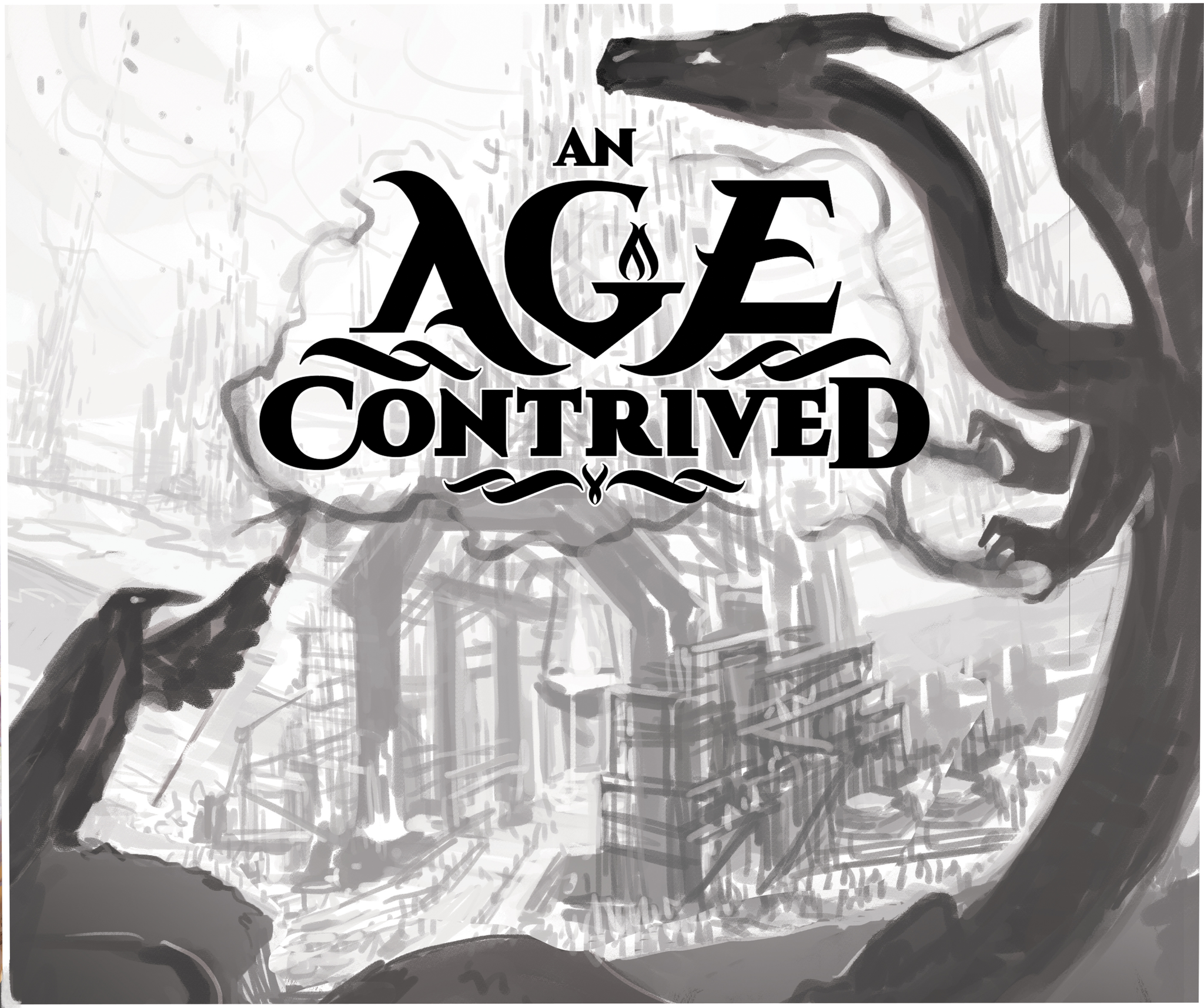
Here’s an early box prototype/sketch. I asked for feedback in my game’s Facebook group. In response, I received no clear suggestions, but people seemed to like the apparent tension between the two characters.
Great value structure
When Chris shared this picture during our conversation, I was struck by how well the characters contrasted in value with the background. They just pop out perfectly, while also helping to frame the rest of the image with their bodies and finger-smoke. At the same time, the title covers too much of the background, preventing me from seeing what I assume is the heart of the game.
I note that he said he received no clear suggestions from his own Facebook group. I have seen him post to the BGDL group and get feedback on later versions–potentially illuminating the value of different groups for different purposes.
Can you give an example of a second prototype? What changed?
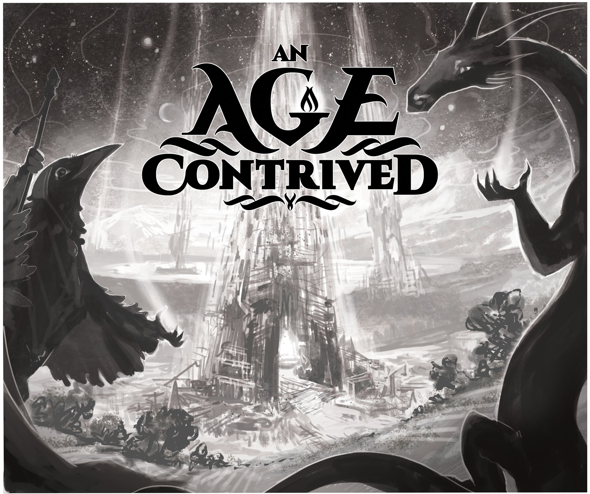
I changed the perspective of the landscape, and the pose and mood of each character.
We’re getting a spiritual vibe now
With this version, I can now more clearly see the rest of the buildings. He’s had to add some white silhouetting on the characters to contrast them with the night sky. The buildings have gone from building to burning — perhaps a sacrifice to these two spiritual sort of creatures?
What are you most proud of, in the final box? Does any aspect of the design still concern you?
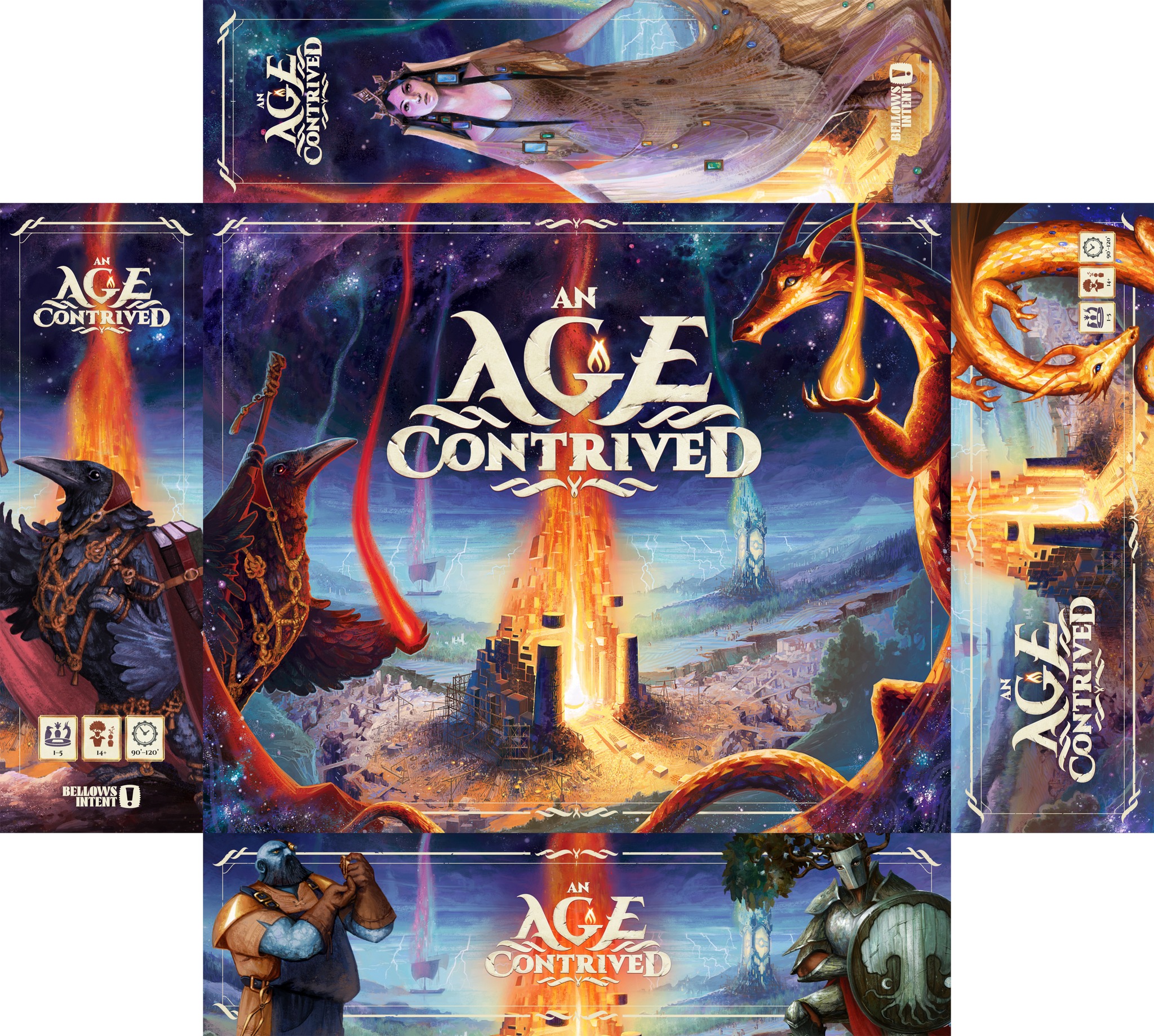
I’m most proud of how the box depict what players are actually doing in the game. My main concern is that viewers could think that the monuments on the box are being destroyed, when in fact they’re being built.
Do they need to be flames?
Yes, it’s also my impression that the buildings are being burned, mainly because of the red coloration emerging from the lead building. Moreover, that coloration shimmies into the night sky in with exactly the same winding, weaving way as a flame. If the coloration was green instead of red, or if they looked more like they were simply glowing with an unearthly power, rather than smoking into the sky, then they would look less like they were burning. Replacing the long trails of fire with unearthly glowing blobs might also help prevent the observer’s eye from tracing the smoke lines into the sky and off the top of the box.
Nonetheless, the illustration is awesome in many other ways
Aside from this detail, I absolutely love the final box art. Here are a few reasons why:
- He’s recovered excellent value contrast for the two characters’ faces, thanks to the lights of their personal flames in their hands.
- The back two structures now distinctly stand out, as well. All feel balanced within the frame.
- The central building, which represents what players do in the game, is the final focal point of the image.
- The two characters help to frame the scene. You’re conscious of their presence as the eye sweeps the scene, but they are the setting rather than the primary subject of the game or the art.
The graphic design feels thematic, a bit grand, and somewhat mysterious.
- The decorative linework and the wordmark feel thematic. I know a lot of people also enjoy characters that pop out on top of such linework. The letters look like stone, echoing the buildings and creating a little bit of a grandness. (The game info on the side should have compatible styling.)
- The side of the box includes the basic information and a compelling character, thus checking the boxes that Jamey Stegmaier found important in his own review of box sides.
- The game has no tagline to explain what category of game it is. I’m guessing it’s a Euro, perhaps, given the box’s size and the illustration of buildings. (His website explains that it’s an engine-builder with a fantasy-themed mythology.) The lack of detail, coupled with the mysterious stars, makes me want to look at the back of the box. Other people might prefer a tagline or some other indication of what kind of game it is.
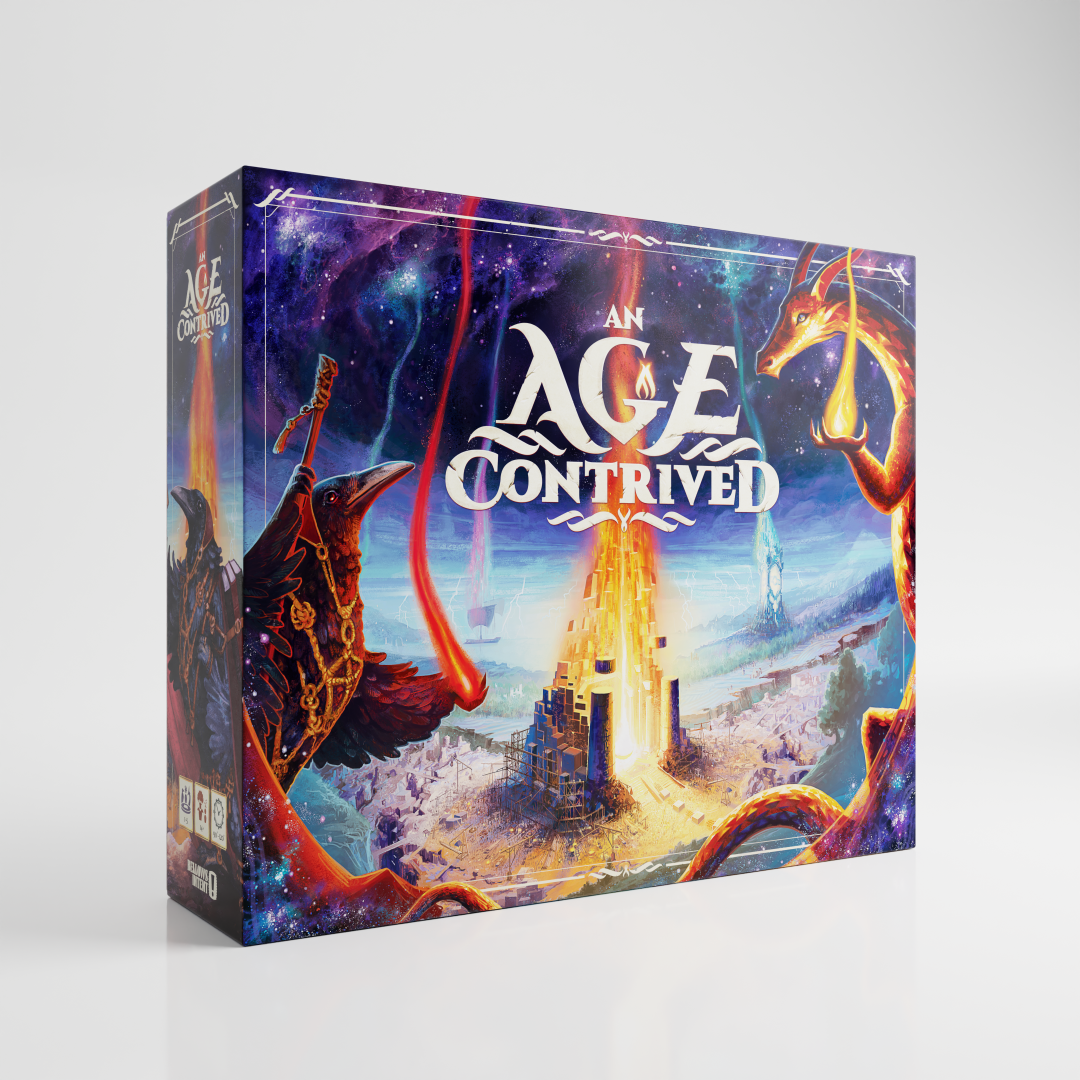
- Chris goes with the 3D render (by Alexei Menardo), which seems like a solid go-to format.
The box makes me feel emotions of curiosity and serenity. Not having played the game, I can’t comment on the appropriateness of this mood. Mystery and serenity seem compatible with the game’s description on its website. However, I can’t tell from that website either how the players will feel while playing.
It’s almost ready to go
One commenter on the image’s Facebook thread said that the illustration “expresses more loneliness, wild life and adventure, a hero’s journey, or something oniric. Not really a city building nor the Sims vibes.” I had to look up what “oniric” means. It refers to dreams. And I can see the point here. Although there is indeed scaffolding around the front building, the appearance of flames may prevent the interpretation of this as a building game. Another person wrote, “Freaking awesome” but also “Looks more like a city under siege by the dragon and bird.” Another wrote, “the dragons are destroying the middle city/tower with fire.” More flame problems.
One person wrote, “The cards in this game are superb and this cover is a great intro to what we will find in the box. Great job.” It seems like the flames are really the only big issue remaining. and there’s a straightforward fix (above).
Where have you shared this? What other methods are you using to draw attention?
I’ve been sharing this box render in the Board Game Design Lab Facebook group, on my website (https://www.anagecontrived.com/discover), and in some ads. Ads on Facebook have been working very well. I’ve also booked booths at some upcoming conventions (SHUX, Essen) and hope that the render will be effective there as well.
Thank you to Chris for permission to post his pictures and for the comments that he provided. Best wishes!
Notes to Self
- Subject and setting: Communication improves in effectiveness when the focal point of the box’s illustration falls on the main subject of the game. This box exemplifies use of characters who are not the primary subject but serve as the setting of the game.
- Value and color: Although a quick read depends more on value than hue, here’s a case where redness can lead to misinterpretation (burning buildings) where other hues (lavender and blue) do not.
- Use of Facebook: Common Facebook groups (such as BGDL) may be more effective than personal/product Facebook groups at getting feedback. And here’s a game where the creator has gotten some benefit from Facebook ads.
- Information and emotion: Age Contrived illustrates the high bar for effective communication of information and emotion through a big box. Even after many iterations, there seem to be more opportunities for communicating on these dimensions, though the creator may pivot against those high expectations (if thematically appropriate) to create an air of mystery by omitting certain details.