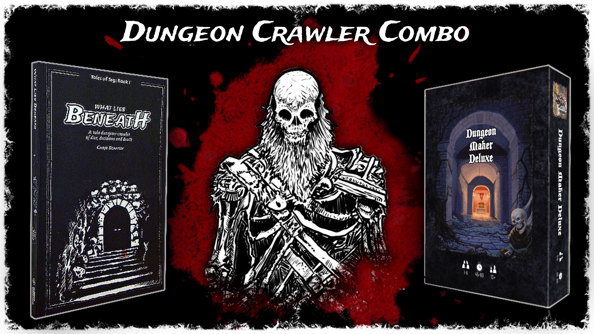
With the campaign for What Lies Beneath rapidly approaching, it’s time to finalize the Kickstarter page. And, as with many other projects, I like to see what has worked well for others before jumping into my own graphic design.
My biggest consideration for the moment is what I’d like the banners (popouts) to look like, though I’ll also comment a bit about the rest of the campaigns’ presentation. Below are a few samples from the search results for games that include “choose-your-own.” All images from Kickstarter are presented for purposes of commentary and criticism.

Fairhaven’s popouts coordinate fairly well with the colors of the maps in the book, as in the example below. However, given that they developed a cool border within the map’s sections (below), I wonder why they didn’t repurpose it for the popouts. I don’t see the circular emblem anywhere in the book, either, though it’s cool. Overall, the popouts feel thematically like they are a reach toward D&D-esque signage without actually feeling like a sign (e.g., in terms of what they could have done with communicating the dimensional form and texture of a real sign).
Incidentally, Fairhaven’s creators currently say they are going to use AI-generated art, FWIW. I see no signs of concern among backers in the comments, though of course non-backers would presumably have the most concerns.
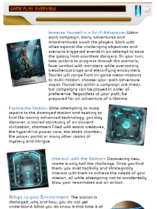
Secrets of Lost Station is a sci-fi RPG with miniatures. A total of 687 backers pledged over $134k in 2020. The standards for Kickstarters have evolved in the past 3 years, but clearly this team did something right here. They had previously done several successful campaigns and had a following, and this successful campaign for Lost Stations was in fact the relaunch of a failed campaign.
Both campaigns had the same popouts, which communicate high-tech, conceivably some sort of a dashboard on a spaceship. The blue dot echoes the background lighting on many infographics, which in turn comes from a blueprint of a spaceship or something similar in many images. The text feels very small, and my connotation for the image overall is of a video-disk player (e.g., DVD or Blueray).
The relaunch prominently emphasizes the features of the game, as shown below. In contrast, the failed campaign jumped quickly to a deep-dive into the miniatures. The relaunch also discusses Key Components.
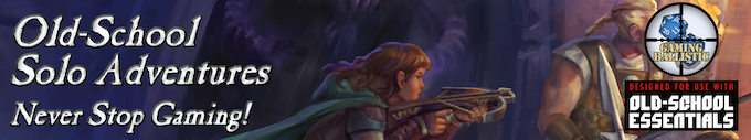
Old-School Solo Adventures likewise had a few previous successful campaigns for D&D 5e content — the first apparently run in partnership with Steve Jackson Games. The creator apparently decided to spin off on his own for Old-School Solo and subsequent projects, and he now has a company that runs such campaigns with content written by other authors (complying with his system and settings).
The banners of early campaigns, such as Old-School Solo above, used an image from the game’s art as the background. They simply set a somewhat thematic display font over the top. An example from a slightly later campaign follows…
Putting the company logos on the right of every single popout feels heavy-handed and out of place. And, the “Steve Jackson” logo is hard to read against the background on this second image. The company logo text is way too small on both images.
The primary font is cool enough in the second image but relatively uninteresting in Old-School Solos. The Old-School Solos image itself certainly is thematic but also feels a little busy.
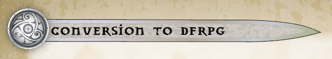
The most recent project combines a thematic image, wipes away the company logo, incorporates a clean shape, and includes a nifty motif. My only nitpicks are (a) that the texture of the sword interacts with the font in a way that suggests anti-aliasing or maybe the image was rendered at too small of a resolution, and (b) the bottom of the image has brighter value than the top of the image for no clear reason. Overall, though, the latest campaign’s popouts are far more usable than those of earlier campaigns.
Kids on Bikes, a campaign for a 60-page dice-driven narrative RPG, uses really tall popouts. Top text spills from a dark overlay into the image, while the bottom text fits comfortably on its own black border. Every popout includes a little ornamental image to the top-left, such as the bike wheel above. These ornaments vary to match the content of each popout (e.g., a book appears on the heading entitled “The Book”). The images within the popouts vary, as well — each generally taken from the book itself.

Pick Your Path uses black text on a yellow elliptical lozenge. I don’t know why.The logo appears on the booklets for sale, but it thematically doesn’t match anything in the games presented. It raised 1047 GBP.

Choose Your Own: Sci-Fi Stock Art uses a speedy-looking display font set within some Flash-Gordon-esque stripes that feel straight out of the 1980’s. Suitable, given that campaign’s top image hearkens to the graphic design of the original CYOA series…
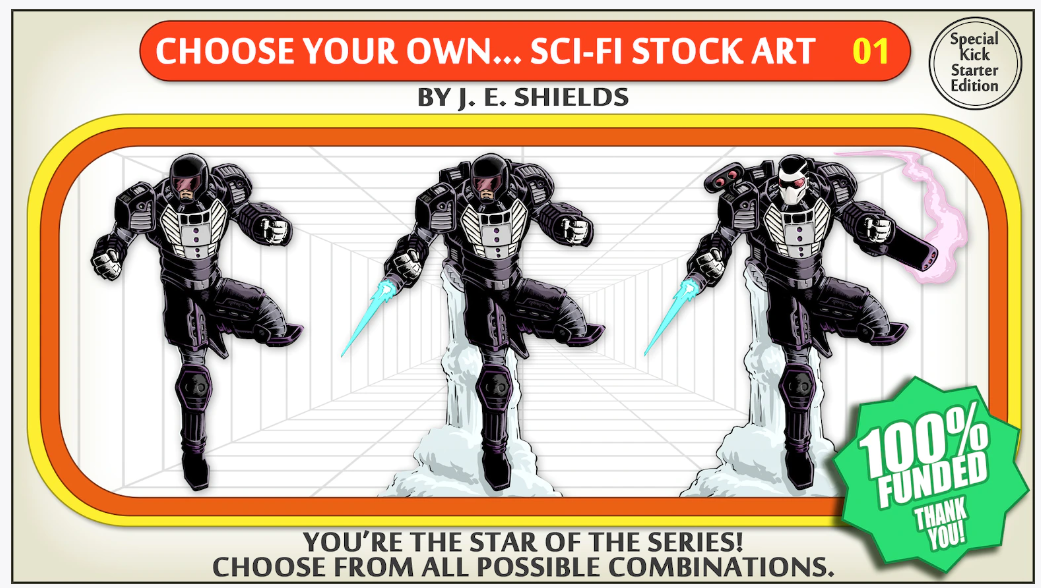
The campaign didn’t sell a book but, rather, sci-fi art to support RPGs. I don’t know how well they sell, but artists frequently sell fantasy art on DriveThruRPG (e.g., Kevin Crawford and Fat Goblin).

Legendary Kingdoms – Pirates of the Splintered Isles used a mono-color image with strong value contrast to communicate a scene, with text overlaid in a very thematic font and a drop shadow. The blue coloration coordinates with the watery theme and the actual cover of the book.
The designers clearly knew what they were doing with value contrast: the left-hand shadow sets off the text nicely, the palms on the right side frame the image, and hints of watery reflection on the bottom suggest a border. But the edges of the image are eroded against the page, achieving a vignette. Subsequent popouts, as in the example below, demonstrate similar qualities.

These are the most inspired popouts that I’ve seen so far in today’s catch.
FWIW, the campaign includes a nice bulleted list of the product’s features. They note that playtesting included solo adventuring and use of the book for a small-group RPG campaign.
The Kickstarter page includes plenty of videos, including several playthroughs and a review or two. This is the third book in the series, and the campaign ended in Sep 2023 with 3213 backers.

Let’s finish with 7th Continent — such a huge success, with over 12000 backers, when it launched in 2017. The popouts included somewhat-hard-to-parse ornament image of a fish (on all popouts), a thematic font, and a simple line. No background.
It’s a bit weird that they didn’t incorporate any of the popouts or imagery from the game itself. They had a lot to choose from. Maybe they didn’t want the popouts to distract from the game content. If that was the goal, success! It’s actually quite hard to notice the popouts amid all the great graphics of this game.

The campaign did a lot of things right. It had tons of positive reviewer coverage. Its “What You Get” infographic comes across as promising the world. The campaign has a “Key Features” list. And it has a long exploration of the world as well as key mechanics.
Notes to self
- Campaign should explain product features.
- Popouts should be easy to read.
- Overlap with background imagery generally gets in the way.
- Exception: Mono-color with effective use of value for contrast and framing.
- Exception: Keep the text off the image itself (on overlays).
- Don’t distract from the product itself.
- Do consider including a thematic ornament.