I ran across a beautiful Kickstarter called Birds of a Feather, published by Snowbright Studios. One reviewer quote caught my eye: “Birds of a Feather is the original bird themed game.” When I found the 2015 version of the game on BoardGameGeek, I noticed several nice updates made to the new version and emailed the publisher to request information and pictures, which they provided. Snowbright licensed the game from Nothing Sacred Games, a company formed by the designer.
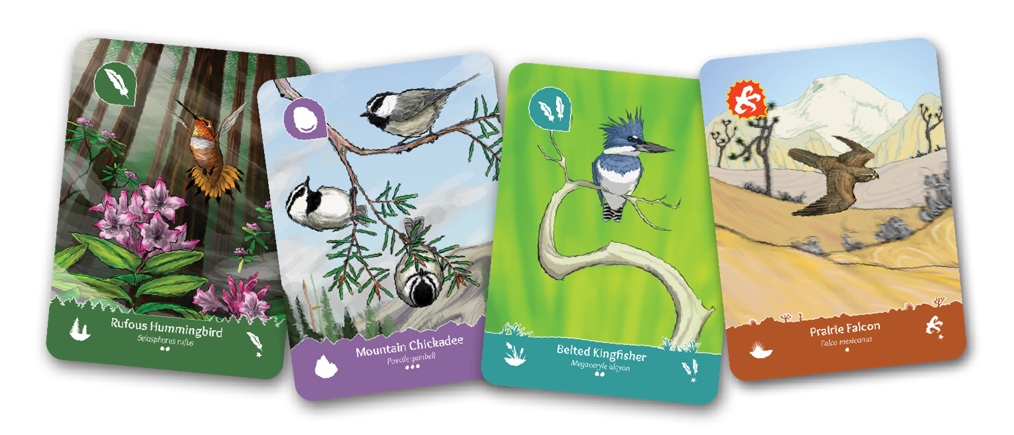
Whereas the original game enclosed the birds in a top and bottom border, the new game only has a bottom border (above). The birds are therefore larger and can occupy more of the players’ visual attention.
The bottom border now has a stylized edge, reflecting a specific type of terrain. The terrain is important because the game is about playing birds into terrain types at the same time as opponents, for mutual benefit. Providing a stylized border edge should help to further disambiguate card categories, already indicated by border color and an icon.
The terrain icon has moved, as well, to the left edge so that it remains visible to the card’s owner while splayed in the hand. In addition, the terrain icons now have very little unnecessary visual detail. For example, the forest icon is just two triangular trees, the ocean is a wave curve, and the mountains are a fat cone. They are optimized for fast readability and distinguishability. The older icons included a great deal of counter-productive detail.
A handwritten font (Overlock) now titles the birds, versus a very thick font (possibly Bookman) in the older cards. With this change and those above, the cards more closely resemble classic ornithological art—in particular, the style that portrays birds with substantial grounding in a natural habitat.
Although the publisher did not need to update the card art, they did commission a new cover illustration, which features prominently in the video that helped drive the game to fund quickly. They repurposed this new art, as well, in the updated scoring app.

Finally, to my eye, the colors of the card border have softened a notch. The Image Color Summarizer reports an average saturation of 35% for the new borders and 58% for the old game, though of course it’s hard to tell for certain because the lighting varied. You don’t need a lot of garish saturation for a game to shine!
Likewise, Snowbright has softened the back of the cards by eliminating a heavy border and yellow text. This follows a common trend in card backs, and it’s important in this game because players spend a lot of time looking at the backs of one another’s cards. It also helps to better align the UI with the game’s naturalistic theme.
The game has not changed mechanically, yet its ratings have risen from 6.7 to 7.5 on BoardGameGeek. While those stats could shift as a broader range of players weigh in on the changes, I think those statistics illustrate the power of art and graphic design, having moved an ok rating to a solid rating.
What other redesigns have you examined closely, and what changes had the most impact on your perception of the games?
1 thought on “Birds of a Feather Ascends with a Fresh Graphic Design”
Comments are closed.