With the approach of autumn, and a Christmas-gnome game on my mind, I find myself wondering how to communicate coziness through components’ graphic design.
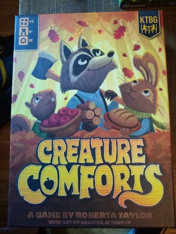
Creature Comforts
Published by Kids Table Board Gaming
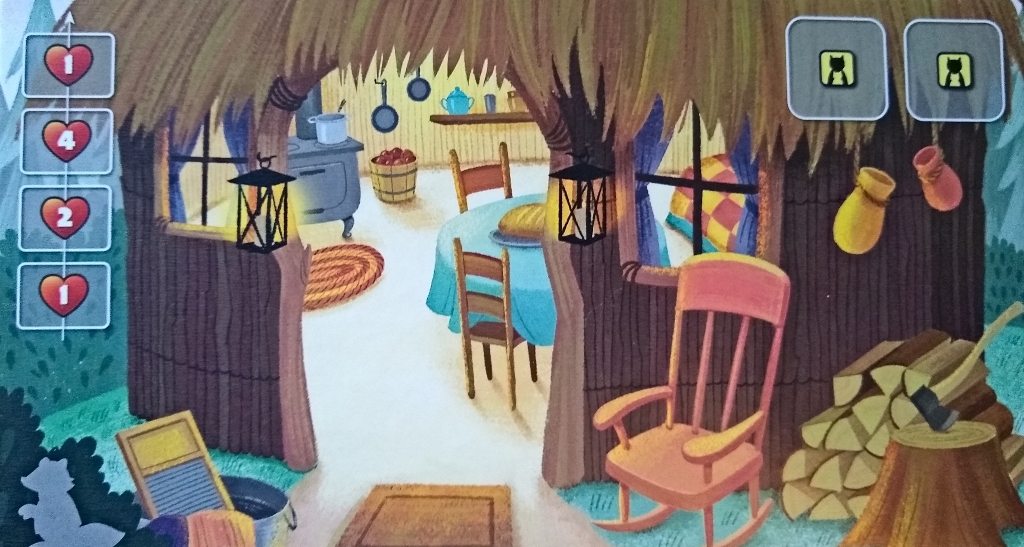
The coziest game that came to mine was Creature Comforts. However, the mat above communicates coziness primarily through imagery — not graphic design. There’s really nothing cozy at all about the semi-opaque lozenges of the popouts. And the icons are extremely generic.
The cover does the same, again primarily through the imagery, but also to a certain extent through the stylized wordmark. I like the connotations of a tail at the end, the acorn in the O, the mushroom in the R, and the hatchet in the upper T. The little leaf and squirrel icons in the top left are nice.
Nonetheless, these examples left me looking for more examples, particularly with regard to component layout and popouts (frames). I asked the good people of The Boardgame Group on Facebook for suggestions of cozy games and got a few leads. All images below are screen-captured from publishers’ websites for purposes of commentary and criticism.
I’m going to focus on popouts and icons on the games’ inner components, versus the box, fonts, art, and palettes — all important enough to deserve articles of their own.
Meadow
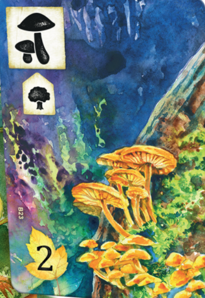
This is probably the coziest game suggested, in terms of graphic design. I love the textured “wooden” popouts, with their slightly eroded and weathered edges, along with the stencil iconography (even weathered a bit, too).
The leaf icon at the bottom of the bigger card here is autumnal.
The smaller card, below, has some sort of a tag on the bottom left. It has nice weathered wooden edges to match the more dominant popout icon at the top left of each card.
Various other components, such as little “pointer” icons carry the wood theme, as well.
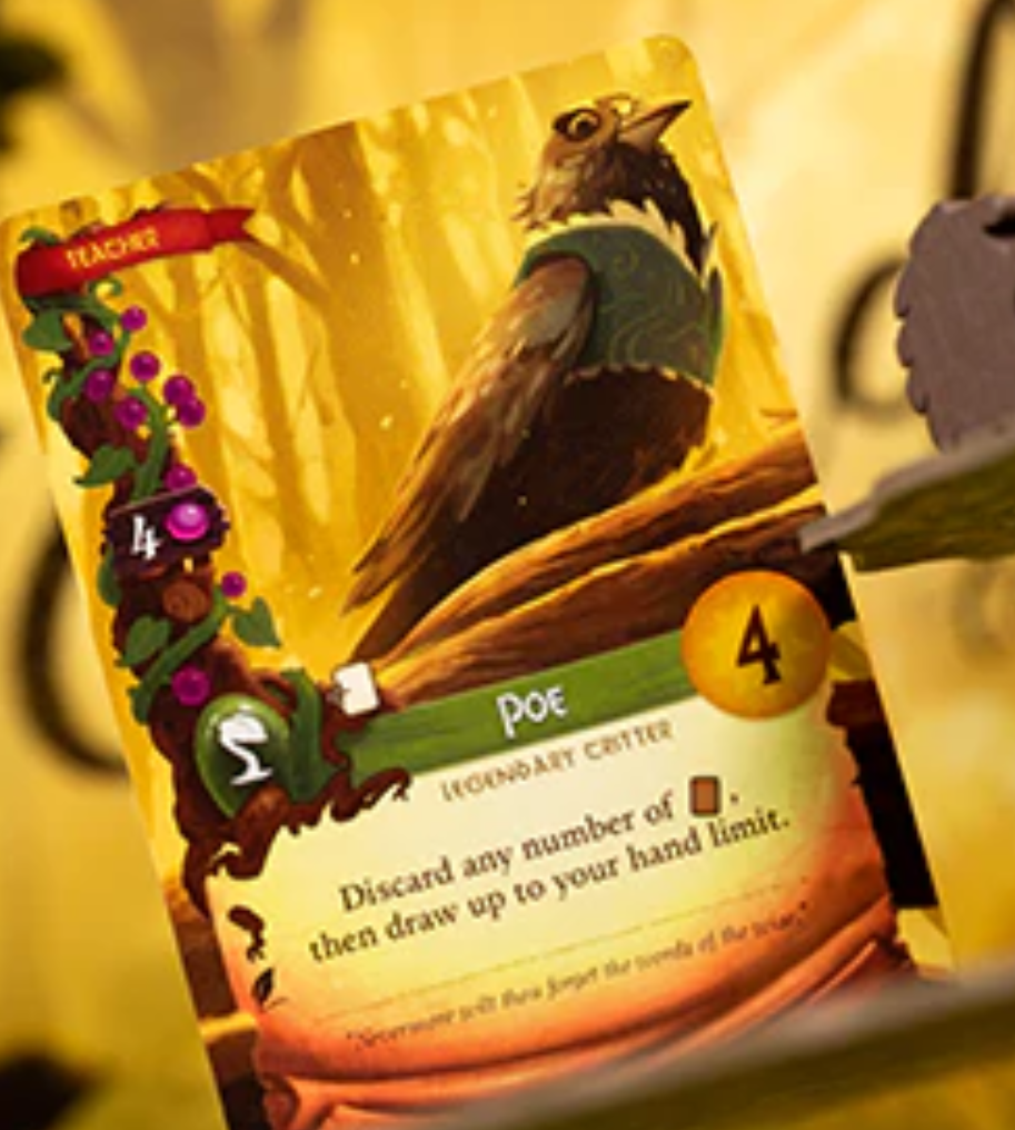
Everdell
Published by Tabletop Tycoon
Everdell’s graphic design is also fairly cozy.
The top left icon of cards is a banner or flag, which connotes wind and honor — not particularly cozy themes.
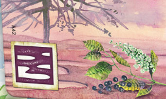
The wooden min-sign in the middle left is a bit hard to read. The berry does thematically connect with the berry vine in the background, though it also blends a bit, visually speaking.
The tag in the middle-lower right is a bit shiny for my taste. But it’s a nice palette.
The coziest part of the card might be the gently textured ribbon at the top of the large bottom popout, which is some sort of unfurled scroll. (Not the primary focus of the article, but the font is woodsy without becoming unreadable — I’d love to know what font they used.)
The scroll beneath connotes messages and directives — not super cozy, but also not un-cozy in this context.
Flamecraft
Published by Cardboard Alchemy
As with Creature Comforts and Everdell (to a certain extent), the art carries the load of communicating coziness within Flamecraft.
It uses scrolls as popouts (in the top-right of card-mats). The icons have the shape of heraldic banners — connoting honor. It’s fine for a game about crafting magic. I don’t find it super cozy.
I do find the little popouts at the bottom of the card-mats to be helpful in terms of telling where to place cards. I also think the dark horizontal overlay on top of images (such as in the example below) to be a great use of space without obscuring the art.
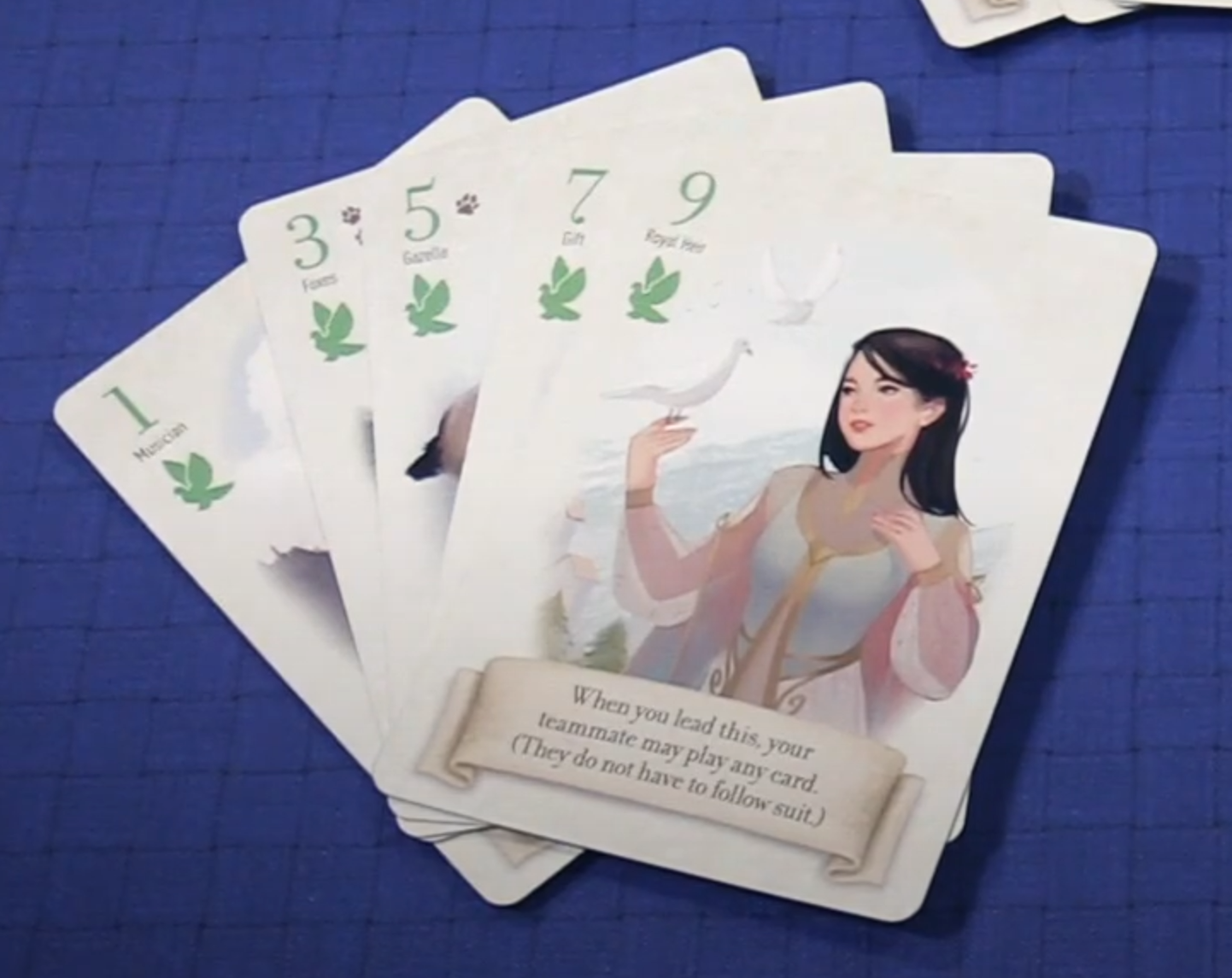
Fox in the Forest Duet
Published by Foxtrot Games
The cover of this game oozes love and coziness. But what about the graphic design of components within the box?
As with other examples above, the game uses banners for key instructions. But it’s a horizontal shape with sides resembling a ribbon, rather than a single loose end like a flag or banner. This resemblance to a ribbon (along with its very soft, curvy edges) greatly mitigates the connotations of announcements or directives.
I really like the little paws in the top left of certain cards (3 and 5). Little mammals — foxes in this case — give this game a sense of friendliness. They’re even more appropriate here, in a coop, then they were for Everdell and Creature Comforts above.
Notes to Self
- Recurring use of wood
- Meadow’s is my favorite
- Banners
- Make them look as much like ribbons as possible (or other non-governmental/military connotations)
- Consider a simple flat overlay instead (e.g., Flamecraft)
- Icons, especially for tags
- Excellent stencil icons in Meadow
- Why the shiny gloss of Everdell? Think flat, not fancy
- Background
- Stuff outside the primary focus of this article
- Thematic font, possibly connoting woodcut (Everdell)
- Autumnal, soft but rich palette
- Emphasis on cute mammals in illustrations