In last week’s post, I sampled games that players said had “awesome art” (or “great art” etc), and which also had at least 1000 ratings averaging 7.5 or higher. Analyzing those games yielded 7 generalizations:
- For animal subjects (other than monsters, below), a watercolor-ish aesthetic dominates.
- For landscapes, an acrylic-ish aesthetic dominates.
- For cards focused on isolated plants, monsters and objects, crisp (often almost photo-realistic) detail dominates.
- When depicting humans…
- Art often emphasizes/exaggerates poses and posture.
- Art sometimes (but not always) emphasizes/exaggerates faces.
- Anatomy rarely matters at the level of musculature and joint detail.
- Art usually includes clothing and props that integrate the subject into the scene.
Treating the above 7 statements as hypotheses, today I’ll test them using a different sample of games that I hope will eventually be the peers of my own games (if I continue putting in the necessary time and effort over the years).
Terminology
Obviously, digital art isn’t literally watercolor or acrylic. I use these as shorthand for the extent to which brush bristles remain visible and/or bleed into one another, as well as the way in which color varies across each stroke and across areas of the work in general.
It’s not like there’s just one “acrylic style,” but all such types of renderings overlay paint in a characteristic way. For example, acrylic painters often like to block out the darker value of an object, and then overpaint highlights, leaving visible light strokes that overlay and cross the darker regions, typically with a little bit of texture resulting from the bristles.
This texture and blockage of colors by succeeding layers is even more apparent in oil paintings. In addition, oil paintings tend to have more blending of colors into one another, compared to acrylic, but the colors themselves can be more vibrant. The strokes of an acrylic are sharper, while the bristle-texture of an oil are more visible.
Top-ranked fantasy games
BGG computes rank based on a combination of rating and number of ratings. It provides a list of top-ranked games by category.
I retrieved the list of games from the first page of top-ranked Fantasy games. Filtering out expansions yielded the following sample of 23 games:
- Gloomhaven | Board Game | BoardGameGeek
- War of the Ring: Second Edition | Board Game | BoardGameGeek
- Spirit Island | Board Game | BoardGameGeek
- Terra Mystica | Board Game | BoardGameGeek
- Root | Board Game | BoardGameGeek
- Everdell | Board Game | BoardGameGeek
- Mage Knight Board Game | Board Game | BoardGameGeek
- Too Many Bones | Board Game | BoardGameGeek
- Caverna: The Cave Farmers | Board Game | BoardGameGeek
- Blood Rage | Board Game | BoardGameGeek
- Kingdom Death: Monster | Board Game | BoardGameGeek
- Mechs vs. Minions | Board Game | BoardGameGeek
- Aeon’s End | Board Game | BoardGameGeek
- Clank!: A Deck-Building Adventure | Board Game | BoardGameGeek
- Five Tribes | Board Game | BoardGameGeek
- Sleeping Gods | Board Game | BoardGameGeek
- Lords of Waterdeep | Board Game | BoardGameGeek
- Tainted Grail: The Fall of Avalon | Board Game | BoardGameGeek
- Cthulhu: Death May Die | Board Game | BoardGameGeek
- The Lord of the Rings: Journeys in Middle-Earth | Board Game | BoardGameGeek
- Rising Sun | Board Game | BoardGameGeek
- The Isle of Cats | Board Game | BoardGameGeek
- Aeon’s End: War Eternal | Board Game | BoardGameGeek
BGG ratings reflect a particular cross-section of player opinions, which frequently depend more heavily on mechanics than on theme. Nonetheless, if I want my games ever to reach this cohort, then they need to have art at least somewhat comparable to historical norms. Art shouldn’t hold the mechanics back.
Animal subjects
Watercolor aesthetic dominates? (Note: This category does not include monsters — see below.)
Key exemplars:
- Root | Board Game | BoardGameGeek – flat cartoons with visible lines – mild resemblance to watercolor, especially on the box, but somewhat less-so on the other components except where colors blend into one another (e.g., on animals’ faces)
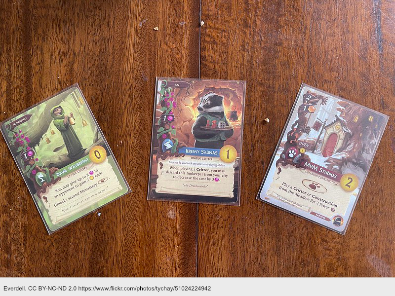
- Everdell | Board Game | BoardGameGeek – resembles acrylic – not watercolor [note: this was part of the previous sample]
- The Isle of Cats | Board Game | BoardGameGeek – cat tiles resemble graphite with marker overlay – not watercolor
All of these exemplars contradicted my hypothesis, at least in part. Referring back to my previous post, I see that I generalized based on 3 non-Fantasy games very much set in the real world. The one Fantasy example of that sample, Everdell, has more of an acrylic aesthetic (as noted above).
Root
Here’s a sample of the comments of players about the art in Root:
- “Same complaints as Oath. Why pick this war game…? The art really saves it.”
- “The art is really cute and doesn’t look like a typical wargame. The game is also much more complicated than the art would imply.”
- “The art is sooo cute”
- “The cute art both contrasts and enforces the theme.”
- “Amazing art and components, as well as world-building. I so much wanted to like this game. But the gameplay felt mechanical and fiddly.”
- “Root is very difficult to teach… I love the art though!”
In reviewing comments, I notice that many players who liked the art found it at odds with the heavy mechanics. The game’s weight is 3.76. Pushing further to a watercolor with ultra-soft edges would have exacerbated this disconnect. The artist (Kyle Ferrin) seems to use a similar art style in most of his games, including Oath (which appeared in the previous sample) and the horror-themed Vast. He does have some variance in the level of watercolory-ness, which he appears to have dialed back for Root.
Bookmark: An awesome interview of Kyle Ferrin, which digs into his ink+color style, the reasons why he likes “ink and watercolor,” and the conscious choice to create Root art “for people who didn’t know they liked war games yet.” So, there’s the intentional rationale for the difference between mechanics and art. The introit of the interview is also really evocative:
Kyle’s story is all too common among artists—juggling multiple hats to make ends meet, the harsh reality of having zero visibility, and what seems like eons to finally “make it.”
Isle of Cats vs Wingspan
The weight here is only 2.35, and the cats look really comfortable stretched out on the ships. On the box, the scene again could be graphite covered with a marker overlay.
The contrast versus Wingspan’s watercolor (from my previous sample) is striking in terms of treatment of value. But I think the difference is primarily due to the large number of different colors on each Wingspan bird. This really helps Wingspan to accurately depict each bird, using tight little areas of color that slightly blend into one another (e.g., across the area of each large flight feather on the wings).
With Isle of Cats, I’m picking up a set-collection vibe that requires cats to have identifiable colors (one per “family” of cats), which would prevent accurately representing color variations. (I’ve never played it.) In that case, mechanics would call for the illustrative approach taken.
Generalization
Watercolors serve well for realistic, “ooooh”-inducing depictions of animals in non-fantasy games. For top-ranked fantasy games, prefer a less soft blending of color, particularly among heavier games. As in all games, obviously, attune to the mechanics.
Landscapes
Acrylic aesthetic dominates?
Key exemplars:
- Sleeping Gods | Image | BoardGameGeek – absolute acrylic (further notes below)
- Tainted Grail: The Fall of Avalon | Image | BoardGameGeek – acrylic or even oil level of texture and overlay of colors, highly painterly, ie no lines (see further notes below)
- The Lord of the Rings: Journeys in Middle-Earth | Image | BoardGameGeek – the box is very much what I’d call acrylic, though with a relatively heavy amount of paint (brush texture); the amount of time probably spent on highlights is incredible
- War of the Ring: Second Edition | Image | BoardGameGeek – resembles acrylic, especially on the cards; the board has softly blended strokes, which help with the readability of the overlaid text
- Root | Image | BoardGameGeek – the board follows the same style as the cards, flat cartoon with visible lines, though the soil blends as if watercolor; still no brush bristles visible as in acrylic or oil
- Everdell | Board Game | BoardGameGeek – resembles acrylic – not watercolor [note: this was part of the previous sample]
- Mage Knight Board Game | Image | BoardGameGeek – not a strong emphasis on landscapes in this one, but where they do appear, strokes are clearly visible, with value and color variation similar to acrylic; note that the body of the popouts looks more like watercolor
- Too Many Bones | Image | BoardGameGeek – definite acrylic style on the box: look at those strokes on the edges from secondary lighting, with no pooling of color as in an oil painting; there appears to be some photo-texturing with soft-light blend
- Caverna: The Cave Farmers | Image | BoardGameGeek – the cover has a mix of soft lines and hard lines but only painterly strokes on softer edges; I wonder if this was sketched and then colored in with a flat color, then shaded and highlighted with another layer; the board is similar
- Blood Rage | Image | BoardGameGeek – absolute acrylic (with texture on popouts); the box’s background has a pastel or chalk kind of stroke (which could be a texture)
- Aeon’s End | Image | BoardGameGeek – landscape background on the box is an acrylic style, consistent with the rendering of the monster (below)
- Five Tribes | Image | BoardGameGeek – not much in the way of epic landscapes; the background son cards could be characterized as acrylic in terms of how highlights overlay base colors
- Lords of Waterdeep | Image | BoardGameGeek – only the box has much in the way of big landscape art, which is impressively epic and has obvious texture in the highlights of the clouds
- Aeon’s End: War Eternal | Image | BoardGameGeek – I guess I’d categorize the box’s background as an acrylic aesthetic, though marker (with no visible lines) is a close second, owing to the negligible texture; ditto for the handful of cards that have some landscape
Sleeping Gods
This game leans much harder into landscapes that most of the others in the list above. The landscapes are absolutely quintessential in resembling what I’m calling an acrylic aesthetic, particularly in terms of how Ryan did the highlights on forms. It showcases absolutely beautiful, well-placed, nearly opaque strokes with really awesome texture (especially on the mid-ground mountains of the cover). Landscapes on the cards are equally impressive.
Tainted Grail
The cover has enough texture that I might call this oil-like, especially in terms of how it almost appears to come from an under-painting that’s pressing upward through the overpaint (e.g., in the dark lines emanating from the focal point through the sky). However, the cards have none of this. They more closely resemble dark forms painted with a textured brush, followed by a texture highlight brush consistent with the “acrylic-ish” aesthetic on other games in this list.
Generalization
An acrylic style absolutely dominates the landscape art among top-ranked fantasy games. Root is really the only striking counter-example.
Isolated plants, monsters, objects
Crisp detail dominates?
Notes on monsters
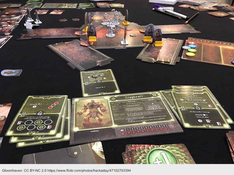
- Gloomhaven | Image | BoardGameGeek – interesting details on the monsters, such as armor and belt on Cragheart (whose heart is, indeed, a carefully rendered crag), as well as little rocks falling from his hands
- Spirit Island | Image | BoardGameGeek – the “monsters” are elemental forces, almost as if landscape with little detail; they are rendered in line art with coloring, with a little bit of texture
- Too Many Bones | Image | BoardGameGeek – the wolf and owlbear tokens have some interesting detail
- Blood Rage | Image | BoardGameGeek – acrylic style on the monsters, with interesting detail (such as the chain on the wolf, Fenrir), matching miniatures
- Kingdom Death: Monster | Image | BoardGameGeek – intricate feathers on this monster, with really textured claws, teeth and eyes; I can even see the veins in the hands and glistening bulbous shapes around the shoulder joint
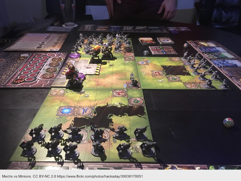
- Mechs vs. Minions | Image | BoardGameGeek – representations on the command cards are cartoony and not especially detailed compared to the examples above; this game has a fairly cartoony style
- Aeon’s End | Image | BoardGameGeek – again, relatively low detail, though I can see individual teeth on the Shard Spitter, and the glowing green heart of the pincer of the Beight Lord is eye-catching — an unnecessary but satisfying detail
- Five Tribes | Image | BoardGameGeek – the monsters don’t have a lot of interior detail; instead, they make their dangerous presence felt by the hard contrast of dark value against lighter background, with intricate edges between the subject and background
- Cthulhu: Death May Die | Image | BoardGameGeek – the tentacles are highly detailed; the innumerable glowing points of light (eyes?) are mesmerizing; the veins pop from the arms; the ick is visceral and appalling
- Aeon’s End: War Eternal | Image | BoardGameGeek – monsters have some detail, sufficient to communicate wetness or threatening form (e.g., spikes), but it’s not nearly as much as in Cthulu
Notes on objects
- Gloomhaven | Image | BoardGameGeek – cards use an acrylic style to represent boots, potions and other objects, without close attention to detail; for example, the “minor healing potion” has some sort of blossom shapes that obscure the bottle — I didn’t even recognize it at such upon first glance
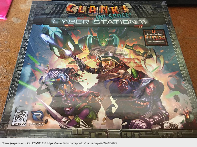
- Clank!: A Deck-Building Adventure | Image | BoardGameGeek – this game includes many cards with images of isolated objects, such as boots and bracers; the rendering is similar to Gloomhaven in terms of acrylic painting style, but with more attention to detail; for example, the buckles on the boots are nice touch, as are the bevels on the bracers; I can make out individual clasps on the amulet of vigor
- Sleeping Gods | Image | BoardGameGeek – the game includes quite a few cards depicting isolated items, which have about the same amount of detail as Gloomhaven and Clank (and are rendered in an acrylic style)
- The Lord of the Rings: Journeys in Middle-Earth | Image | BoardGameGeek – the item cards are rendered with moderate detail in something like acrylic; although some cultural styling is apparent (e.g., in the triangles on the dwarf-forged helmet), they aren’t nearly as salient as in many other games, perhaps because these cards are minis (iirc); monsters are rendered with some detail on the box cover
Bookmark: I notice that many games use miniatures to represent monsters (e.g., LOTR Journeys, Cthulu, and Rising Sun). The miniatures have plenty of detail to satisfy tactile and visual senses. Such miniatures deserve a post of their own.
Generalization
For monsters, games include sufficient detail to evoke feelings of ick or danger, but not much additional superfluous detail. Not one monster struck me as photo-realistic. Five Tribes demonstrates how to take maximal advantage of contrast against the background to communicate detail through edges. Blood Rage demonstrates how to use props with monsters (e.g., the wolf’s chain).
For objects, games similarly include moderate detail up to the level allowed by the card or token size. I just don’t see the near-photo-realistic detail present in some of the lower-rated games previously sampled. All of these fantasy games render items with an obvious acrylic style. Does this add to how players perceive the level of investment by the publisher?
None of these games, as far as I noticed, include many cards focused on isolated plants. This may say more about the nature of the thematic category than it does about art.
Humans
Emphasize posture, faces (somewhat) and props, vs detailed anatomy?
Key exemplars:
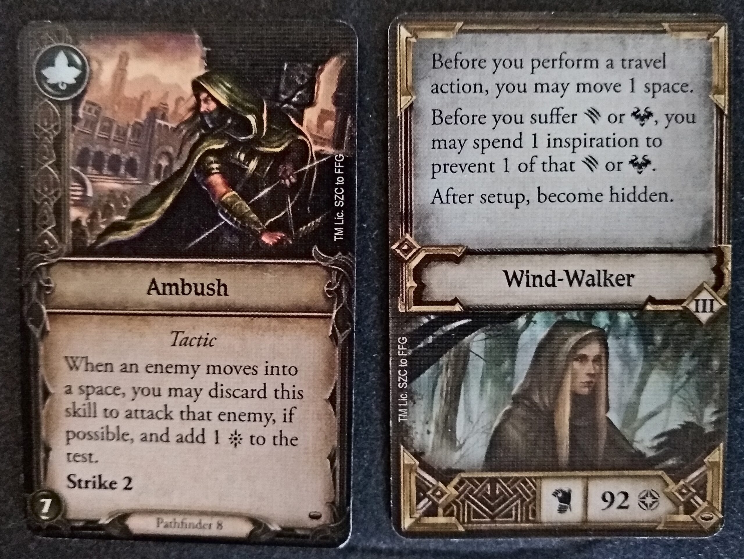
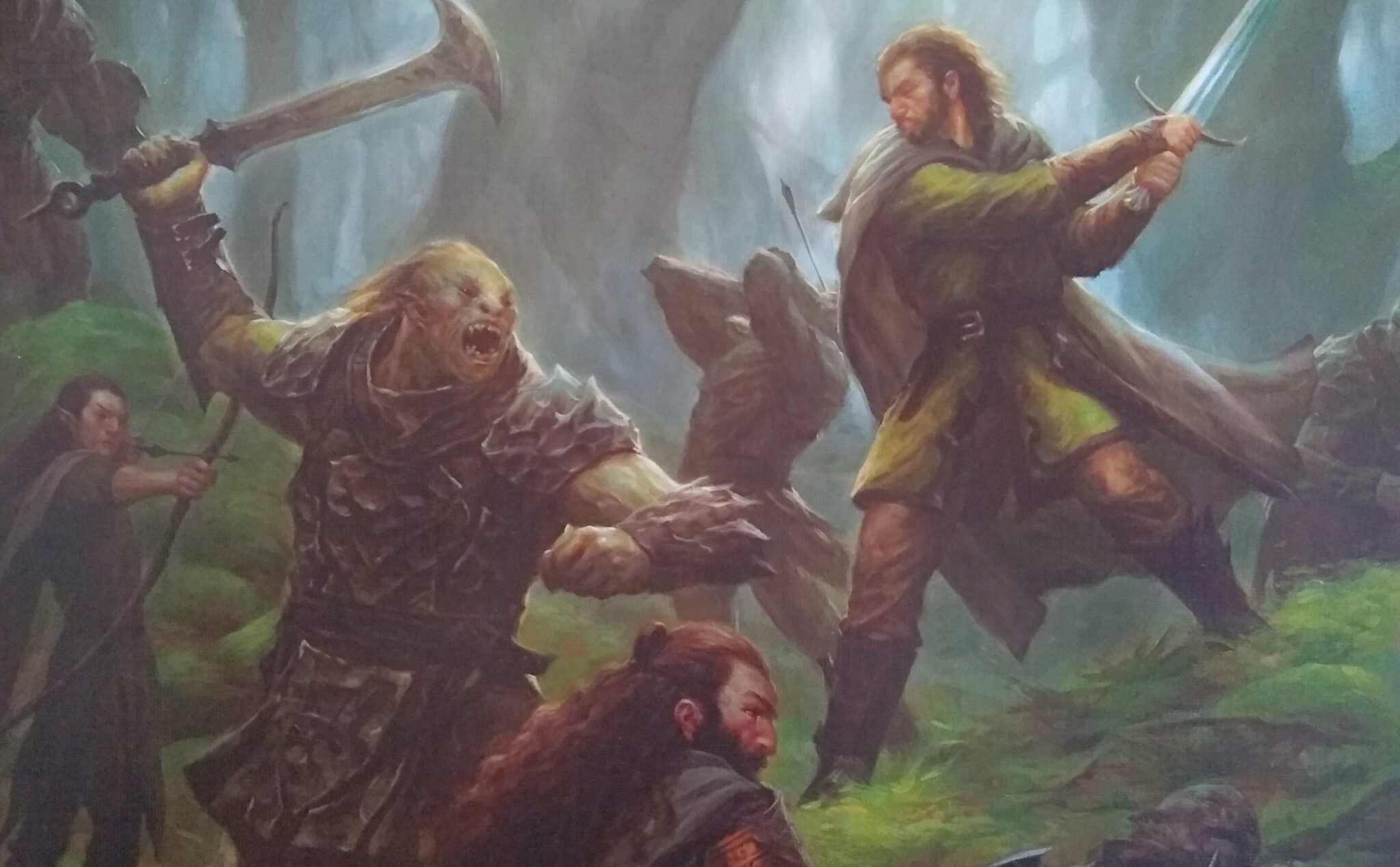
- Gloomhaven | Image | BoardGameGeek – I think everybody faces the camera, has a posed or fighting posture, little visible skin aside from the face and sometimes hands + upper legs, and plenty of props (armor, shields and hammers)
- Mage Knight Board Game | Image | BoardGameGeek – ditto; many of these poses include jumping or somehow otherwise flying through the air while fighting, though certainly not all
- Too Many Bones | Image | BoardGameGeek – ditto; the Tinsel character has a particularly entertaining prop, consisting of a little plant she’s holding (she’s supposed to be a conservationist, apparently, which this one plant is supposed to communicate)
- Caverna: The Cave Farmers | Image | BoardGameGeek – ditto; props include a lot of dwarfish work equipment such as hatchets and picks
- Blood Rage | Image | BoardGameGeek – ditto for the most part, though I do see a few cards where at least one human faces away from the camera (e.g., Tyr’s Challenge — because that subject is facing another one who is facing the camera)
- Aeon’s End | Image | BoardGameGeek – ditto, although as with Blood Rage, a handful of subjects face away from the camera; props nclude glowy staffs with lots of lightning, fire, and glowing spheres; the glowy is strong with this one
- Clank!: A Deck-Building Adventure | Image | BoardGameGeek – ditto. We face the camera, we have nifty props including appropriate clothing such as the outfit of Queen of Hearts
- Sleeping Gods | Image | BoardGameGeek – ditto. Face the camera, wear clothing matched to the role, and maybe carry one item such as a gun or sword.
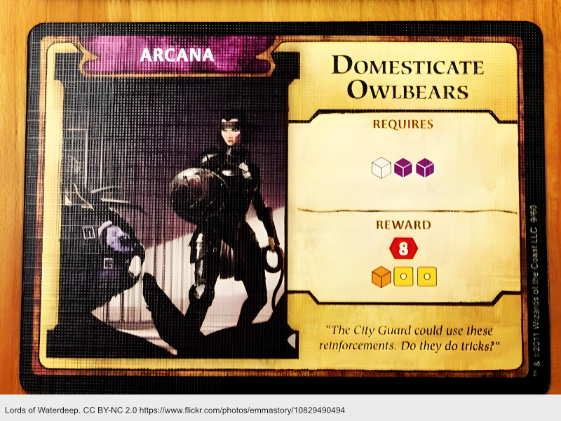
- Lords of Waterdeep | Image | BoardGameGeek – ditto. The armor and other clothing is especially well-developed in this game. IIRC, the cards are jumbo, affording plenty of space for such detail.
- Cthulhu: Death May Die | Image | BoardGameGeek – ditto. Every one of these cards shows the face of a subject, in order to really clearly communicate the horror or other emotion of the subject. I also see a lot of props, such as medals on a uniform, dinner plates, and bullets. Clothing is thematically colorful and detailed.
- TSM Reviews: Lord of the Rings: Journeys in Middle-Earth | BoardGameGeek – ditto, though quite a few of the poses are just plain relaxed! Props include Aragorn’s drinking flask and Beravor’s staff.
- Rising Sun | Image | BoardGameGeek – ditto, with some nice armor, capes, head-dresses, belts, swords and clubs. Muscles are apparent on approximately half of the characters of Turtle Clan, though not so much on others.
Generalization
Subjects typically face the camera. They typically show little or no skin except on the face. Clothing plays a major role in establishing a character. Other props help. Subjects quite often simply pose, but many assume a fighting posture of some sort.
Artists
Only a few of the last sample of games had more than 1-2 artists per game. In contrast, most games in today’s sample had 3 or more artists. For reference, here are the first artists listed for each game:
- Alexandr Elichev | Board Game Artist | BoardGameGeek – 24 games
- John Howe | Board Game Artist | BoardGameGeek – 33 games
- Jason Behnke | Board Game Artist | BoardGameGeek – 8 games
- Dennis Lohausen | Board Game Artist | BoardGameGeek – 258 games
- Kyle Ferrin | Board Game Artist | BoardGameGeek – 27 games
- Andrew Bosley | Board Game Artist | BoardGameGeek – 72 games
- J. Lonnee | Board Game Artist | BoardGameGeek – 20 games
- Josh J. Carlson | Board Game Artist | BoardGameGeek – 30 games
- Javier González Cava | Board Game Artist | BoardGameGeek – 42 games
- Henning Ludvigsen | Board Game Artist | BoardGameGeek – 229 games
- Zeen Chin | Board Game Artist | BoardGameGeek – 15 games
- Danny Beck | Board Game Artist | BoardGameGeek – 2 games
- Gong Studios | Board Game Artist | BoardGameGeek – 47 games
- Rayph Beisner | Board Game Artist | BoardGameGeek – 19 games
- Clément Masson | Board Game Artist | BoardGameGeek – 13 games
- Ryan Laukat | Board Game Artist | BoardGameGeek – 107 games
- Eric Belisle | Board Game Artist | BoardGameGeek – 15 games
- Piotr Foksowicz | Board Game Artist | BoardGameGeek – 42 games
- Nicolas Fructus | Board Game Artist | BoardGameGeek – 55 games
- Edgar Skomorowski | Board Game Artist | BoardGameGeek – 16 games
- Dragolisco | Board Game Artist | BoardGameGeek – 13 games
Every single artist has multiple games; most have at least a dozen. In contrast, approximately half of the games in the previous sample included artists with only 1-3 games. This says as much about the budget of successful publishers (to hire top artists) as it does about how success begets success (as many artists’ games came subsequent to the games in today’s sample).
And the more games that these artists are now invited to create, the more games will reflect the artistic sensibilities apparent in today’s sample. These artists, among others, are shaping the norms in the industry. This isn’t to say it’s impossible to innovate. However, it does set a baseline for future games.
Notes to self
- Animal-focused cards in fantasy games needn’t follow the watercolor style more apparent in games set within the real world.
- Root is an example of a publisher and artist intentionally leaning into a cartoony style to shape audience expectations away from traditional heavy war-games (although that is, nonetheless, what Root is at its heart).
- Landscapes in top-ranked fantasy games very consistently follow an acrylic aesthetic.
- Visible brush strokes, especially in highlights overlaid on darker base values, with some visible bristle texture
- Moderate brightness, not as opaque or brilliant as traditional oil work; also, little blending of strokes as in oil (or watercolor)
- Render monsters in an acrylic style with enough detail to evoke ick or danger.
- Consider amplifying contrast on edges and incorporating props to evoke feeling and character.
- Render objects in acrylic style with as much detail as the cards allow, but no need to go overboard.
- Rather than rendering isolated plants, consider if there’s a better subject for the card/art.
- Emphasize humans’ faces and props.
- Orienting subjects away from the camera is abnormal and should only be done with intention.
- Clothing is an ever-present and important prop.
- Complex poses aren’t essential, and there’s negligible amount of attention to musculature or anatomic detail.
- Success begets success begets success begets success begets success begets success begets success begets success begets success begets success begets success begets success begets success begets success begets success begets…