Art direction can go anywhere the theme and mechanics allow. Should the art include just human or animal protagonists? Or entire landscapes? How should the art portray these, in terms of style? Do these answers vary by subject?
To explore these questions, I reviewed a sample of games with purportedly “awesome” art, in search of commonalities.
Sampling method
I used Google to find reviews that mentioned “awesome” art. I used queries of the form “beautiful art” “Ratings & Comments” site:https://boardgamegeek.com/boardgame/. My 6 specific queries included the phrases “beautiful art”, “amazing art”, “awesome art”, “great art”, “stunning art”, and “excellent art”.
This yielded a few dozen hits that players liked, which I filtered to include only games with a rating of at least 7.5 (i.e., a solid game) and at least 1000 ratings (i.e., sold out at least one print run). This filtering allowed me to focus in on games produced by competent publishers who probably have a good sense of art.
Resulting sample
The resulting list of 16 games varied considerably in weight (e.g., 1.67 Canvas and 4.07 Oath), art style, artists, and publishers.
- Canvas | Board Game | BoardGameGeek
- Wingspan | Board Game | BoardGameGeek
- Floriferous | Board Game | BoardGameGeek
- Meadow | Board Game | BoardGameGeek
- Abomination: The Heir of Frankenstein | Board Game | BoardGameGeek
- Unsettled | Board Game | BoardGameGeek
- The Red Cathedral | Board Game | BoardGameGeek
- Oath: Chronicles of Empire and Exile | Board Game | BoardGameGeek
- Unfathomable | Board Game | BoardGameGeek
- Modern Art | Board Game | BoardGameGeek
- Ginkgopolis | Board Game | BoardGameGeek
- The 7th Continent: Classic Edition | Board Game | BoardGameGeek
- Everdell | Board Game | BoardGameGeek
- Super Fantasy Brawl | Board Game | BoardGameGeek
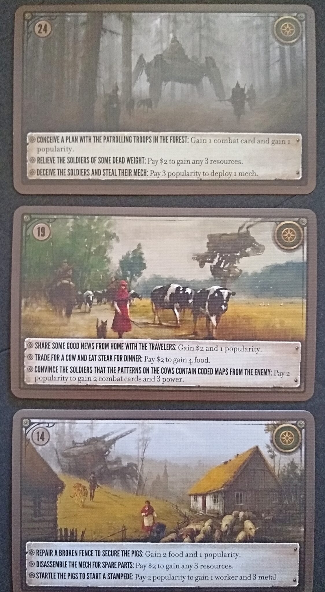
- Scythe | Board Game | BoardGameGeek
- Gùgōng | Board Game | BoardGameGeek
Animal subjects
Watercolor aesthetic dominates
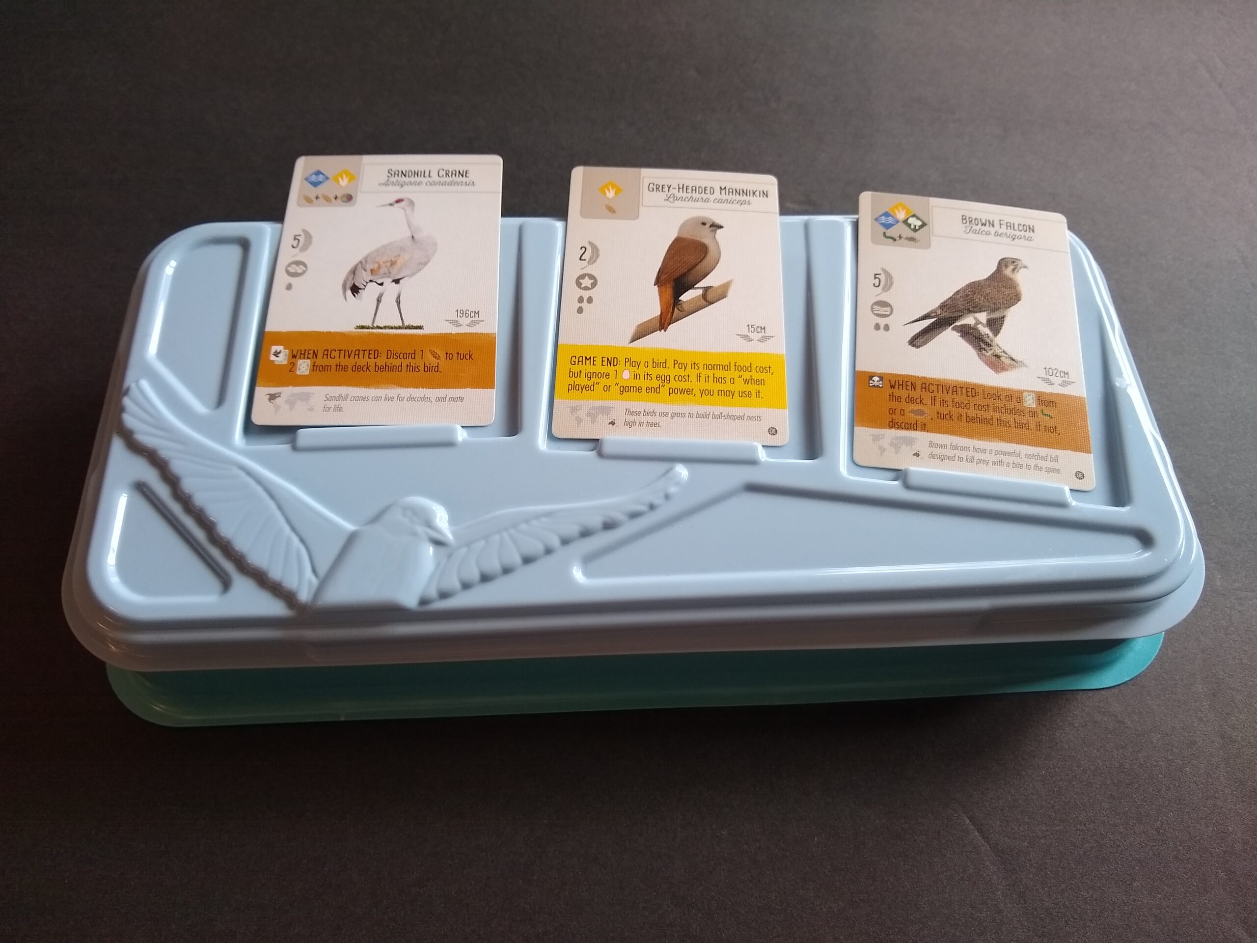
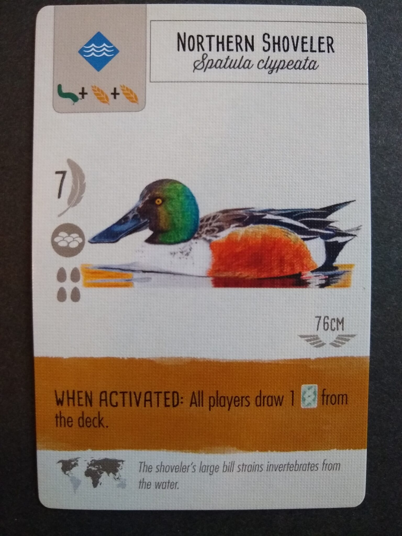
Quite a few games included numerous portrayals of animals. Several used a watercolor-like style (Canvas, Wingspan, Meadow). Bosley’s Everdell more closely resembles a digital analog of acrylic or oil painting.
- Canvas | Image | BoardGameGeek
- Wingspan | Board Game | BoardGameGeek
- Meadow | Image | BoardGameGeek
- Everdell | Board Game | BoardGameGeek
Landscapes
Acrylic aesthetic dominates
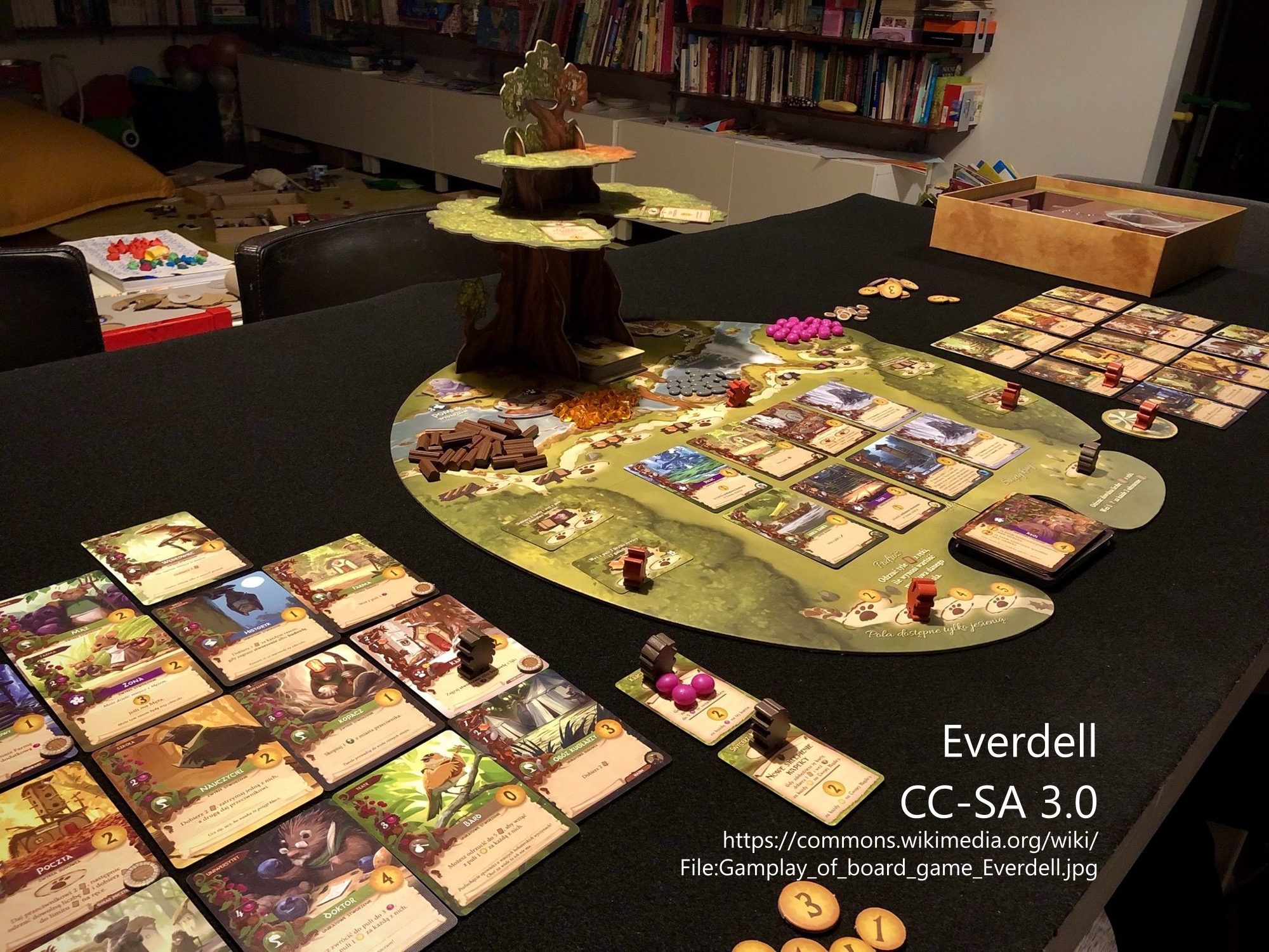
Everdell sets animals in landscape scenes. As noted above, these are rendered with something resembling a digital equivalent of acrylic. Brush-strokes are clearly evident. No cards by themselves feel epic, but they each feel complete.
Unsettled has a ton of landscapes set on other planets. Their overall feel resembles concept art in terms of epic scope, but they have more of a hand-painted aesthetic (resembling a digital analog to acrylic) than the photo-compositing process that seems common among concept artists. The landscapes are not hyper-detailed.
7th Continent’s style of landscape is fairly close to Unsettled’s, except that the tiles together comprise an epic landscape (vs each card having its own, as in Unsettled).
Gugong’s board is a landscape showing a complex of buildings, rendered much like Unsettled and 7th Continent.
Scythe includes very many landscape scenes. They closely resemble composited photos with overpaint. The way the paint bleeds out of the strokes and into the (non-existent) texture of the canvas reminds me a lot of oil paintings.
Cartoony
Oath includes some landscapes, which are rendered in a cartoony style (visible lines, with fill, and few shades of value).
Red Cathedral’s board is a series of four landscapes, each rendered in a flat style not very different from that of Oath. Each of the four scenes includes a large cathedral in the background, a representation of a season in the flora, and a human subject. As with the other cartoony styles, there’s little attention given to grounding shadows or value shading related to lighting.
Ginkgopolis depicts many buildings with glossy cartoons that could have come straight out of a 3D-rendering engine (precise geometric shapes, textured surfaces, and ray-trace lighting).
Isolated plants, monsters, objects
Crisp detail dominates
Floriferous’s cards are all flowers that look crisp enough to have been drawn with pencil and then colored with a marker or perhaps watercolor.
Gugong includes many cards that each depict a single item in hyper-realistic (almost photo-realistic detail). These could be photos run through a filter.
Tiles in Unsettled depict plant/animal things, such as other-worldly sea urchins. These have the same rendering as the landscapes in this game, in terms of looking like hand-paintings, but these are done very precisely. Some, such as the Translucent Wurm, are so detailed that they almost look like a photograph was used as a mask and then overpainted.
The board and tokens of Abomination depict books and other objects. The board illustrations are un-detailed but textured — I could imagine drawing these with a dry brush or markers. The tokens with items are as crisply drawn as any card in Floriferous.
Abomination includes body-part tiles that players assemble to create Frankenstein monsters. These depict muscles and other internal gore as if from a medical textbook.
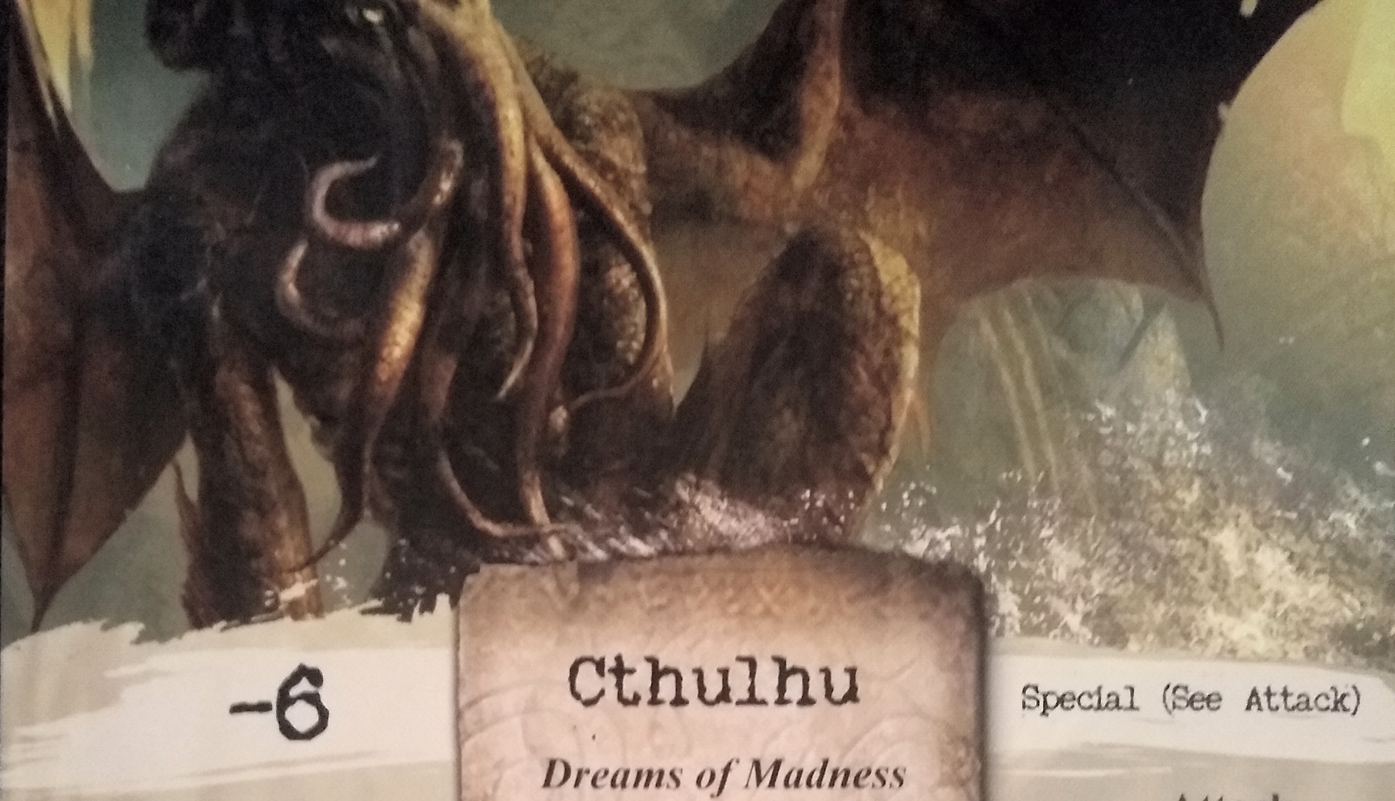
These findings remind me of all the gory details in Arkam Horror, which perhaps should have made the list. Look at those squid-like arms and the nasty spike-spines in the wings below!
Humans
Humans typically appear within landscapes or other settings already discussed above. As such, they’re rendered with a compatible style. Regardless of rendering style, I see 3 generalizations worth noting.
Human poses matter; faces sometimes matter
Games often face humans in art away from the camera — as if to personify the player. A very high proportion of Scythe’s characters face away from the camera, and I don’t think this has to do with personification so much as saving the artist time and drawing the player’s gaze toward what the characters are looking at.
There are counter-examples, though. The faces in Oath, for example, add humor. When faces do appear in Scythe, they help to communicate the sense of smallness and even helplessness that the people experience in a world of mechs.
Anatomy doesn’t matter, other than overall posture
Games typically do not render humans with enough detail to see musculature or other fine details of anatomy. For example, the humans in Canvas are often small (1″ or less). To my surprise, this is true to a large extent even in the cartoony Super Brawl, where heavily stylized clothing covers the bodies. In Gugong, the clothing and posture communicate culture.
I had at first thought that the scenes rarely depicted people simply posing. But then I saw more examples of posing, particularly in Canvas, Unfathomable, and Super Fantasy Brawl. Maybe slightly more than half of the games have people actually doing something, such as carving in Red Cathedral, walking or farming as in Scythe, showing as in the Ginkgopolis cover, or burning books as in Oath. (Red Cathedral is maybe 50/50 active/passive poses.)
Integrative details matter a lot
Heavily stylized clothing also plays a role in Scythe illustrations. You can really get the sense that some of these characters are the WW 1920s+ equivalent of Prussians or Germans. Similarly, the humans in Abominable are all dressed up, each in the clothes of their period and nationality. The clothing of characters on the Red Cathedral board is also heavily stylized.
Other details help to integrate the humans into the scene. These are like props. In Oath, for example, the Herald has a piece of paper. In Super Fantasy Brawl, Dugrun (Warden of the North) has some heavy-looking armor and weapon. In Canvas, animals sometimes serve as integrative possessions of the human characters.
Artists
Finally, here’s a copy-paste list for reference of the first artist listed in each of these games.
- Luan Huynh | Board Game Artist | BoardGameGeek – Canvas is the only game
- Ana Maria Martinez Jaramillo | Board Game Artist | BoardGameGeek – Wingspan (and expansion) is the only game
- Clémentine Campardou | Board Game Artist | BoardGameGeek – Floriferous and Delicious (same publisher) are the only games
- Karolina Kijak | Board Game Artist | BoardGameGeek – Meadow is the only game
- Mikhail Palamarchuk | Board Game Artist | BoardGameGeek – Abomination is the only game
- Bartek Fedyczak | Board Game Artist | BoardGameGeek – 35 games listed
- Chema Román | Board Game Artist | BoardGameGeek – Red Cathedral and 2 other games are listed
- Kyle Ferrin | Board Game Artist | BoardGameGeek – 27 games listed
- Henning Ludvigsen | Board Game Artist | BoardGameGeek – 229 games listed
- Carole Carrion | Board Game Artist | BoardGameGeek – Modern Art and Origin are the only games listed
- Gaël Lannurien | Board Game Artist | BoardGameGeek – 28 games listed
- Ludovic Roudy | Board Game Artist | BoardGameGeek – 30 games listed
- Andrew Bosley | Board Game Artist | BoardGameGeek – 72 games listed
- Stéphane Gantiez | Board Game Artist | BoardGameGeek – 81 games listed
- Jakub Rozalski | Board Game Artist | BoardGameGeek – 2 games listed
- Andreas Resch | Board Game Artist | BoardGameGeek – 81 games listed
Notes to self
- Render animals in watercolor
- Render landscapes with an acrylic aesthetic
- Perhaps guided by photo-compositing
- The result should retain clear brush strokes
- Do not rely on photo-texturing
- Cartoony can be ok, but it isn’t most common
- Render isolated things in crisp detail
- Especially when they appear as small images on small tokens
- Render humans based on the context
- As probably situated in a landscape, probably with a brushstroke aesthetic
- Don’t obsess about anatomy
- Focus more on clothing and similar details that help integrate the character into the scene
- “Modern Art” is in a category of its own.