
In honor of the Tapestry: Fantasies & Futures release, which Andrew Bosley illustrated, I’ll review a small sample of his work that illustrates how he represents specific aspects of the subjects. I’ve previously discussed how the digital game art by Andrew and by others both compares and contrasts with paintings done with physical media.
Other Tapestry: Fantasies & Futures content
- Read the design notes in a separate blog article.
- Sign up to get strategy tips on the new civs and city mats via the monthly newsletter.
Speedy athletes
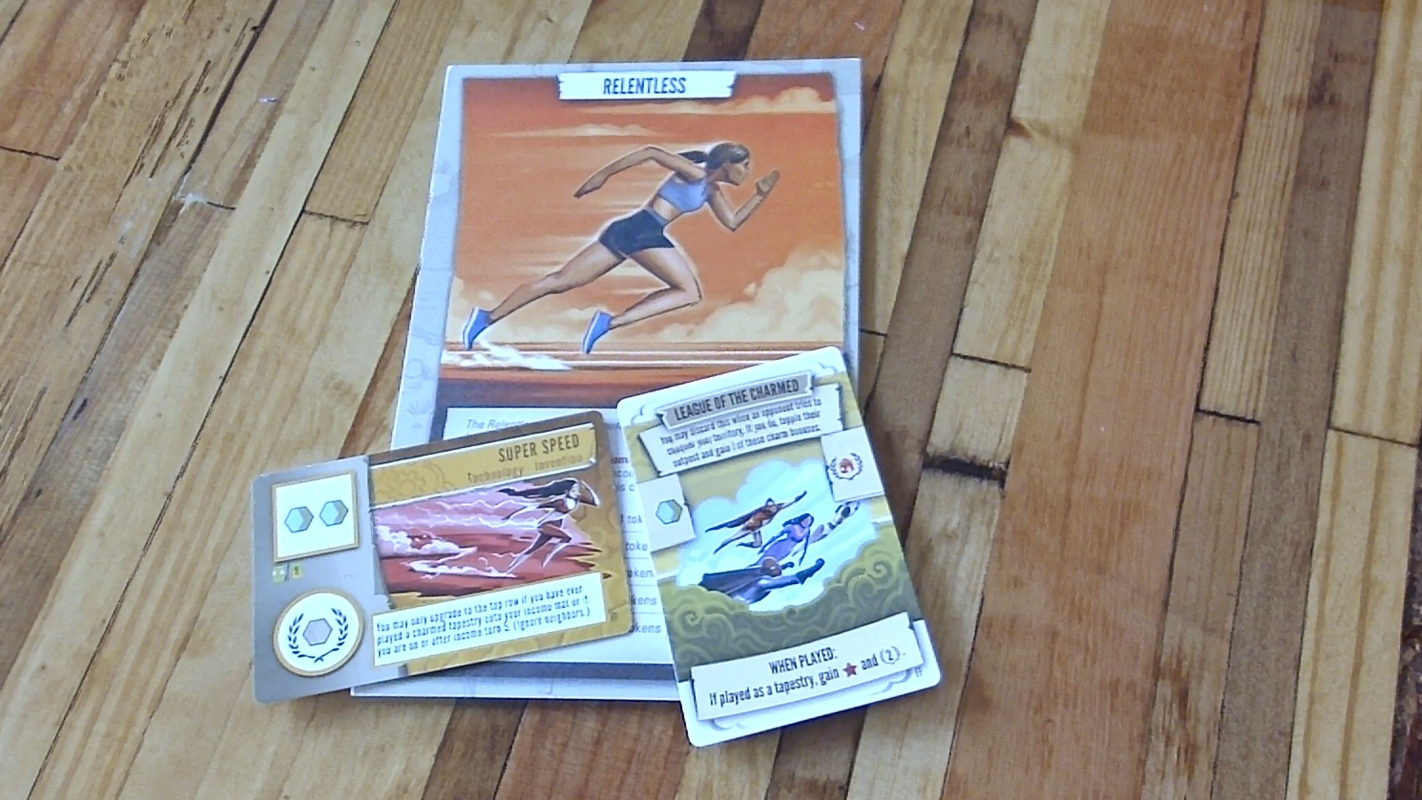
The illustration below shows two new Tapestry cards from the Fantasies & Futures expansion, as well as the Relentless civilization mat from Arts & Architecture. I’ve noticed that Andrew usually illustrates athletes with sleek bodies — he doesn’t usually go for the resistance-trained bod. The closest counter-example is the Genie illustration (further below), but he’s a genie, not an athlete. The most pronounced muscles on the illustrations here are the calf muscles and the hamstrings on Relentless (the latter of which are only prominent at the tibial insertion near the knee). Pointy shapes are oriented forward, warm colors saturate 2 of the 3 cards, and mist/smoke tailing behind the athletes emphasize their speed.
Elegant ladies
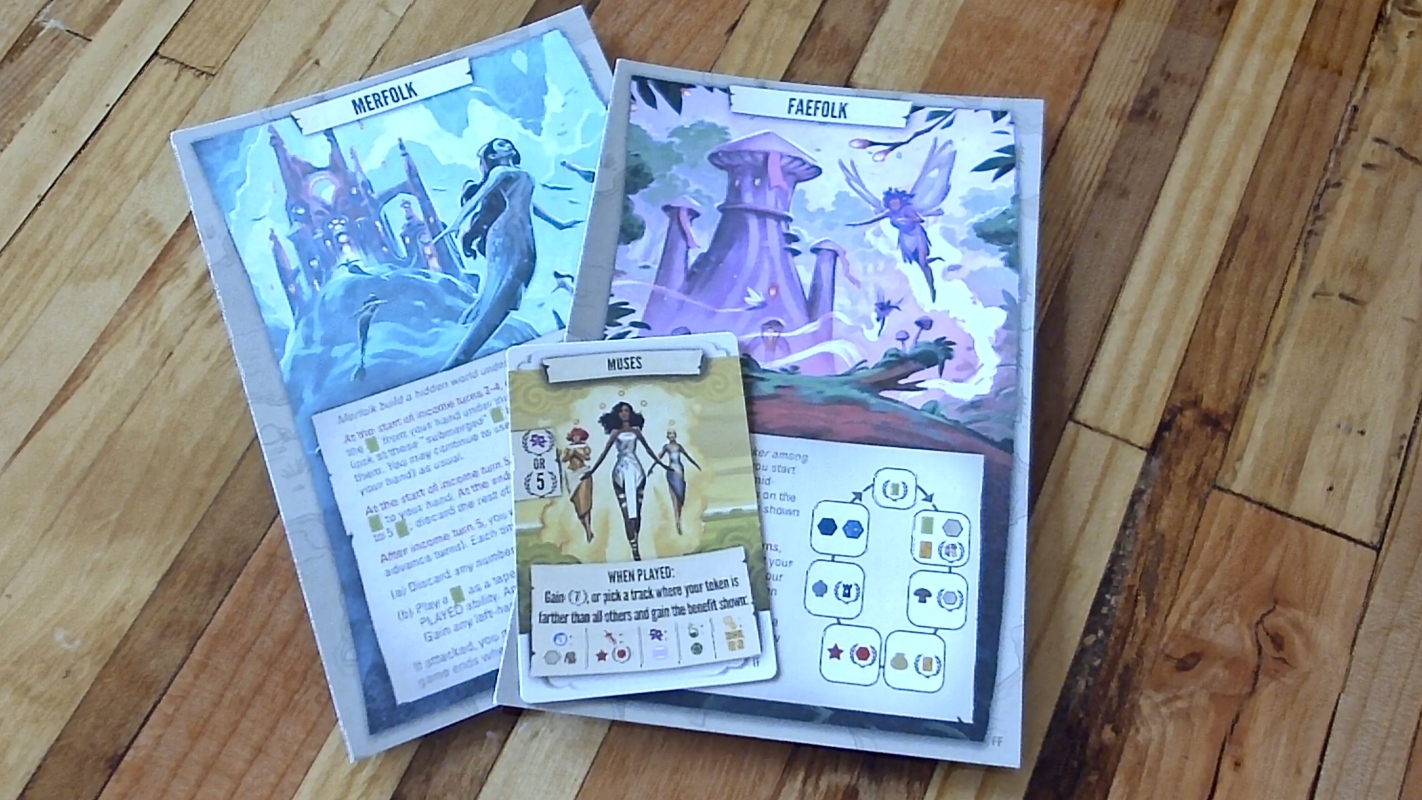
Andrew usually makes ladies look elegant. The guys often look dapper (as in the Doppelganger example below) but rarely elegant. The ladies sometimes have a long, sleek look that I rarely see among his guys. The look works especially well with the two civilization mats below, as these involve flying beings.
Likewise, the athletic look above works well for the flying characters in League of the Charmed. On that Tapestry card, the male characters have a horizontal-vertical ratio of roughly 2:1, whereas the female characters are 5:1 or higher. Again, relative elegance.
Uncomfortable shapes
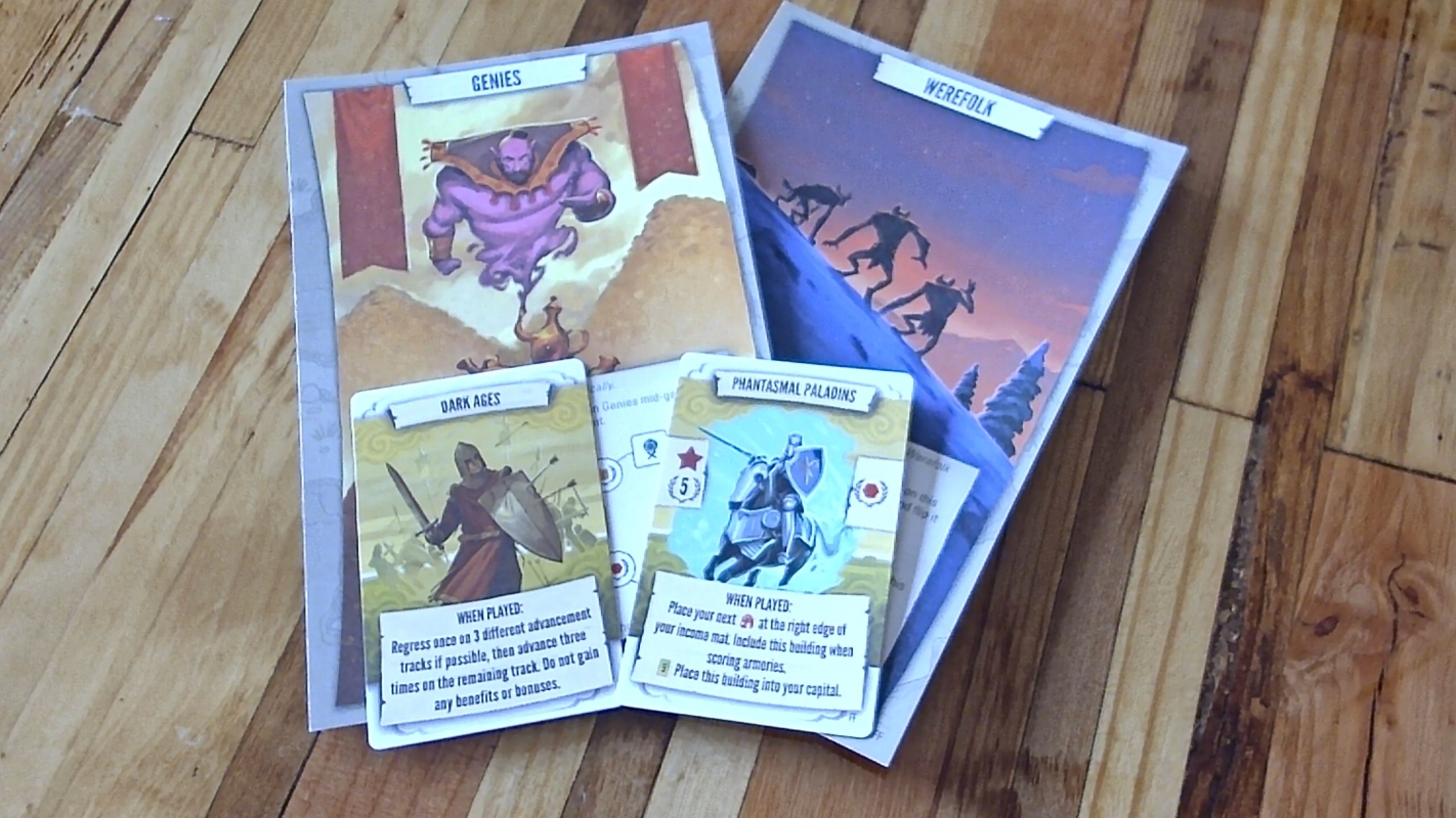
Illustrations of male characters more typically involve uncomfortable shapes, especially the square and triangular shapes that connote danger or solidity. Examples include the bearded genie and the swordsmen of two Tapestry cards. The Werefolk might or might not be male; on this mat, I’m more affected by the angular tilt of the landscape, which creates a definite feeling of discomfort (appropriate for the mat, which has highly random mechanics).
Minimalist eyes
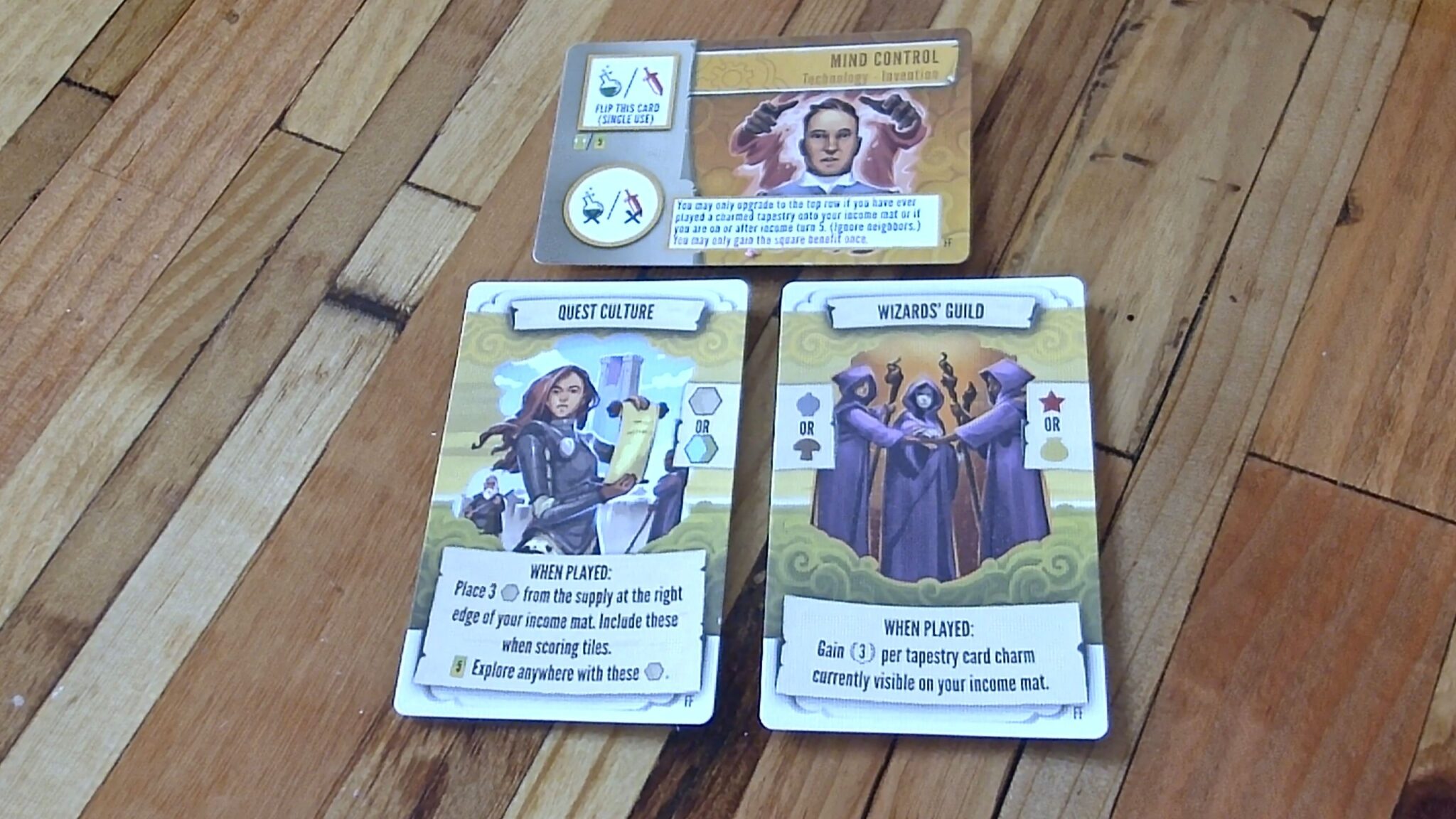
Andrew’s work has really taught me the importance of avoiding too much detail, especially when it comes to the face. I’ve noticed, in particular, that he rarely illustrates the eyeballs in Tapestry. I had to search quite a while to find a card, Mind Control, that included a very detailed view of the eyeballs (important in this case for conveying the meaning of the card). The first time that I noticed this was on the Leaders civilization mat, and then I looked through the others and noticed that Andrew only includes eyeballs when doing so is necessary for communicating about the characters — which is rare in Tapestry. This contrasts with his animal art (which I’ll discuss below), in which the eyes are an important part of creating feelings about the characters.
A touch of whimsy
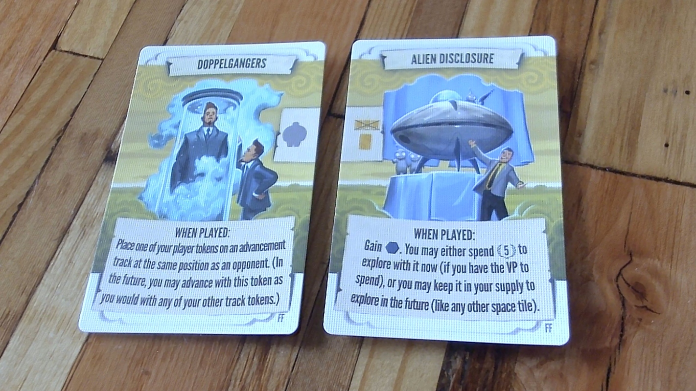
I especially enjoy when Andrew includes a little tongue-in-cheek in his art. The Alien Disclosure card emerged from a discussion that Andrew and I had about the government revealing their alien buddies like a salesman (as if all was well and good, despite the alien peeking out at the top with his raygun). The hair in the Doppelgangers adds whimsy while also clarifying the meaning of the card.
Upper rim lighting
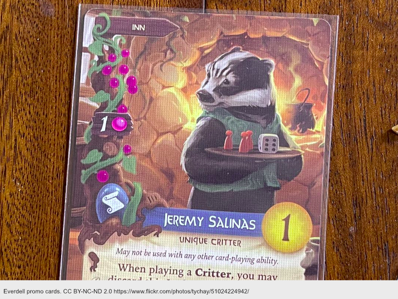
One distinctive aspect of Andrew’s art is the use of upper rim lighting. It’s clearly visible in essentially every card and mat above. It’s also present in older cards, such as those shown below — and it comes in very handy when he needs to visually distinguish a foreground character from a similar-value background (as in Stolen Plans).
Everdell
Tapestry is by no means the only game that Andrew has illustrated. BoardGameGeek lists 75 projects that include Mission: Red Planet, Blood Bowl, Love Letter, Caylus 1303, and Trailblazer.
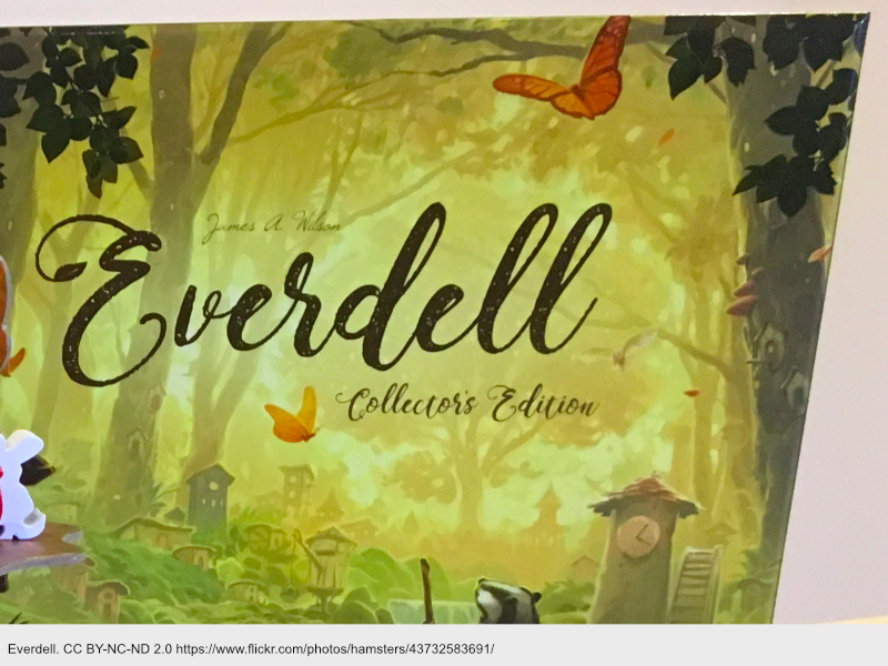
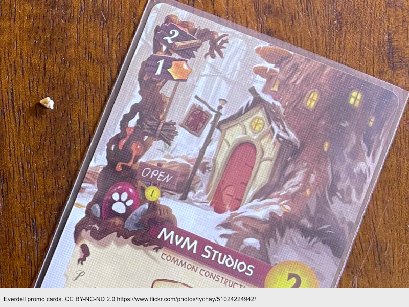
His highest-rated game is Everdell, a game about loveable creatures building societies in the woods. This game is a huge success, selling over a quarter of a million copies since 2018, and in no small part due to Andrew’s portrayals of the cute creatures in this game.

Although Andrew retains the heavy use of upper-rim lighting, the harsh angular shapes and minimalist eyes are gone, replaced with rounded, expressive shapes — both for the creatures themselves, and for the shapes in the background. The box itself conveys grace and comfort, using butterflies and elegant tree limbs.
Finally, I appreciate the cozy warmth of the architecture in this game. The snow shows how cold it is. The curvy shapes of the buildings emphasize how nice and comfortable they are.
Merchants of the Dark Road (MODR)
Although MODR has a much lower BGG rank than Everdell and Tapestry, I think that might be more of a reflection on the publisher’s marketing than on the mechanics (as its rating is 7.5, similar to Tapestry) or on Andrew’s art (which is among his best).
The buildings on the MODR board (below), also have snow and a comforting shape and feel. I also notice in this game that the snow has a nice texture.
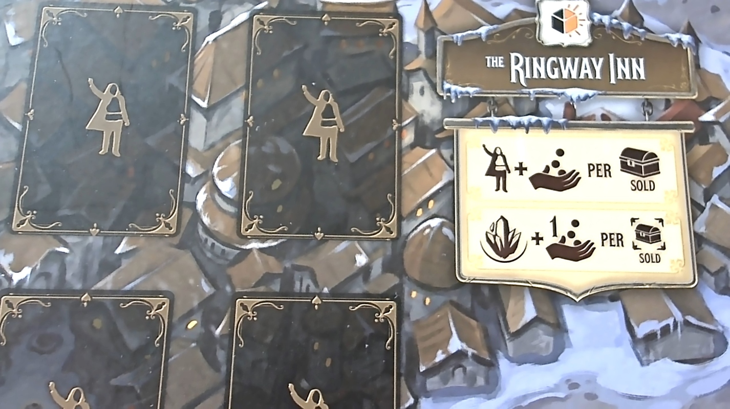
In contrast to the warm sunlight of Everdell, Andrew’s illustrations for MODR emphasize the darkness of the road (hence the name). He uses the little lights of buildings (above) to give signs of life, and various other cards contrast the darkness against lanterns, fires and other warm sources of light.
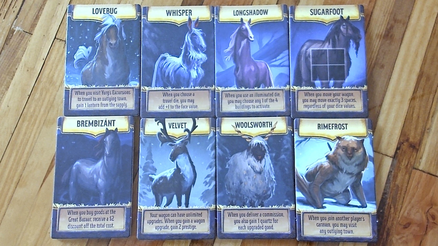
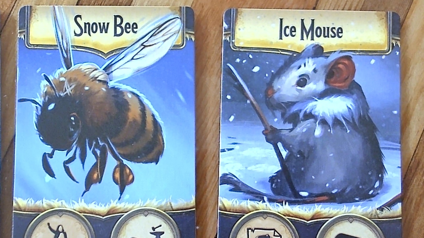
Andrew’s skill with animals also shines in MODR, both with equines and cuter animals (below). Again, we have expressive eyes (especially on the Snow Bee and Ice Mouse, where there’s plenty of space) and upper rim lighting.
If I ever need to draw a horse from a frontal view, I will need to look at Andrew’s for ideas!
Notes to self
- Check Andrew’s other games — in which situations does he include lots of eye detail? Just cute animals?
- Did he draw more muscular athletes/warriors in his earlier work? Or is the emphasis on sleekness more recent?
- How does his portrayal of furry creatures (e.g., mammals and bees) differ from other animals?