What’s most striking to me about Stonemaier’s Wingspan is how it tapped into a non-gamer-oriented audience (bird-lovers) by respectfully treating the theme in a manner that connected to that audience’s experience outside gaming. Put another way, the game represented the theme in a way that would be familiar to the audience’s aesthetic sense.
Classic ornithological images
Before diving into the cards themselves, let me give a whirlwind tour into the world of classic ornithological art, which grew in the modern sense out of the Rennaissance. Perhaps the primary driver was European nations’ thirst to colonize the world. Numerous explorers came back with specimens of native flora and fauna. By the late 1500’s, these had captured the fancy of European leaders enough to fund the work of naturalists–for example, ornithological illustrators such as Ulisse Aldrovandi, who helped create one of Europe’s first botanical gardens. Illustrations of exotic birds accumulated throughout the 1600’s and accumulated into massive compendia.
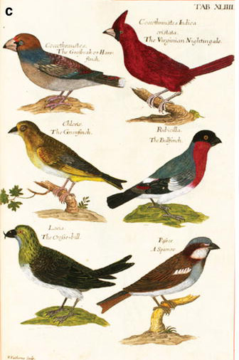
One keystone event was the publication of Ornithologia beginning in 1676, which stood out due to its scientific presentation of birds. For example, in addition to black-and-white line-art illustrations of birds, it organized birds into a taxonomy, it laid out statistics on anatomical features (such as wingspan), and it focused on facts rather than unsubstantiated folklore (which previous compendia had typically included). Subsequent printings included hand-colored plate-generated illustrations, such as the one to the right; these apparently did not appear on the page alongside the birds’ statistics, probably because such plates were expensive to produce and therefore would be focused on content that required color.
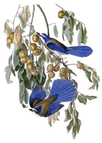
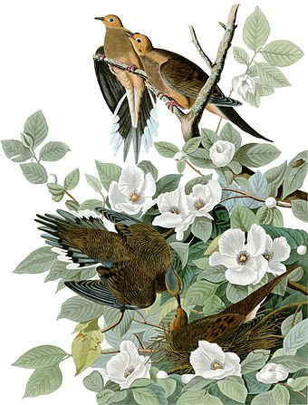
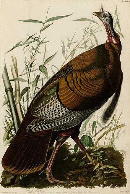
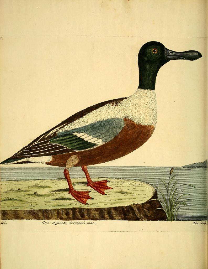
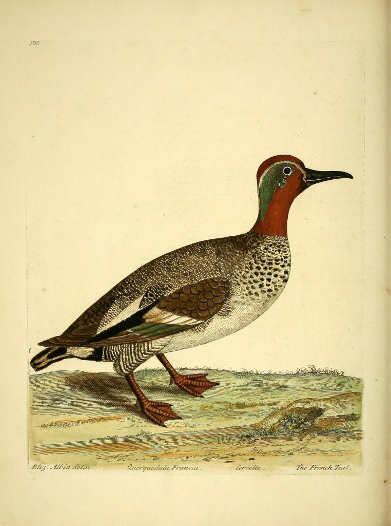
By the 1700’s and 1800’s, ornithological art had developed into an entire genre, with compendia coming out every few years. Two main presentation styles are apparent among these images. Artists such as Audubon, as shown in the images to the left below, preferred to depict birds in a naturalistic setting (e.g., among bushes or water bodies). Others, as shown to the right below, depicted the birds with more minimal grounding, occasionally even omitting shadow beneath the birds’ bodies. In all cases, the page provided the common and/or formal name of the bird in a stylized font.
Modern bird-related products
If you take a look at what’s available on Amazon right now, you will find that virtually all contemporary published products aimed at bird-lovers follow one of those two styles for presenting birds.
- Step 1: Show a photograph/illustration of the bird in its setting, often with minimal grounding.
- Step 2: Provide the bird’s name in a stylized font and, perhaps, a few key statistics.
- Step 3: Profit.
There are an infinite number of ways that birds could be presented (e.g., in fanciful settings, in extravagant popouts/borders, or with hyperbolic eye-catching curves), but that’s not how it’s done when you’re publishing a product aimed at bird lovers (at least, if you want to make a lot of money).
Aesthetics of Wingspan
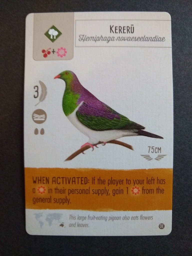
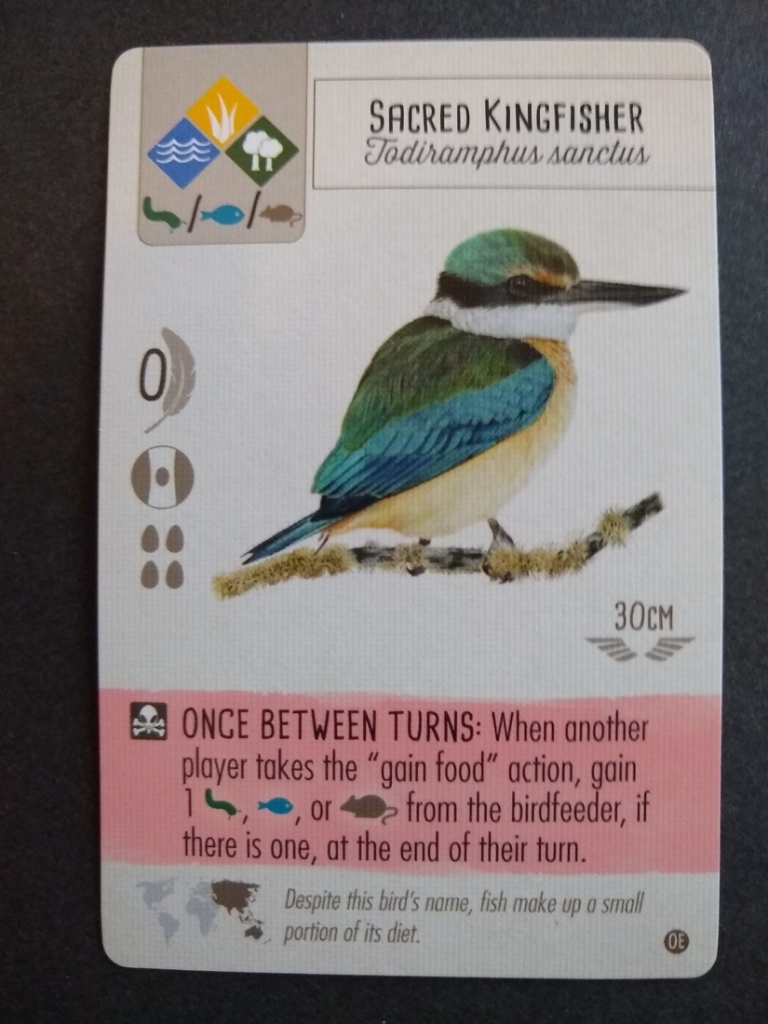
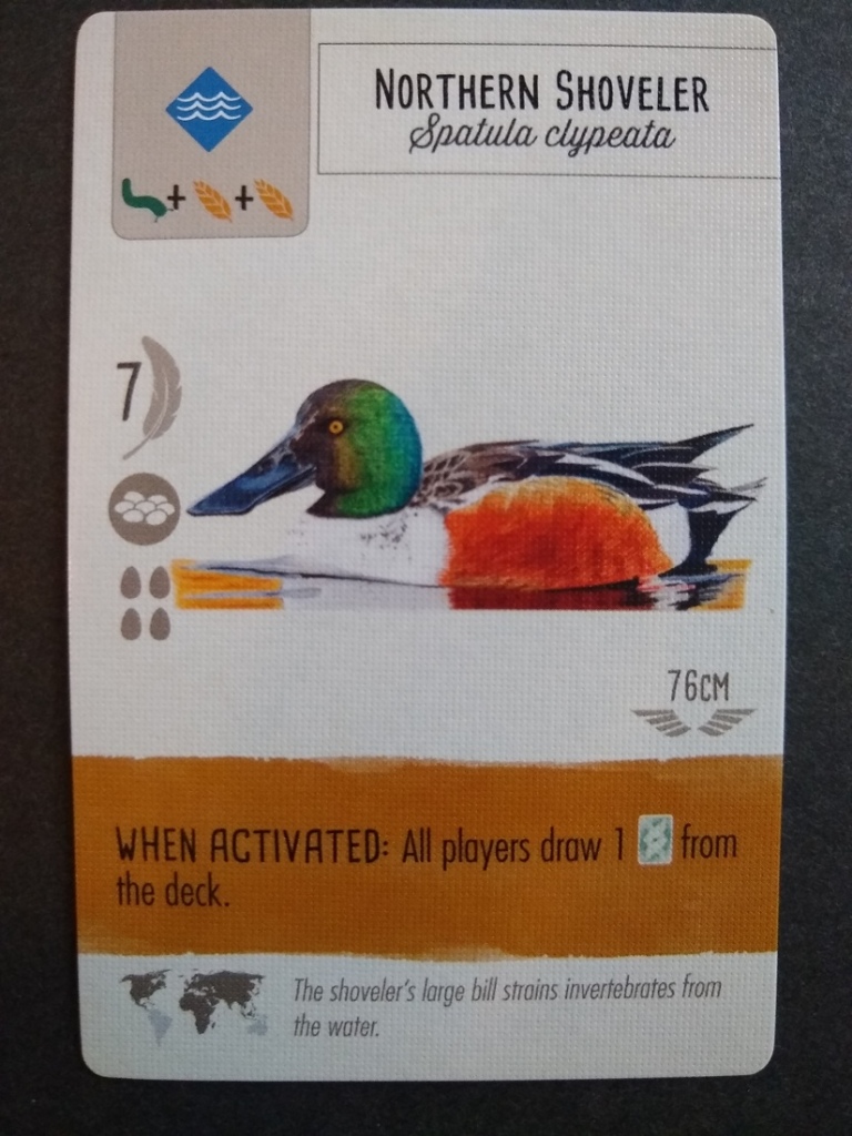
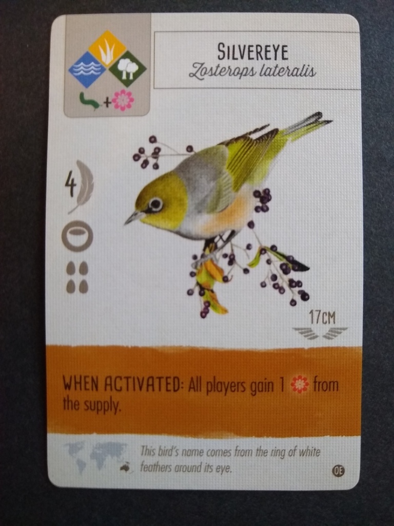
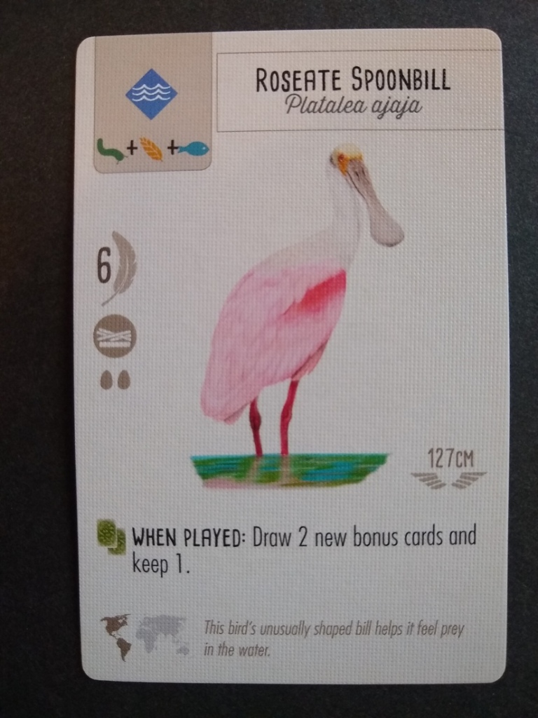
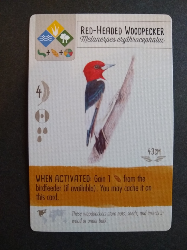
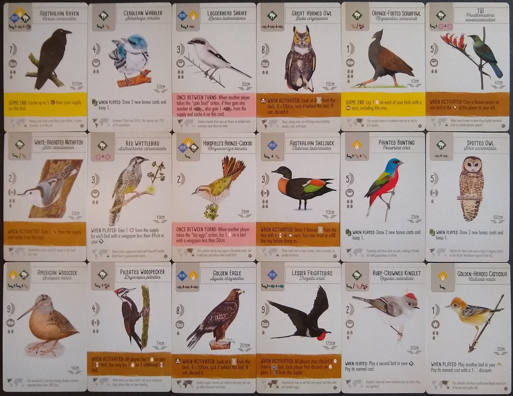
Wingspan carries this aesthetic sensibility into the world of tabletop gaming. The cards follow the second style of minimal grounding, an appropriate choice considering that the birds are the star of the show. The game follows the practice of giving each bird’s common and formal (typically Latin) name. These names are rendered in hand-written fonts (Cardenio Modern and Thirsty Rough, respectively), further amplifying the similarity to classic ornithological compendia, which virtually always gave these names in script lettering. (I have asked Jamey Stegmaier how the graphic designer settled on these specific fonts, but he said he didn’t know.) The off-white background of the card, with no popout or border around the birds, exactly matches the presentation style in most ornithological compendia. The flavor text and distribution map at the bottom of each card present scientific information and help to connect the cards to the theme.
The result: This game looks and feels like innumerable products familiar to bird lovers.


A word about usability
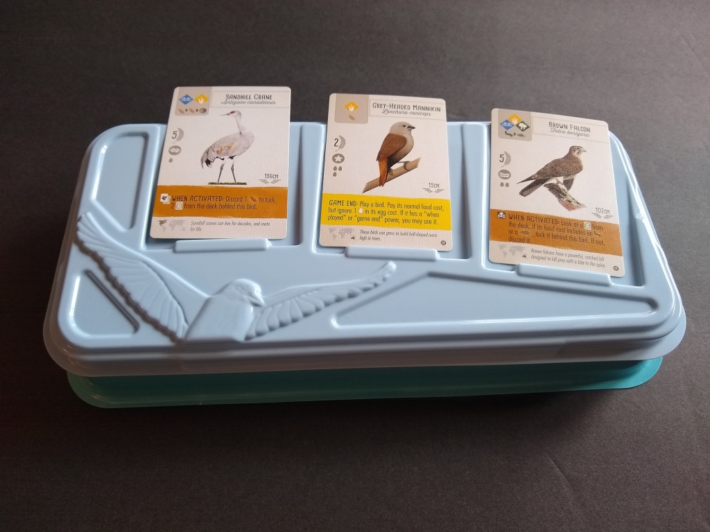
Before wrapping up this post, I want to spend a moment on usability. Although these cards look awesome when laid out in each player’s tableau, thereby heightening table presence already created by the dice tower, they do create a serious usability challenge. Players draft these cards from an open pool of 3 cards, which means that they need to see the cards’ text well enough to decide which card to select. When players need to read from across the table, Stonemaier normally uses symbols approximately 1/2″ in height (roughly 36 pt). Rendering the birds’ effect text at this scale would be impossible: the text would leave negligible room on the card for art, thus destroying table presence.
Stonemaier solved this problem by introducing a handy tray enabling players to pass the open pool around the table. The tray doubles as a lid for the card-storage container, which in return gives the tray enough stiffness so that it does not flop around and spill the cards when players pass it. Very clever.
Excessive complexity is the bane of gateway gaming
Finally, the game avoids bizarre, complex game mechanics that would flummox new gamers. In particular, I don’t notice any truly novel mechanics in Wingspan, although the combination of mechanics is fun and fresh. Of course, you don’t need to have a new mechanic in every game–especially one aimed at non-gamers because (almost) every mechanic will be novel to such players! If publishers want to reach a massive audience, then they really need to be judicious in how complex they let the mechanics become. Stonemaier certainly hit a sweet spot with mechanics in Wingspan.
Notes to self
Wingspan is a tour de force in achieving visual familiarity to a broad target market, amplifying table presence, and maintaining adequate usability. Game publishers have taken note of Wingspan’s exceptional success, with over 1.4 million copies sold in barely over 3 years. They would do well to also take note of how Wingspan succeeded, including the attention given to the audience’s existing aesthetic sense.





Thanks for your blog, nice to read. Do not stop.
Thanks, Mark! I appreciate the encouragement. Feel free to email me any time with suggestions of topics that you’d like me to cover.