I’ve previously discussed how Wingspan excelled in part because it aesthetically resembled the kind of product that bird-lovers have come to expect, such as birding books.
I’ve previously discussed how beautiful a desaturated palette can look. Natural environments have some saturation, but not as much as you’ll find in a Happy Meal plastic toy, for example.
These considerations led me to the following speculative syllogism:
- Garden-lovers probably would love games with aesthetic sensibilities similar to garden books.
- Gardens have sparing saturation, largely limited to fruits and flowers.
- Therefore, garden-lovers probably would love games with sparing saturation.
If you want the punchline, here it is: I needed to punch up the saturation of my game, Gnomadic Gardeners, which is about garden gnomes! The first attempt went poorly with reviewers. The second attempt went well. Shall I walk you down the road that I trod?
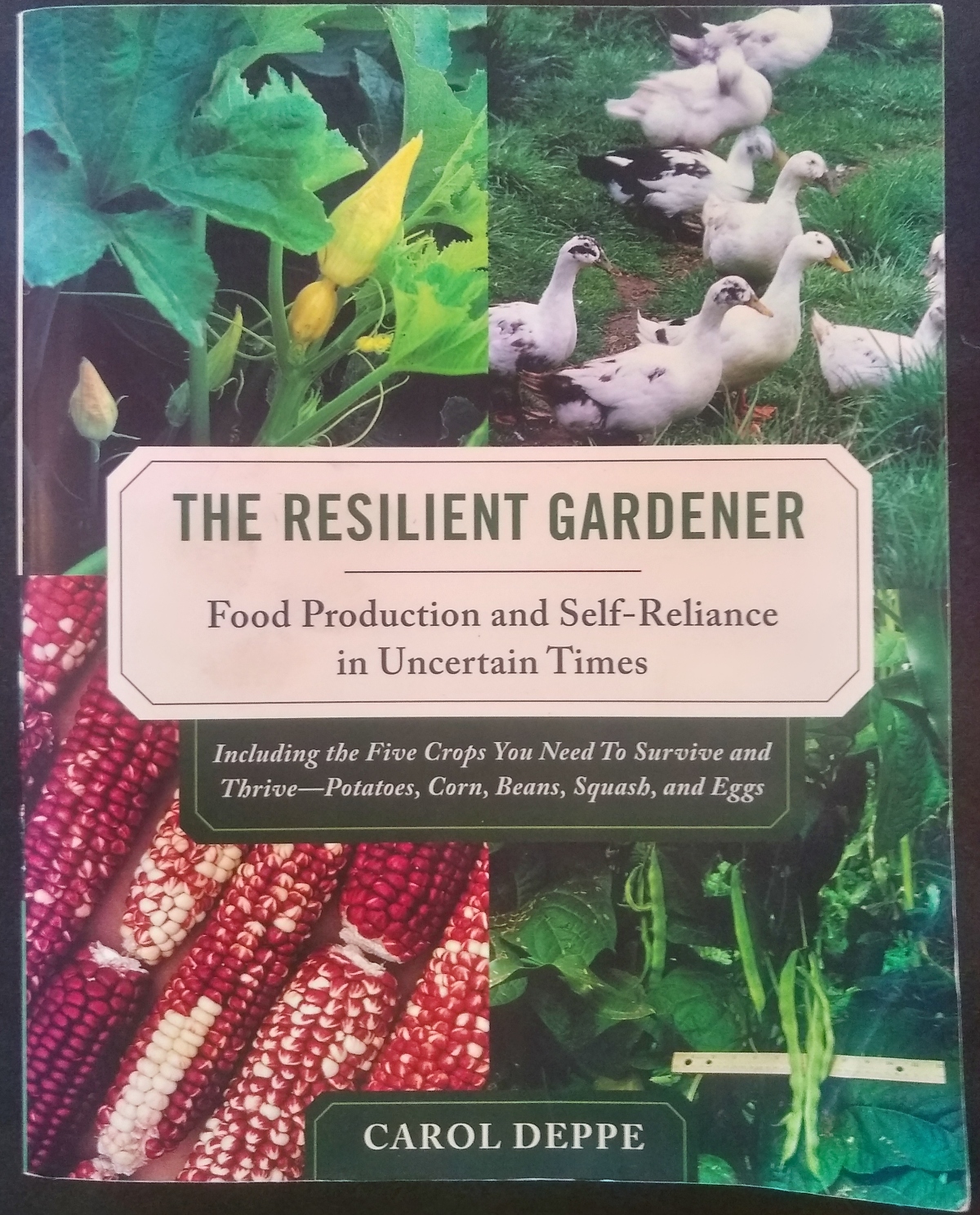
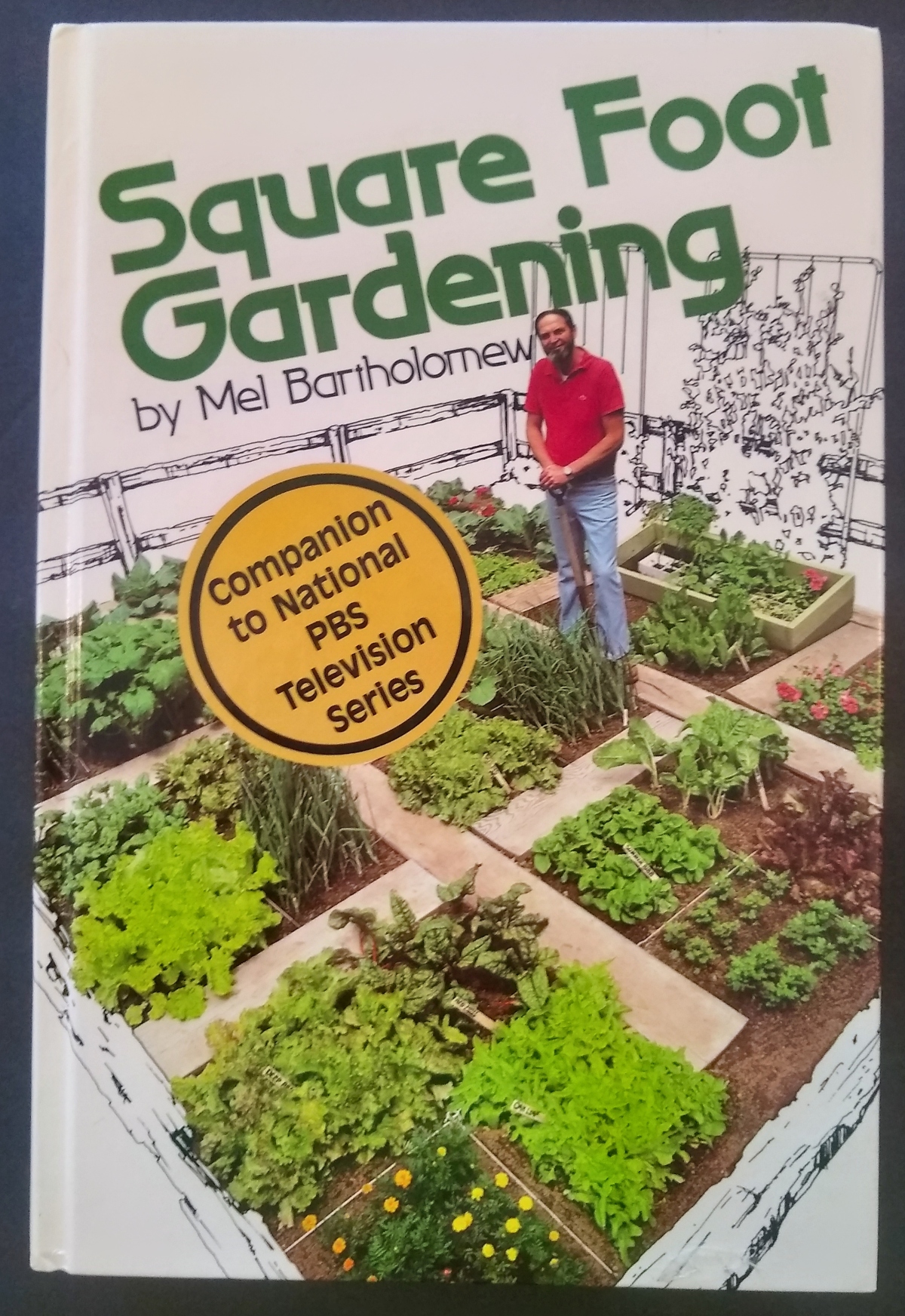
A sample of garden books
Knowing that I planned a game about garden gnomes, but lacking access to books about gnomes, I decided to sample some garden books. (What I probably should have done was sampled gnome art, of which I have plenty, but we’ll get back to that.) All of my favorite garden books sported largely desaturated palettes, with saturation largely reserved for the brightest of the leaves and for the fruits.
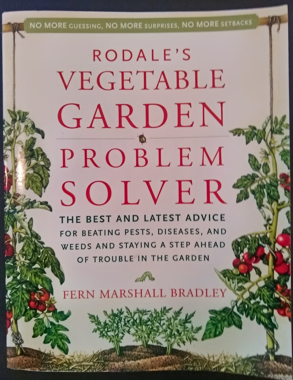
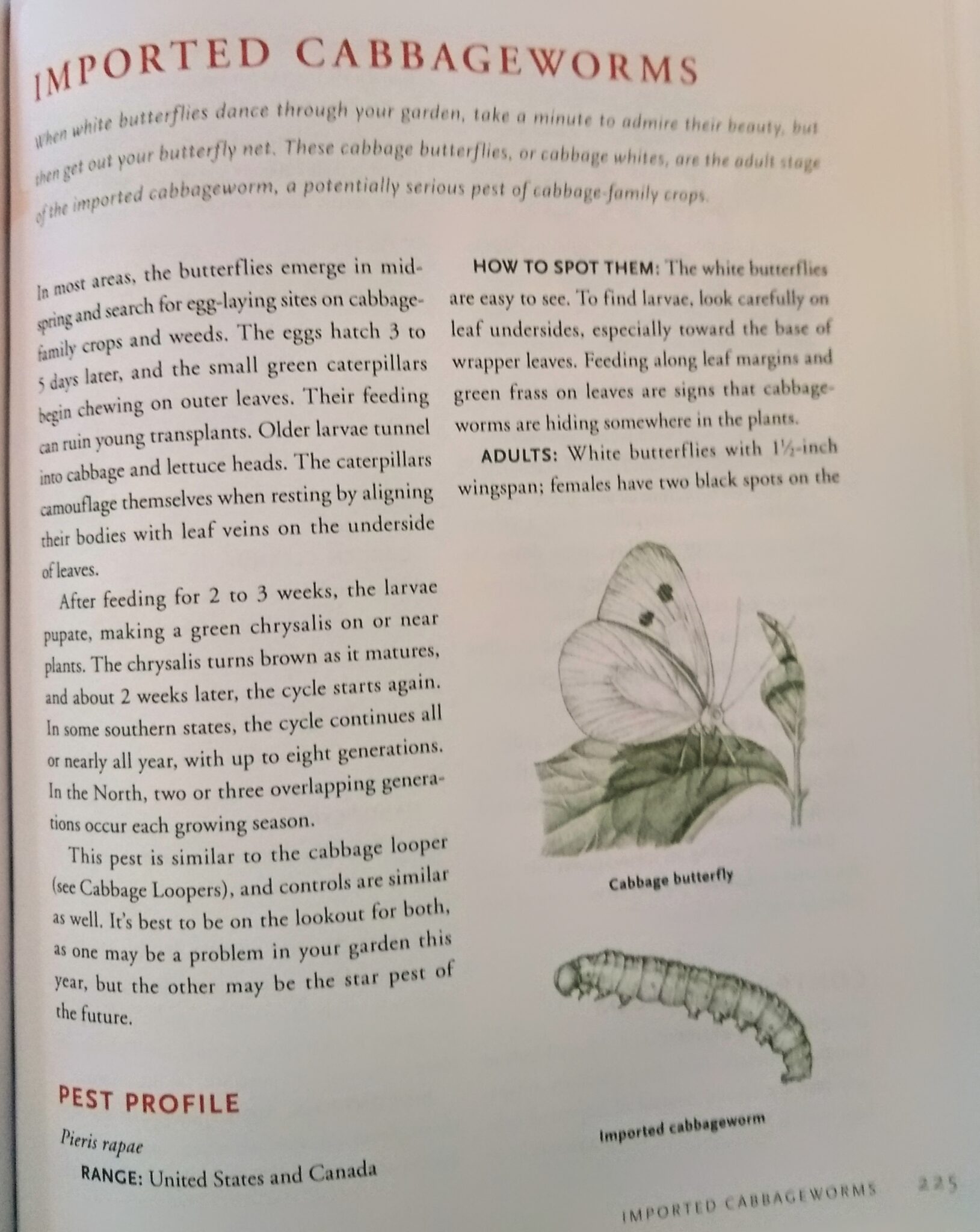
The last of these books brims with great line-art illustrations of various plants and pests. I adopted the gentle shade of red for my cards’ headlines and the sincere, earthy green of the text for my own body text.
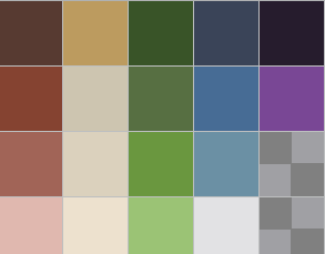
Sampling these and other books led me to the palette below. Honestly, I was even a bit reluctant to include some of the brighter colors, such as the purple on the right, though I knew that I would need it for certain icons.
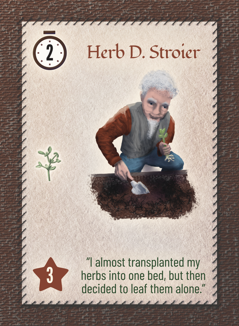
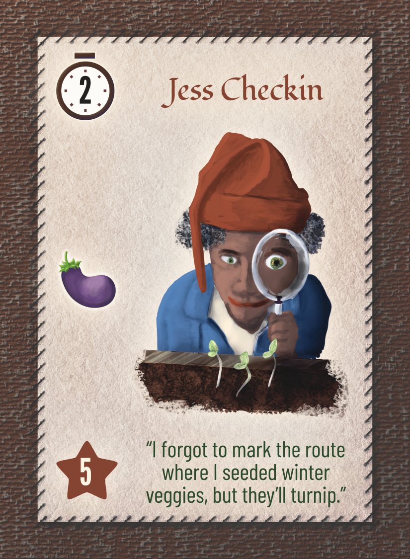
Drafting some gnomes
Putting these palettes into action, I roughed out some gnomes and prototyped up some cards that I used with playtesters for a couple of months.
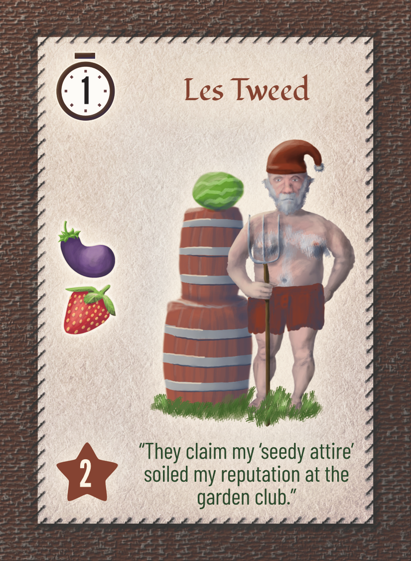
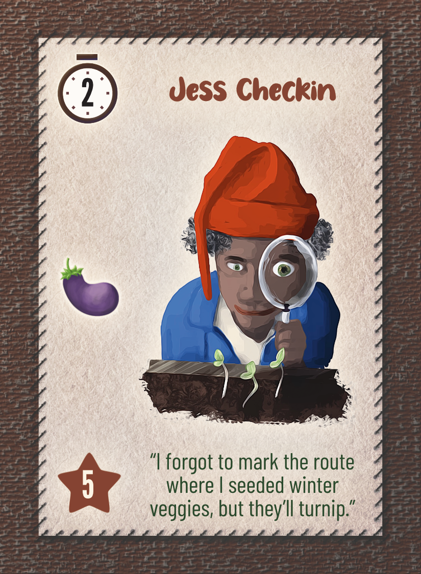
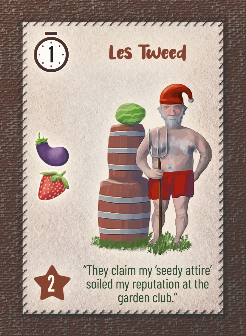
Aside from helping me to fine-tune the game’s machanics, they identified a few areas for improving the art’s clarity and focus, which I took care of, then ordered and shipped the game to previewers. Here’s a sample of what the previewers saw…
The previewers absolutely loved the mechanics, far beyond my wildest hopes. It felt awesome!
But to my surprise, they generally did not like the palettes. Here’s what one gentle previewer wrote: “The art is a little darker than I was expecting. When I heard the game was about gnomes I had a mental image of brighter colors and exaggerated caricatures so I was surprised by the more muted/earthy color palette. but as I played more it grew on me. ” The others were bothered at least as much by the puns, which they found unpalatable, as they were by the colors of the palette.
I also requested feedback from a Facebook group for artists of tabletop games, and one kind person explained, “The colors and images themselves are somewhat subdued instead of spirited. Personally I’d like to see brighter colors, fun patterns, a little more personality in the fonts, and more quirky details.” (I’ll discuss the fonts at another point, I guess — let me focus on the palette today!)
Where I went wrong
At this point, I realized that I had erroneously conflated gardens with gnomes. The aesthetic sensibilities surrounding books aimed at gardeners certainly need not match the aesthetic sensibilities surrounding other garden-oriented products, including those such as garden gnomes.
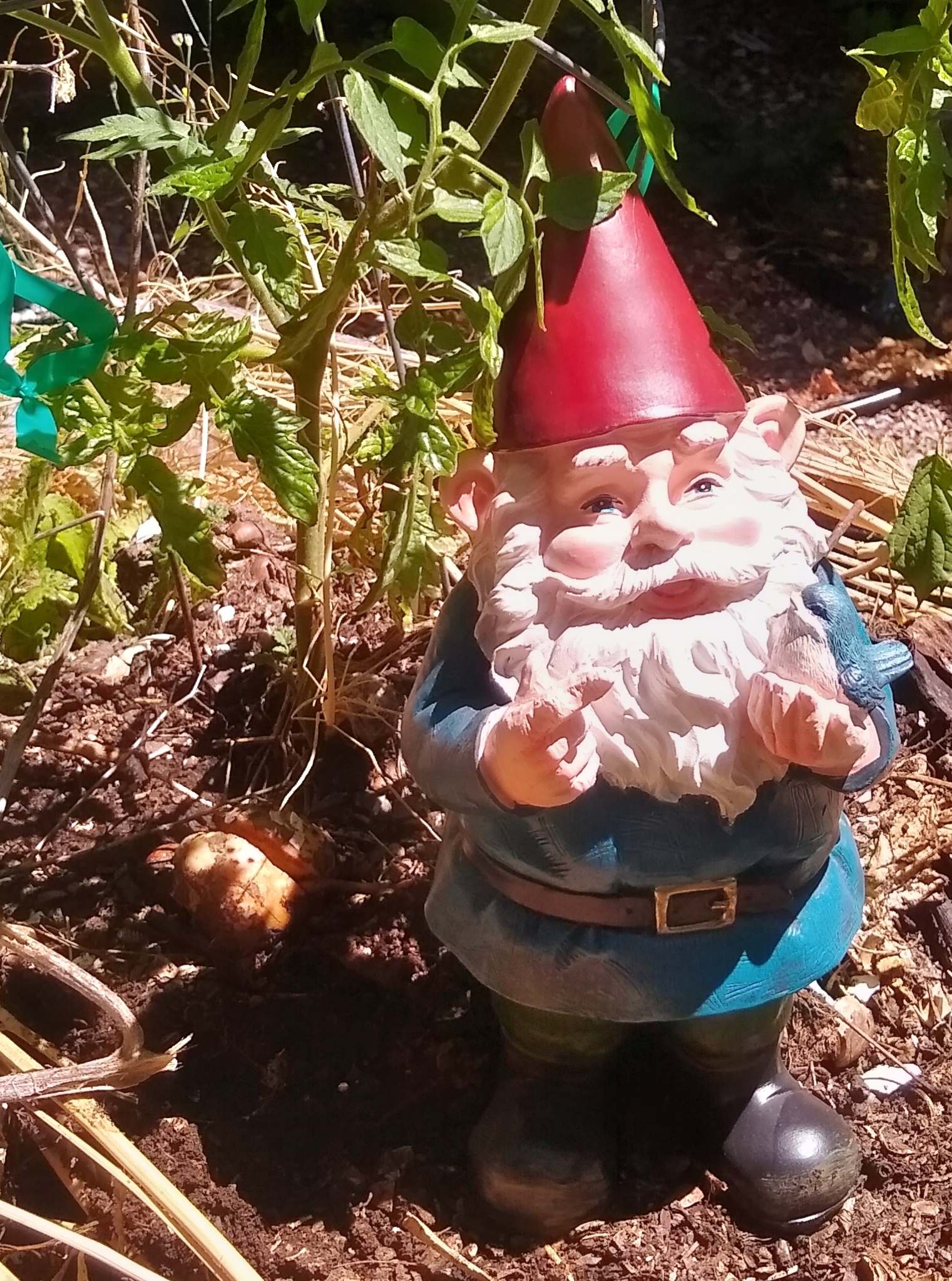
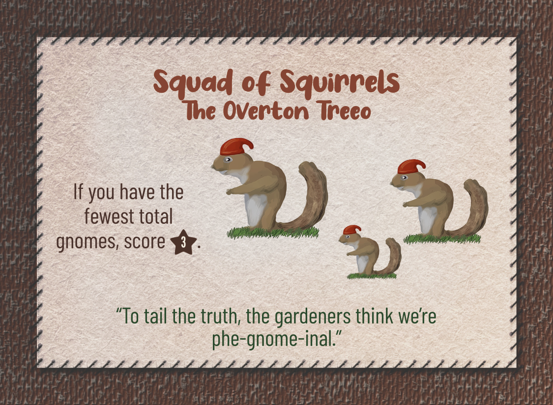
To the contrary, gnomes stand out in a garden. They draw attention with their mildly creepy faces, and they draw attention with their outrageous palettes. I mean, look at that guy’s bright red hat and unnaturally blue coat. Colors like these don’t grow on trees.
(Well, they do, actually. That’s how you know a fruit is ripe! It stands out against the green background, provoking birds to eat the fruit and spread the seeds all over. So I’m speaking metaphorically when I say that colors like these don’t grow on trees.)
And I realized that the point of gnomes wasn’t that they blend in, but that they stand out, so my game’s art should stand out all the more.
You’d think that I would have figured this out simply by remembering the retouching work that I did for Tomten last year. Nope. I had fallen in love with desaturated palettes and carried the lesson all too far in the wrong direction.
Punching up the gnomes
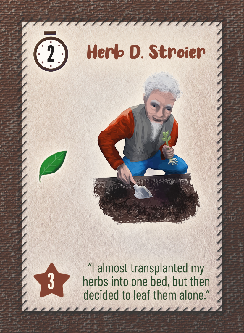
Armed with these new thoughts, I revisited the gnomes. Fortunately, it’s super easy to fix problems with hue or saturation in art. Fixing mistakes with value is much harder. But it only took a day or so to make the characters really bright and beautiful. I retained relatively muted colors for the faces, gardens, headings, flavor text and card background, in order to avoid entirely losing the garden aesthetic. While I was at it, I also edited and punched up the iconography in ways that improved visual differentiation.
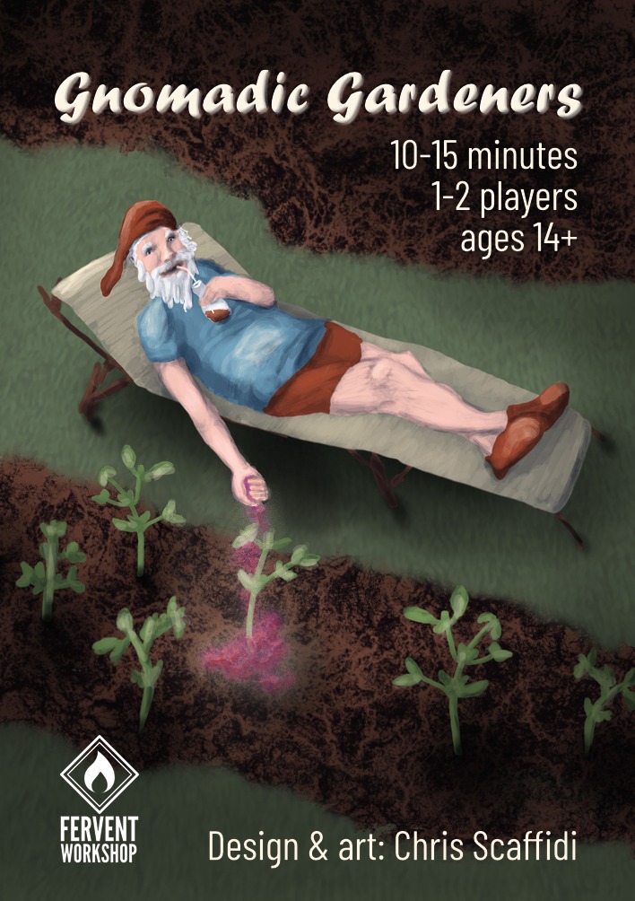
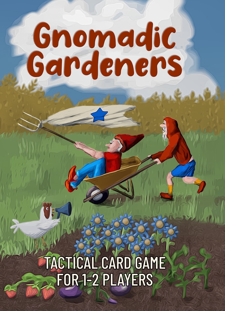
And I completely redid the cover art with more of a focus on opening up the space and colors — with the goal of creating a happier scene, a place of joy rather than a place of doing garden chores (or evading them, as in the first cover).
Latest feedback
When communicating with a few final previewers, I mentioned that I was updating the art and provided a link. Thus, they knew where I was headed and that the game would be brighter.
To my delight, these previewers really had no reservations about the art, including the palette. The preview published this week said, “The artwork is cute and easily read… The flavor text and artwork are cute.”
The preview also opened with some words that reminded me of gnomes’ role in helping gardens to feel like happy places: “I love gnomes. I have gnomes in my garden. I have a gnome at my office. I have gnomes in my home.” This mentally clicked for me with what the Facebook colleague had written, above, about how he expects gnomes to feel “spirited.” I’m glad that I redid the cover to focus more on having fun in the garden.
As an added bonus, the previewer lavishly complimented the mechanics, replayability, learnability, and portability.
Now, I just need to get rid of the ugly gray cubes used to mark animal assistants! Never fear! Those will be replaced with full-color animal art if we get at least 30 backers, which should be entirely doable. But that’s a topic for another day!
Notes to self
- The people in a particular target may have quite different aesthetic sensibilities surrounding different products for that same market.
- Books: To be read about their gardens
- Gnomes: To brighten up their gardens
- Don’t rely on playtesters for warnings about aesthetics, especially when they are not members of the target.
- Game designers can give great feedback about mechanics yet not realize when a prototype mismatches the target’s aesthetic sense.
- Remember that games exist to bring joy, and bright palettes have a role to play in lifting players’ spirits.