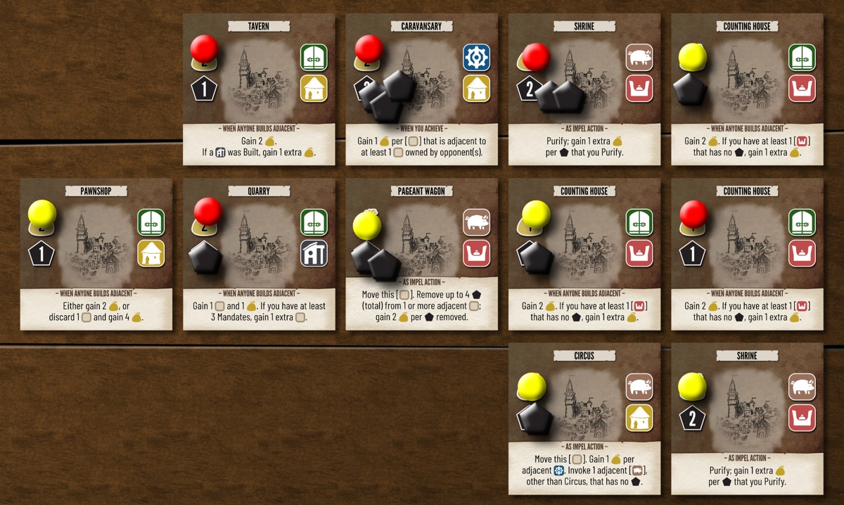
Over the past few months, I’ve designed a new game called Cartref: City of the Hut Traders. You are a goblin land baron and member of the Hut Traders guild—purveyors of magical real estate for weefolk, bigfolk, and everyone in between. You place, invoke and manipulate a grid of city cards. Use your wits and magic to amass the greatest wealth in the budding city of Cartref.
Why line art?
I like to sketch little thumbnail pictures before I paint, so that I can get a good idea of the composition before putting a lot of work into the whole thing. The game progressed to the point where it was ready for blind playtesting, and I needed placeholder art. (I’m a much faster game designer than artist!) Line art served the purpose.
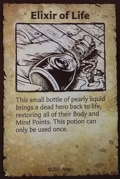
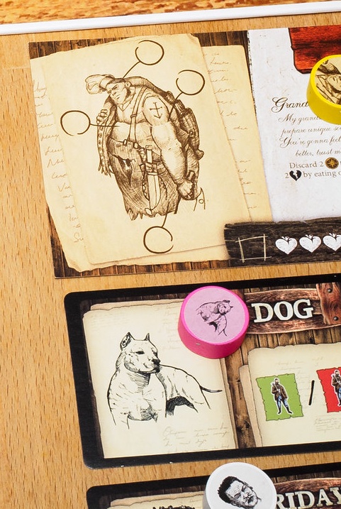
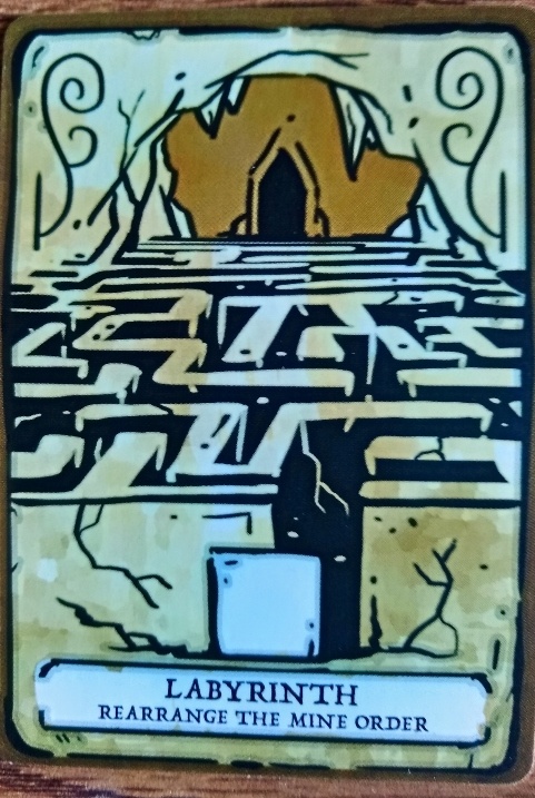
Several games have made excellent use of similar line art. In some cases (e.g., Dwarves: Dig, Delve, Die and HeroQuest), I think a non-trivial proportion of players would rate the art higher than the game.
I’ve also really enjoyed the line art of Jason Glover, which a publisher and I have been using for another, separate game. Here are some samples of Jason’s excellent work.
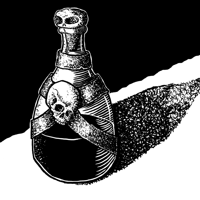
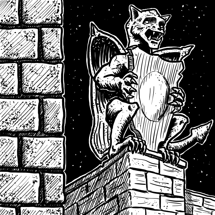
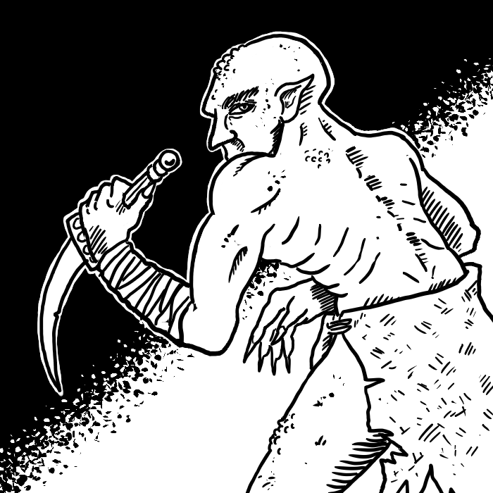
Given these examples, I went ahead with line art in my prototypes. And, as it turns out, players really liked it.
Why understated art?
I’d like the cards to be usable at 2.5″x2.5″. There are two reasons. First, I’d like it if players can enjoy the game on a small table while traveling. Second, if I eventually publish on The Game Crafter, I’d like to use small square cards for affordability. Because of these factors, I wanted art that read well at small scale and didn’t distract a lot from the nearby Effect text on each card.
I tested a couple of options suggested by the Facebook Art & Graphic Design group, in addition to a third option to test whether line art was the right idea in the first place.
I tried carving out more space for art by moving all icons to the left and making the art bleed to the left and right. But playtesters found the line art behind the icons to be too distracting.
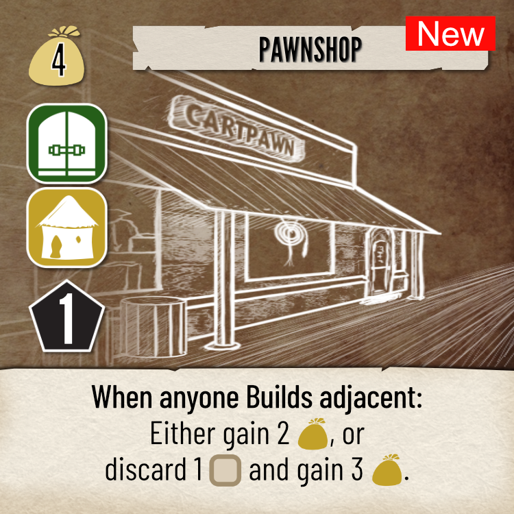
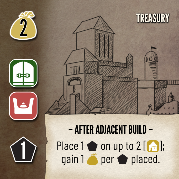
I tried placing a block on the left, spreading icons out, and pulling the title out of a popout (frame). Playtesters still found the cards hard to use because they couldn’t quickly scan for icons during gameplay.
I tried using a small vignette with a painted illustration. The playtesters disliked this, as it broke with the “Wild West” style otherwise evoked by the graphic design (and the gameplay).
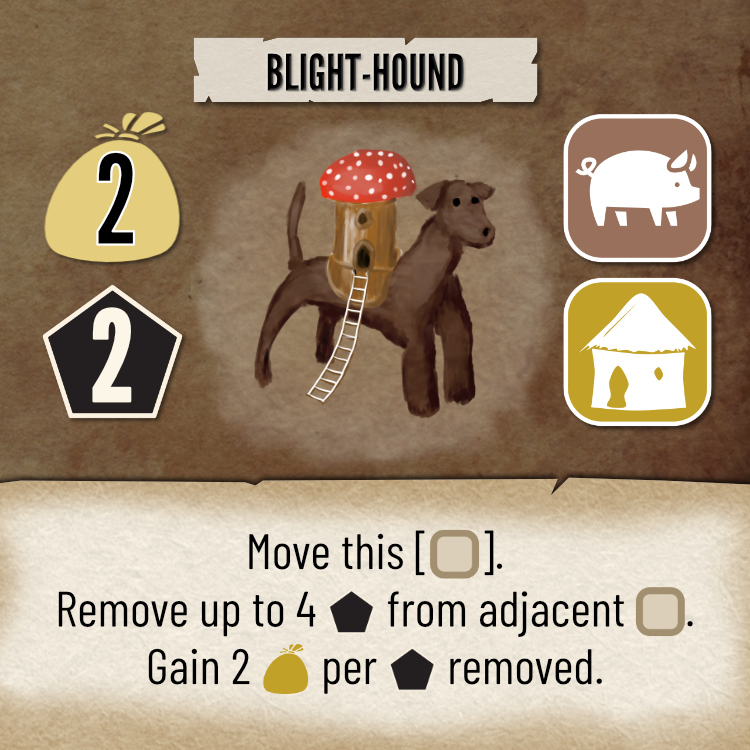
It’s worth mentioning awesome art in tabletop games usually has a painterly style. Such illustrations have full color, you can see some brush strokes similar to what you’d see in acrylic, and you sometimes even see the illusion of texture. As with line art (especially in a small space), painterly art includes selective details.
The final option above comes closest to that characterization, although it’s pretty hard to paint loosely in such a small space. I might return to that design someday if I ever publish Cartref on larger, 3.5″x3.5″ tiles, which would afford much more space for brushstrokes and a far looser paint style. For now, though, the players prefer for the colors of the icons to pop, and full color illustrations would impair more than inspire.
What I learned
In the end, I settled on something pretty close to what I had to start. The art is small and understated, so that the iconography can stand out really well. The biggest suggestions from the Facebook group that I ended up adopting were:
- Shrink the bottom popout (frame) around the text to waste less space.
- Increase the contrast of the vignette background versus the foreground line art.
- Extend the art as much as possible both upward and downward.
The current design, with a placeholder sketch:
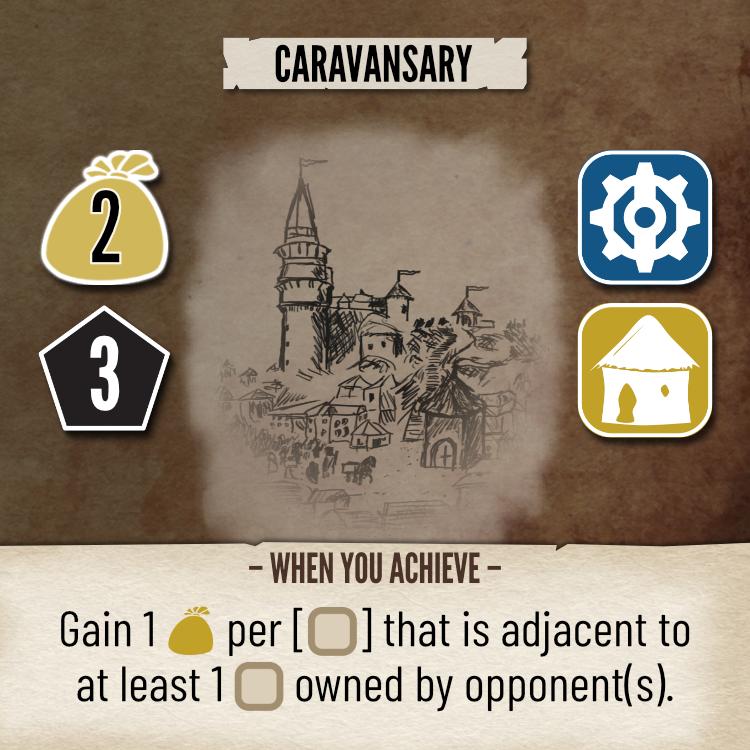
My main takeaway is that just looking at a sample card in a Facebook group can easily lead to different conclusions than actually playing the game with that card.
That’s not a slight or an insult to the group! It’s an observation that different kinds of evaluation lead to different perspectives, insights and conclusions. And it’s a caution that no amount of discussion in any Facebook group can substitute for good old-fashioned playtesting (or vice versa).
Notes to self
- Specific to Cartref:
- There’s room to further expand the art (vertically).
- Test new icons for the gnomes, goblins and bigfolk.
- Artists and graphic designers had good suggestions of things to try.
- Interleaving FB and playtester feedback worked well
- Doing FB feedback and playtester feedback in SERIES would have been suboptimal…
- Doing all playtesting, then refining based on FB feedback, would have led to serious usability issues
- On the other hand, refining based on FB feedback, then doing playtesting, might have been equally problematic because playtesting substantially affected the content of the game components
- This experience offers as a caution for any publisher who doesn’t do playtesting after the graphic designer does an initial layout, especially if that layout differs substantially from what the designer tested before licensing the game to the publisher.
1 thought on “Understated Line Art and the Graphic Design of Cartref”
Comments are closed.