Playing Waterdeep with friends recently reminded me of the board’s lightly colorized line art. By this, I mean that the buildings are entirely just line art, and the only bits with color are the roofs. These, in turn, have extremely light shading — so light that you only notice it’s there because it pops out of the otherwise cream-and-black context.
Cartref
My biggest concern with colorizing Cartref has been the fact that the game requires players to visually scan the city for cards of certain types. This is trivially easy when the tag icons have color and the illustrations do not. My solution has, so far, been to retain only black-and-white line drawings.
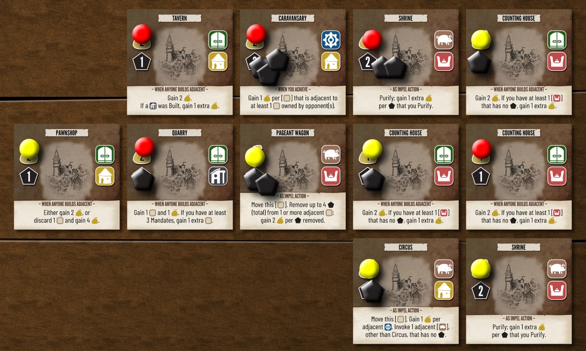
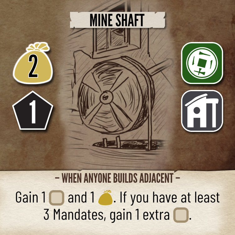
That said, I personally prefer color art. In fact, drawing in black-and-white sometimes feels like a chore. In contrast, painting in color rarely tires me by the end of the day. Now, I didn’t get a lot of responses to my queries on BGG about what style of art to use for the cover, and at least 1 or 2 people preferred a colored cover but thought it clashed with the black-and-white card art.
There’s another city-building game, Prestige, coming out this summer. They have exactly the same challenge of illustrating cards that players need to scan. They opted to go with full saturated colors and black-and-white icons (at least in the prototypes that I’ve seen so far). I have the feeling that these will be hard to scan.
In contrast, the publishers of Suburbia took the same approach that I have, so far, in terms of using a big block of color to represent each tile’s category, and then relying on black-and-white line art for the illustrations. But the resulting tiles don’t appeal to my aesthetic taste very much.
So: If I were to add any color to the cards, how could I do it without wreaking havoc on players’ ability to scan the city?
Waterdeep
Perhaps Waterdeep’s board suggests a path forward. Only the roofs have color. I could try just colorizing the roofs, and I could do so in a way that coordinates with the cards’ iconic colors.
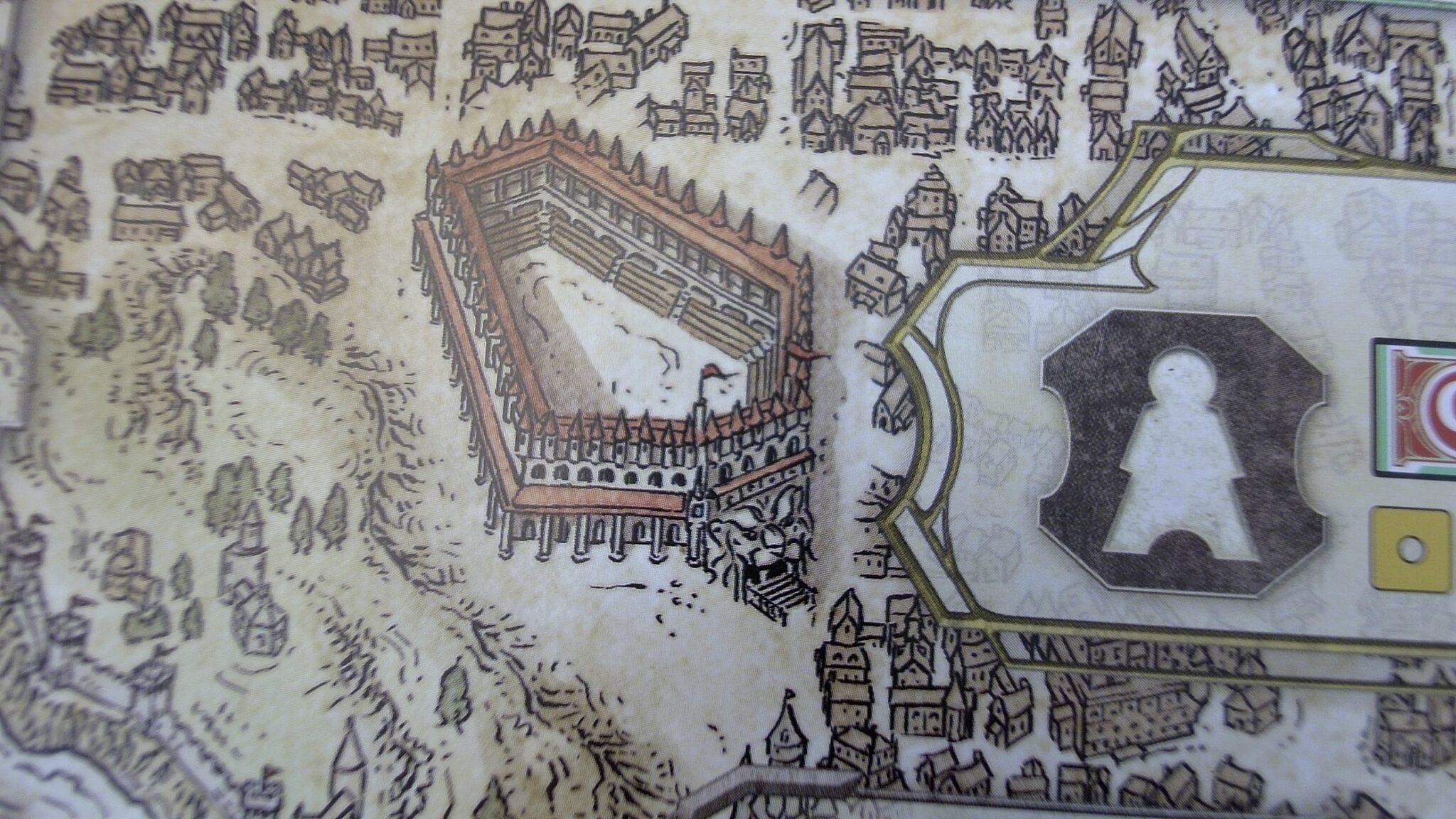
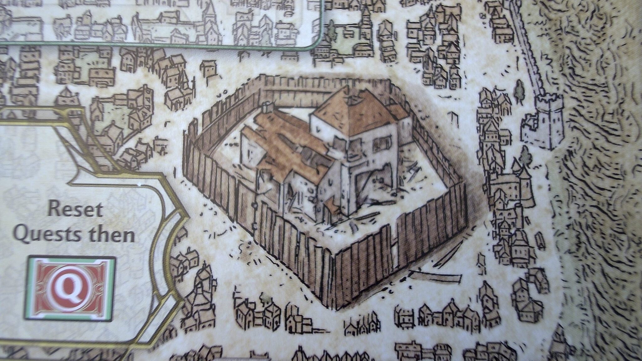
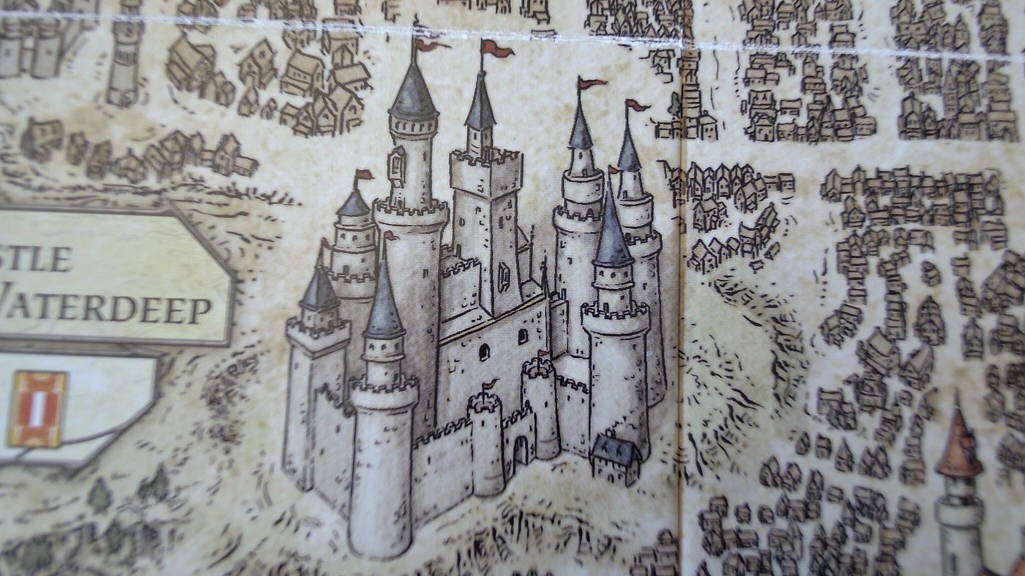
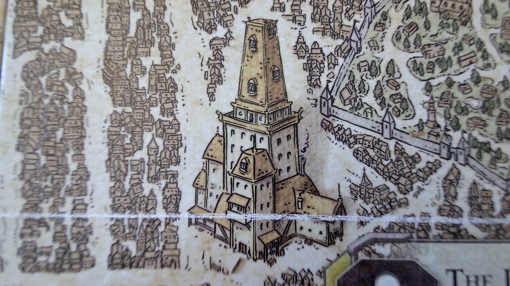
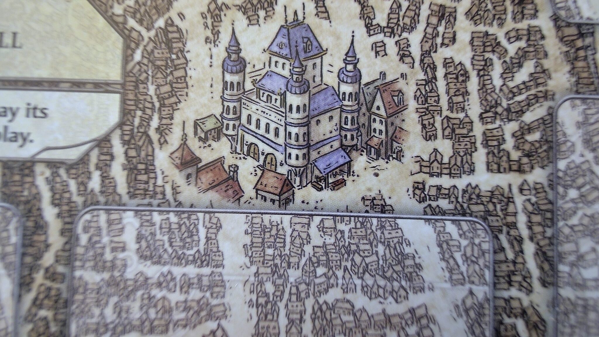
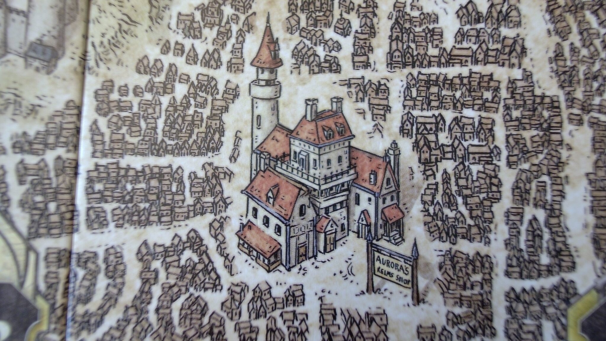
Another detail is the whitewash of the building walls. This helps the buildings to pop out against the cream-colored roads.
The windows are eroded on one side, in many images, to convey depth. Shadows aid definition of form.
I’m a fan of the desaturated colors. They don’t distract from the main iconography on the board. And desaturated can look good, though these days I have some qualms about using desaturated colors for happy themes. Still, a goblin guild isn’t as happy of a subject as a gnome garden.
Each illustration, like the board as a whole, portrays the building from a partially top-down view — essentially, a vertical 3/4 view. A downside is that the buildings are right-side-up only for one privileged player (as in LOTR). But it would work for Cartref because I designed the game anyway for up to 3 players. That way, they can sit on the same side of the table when reading the cards’ effects. I wouldn’t need to rework my existing illustrations to any significant degree.
An experiment
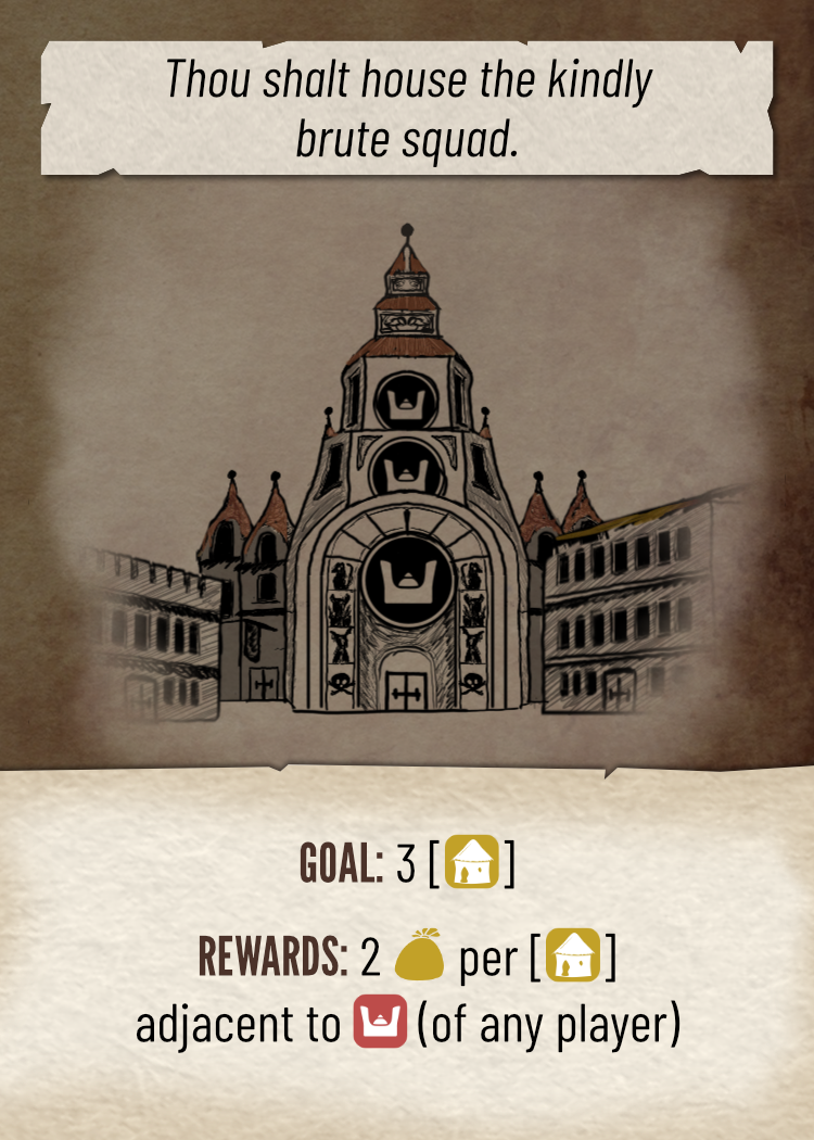
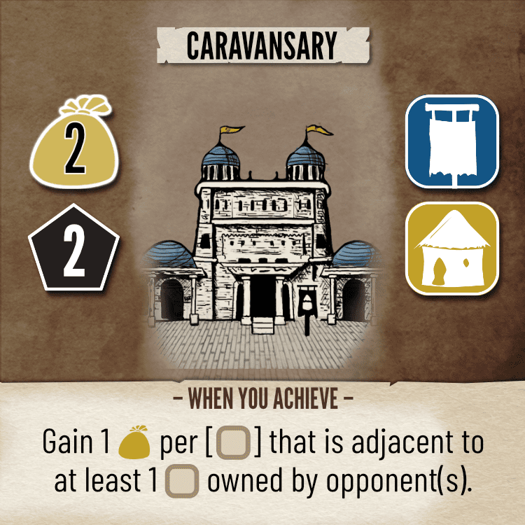
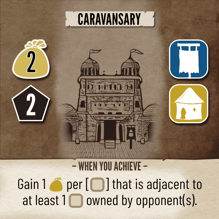
I tried colorizing a single card, to see how it would turn out. It seems ok. I haven’t tried many ways of repainting the walls yet or experimented much with colors. Perhaps this is the way.
Notes to self
- Don’t forget to try whitewashing the walls.
- Colorize based on card purpose or card inhabitants? Both?
