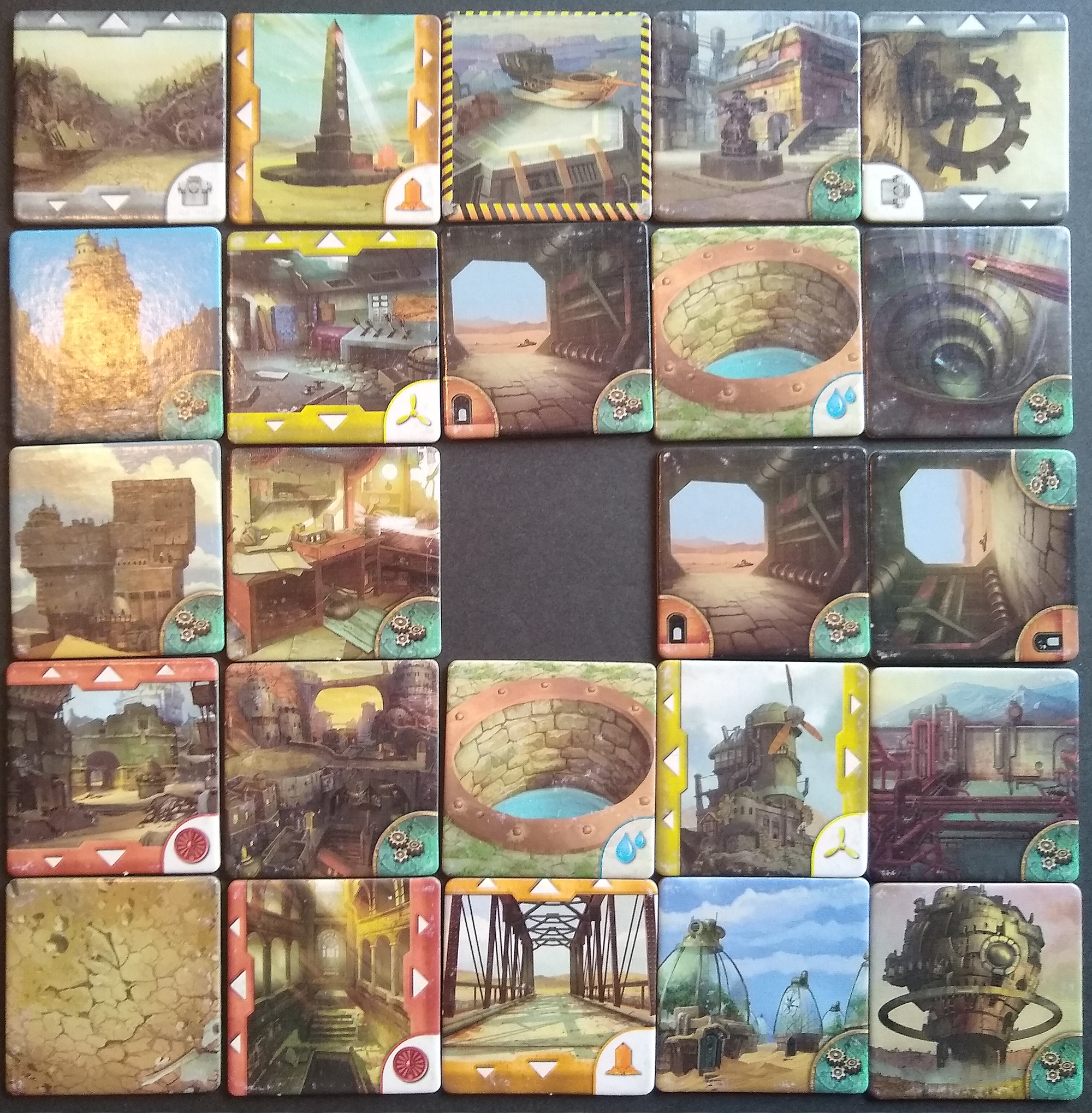
Gamewright’s Forbidden Desert, released nearly a decade ago, still rocks a solid rank of 424 to this day on BoardGameGeek. I don’t think it’s just because of the nifty sand-sliding mechanic that helped make the game famous. I think part of the reason is the artists, CB Canga and Tyler Edlin, made a game that is beautiful to look at.
Most of the 24 tiles depict eerie scenes offering rewards and clues to the locations of aircraft parts that the players must cooperatively gather before the sun fries everyone or the sandstorm buries everyone forever. For example, the workshop scene and castle/ruin scenes (below) each provide a special card with a tool to help the players.


The art’s desaturated palette makes it really easy on the eyes. All of the dominant colors have a saturation below 50%.
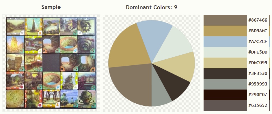
We can compute a histogram to visualize the distribution of colors by saturation. The histogram below shows that pixels with saturation above 50% account for only a tiny proportion of the overall image. In fact, approximately half of the pixels have a saturation of 25% or less. This is a great fit to the theme and mechanics, when you consider that the colors in these scenes (in real life) would be degraded by the bleaching of the sun and the incessant sliding of the sand.

Let’s compare this to another piece of beautiful art, the Scythe board. Scythe’s histogram, below, indicates plenty of pixels with saturation above 50%. This is what gives the board its visual richness. On the other hand, as with Forbidden Desert, those heavily saturated pixels remain less common overall than desaturated pixels.

Let’s contrast this with my photo of Jurassic Park–a game that really puts the dinosaurs center-stage both mechanically and thematically. The game is less desaturated than either Forbidden Desert or Scythe, with fewer pixels pushed below 25% saturation. But I think the most interesting thing is the little bump at the right end of the histogram below: those big red dinosaurs’ pixels just leap out of the histogram. Ravensburger makes it perfectly clear, using color saturation, where they want your attention.

These games together illustrate a few principles. First, as every graphic designer is probably taught in the first semester, don’t overdo saturation. Too much is exhausting to look at and makes it impossible for people to figure out where to devote their attention. Second, do use saturation to target the small number of items that need the most attention. Third, you can make a game look rich using a moderate amount of saturation (as Scythe’s histogram has a small and flat amount of saturation in the range from approximately 50% to 90%). Finally, a game can look absolutely beautiful without a lot of saturated colors.
What other games have especially desaturated or saturated art? How do the games’ colors affect you?
4 thoughts on “Forbidden Desert Looks Good by Not Using Much Saturated Color”