I’ve frequently noted that players’ behavior during a game can contribute to table presence, such as through laughing or other antics. And, I’ve specifically commented that games published by Steve Jackson often come up as great examples of games that make players laugh.
Today, I’ll focus on perhaps one of their best-selling games, Munchkin, with a specific focus on how this card game’s flavor text and art is aimed at creating a goofy, even ridiculous frolic around the table. Mechanically, the game has a lot of chaos and luck — consistent with the theme of some silly characters kicking down dungeon doors and hunting for treasure. But I remember my friend Erika repeatedly guffawing when we last played, and it wasn’t the mechanics causing this reaction! Let’s dig in.
Of course, the puns
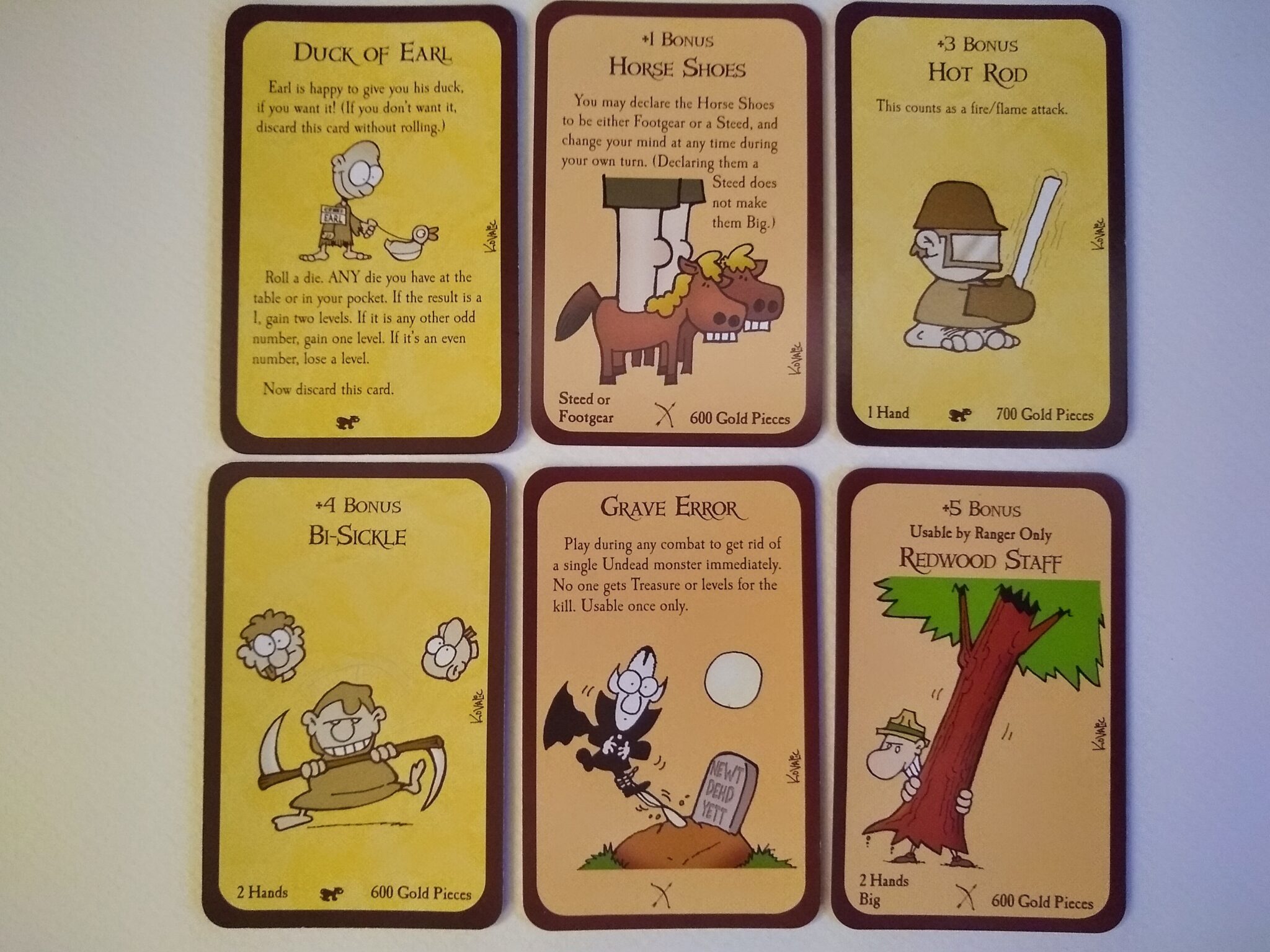
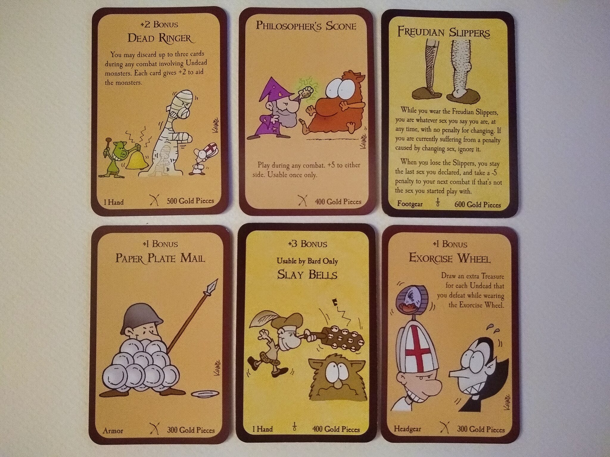
My bit of punditry: most goofy games can benefit from some wordplay (especially those about weefolk, gnome-matter what it takes). Munckin has its more than its fair share, including some of my favorites below. Actually, I had planned only to include one photo spread here, but the game just had too many great puns, so you get two photo spreads.
My favorites combine mechanics with wordplay. For example, the “Bi-sickle” is a type of weapon with combat bonus. The “Horse Shoes” are footwear that can also be used a steed (as footwear and steed have a mechanical meaning in the game).
Horror humorized
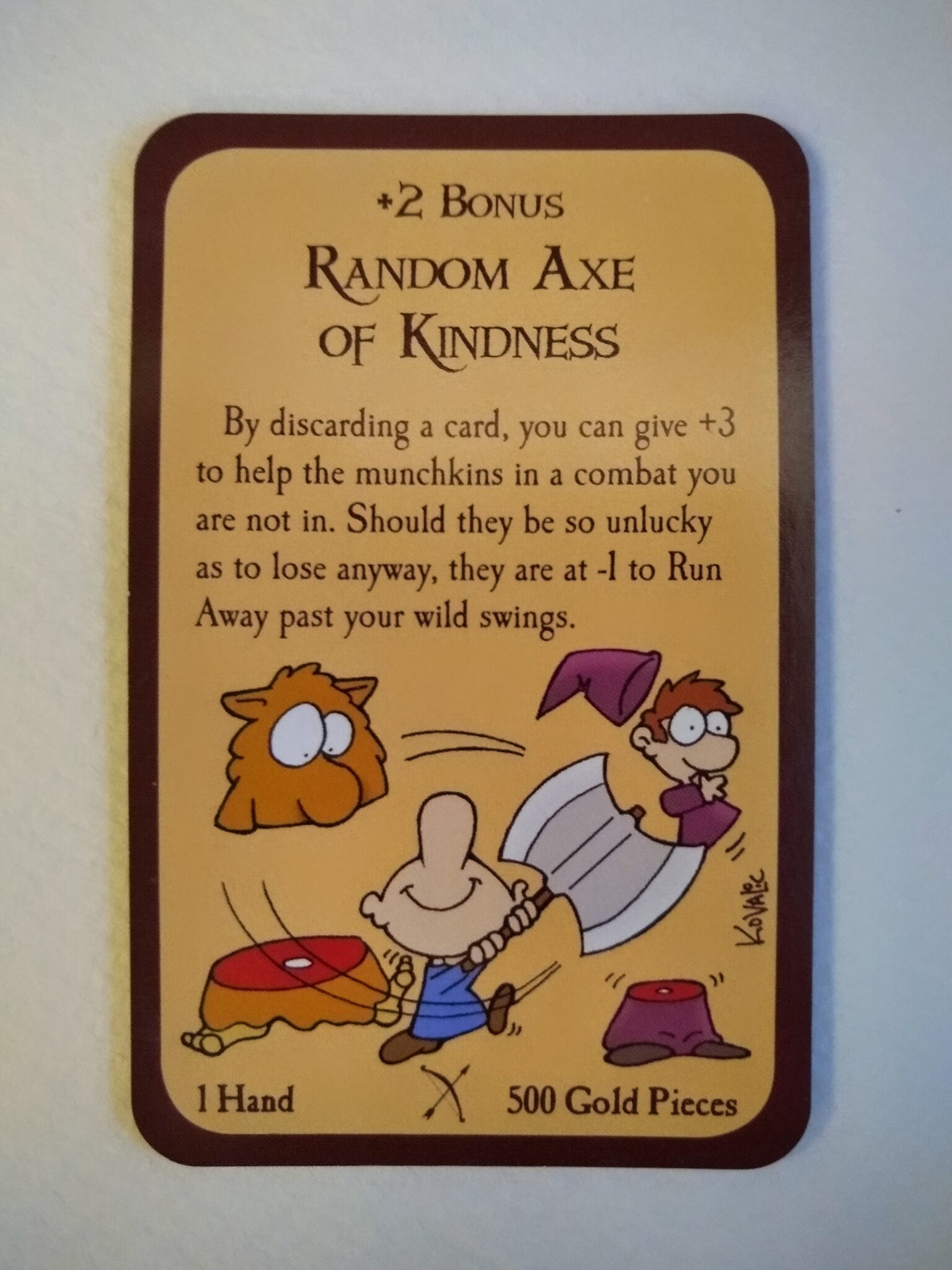
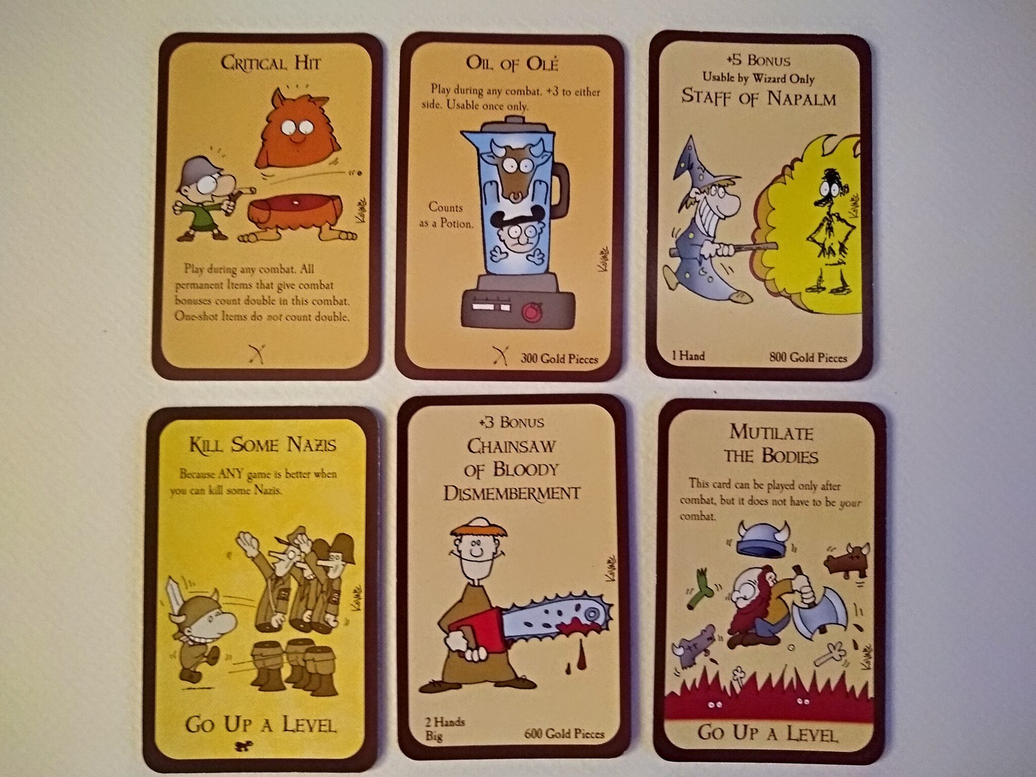
Another category of cards includes images that would truly horrify children and some adults, were they rendered with photographic realism. These cards portray characters cutting other creatures in half or wallowing in a pool of bloody body parts. The publisher has cartoonified the horror, in most cases for a smirk or maybe even a few yucks (pun intended). At their best, these include both horror and a pun, as in the “Random Axe of Kindness.”
Note the contrast with other mass-market games that have a horror theme and more realistic (less cartoony) images, such as Arkham and Valeria. Such games portray the horror by focusing on the beasts and characters, who aren’t actually doing anything horrific to human beings. This is necessary both for branding and to maintain suitability for play by young teens and tweens.
The marketing implication is that you can’t simultaneously have all 3 of the following: a teen/tween audience, realistic illustrations, and portrayals of characters doing horrible things. You can have 2 out of 3, but not all of them.
Sex humorized
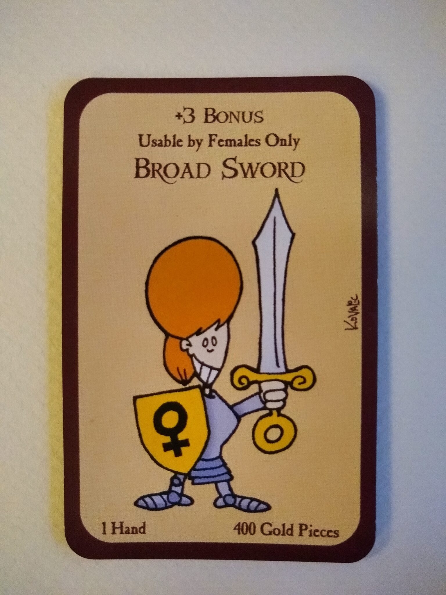
As with horror, the game includes a few cards based on humorifying sex-adjacent topics. Some of these combine a pun with a reference to males or females, as in the “Broad Sword” (usable by females only!!!!) IIRC, some people feel insulted when they hear a woman called a “broad”–but I infer that Steve Jackson isn’t one of those people!
The game’s art, at its heart, derives most of its humor from hyperbole. These include exaggerated caricatures of faces and bodies. Breasts are no exception. The joke in many cards is that these body parts just don’t happen in real life.
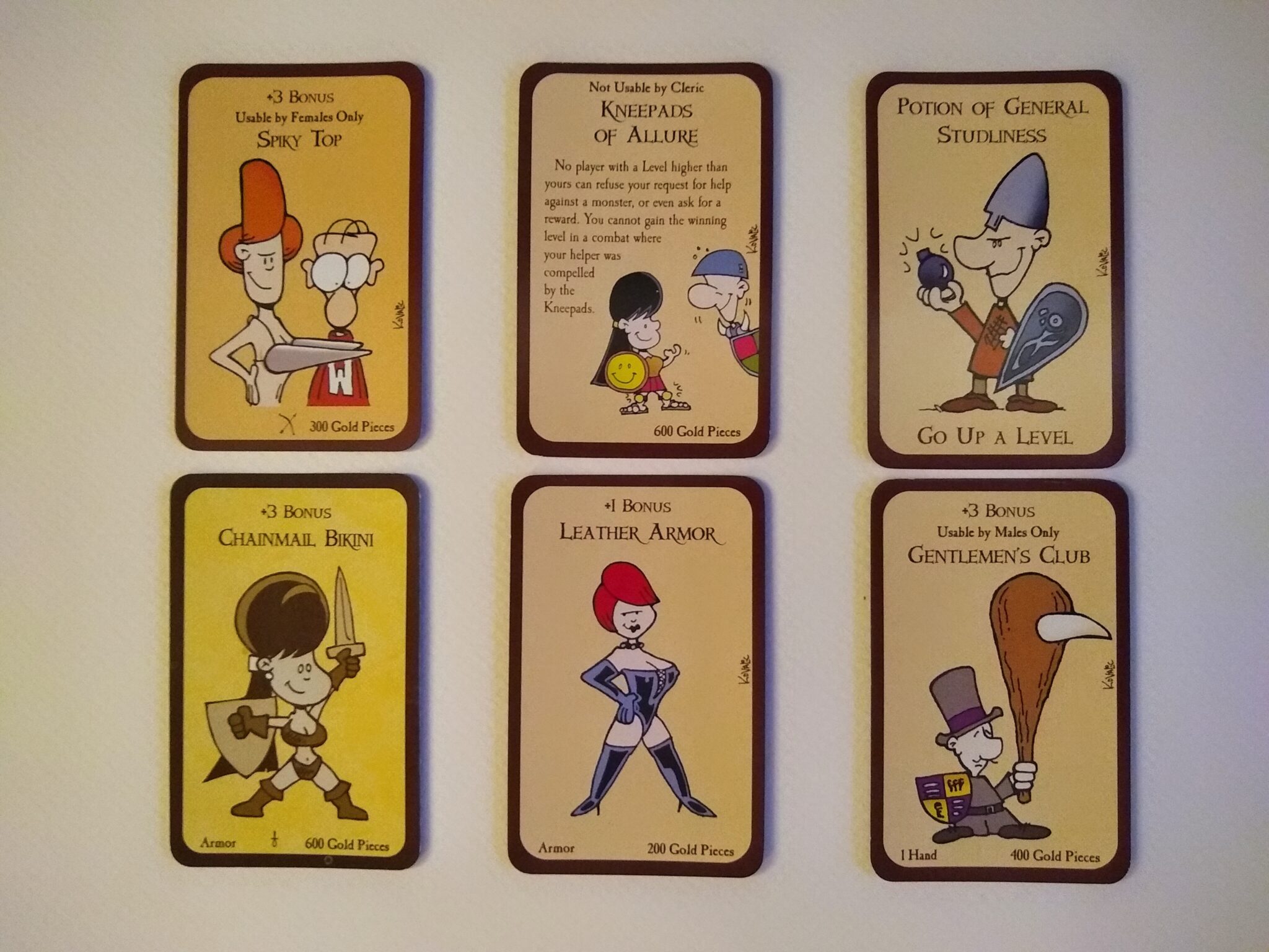
My point isn’t that Munchkin stands out as immoral or wonderful in its treatment of sex. Plenty of people better informed than me have extensively discussed objectification and empowerment (there’s a big difference) reflected by female sexualization in RPGs, video games, magazines, and, well, everywhere. Plenty of games are more sexually explicit, more visually explicit, or more obvious about objectifying women–including in D&D. The jokes in Munchkin work precisely because they pivot against the genre trope (of which, “Chainmail Bikini” is a great example). So if this was an article railing against objectification of women, I wouldn’t have picked Munchkin as my exemplar.
My point is that the constraints on humorization of sex appear remarkably similar to the constraints on humorization of horror above. To wit, the marketing implication is that you can’t simultaneously have all 3 of the following: a teen/tween audience, realistic illustrations, and portrayals of sexy characters. You can have 2 out of 3, but not all of them.
It’s also worth noting that humorizing sex doesn’t require big breasts. I find the “Kneepads of Allure,” below, especially fun as it turns objectification on its head. Kneepads rank right up with elbows as sexy body parts!!! I also enjoy the unibrow guy with the “Potion of General Studliness,” and every punster probably has at least a little professional respect for “Gentleman’s Club.”
(A few not-so-smiley examples)
It’s worth mentioning that the characters in the cards above are smiling. These characters appear to have chosen their various accoutrements for themselves, and they appear rather satisfied with the bonuses with which they are thereby empowered.
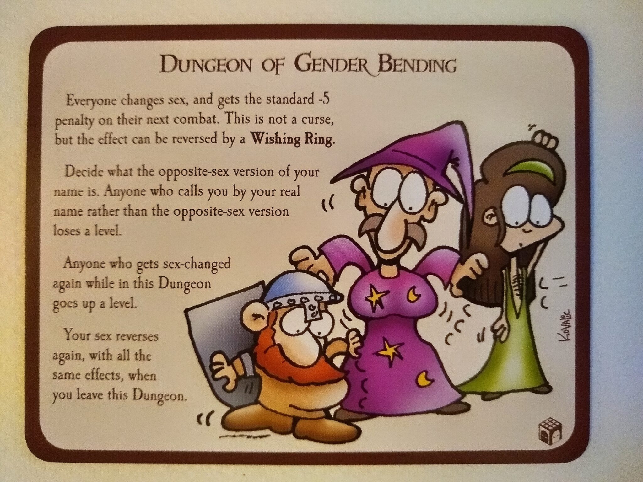
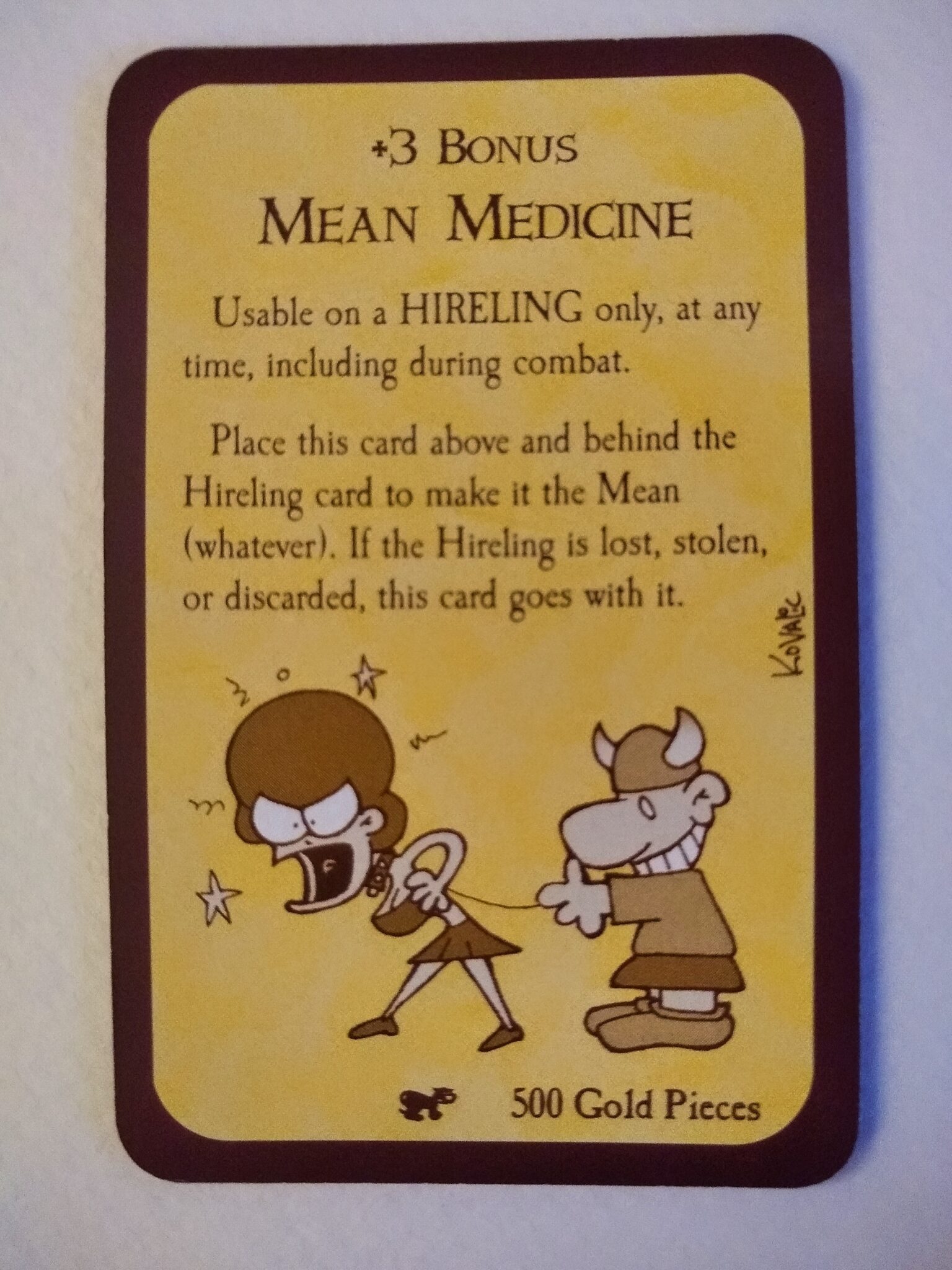
I mention this point because it contrasts with the two cards below that also touch on gender. The first is aimed at making humor from the idea of changing gender (which relates to a specific mechanic in the game). This subject has become so sensitive in the past few years that I personally wouldn’t include such a card in my own games–it’s way too risky and potentially insulting. The second card has a picture of a really angry woman on a leash, which could insult more people than it entertains. If you’re Cards Against Humanity, then I guess that’s a plus, but it would definitely be a minus for most of us.
Fortunately, such cards are blessedly rare in Munchkin, and 99% of the cards hyperbolically pivot squarely against the genre while maintaining smiles on most of the illustrated faces.
Mock the genre
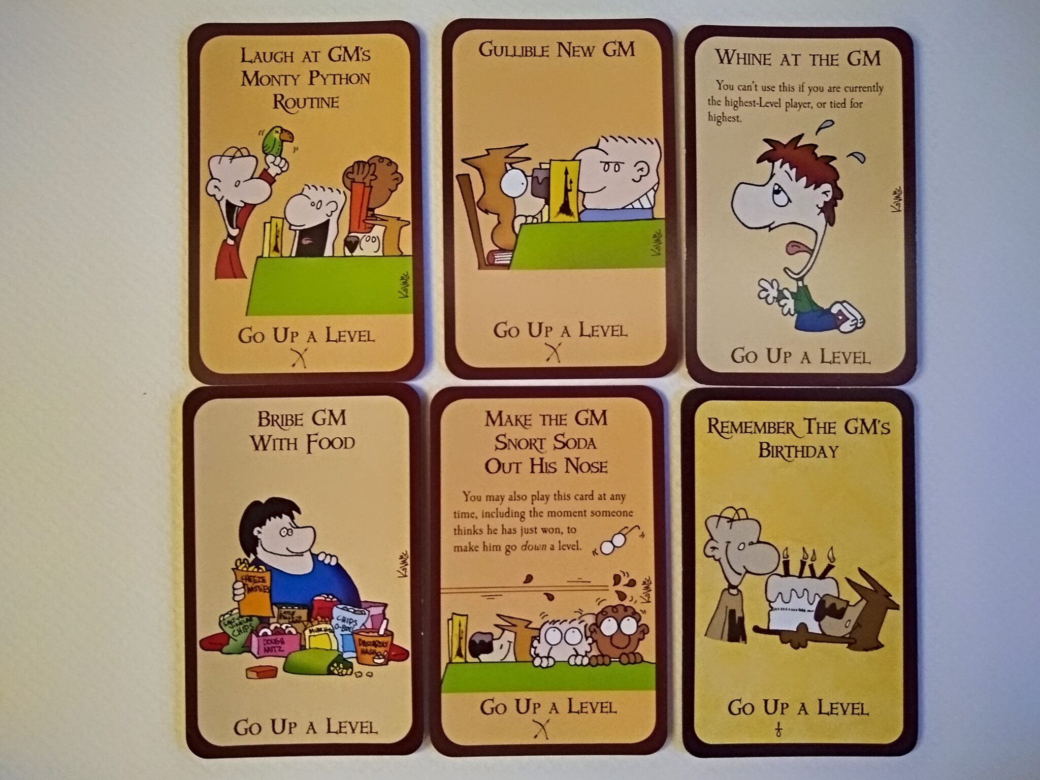
As long as we’re on the subject of humor that uses tropes as a pivot, let’s also glance at a few cards that mock the presence of an all-too-human Dungeon Master in role playing games. To be precise, though, the proper term here is “Game Master” because Steve Jackson RPGs don’t always happen in dungeons (which I consider one of the design advantages of GURPS over D&D). Some of these cards, such as “Whine at the GM,” also mock common player behavior in RPGs.
Shades of grey
[No, I’ll come back to that topic.]
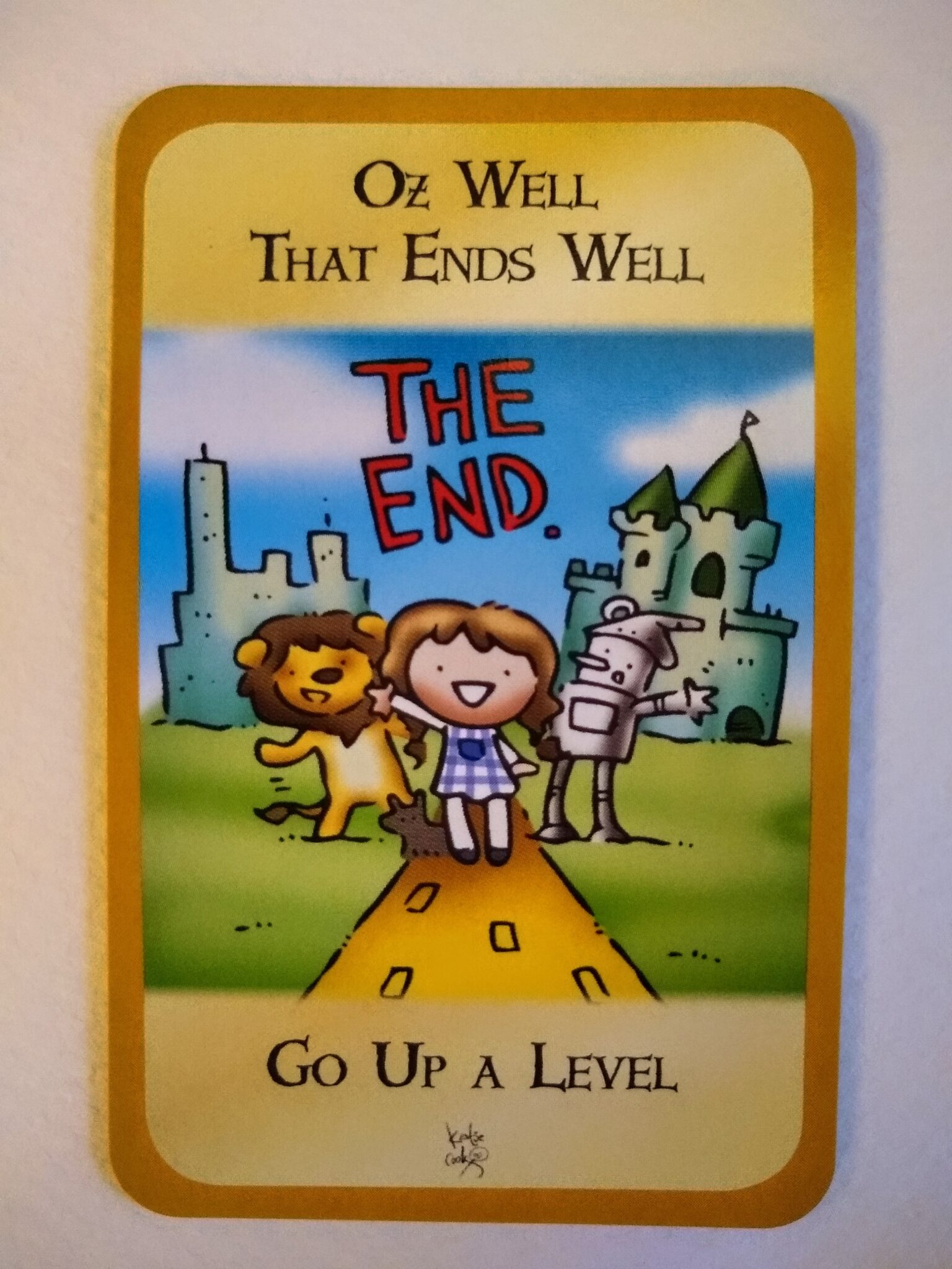
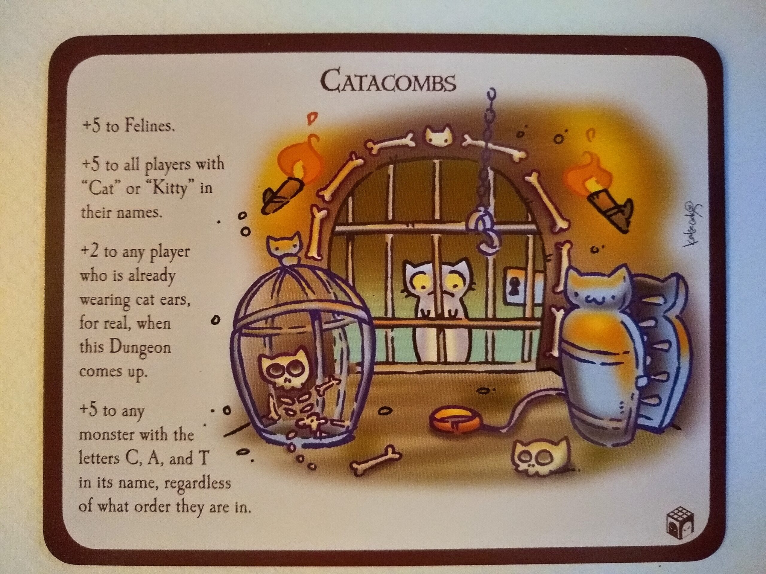
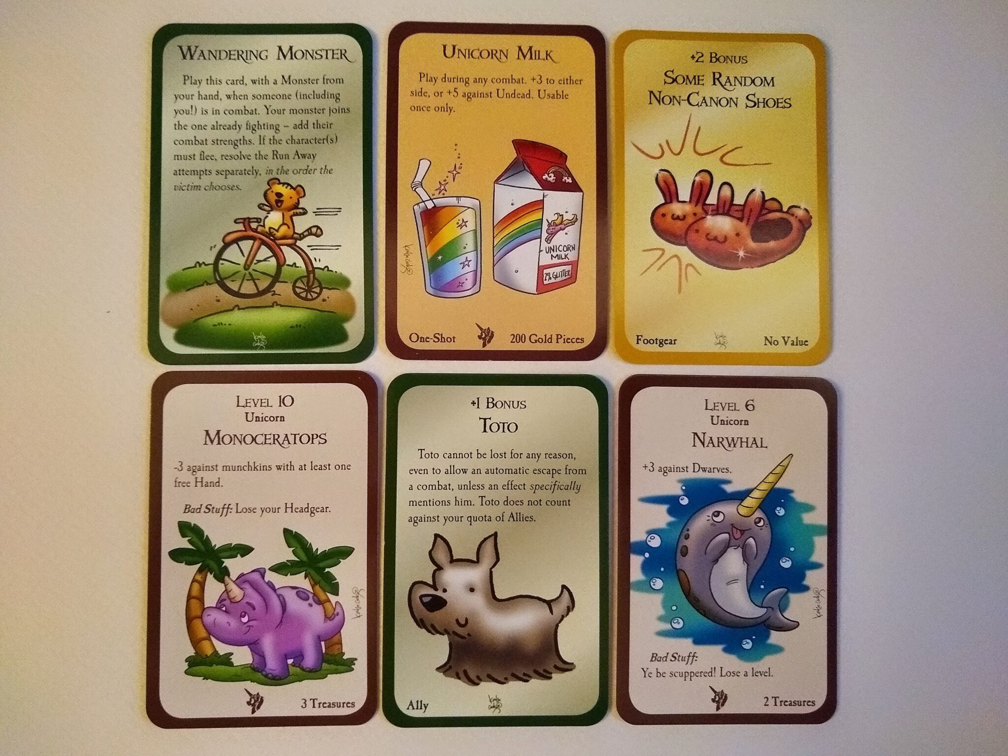
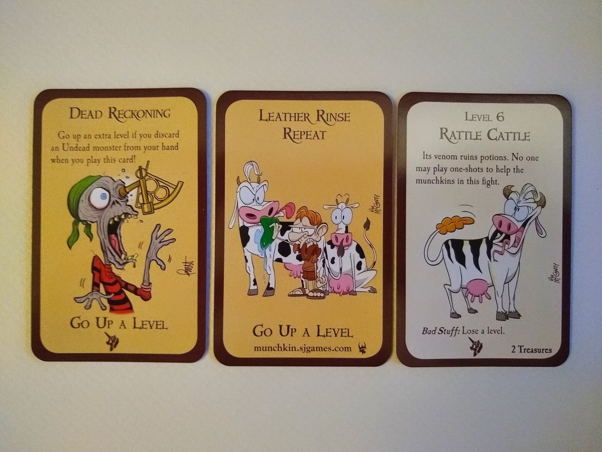
A guest artist, Katie Cook, illustrated the Munchkin expansion Munchkin Oz. Unlike in the base game and earlier expansions, this one includes images with shading. The additional levels of value in the illustrations turn the shapes into forms, which Katie uses to strategic advantage for amplifying the emotional content of the cards.
For example, the lighting on the grass of “Wandering Monster” — it’s a teddy bear! — amplifies the cuteness of the scene and makes the joke much funnier than it would be with line art or flat colors. The shading on the “Monoceratops” and “Toto” make these look ridiculously cute (the joke with the “Monoceratops” being that he’s actually a valuable, high-level unicorn of a monster).
Shading also amplifies the cuteness of the people-images on these cards. The faces look much rounder than they would with simple curves and flat colors. Katie achieves a certain Kawaii flavor on these cards. I especially enjoy the whimsy of “Dr. Nikidik’s Celebrated Wishing Pill” and the chagrin conveyed by the “Budget Unicorn Costume.”
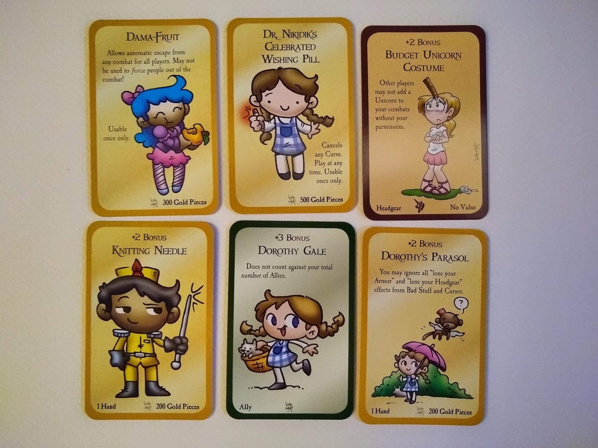
Katie also uses shading to advantage when portraying not-so-cute subjects. For example, she really makes the eyeball pop in “Dead Reckoning,” and shading helps to hyperbolize the udders on the other two cards below. I can’t help but smirk at the squatting cow in “Leather Rinse Repeat.”
Find the line
None of these cards with shading veer into sexualization or horror. It wouldn’t be appropriate for an expansion that draws upon Wizard of Oz for inspiration. Moreover, integrating big breasts or other sexualization into the cuteness of the people-image cards above would end up squarely in Ecchi land. (And, no, the udders above aren’t a cownter-example.) I can’t think of a single game with Ecchi art — certainly nothing that has sold as well as Munchkin, nor anything you’d see in the front window of your local game store. And adding a bit of value to illustrations is a long way from photo-realism, which really goes to reinforce the point about marketability made above. There are some things that you just don’t do as a publisher, if you want your game to sell well.
There’s an art to finding the line in any comedy, and the same applies to any attempt at amplifying table presence through humorous cards.
Notes to self
- In terms of marketability, you can’t have all 3:
- Tween/teen audience
- Realistic illustrations
- Sex- or horror-based humor
- Does this tri-partite tradeoff apply to anything that would merit an R rating in a theater?
- Shading (value) can amplify humorousness
- The humor trifecta in Munchkin:
- Pivot against a genre trope
- Include a pun
- Hyperbolize
- And, of course, link closely to theme and mechanics
