Occasionally, a friend will pull out a game that he’s owned forever yet never actually played. That’s how I found myself in the town of Arkham this weekend, with Fantasy Flight’s Arkham Horror. This was the huge, sprawling version of the game from the turn of the century, not the more recent card version.
The game scored high on the insanity level in so many ways, and not just because the game is about trying to shut horrific monsters out of our universe before they destroy our sanity and take over our world.
First was the size. If you ever want a fast and easy way to create table presence, just make the board twice as large as it really needs to be. Our 5-person play took up a massive 10’x4′ table and still left us scrambling for space to put stuff off the table even before we had fully set up.

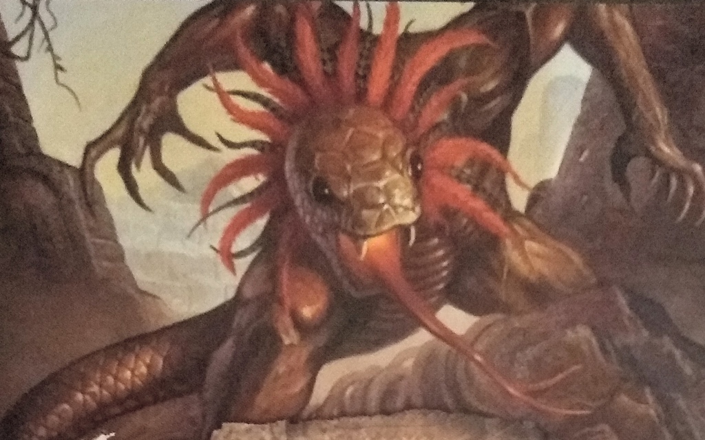
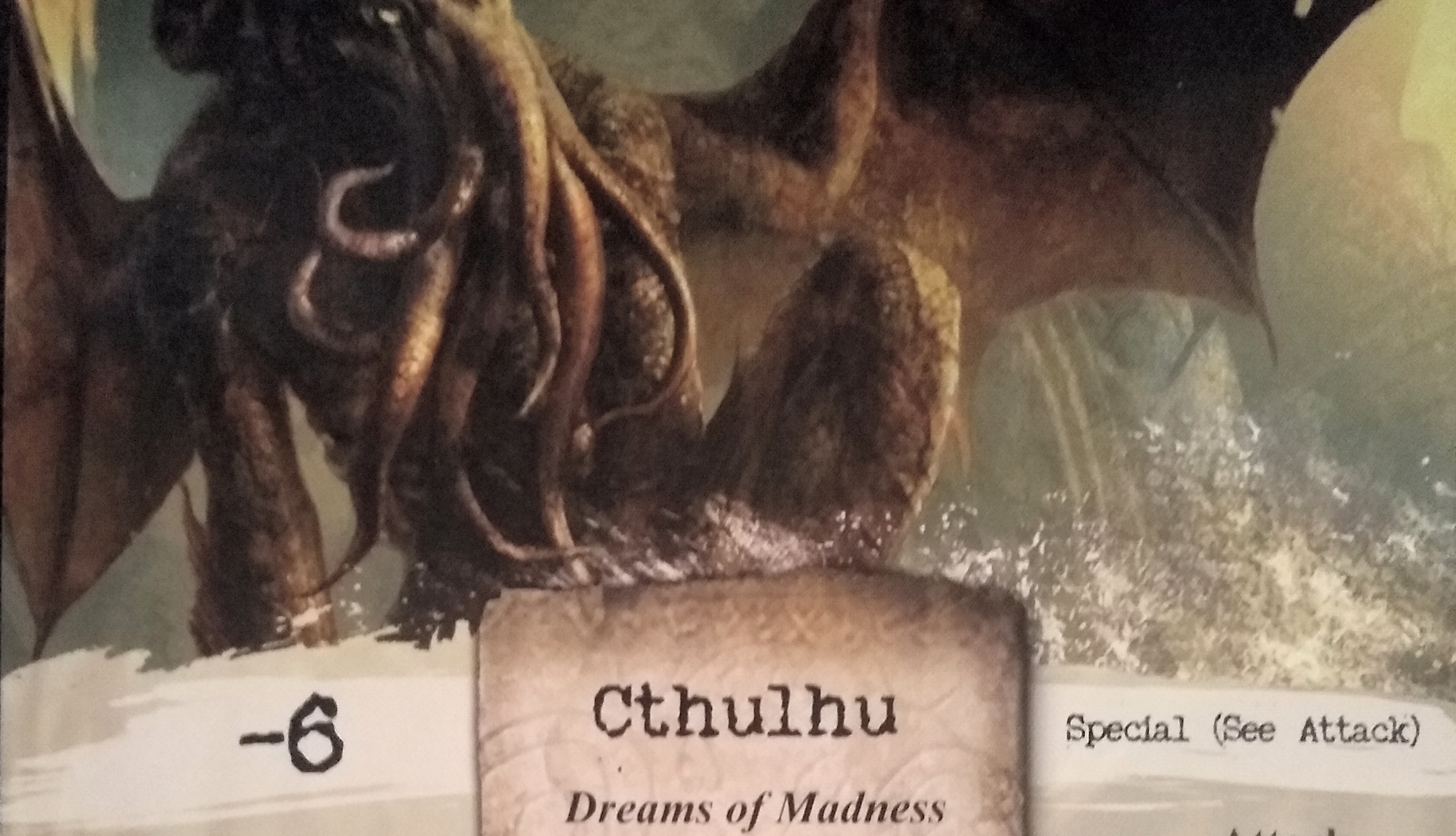
Second, the art was also insane–literally depicting characters on the verge of losing their sanity. Why? Because of the monsters. I’ve previously written about the use of hyperbolic shapes, faces, and dynamic action to make players pay attention to Valeria’s card art. Arkham takes a slightly different approach of making the depicted creatures look just plain dark, evil, otherworldly, grotesque and disgusting. Very Lovecraftian.


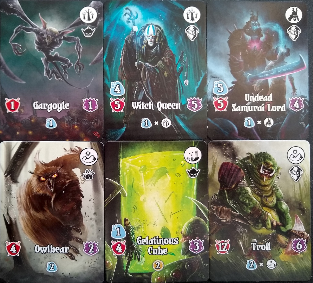
Notice how the art here contrasts with that of Valeria (below), which doesn’t give me any feelings of disgust. A few noteworthy differences…
Most of Arkham’s creatures have a look like they are directly hunting the viewer. Valeria’s Owlbear looks that way, but the others just appear to be making a general menace of themselves.
Much of the reason is that Arkham’s creatures are much closer to the camera — these monsters are getting right up into your face. In contrast, the Valeria creatures generally fit well into the frame (except for the flying creatures). You might have time to get away from Valeria’s creatures, who have only just noticed you and are still a distance away.
Arkham’s level of zoom also results in a level of detail omitted in Valeria’s art. For example, the second creature above has a disgusting quantity of identifiable hairs on its arms. In the third creature, you can see the wetness of individual eyeballs. The space to portray detail fosters an opportunity to create a higher level of disgust.

Valeria’s monsters might want to kill you. Arkham’s would rather enjoy driving you mad by touching you with their awful tongues and tentacles, or by toy-fully unravelling your mind from the inside out.
In the end, what really drove us mad was the long, slow play-style of the game. We ended up putting it away after an hour and switching to a lighter game, which is to say that making a massive game with disgusting art might get people to the table, but it might not suffice to keep them there for a whole game.
Have you ever played the newer Arkham games? What feelings do their art styles create for you?
