BoardGameGeek runs tons of contests, each of which typically attracts dozens of entries. Users (and fellow contest participants) select the winner for most such contests.
Therefore, Step #1 to winning is actually getting other people to look at your entry. Otherwise, they’ll never try out your game, never experience its awesome mechanics, and never vote for you to win.
How do you get attention? Several games illustrate some tactics, which I intend to apply for my own recent entry (Cartref). Contest participants have given me permission in writing to use their images in this blog post.
4 games
As I reviewed a few of this month’s contests, these games caught my eye:
- Mini PC Builder is about running a business that builds and repairs computers.
- Survival Park is about escaping rampant dinosaurs.
- Away Team is about exploring planets.
- Galdor’s Grip is about traveling through a mind to find information.
Thematically relevant imagery
The main reason these games caught my attention was the imagery that the designers posted.
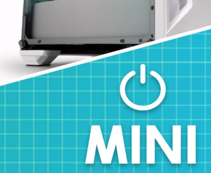
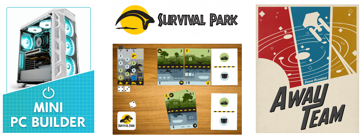
The Mini PC Builder image and the Away Team image both are thematically on point. For example, the Mini PC Builder image is clearly a recognizable computer (unlike an earlier purple placeholder image that originally appeared in the contest thread, which might not have been recognizable as a computer). The current image also includes some sort of blueprint-paper-ish pattern on the bottom, perhaps connoting the fact that the player will build something.
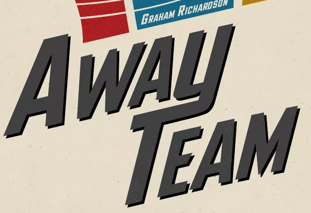
The Away Team image strongly connotes Star Trek. In addition, the off-white background and “flavor” of the palette have a very mid-1900’s aesthetic (at least to me), which further amplifies a feeling of old-school Star Trek.
Survival Park’s image currently seems to depict a flying snake velociraptor claw (the designer has corrected me), although there’s some discussion in the thread about how to make it more like a dinosaur without amplifying perceptions that the game is thematically derivative of Jurassic Park.
Galdor’s grip includes screenshots of many cards from the game. They look so much like Arkham’s illustrations, conveying insanity through highly detailed, disturbing imagery.
Strong contrasts, saturated colors
All the games’ images exemplify strong value contrasts. For example, Mini PC Builder literally has a lot of black and white — you can’t get stronger contrast than that.

All the games also have a strongly saturated color–or 3 such colors, in the case of the Away Team and a few others for Galdor’s Grip. The designers have judiciously opted not to paint the entire image with saturation, which is wise in terms of not overwhelming the viewer.
Lettering that pops
Survival Park and Away Team use lovely thematic fonts. Survival Park’s wordmark font is very similar to that of Jurassic Park (not identical — compare the A’s, for example), which amplifies the thematic feel. Away Team’s Y swishes into the T, and it’s angled in large block, very similar to the original Star Trek logo (not identical — compare the A’s, for example).
Mini PC Builder and Star Trek use drop shadows to make the text pop off the page. Drop shadows are often over-done. These games achieve the effect without over-doing it. (Star Trek’s original logo on wikipedia has a similar drop-shadow, although I’m not convinced that it was present when the show ran in the mid-1900’s.) Meanwhile, Survival Park achieves some pop through strong contrast of the lettering against the background.

Galdor’s Grip also has excellent, thematic lettering and a cool little torch in the final “I” of the wordmark.

When in doubt, animate
Survival Park stands out especially well on the contest page because of including an animated GIF. I would post a copy here, but I think it’s essentially a screengrab from the original Jurassic Park movie, and I don’t want to infringe copyright. Needless to say, though, this is an effective move for getting people to notice the contest entry.
Other observations
There are a few other things that I particularly liked about these contests’ entries on the main contest thread.
- The images read well even when zoomed out. No important text gets lost.
- The images don’t bleed abruptly to the edges. They all have suitable whitespace setting the message off from the borders.
- None of the images include extraneous details.
- All the images leave me with a feeling (accurately) of what the game is about.
- None of the images look like they were quickly scrawled in Microsoft Paint.
- All of the images show good taste in terms of being something that’s pleasant to look at (even Survival park, despite being a bit scary).
- None of the images include weird drop shadows or halos.
- Except for the claw that looks like a flying snake, none of the images leave me asking myself, “Why did they do that thing that way?”
Notes to self
These submissions highlight a few ways in which I should improve my own submission images, either for Cartref in the current contest or for the future.
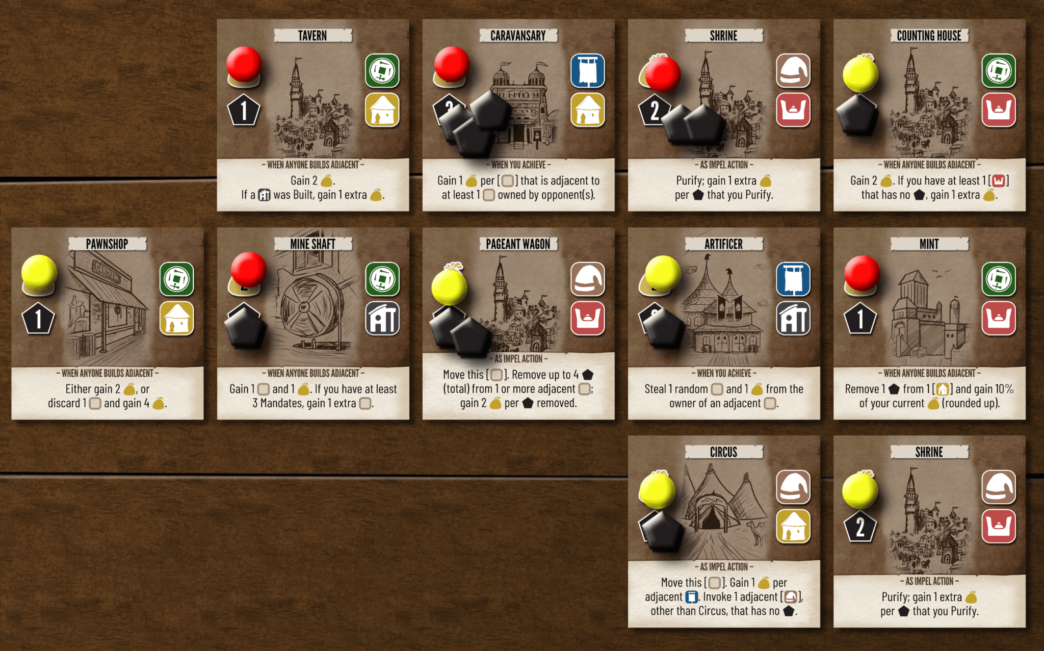
Most importantly, I could/should push the game screenshot into my entry’s thread and instead post a wordmark and a nice, smaller illustration to advertise the game on the contest page.
Other issues to keep in mind:
- The image can be somewhat smaller (e.g., 1000 x 1250 as in the case of Away Team, vs my current 2530 x 1577).
- The image ideally shouldn’t fully bleed, jarringly running into the edge.
- The image should omit those tiny little card details that nobody can see when zoomed out.
- The image should include the game’s name.
On the other hand, some aspects of the current image aren’t entirely bad:
- The image shows a grid of buildings, corresponding to the fact that it’s a game about building a city. What’s not obvious is that some of the cards are tricksy, consistent with the nature of the goblins and others who inhabit the city.
- The card illustrations, when zoomed in, have enough detail that they obviously weren’t just scrawled in MS Paint.
- The image is pleasant to look at, according to most players.
- The cards have subtle drop shadows, which at least don’t have any weird colors. I might have overdone it a tad with the drop shadows of the tokens.
- The tokens pop and icons nicely and can provoke the viewer to ask what they mean. This might be a bad thing if it were to distract from the game, but a good thing if it draws people into the contest entry page.

