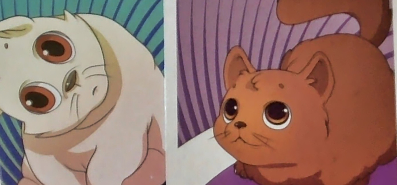
Sometimes a game gets just a little extra something in terms of graphic design or art. It’s not necessary. For example, it could be as simple as giving animals some extra big eyes, with shiny little reflections, as Closet Nerd Games did for Kittens in a Blender (above). These cute cats, in fact, might be the best thing about the game.
And what about a game that has great mechanics, great art, AND just the right little touches? The combination can take a game off the charts.
Whimsy
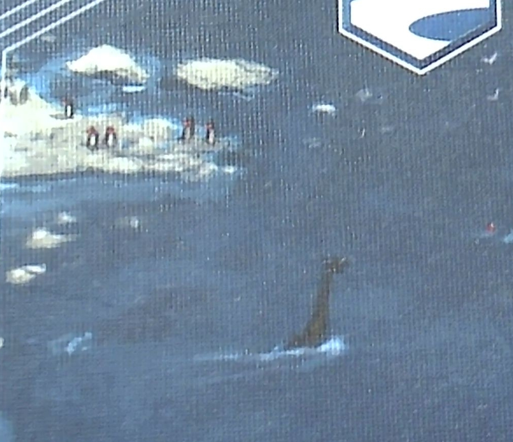
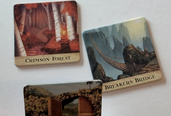
Scythe is a great example. There’s no reason why the artist had to put penguins and the Loch Ness Monster in one of the hexes of the board. Santa Claus also appears elsewhere, IIRC. Such details neither break the game, nor distract the player. Instead, they provoke some positive feelings and signal that the artist (and the publisher) cared enough to go beyond the minimum.
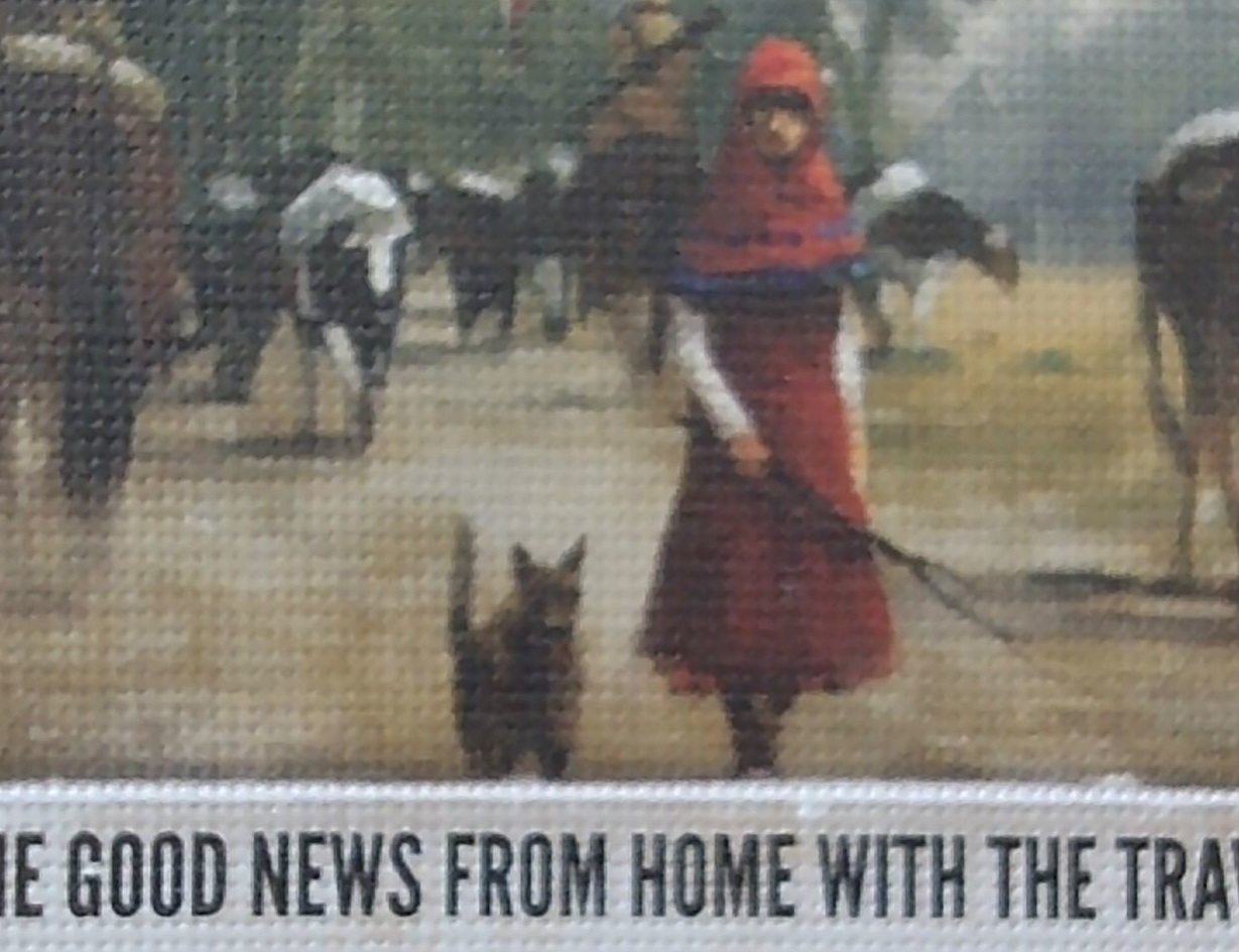
One card in Scythe also includes a cat. This is a running joke with Stonemaier, which almost always includes Jamey’s cats (or similar) somewhere in the game. Looking for the cats has become something of a Where’s Waldo for fans.
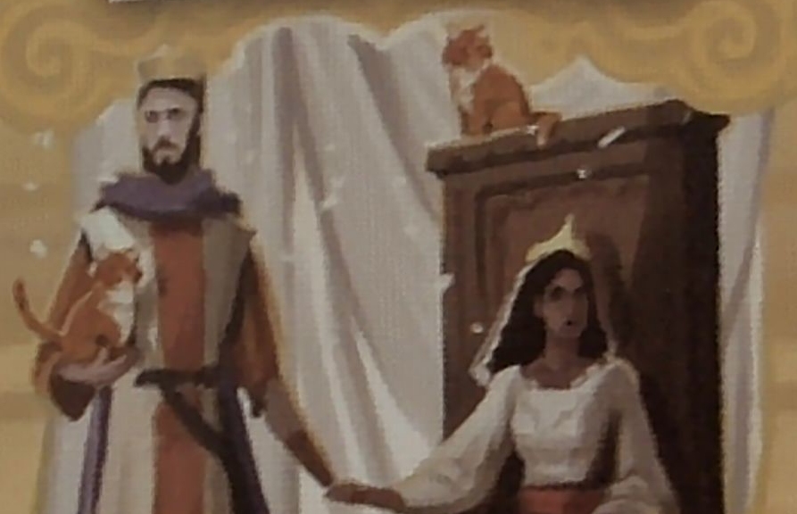
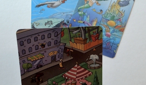
Tapestry’s cats, for example, appear on the Marriage of State tapestry card.
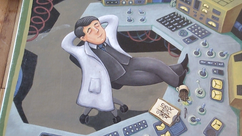
Goofiness can provoke positive feelings, as well. For instance, the worker portrayed on the cover of Power Grid seems relaxed — so relaxed from his tic-tac-toe game, in fact, that he’s accidentally knocked over his coffee at the controls of the nuclear power plant.
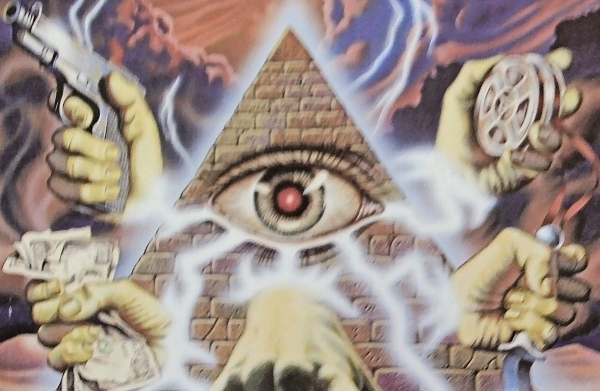
As another example, Illuminati’s cover art includes an all-seeing-eye pyramid with hands that hold paraphrenia associated with various cards in the game. It’s an absurd image and a knowing wink to the player that says, “Please suspend your disbelief, as we’re entering the realm of fiction.” (Or are we?)
Clever popouts
Alert graphic designers spot ways to link little details of the design with these knowing winks, with the theme, with the brand, with the game’s mechanics, or with aspects of the game’s meaning.
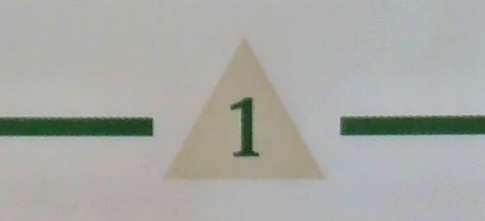
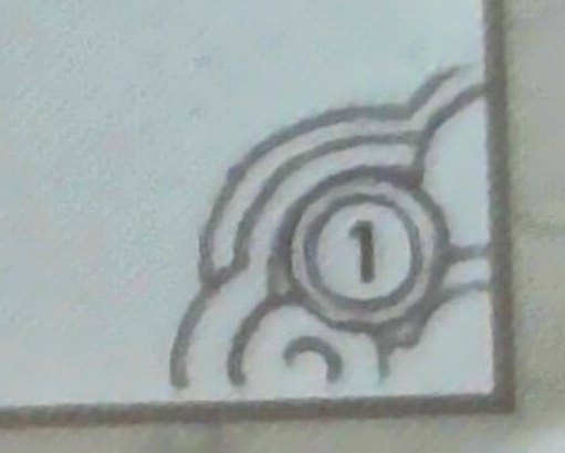
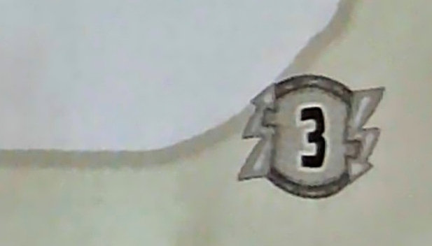
The popouts that frame page numbers in the rulebook are a great place to do this. For example, Illuminati’s are pyramids. Tapestry’s are little clouds that echo the line art on tapestry cards. Power Grid’s are electricity-lightning symbols that echo similar annotations on the board.
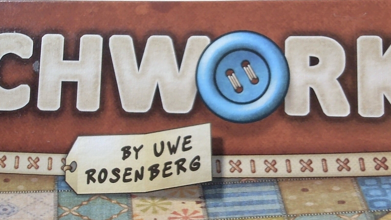
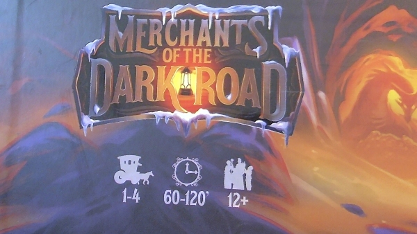
Another common place for such linkages is in the popouts for information on the box. I discussed several examples of thematic frames for titles in my post a few weeks ago. Another example is the frame for the designer’s name on the Patchwork box. In addition to its thematic frame for the title, Merchants of the Dark Road has thematic icons for each of the game’s stats (player count, time, and player ages). The corporate brand mark on Here To Slay has a unicorn horn — a reference to the fact that the publisher’s early big hit was Unstable Unicorns.
Component details
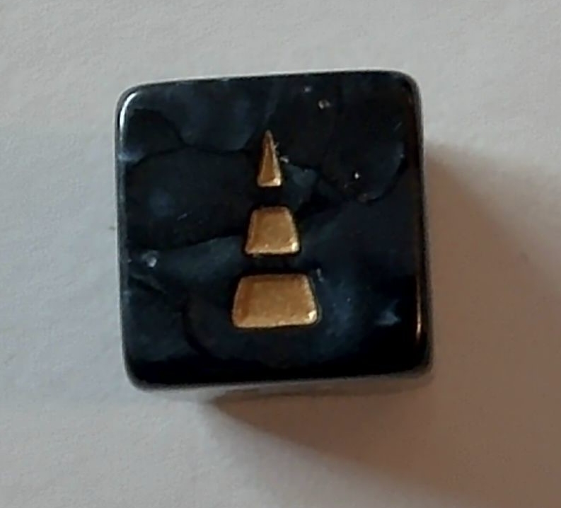
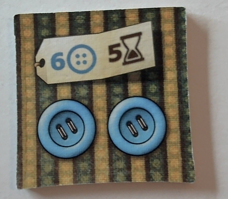
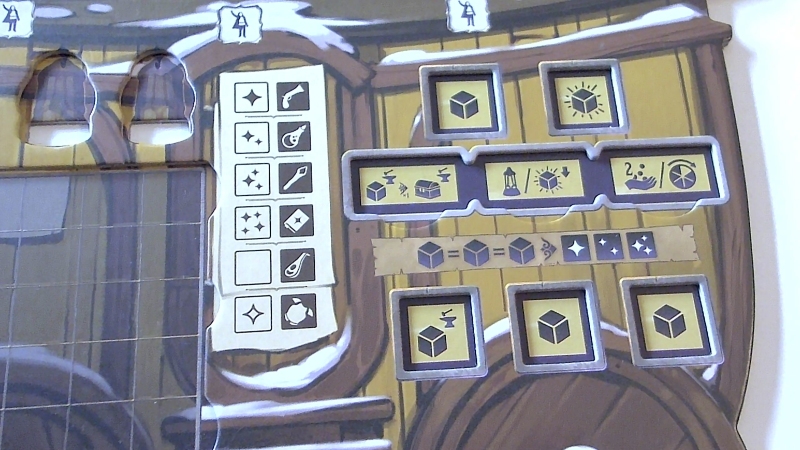
A clever designer will further link details like those above to the components. For example, the die in Here to Slay has a single unicorn horn to represent a roll of 1. In addition to an unnecessarily chunky die, Rolling Realms has decorative line art on the cards that reinforces the theme while adding little reminders to gameplay mechanics, as in the card for Between Two Castles below. Patchwork’s chunky tiles use buttons to represent the key resource and method of scoring (rather than stars or laurels, as found in many other games to represent victory points).
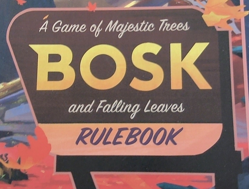
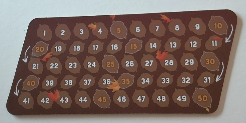
Another game that does this well is Bosk. A frame resembling a National Park sign serves as the popout for the title on the cover, and the chunky scoring board echoes that shape.
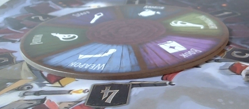
Speaking of chunky, sometimes a component simply has unnecessary heft or quality — another signal that the publisher decided to take it over the top. For example, Forbidden Island has chunky tiles, Eye Found It has quite thick cardstock (handy as it’s a game for 3+ year olds), and Merchants of the Dark Road has a nice thick wheel attached to the board with a magnet.
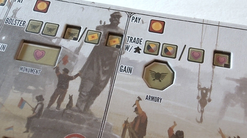
Jamey Stegmaier routinely mentions cool components in his videos, as having a special component is a goal in every Stonemaier game. For example, Scythe has handy double-layer boards to help players with setup. Merchants of the Dark Road does the same to help guide dice placement.
Other packaging details
Every component of the game’s packaging presents an opportunity to impress the players. I’ve previously written about non-box packages that stand out. Another opportunity space is any packaging inside the box, such as inserts to keep components organized. For example, Power Grid’s cardboard insert includes illustrations evocative of the cover art. Unnecessary — yet nice.
Perhaps an endless list
I could continue with a hundred more examples in a dozen areas such as:
- Texturing on the box
- UV coating on the box
- Popouts for headings in the rulebook
- Iconography taken from the game to add interest on the backs of cards
- Use of pleasantly tactile rubber or other materials for miniatures
- Use of textured material for the rule book or other components
- Inclusion of faux texture in the background of popouts
- Historically accurate line art in page gutters
- Tasteful little details in the line art of logos
These and hundreds of other little details signal that “good enough” isn’t good enough for a publisher. Most of them cost very little. Yet they can deliver significant value in terms of communicating respect for the customer, promoting positive feelings, and amplifying thematic immersion.
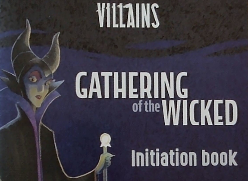
After all, what other reasons could there possibly be for referring to a simple rule book as an “Initiation Book?”
Notes to self
- Always consider what feeling the game should evoke (e.g., humor/whimsy/dark humor).
- Always brainstorm how to trigger those feelings using motifs, illustrations, or other graphics.
- Specifically spend time thinking about game titles, page numbers, and rulebook headings.
- Devote time to analyzing the tradeoff of cost versus boosted components.
- … while staying alert to the risk of overkill.