Scenario/mission mechanic: “A game system that can be applied to a variety of different maps, starting resources and positions, and even different win and loss conditions. These variable conditions can be assembled into a broader narrative or campaign, or they can be entirely disconnected from one another.”
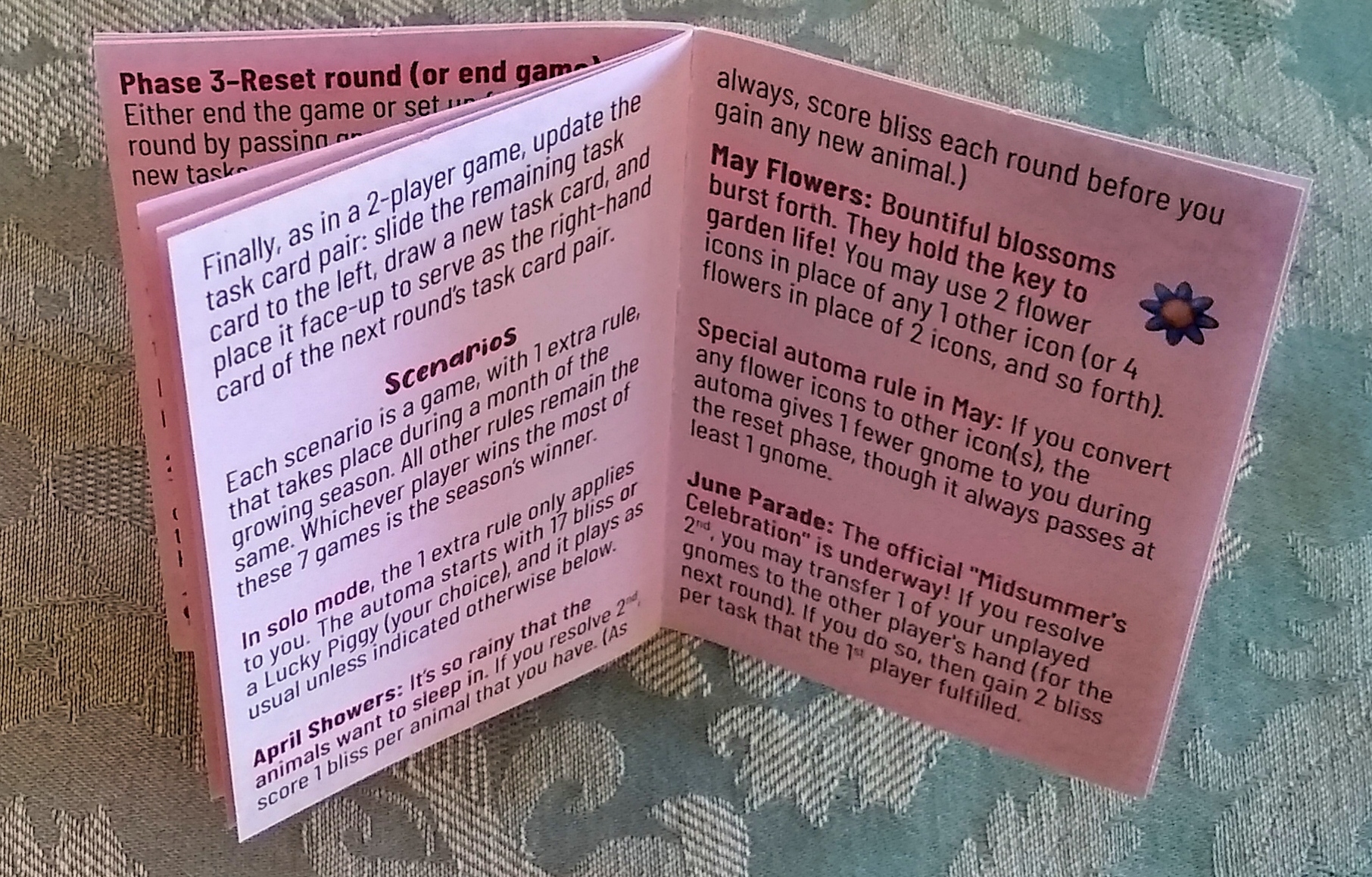
Today, the Kickstarter campaign for Gnomadic Gardeners reached 100 backers, unlocking the stretch goal of scenarios. Each scenario is a game, with 1 extra rule, that takes place during a month of the growing season. All other rules remain the same. Whichever player wins the most of these 7 games is the season’s winner. The print-and-play edition will also include these scenarios, though I’ll organize the booklet content into a format that displays easily on a smartphone or that prints in 2 columns on regular office paper.
This event creates an opportunity to reflect on a few of the other ways that publishers have represented, with a few comments about what I like about each.
Quarriors: Stand out from the rules
My copy of the Quarriors rulebook contains 5 scenarios. I say “my copy” because I have some sort of mega-edition that includes many expansions. Scenarios vary considerably in length, ranging from 1-4 pages (8.5″x11″).
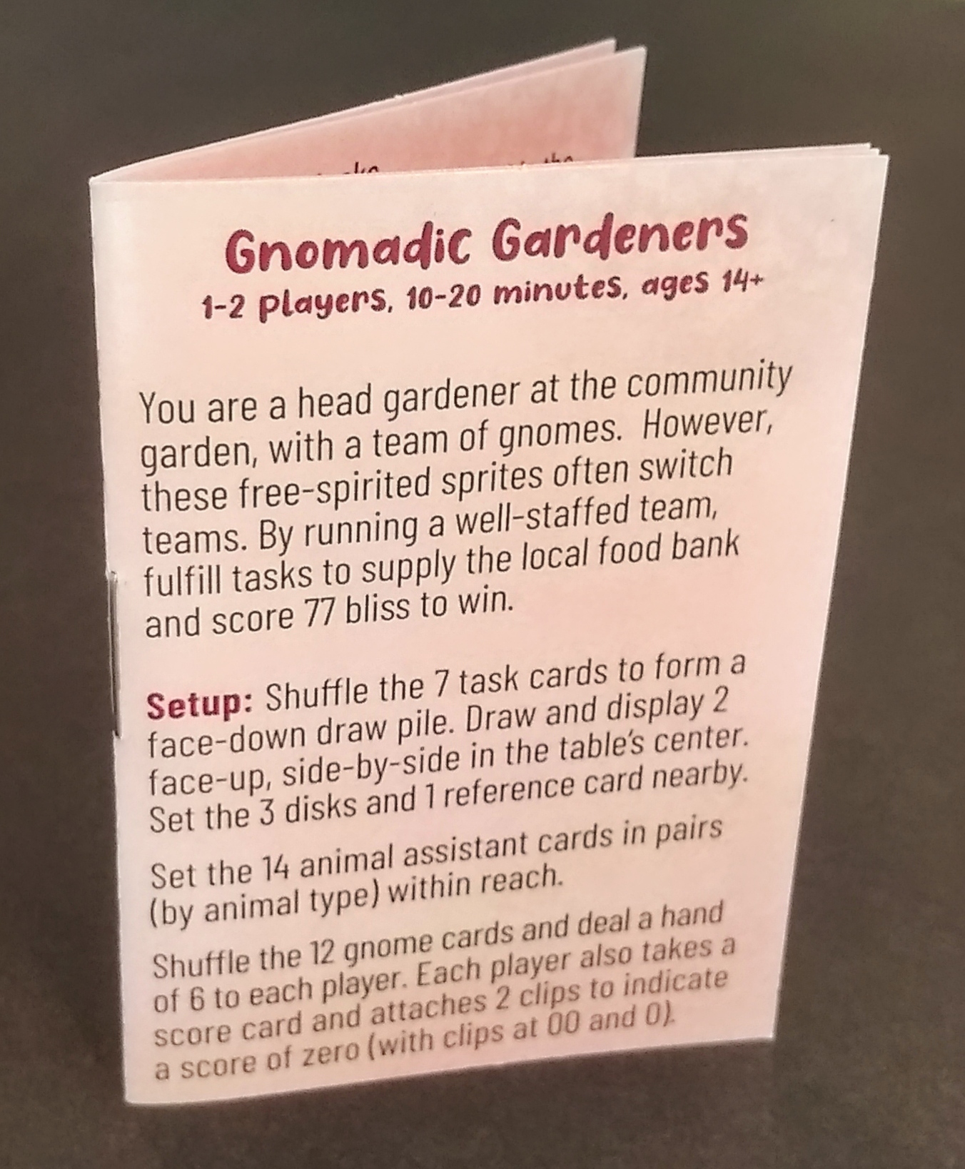
Perhaps because they came from different expansions, the scenarios’ graphic design and layout differs considerably versus the rest of the rule book. For example, the left side of the photo below shows the last page of core rules, while the right side shows a scenario. For instance, the page borders differ, the flavor text (introit) isn’t anywhere in the main rulebook, and the card insets are angled (vs orthogonal in the rest of the rules). Moreover, these and other graphic elements vary from scenario to scenario.
Do I like it? Well, it certainly makes it easier to notice the scenarios when paging through the main rulebook. In addition, the willingness to break with patterns makes it possible to customize the fonts and other elements to the specific theme of each scenario. I especially like the leading W of the scenario below. One of the other scenarios, Quarmageddon, has a particularly fun rendering of the font for the scenario title, which looks like an earthquake cracked the letters. Wisely, WizKids retained the same wordmark for the Quarriors! title above each scenario.
Overall, these little tweaks make the scenarios feel fresh, just as they themselves help to keep the game fresh.
Tapestry: Maintain consistency
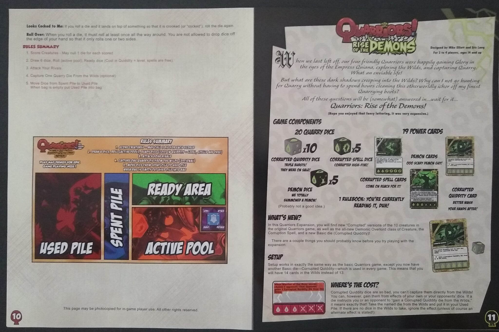
The Atlantis campaign in the 1st Tapestry expansion (Plans and Ploys) includes 5 simple scenarios. Each fits on a single 7″x7″ page of the Automa rulebook. Because these aren’t buried inside a long rulebook, there’s less need for the scenarios to look different.
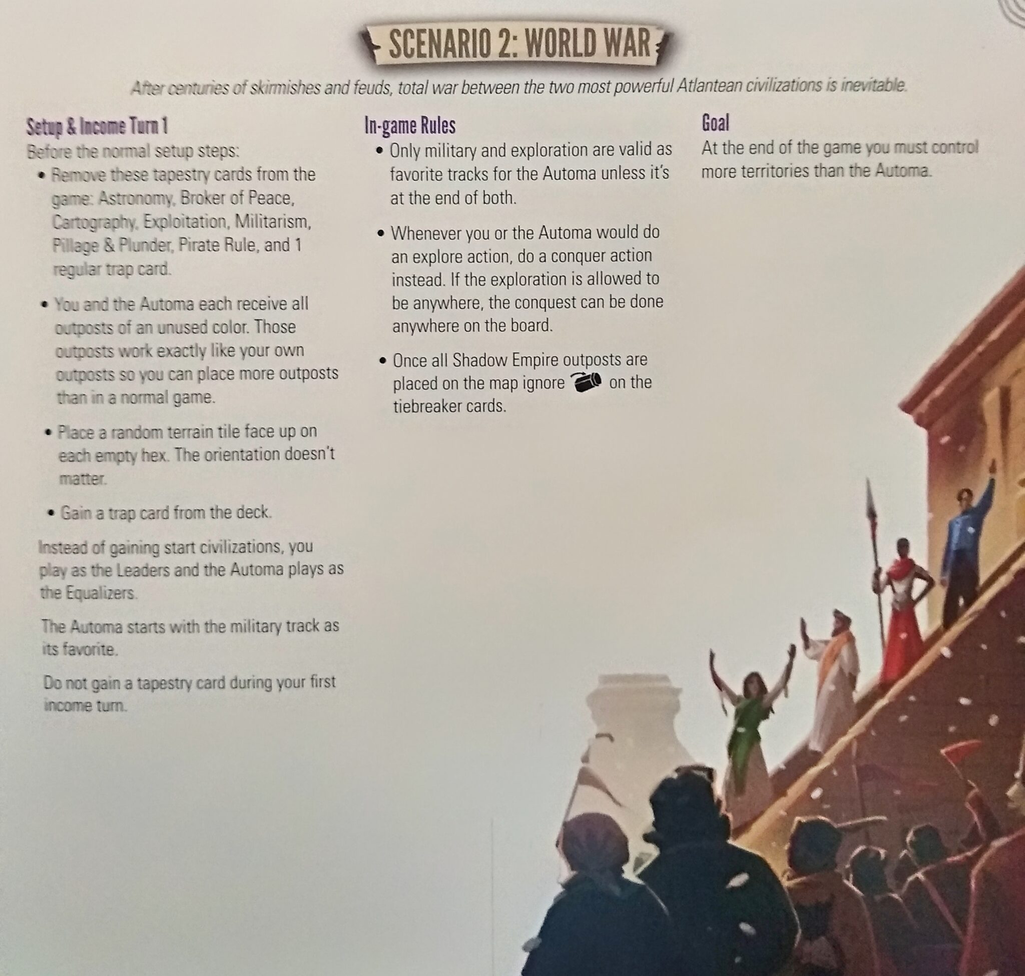
I like the fact that the scenarios’ graphic design closely resembles that of the core rulebook. Stonemaier reused some existing art to illustrate the scenarios (the illustration below is that of the Leaders civilization), which is great for cost-effectiveness and consistency with the rest of the game’s appearance. The scenario booklet also has the same high-quality, textured paper that Stonemaier used in the core rulebook.
Overall, these scenarios reflect the fact that Stonemaier (and Tapestry specifically) has a stronger focus than WizKids on an understated, professional aesthetic. Whereas I find the Quarriors style above to be mentally jarring and a bit difficulty to process cognitively (due to long paragraphs and distracting images), the Tapestry rules are quick and easy to read (surrounded by lots of whitespace) so that I can get right into the game.
Charterstone: Accumulate increments
This final game differs considerably from the previous two, in that a Charterstone campaign’s scenarios compose a sequence of games that gradually unlock rules and other goodies. Each scenario may unlock multiple rules. Thus, the “unit of analysis” is smaller than a single scenario.
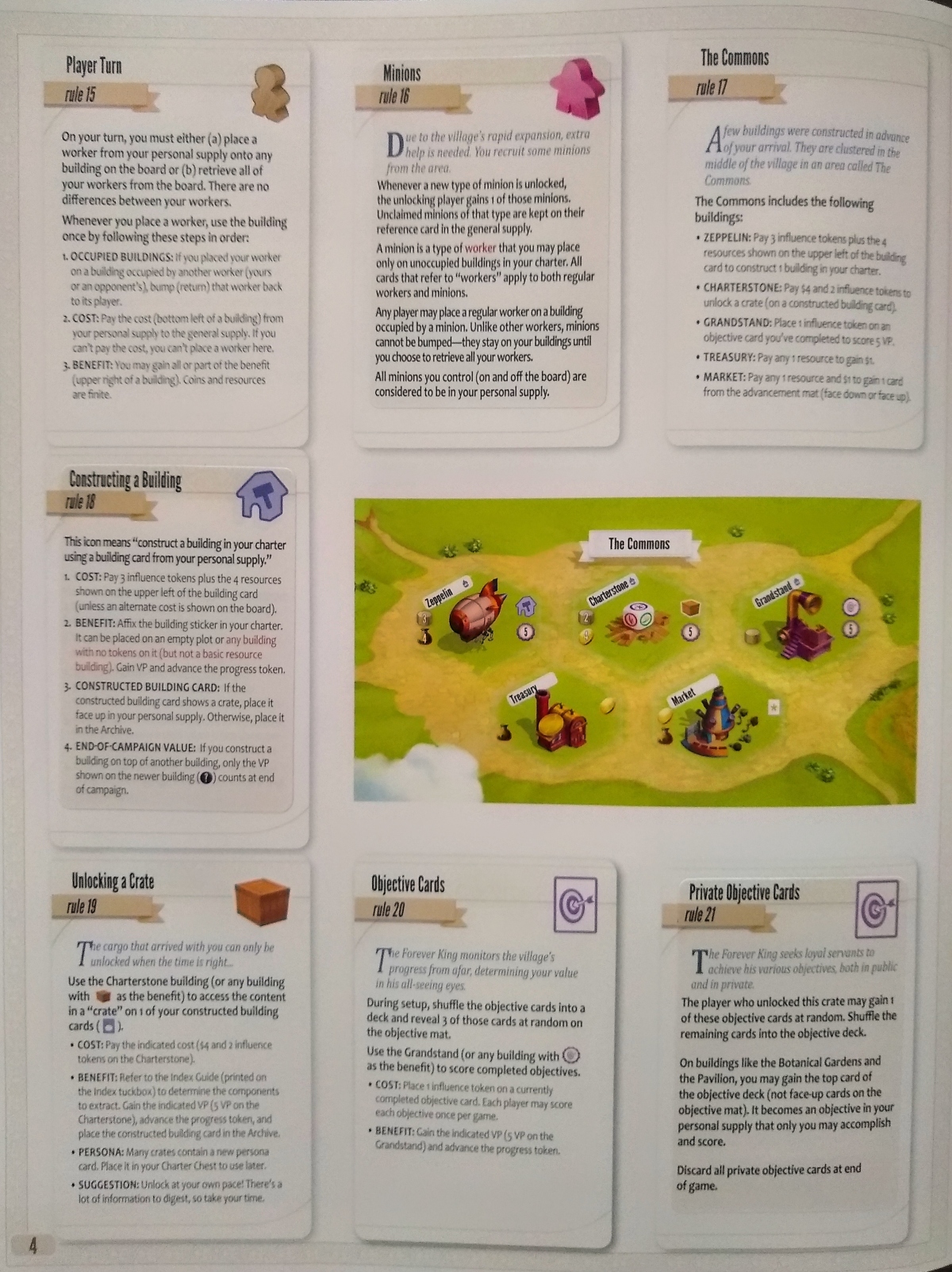
Each new rule is printed on a sticker, as shown in the following picture. Players accumulate these stickers to build up the full rule book. Thus, the scenario booklet ends up having lots of small bits. The constantly changing rules, as well as the incremental nature of the resulting rulebook, does impede memorizing and obeying the rules. Personally, I didn’t have much desire to play the physical version, but I have the digital edition and look forward to playing.
That said, I really like the tactile, interactive nature of a legacy scenario booklet. It’s not just something to be read. It’s something that the players get to manipulate.
As far as freshness, I always worry that the destruction of a legacy game impairs its long-term freshness — which inspires me to wonder what Jamey has planned for the open-world game that he has resolved to finish designing this year. Will it include little bits of stuff that we can interact with, within a scenario booklet? Will we need to destroy the booklet legacy-style, or will it still retain replayability as a open-world game usually does?
Notes to self
- If scenarios are in the rulebook, find ways to set them off so they don’t get lost.
- If scenarios are separate, then there’s less risk that they’ll get lost.
- Either way, try very hard to avoid making the reader turn a page within a scenario.
- Reusing art from the rest of the game seems fine for illustrating the scenarios.
- Consider how a scenario booklet can provide interactivity without the need for destruction (legacy-style).
