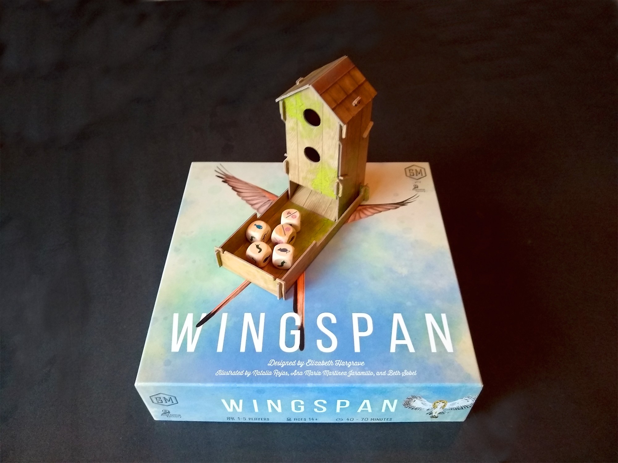
Stonemaier Games integrates a special component into every game. Wingspan includes a nifty dice tower, which the players use to roll dice. These indicate various foods currently available in the ecosystem for feeding the birds that players collect in their sanctuaries.
The tower contributes to table presence in at least three ways. First, it’s big and three-dimensional. Second, it makes a rattly noise to attract attention from passers by. Finally, it provides a nice tactile dynamism that requires players’ bodies to move as they reach across the table to load the dice. People moving at a table, interacting with a noisy 3D object, is a lot more attention-grabbing than silent faces grimly contemplating their tableau!

The dice themselves are a natural wood color, which aligns well with the theme. Although the icons include a few subtle touches, such as the tentacles on the slug’s head, the iconography overall is clean enough to easily distinguish all the shapes from one another (although the yellow wheat icon blends into the brown wood color a bit). Readability is particularly important here: players need to make out the icons against the subtle texture of the wood’s grain, and the icons on dice faces are also a bit smaller than 1/2″, which is approximately the normal size that Stonemaier uses for icons that players read from across the table.
(Incidentally, just as Wingspan uses open drafting for selection of dice, players similarly draft cards from a common pool. Those cards’ effects include significant complexity, which can’t be reasonably fit onto a card at 36pt or 1/2″ text. How did Stonemaier make sure that players could read those cards? They provided a handy carrying tray that houses the cards, enabling players to pass around the pool of available cards. I’ve written about this tray in another post that also goes into how the cards address players’ aesthetic expectations.)

Finally, the dice tower itself includes wood-grain texture coordinated to the dice as well as an illustration of moss. It would have been cool if the tower were made of real wood rather than cardboard, so that players could actually feel the texture, but alas such things don’t come cheap. I like how the moss’s rendering is a bit fluffy or wispy, which coordinates with the rendering of the clouds/sky on the game box. That softer look helps to accentuate the crisp lines and colors of the birds, who of course are the stars of the show.
Dice towers have been around for over a thousand years, and BGG has an old thread about players’ hand-made dice towers for other games. Some other games, such as Shogun, include towers. I’m not sure that I’ve ever seen a dice tower that I liked as much as Wingspan’s, from the standpoint of thematic and aesthetic integration with the rest of the game.
What other games can you think of that have a great dice tower?

4 thoughts on “Wingspan’s Bird Feeder Links Theme to Table Presence”