Scythe, designed by Jamey Stegmaier at Stonemaier Games, helped inspire me to become a professional game designer a few years ago, so it’s fitting to start my blog here. Jamey, in turn, was inspired to create the game by the 1920+ world depicted by artist Jakub Rozalski. He credits Jakub’s work with helping to drive the massive amount of early interest that Scythe attracted.
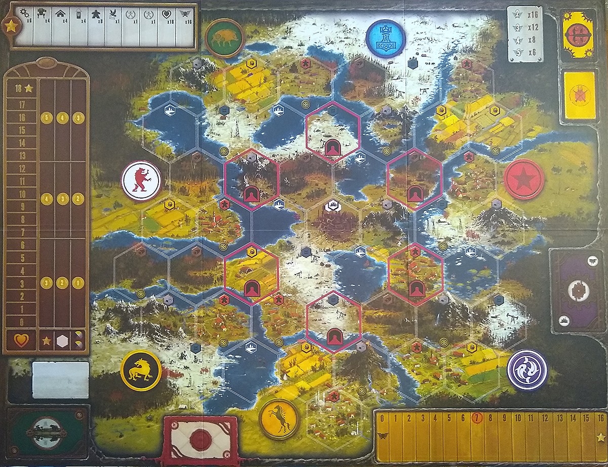
While the game has hundreds of compelling images, the biggest is its massive board. When you wallpaper your dining room table with this 24.5″x32″ behemoth, your attention will sink deep into its incredible level of colorful detail. Today we’ll focus on the board and come back to the other components another time.
The rich colors indicate the different terrain types, each of which produces a different resource or, in the case of the mottled red-and-green villages, produces meeples. Players subsequently consume these resources to create structures and mechs as they carve out nations in a broken world.
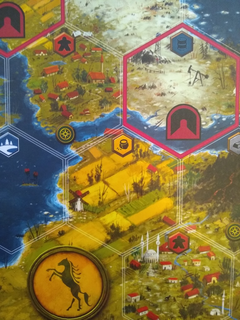
The buildings vary in each village and correlate with their position in the map, which is thematically set in Eastern Europe. Religious buildings in the east have steeples with a Russian flavor, while the white religious building in the south (as in the screenshot here) closely resembles Hagia Sophia. Details like these help the map feel like it corresponds to a place that could have been real, had World War I gone differently.
Many territories include whimsical touches, such as the hot air balloon and submarine in the next picture below. I seem to recall finding a Santa Claus and a Loch Ness Monster somewhere on the board but can’t find them now.
The central territory depicts the factory, a unique and powerful location that provides upgrades. As suggested by the triple-hex icon shown below, the factory scores 3 times as many points as an ordinary territory (an implementation of the King of the Hill mechanic). By minimizing detail at the map’s periphery, where colors trail off in both brightness and saturation, the board does a good job of drawing the viewer’s attention toward the center. Bright red borders around the map’s tunnels (which facilitate a movement mechanic to increase player interaction) further draw attention to the middle.
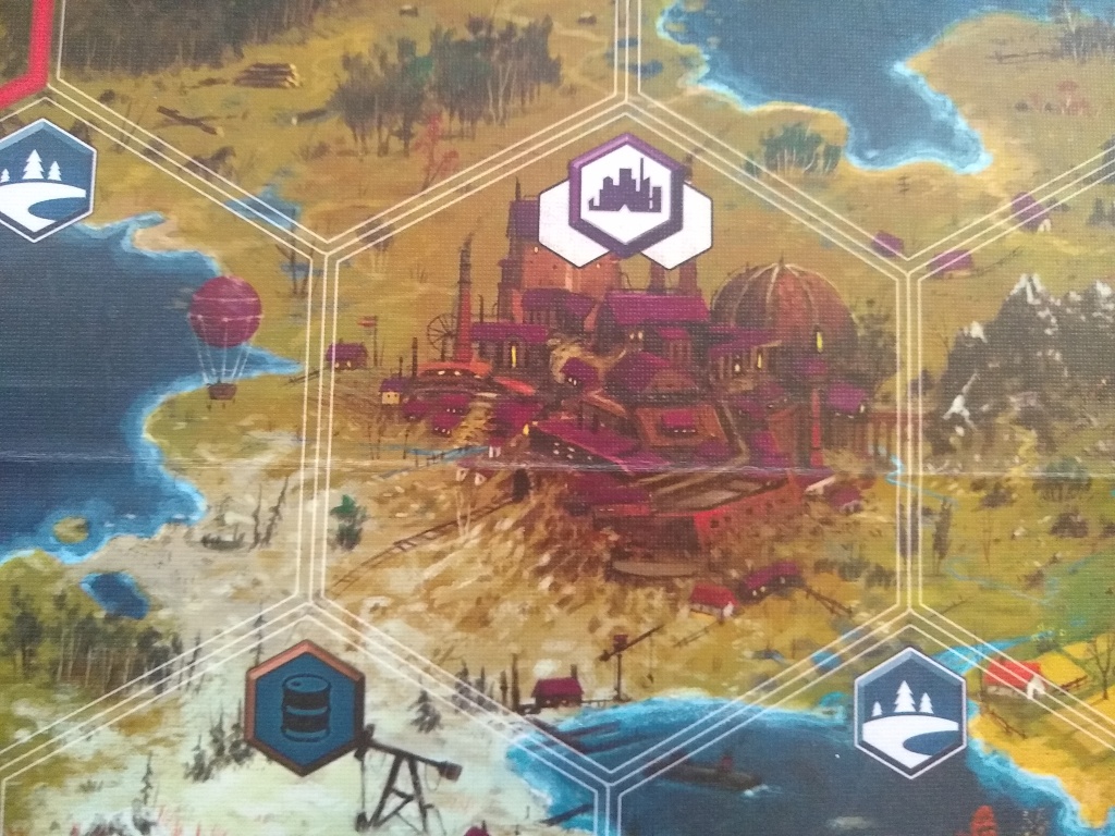
I like the gritty feel that pervades the factory and other territories. The art doesn’t shy away from depicting the dirty reality of resource production: for instance, you can see an oil pump plunging into the pristine snow in the bottom of the picture above, as well as despoiled timberland in the top of the picture. This grittiness is also evident in the borders of the popouts around the edges of the board, where draw-piles of cards reside. (Those cards’ visuals, as well as the mech miniatures, also communicate a raw, authentic texture.)
Probably what I love the most about this art is that even though realism drives the subject matter, the style is impressionistic rather than photographic. Although the lines in the graphic design are sharp and clear, the lines in the art are often fuzzy. Noise from borrowed texture is visible everywhere and especially in areas where high and low value collide, such as the shoreline beneath the factory space. (Other heavy use of borrowed images has caused Jakub some controversy. Please log your references, art friends.)
The result strikes me more as concept art than finished illustration. I absolutely love the result because the 1920+ world depicted is supposed to be an unfinished (broken) world that the players are working to develop in the image of their respective nations. Given the fit between the art’s raw unfinished feel and the theme of a raw unfinished world, I’m surprised that more games with a similar theme and mechanics don’t make heavier use of illustrations that look like concept art (either in terms of process, result or both).
What other game boards also look very similar to concept art?
7 thoughts on “The Big Game Board in Scythe Is Concept Art Writ Large”