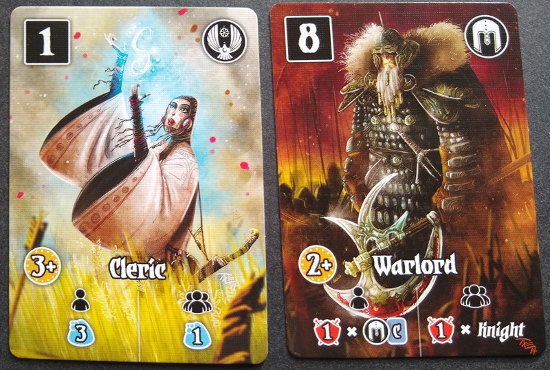
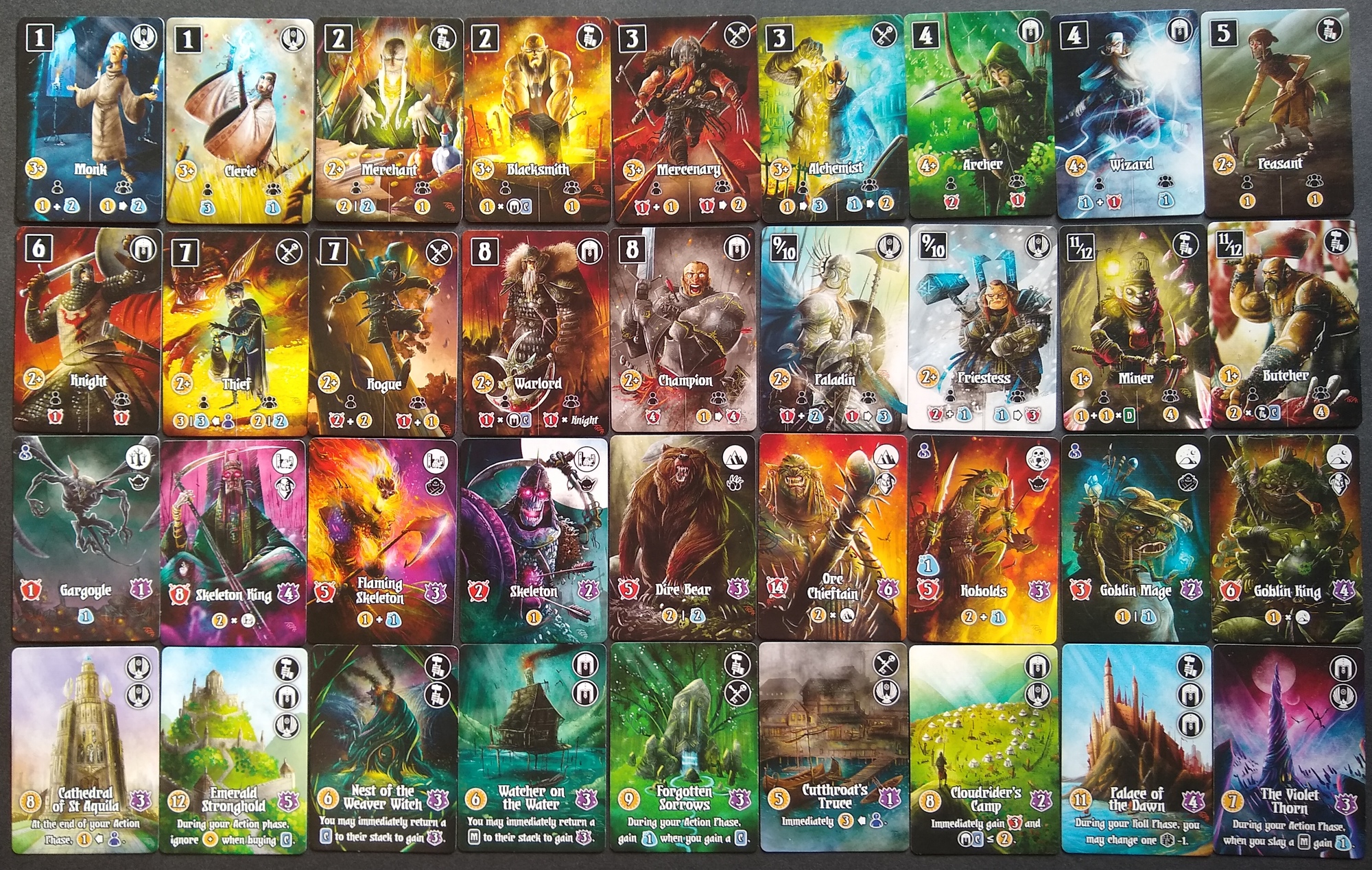
Valeria Card Kingdoms is one of my favorite lightweight games. For one thing, I’m a sucker for tableau-centric engine-builders. But just because a game lets me collect cards doesn’t mean that I’m going to love it. Perhaps the biggest reason that I love Valeria is its art. Slaying the game’s monsters, recruiting its citizens, and buying its domains feels great primarily because I can get my hands on really artistic cards.
And Valeria Card Kingdoms only has cards. No board, no player mats, no miniatures, no dice tower, no buzzer sounds, no wacky catapult that lets you fling other components across the board. Just cards. How can a game with just cards feel so engaging?
Artist Mihajlo Dimitrievski (aka “The Miko”) pulls out all the usual tricks: highly-saturated colors, strong value contrast, focus to the foreground figure, and copious atmospheric effects on the background. The cards are full US poker size (2.5″ x 3.5″), affording generous space for illustration.
Three additional features in the art stand out.
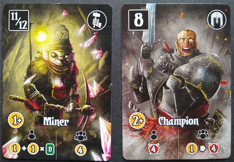
First, the artist uses many attention-grabbing shapes. I’ve included a de-saturated version of a couple cards below so the shapes are isolated from colors. The art includes spears and other objects with sharp points, which are well-known to draw the viewer’s attention. Perhaps less widely recognized is the role of strong curves in drawing and holding attention, which the art accomplishes with hugely hyperbolic curves (pun intended) that exaggerate proportions beyond belief. (If my head was that small in school, imagine the nicknames people would have given me!)


Second, after having used curves and sharp corners to get you to even look at the cards, the artist draws you in emotionally with the hyperbolized facial features of characters. I mean, there is something deeply wrong with the guys depicted in the cards below. I don’t think I’d like to have a beer with either of them.

Finally, many cards capture a dynamic moment. They depict live action, not poses. In the examples below, the blacksmith has just struck the anvil–I find myself imagining a mighty CLANK. The archer has just let loose an arrow literally bending as it flies forth to fly. The sparks of the blacksmith feel hot against my mind; the rain of the archer is cold upon my gaze.

The artist employs similar and other techniques to make the monster and domain cards attention-grabbing, as well.
What other cards-only games have awesome table presence, and what techniques do you notice in the art to snag your attention and draw you in?

6 thoughts on “How Does Valeria Grab Attention Through Awesome Card Art?”