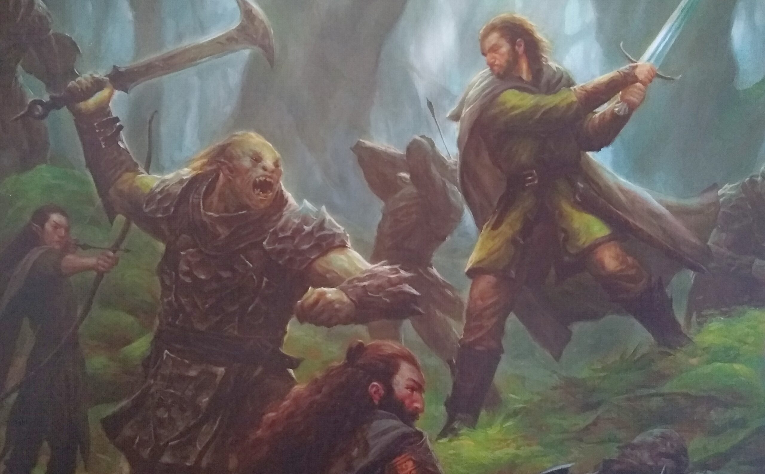
The box of Lord of the Rings: Journeys (LOTR) is what got me to pick it up and read the back. It was the orc with the axe-blade who hooked me, so to speak. Look at those teeth. Look at those eyes. He’s ready to go. The protagonists’ faces are good, too. The guy on the bottom left looks really tired. The guy in the center looks ready to give up. My only disappointment is that the protagonist faces don’t match those of the actors in the movie, but that probably would have cost extra.
Facial focal points
Every compelling work of art includes a primary focal point and, often, a few other points for the eye to linger. Da Vinci’s Mona Lisa’s eyes. Botticelli’s bodice of Venus. Michelangelo’s fingertips of God and Adam.
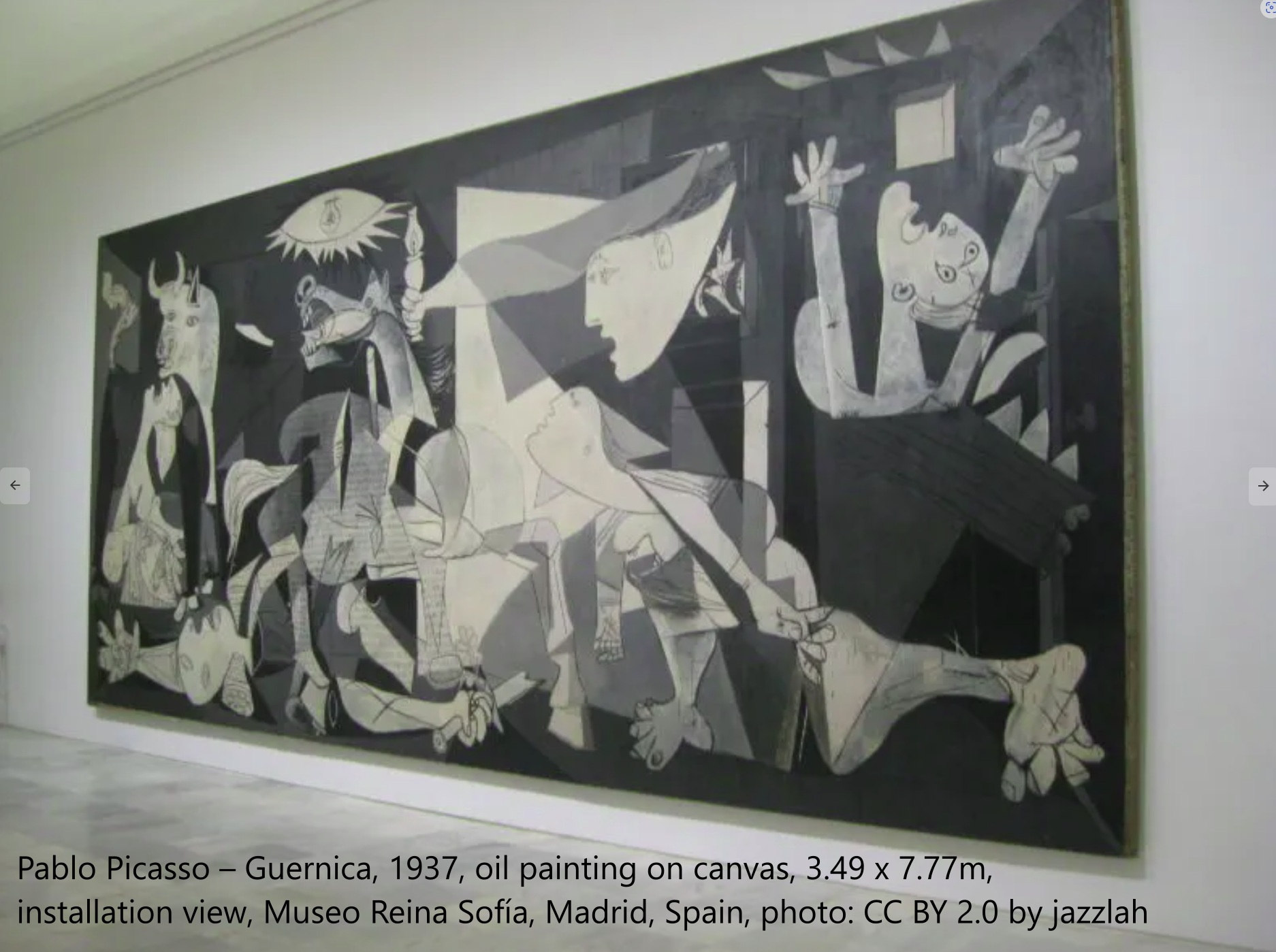
I have never trembled in fear at an art museum except when standing before Guernica in Spain. My eyes passed among the faces, and their anguish literally brought tears to my eyes. (It helped, of course, that I knew the horrific story behind the work.) The amount of detail is relatively high on the faces versus the blocky shapes of the background. All the curves are organic — and those of humans are deformed under the onslaught of beasts, sharps and shapes.
There is no substitute for faces. Humans are highly adapted to perceive minute distinctions in facial expression. Because of this depth of informational content, faces capture our own gaze. And, through the faces of others, we empathetically gain experiences unlike our own.
Great faces in games
I often study Andrew Bosley’s work for guidance, and Stonemaier’s Tapestry is a useful tool in that regard because the civilization mats provide a large area for examining his work in close detail. The mat illustrations are thematically crucial to the game because they illuminate how the players’ societies differ from one another. These differences among societies play out mechanically and contribute greatly to the game’s replayability.
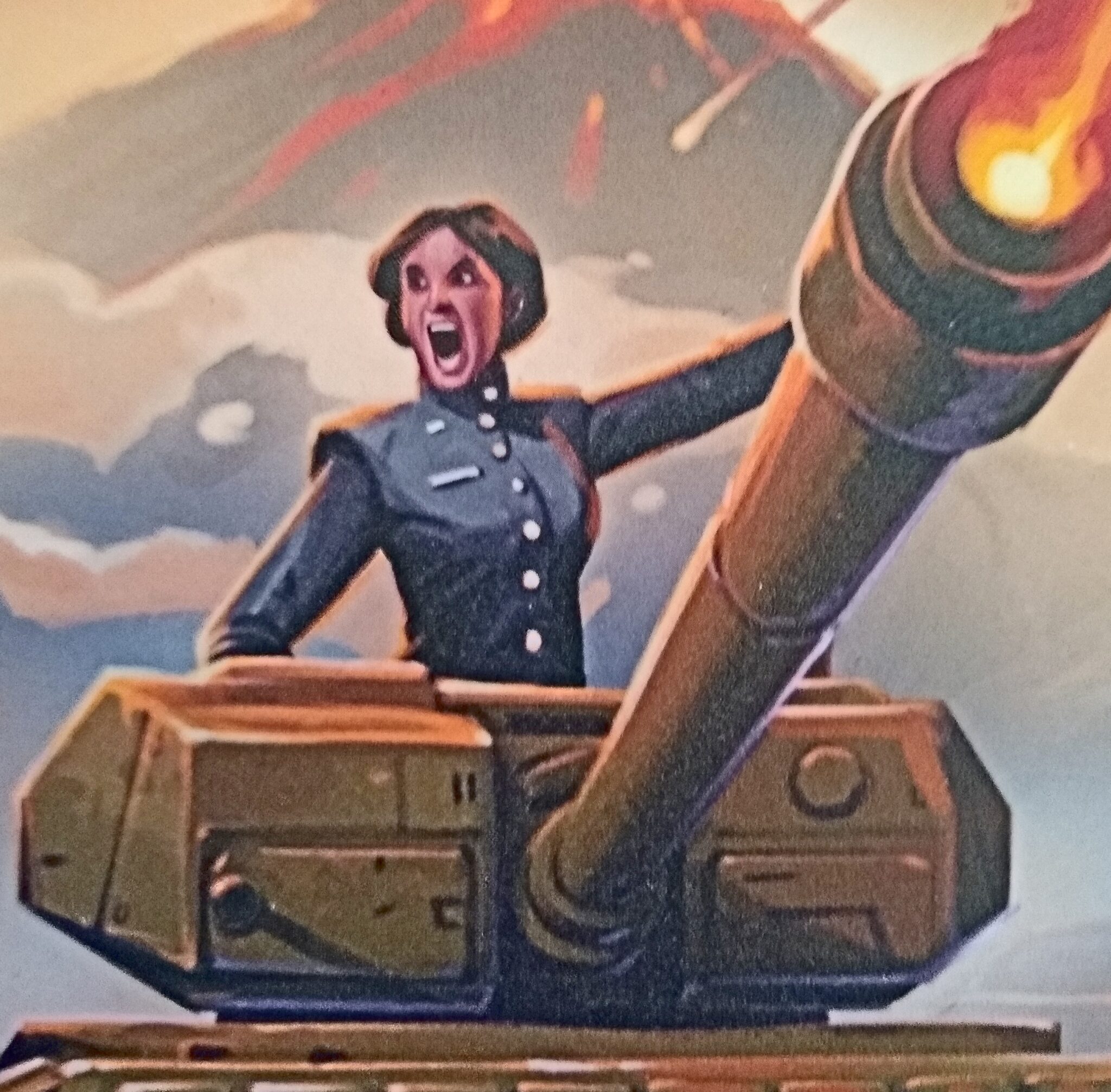
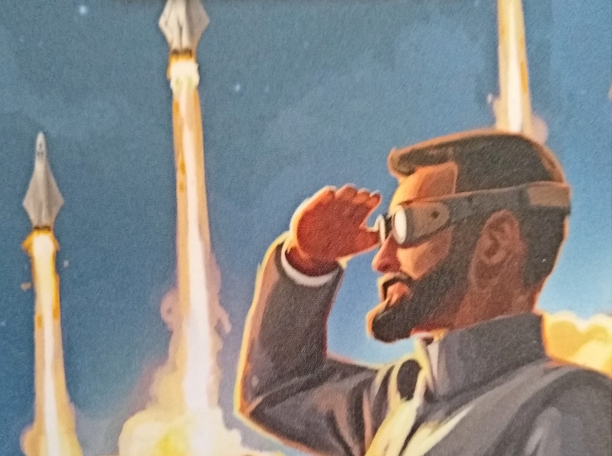
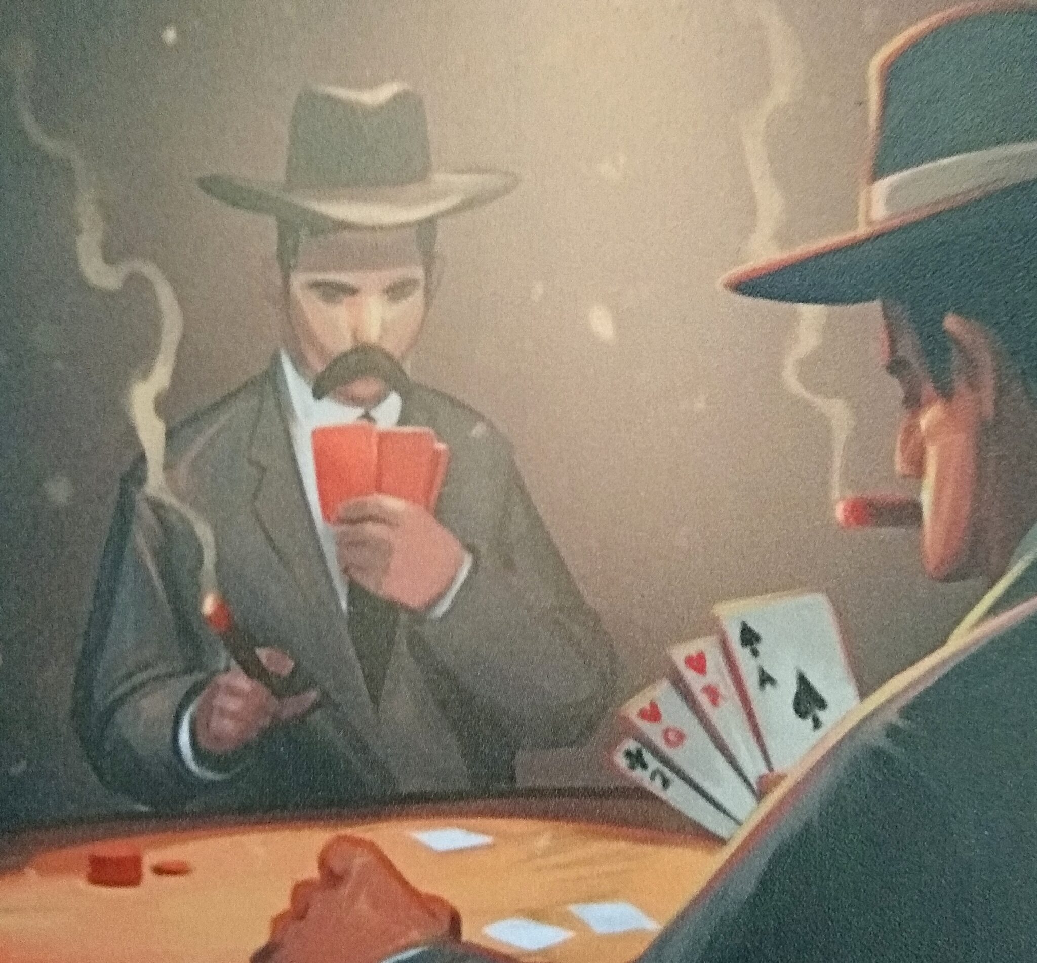
Because the mats are fundamentally about societies — i.e., people — it is fitting that quite a few of the most compelling mat illustrations include the faces of people. These faces communicate a wealth of emotion in most cases, whether hatred or pride, or sometimes intentionally no emotion at all (in the case of the Gamblers, below). Andrew does a great job of maintaining strong saturation and value contrast on the faces, with negligible distracting detail in the background. An exception, again, is the desaturation of the primary subject face in the Gamblers illustration.
I’ve previously mentioned The Miko’s faces in Valeria. He, too, uses strong contrast on the faces and hyperbolic shapes to draw attention. The faces, as well, communicate emotions such as serenity, resignation, malice, and blood-thirstiness. Like Andrew, Miko avoids unnecessary detail in the background.

Cards without faces
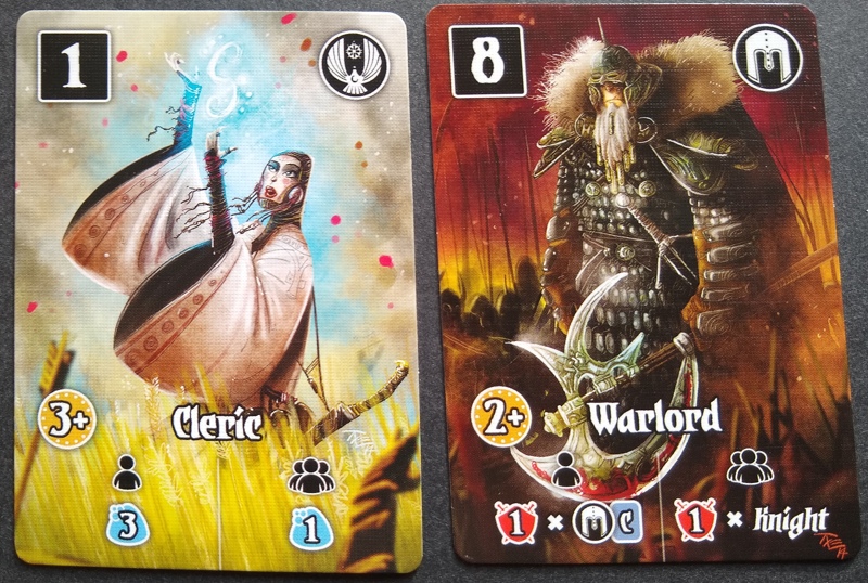
It’s worth noting that great cards don’t always need faces, nor do the faces always need to be large enough to display detail when other points of the illustration serve as suitable focal points. The top of the Warlord’s axe, above, is an excellent example. The face is tiny. The blade is huge. Message delivered!
Tapestry’s civilization mat for the Tinkerers (below) embodies a similar approach, placing the focus on a giant clock. Some of the LOTR illustrations, such as Ambush, divide the focus between the face and a contextual cue — in this case, a somewhat detailed rendering of a battlement in the background.
Some LOTR cards suffer from too much background detail. For example, the Wind-Walker is a perfectly competent character illustration with a nagging, overly-detailed wispy thing in the lower right. Perhaps its a wren? Perhaps a ghost of some sort? Maybe nothing at all?


When the card isn’t about people
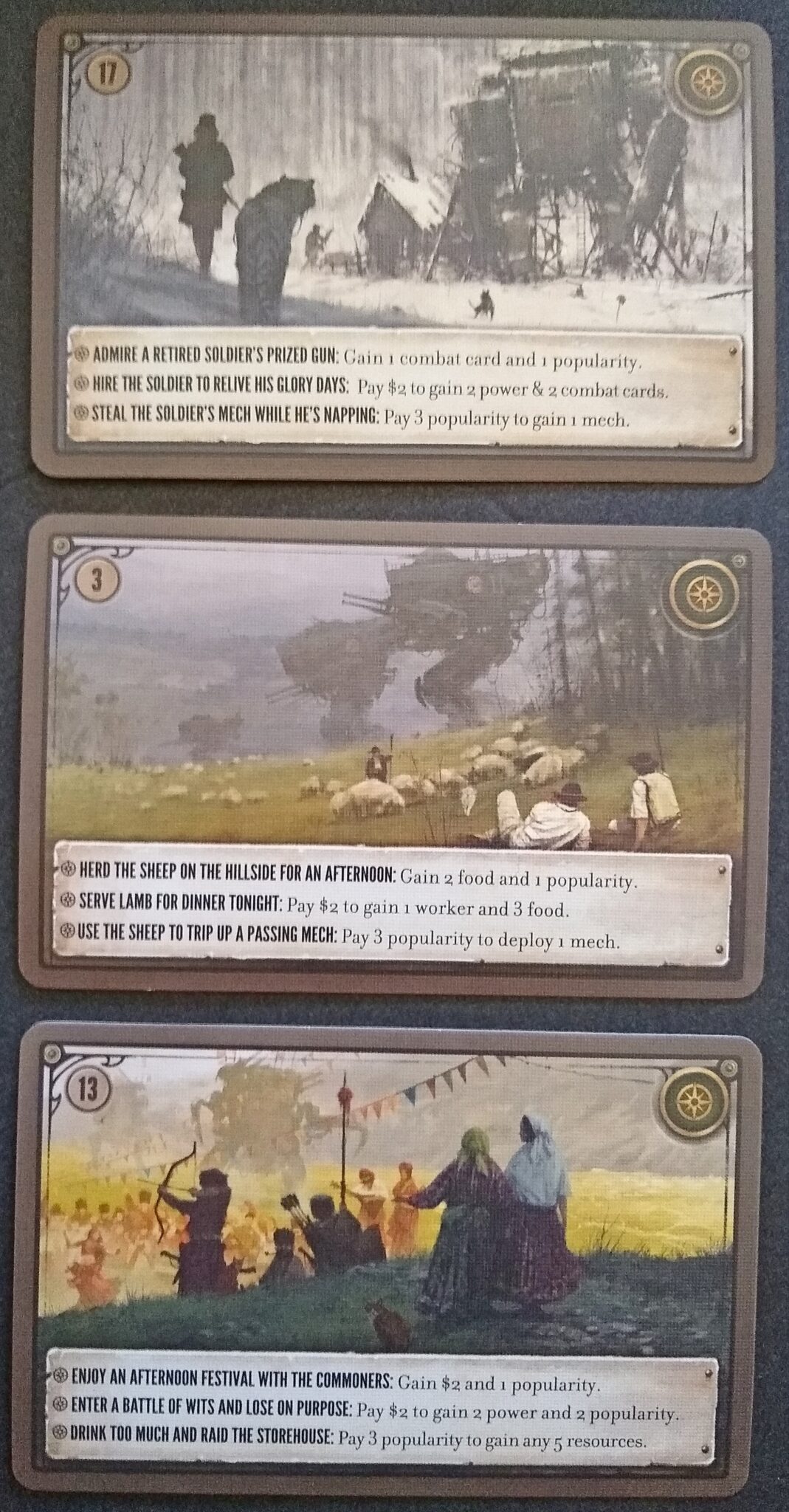
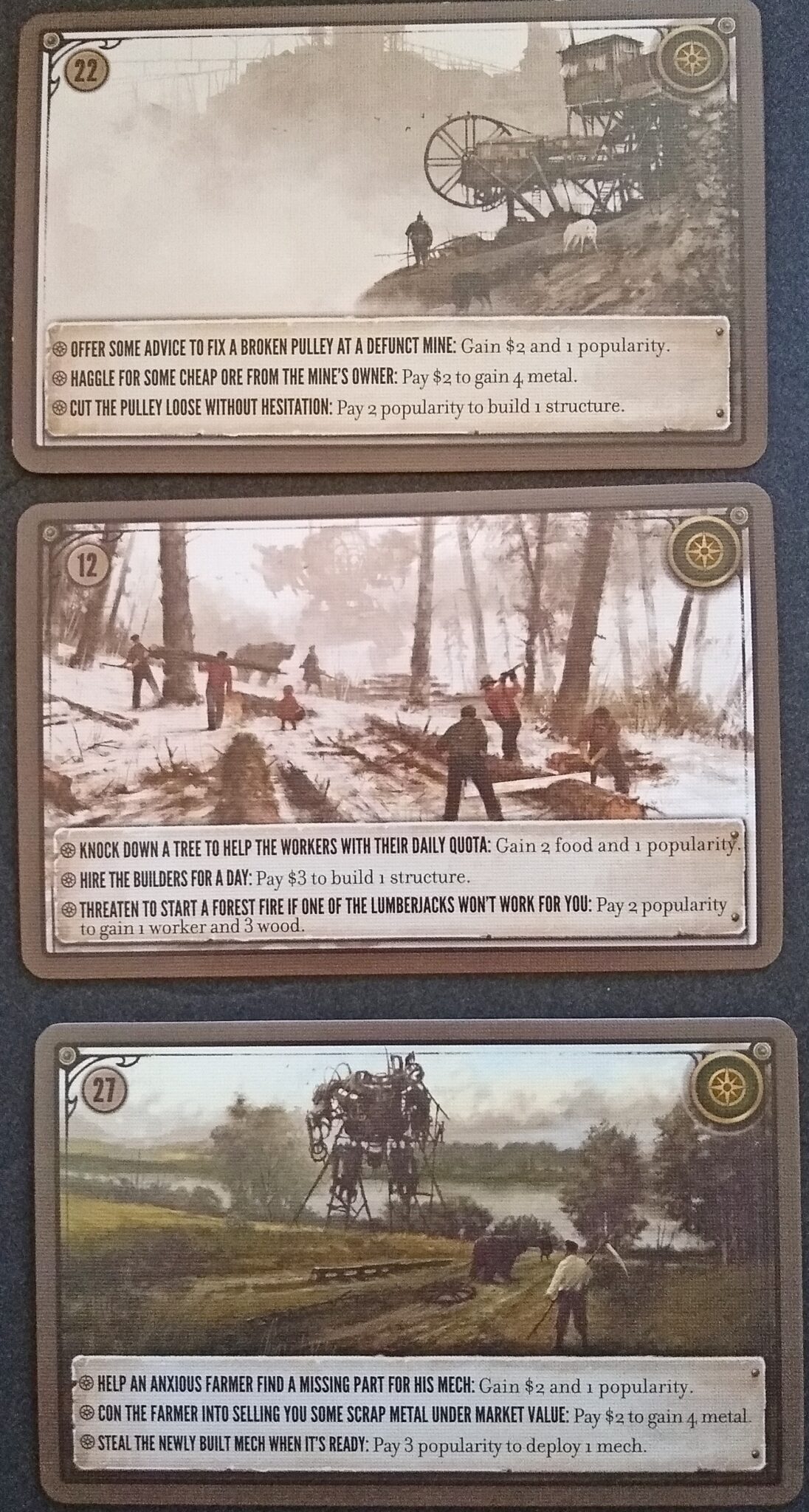
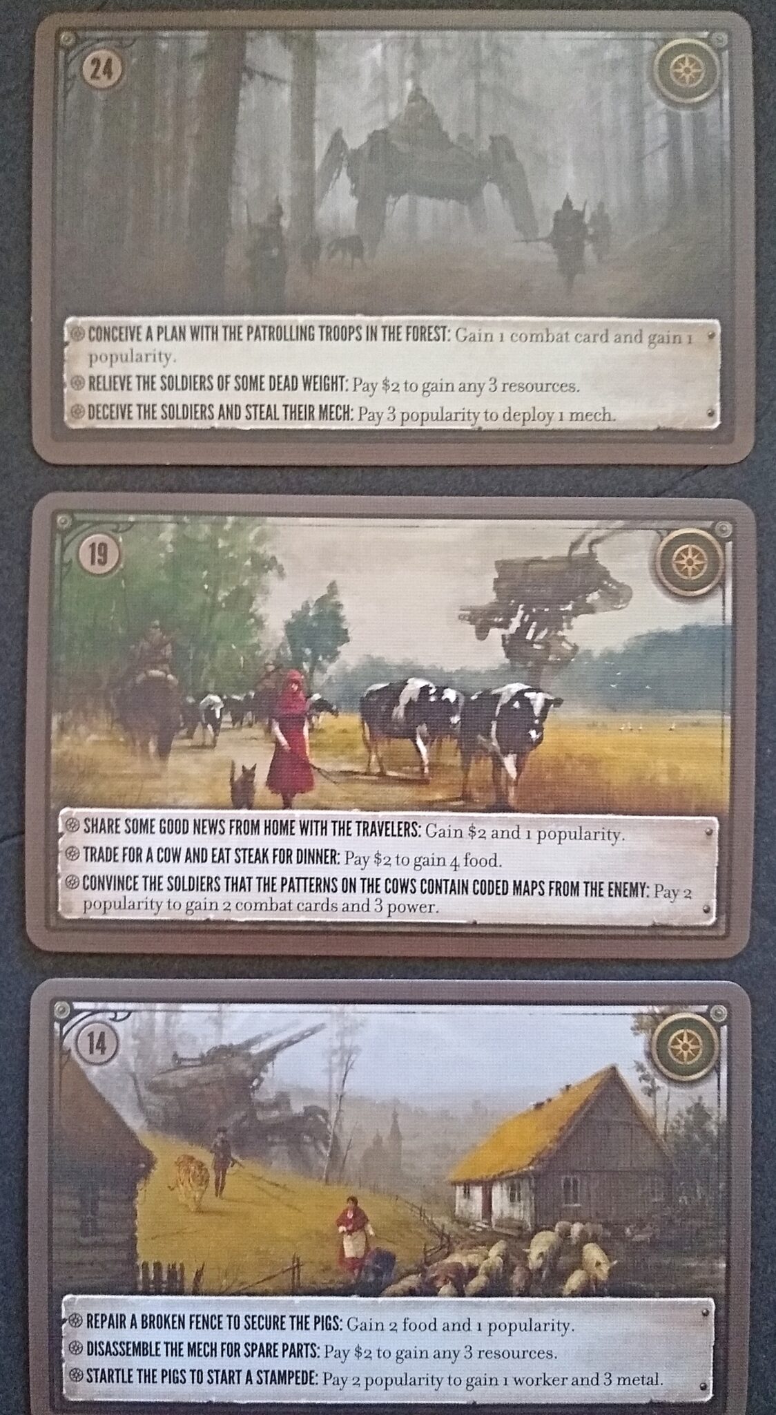
Scythe is a great example of a game where facial details would be detrimental because the people aren’t supposed to be the stars of the show — the mechs are the primary subject. Consequently, Jakub Różalski’s illustrations in Scythe appropriately omit facial details. In most cases, the faces are simply small, and the big mechs become the focal point of the illustration. Other times, the people face away from the camera. In quite a few cases, they face away and are small. Whatever it takes to put the focus on the main subject!
Faces in Gnomadic Gardeners
Faced with these examples, so to speak, I sought to bring faces to the fore in Gnomadic Gardeners — the first game that I’ve illustrated (beyond simply retouching public domain work). In my case, the gnomes are the stars of the show because they are gardening. Consequently, I wanted to include visible faces, with only enough secondary detail to communicate the gardening context. In particular, each gnome has its own flavor text (a pun), and I linked the illustration’s non-facial details to the content of that pun.
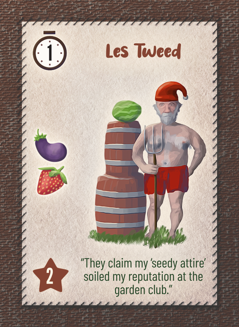
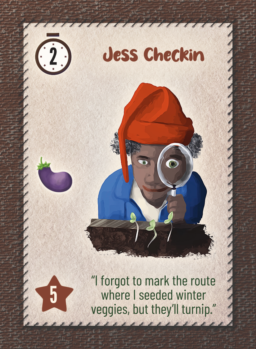
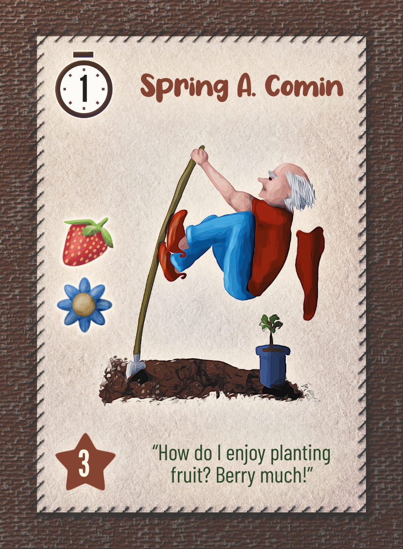
These cards are the result of several rounds of editing, which included tweaking the expressions so that I felt they conveyed emotions consistent with the gnome’s personality (as implied by the flavor text). For example, I wanted Les Tweed to look a bit chagrined without losing the resolute seriousness of American Gothic. I wanted Jess Checking to seem curious and a bit satisfied with what she saw. And Spring A. Comin above started out looking just plain frustrated, but I edited him until he seemed to be working furiously but also having a bit of fun just being himself.
I didn’t get everything right — and certainly not in the early drafts of the art, which the reviewers didn’t like very much. I’ll write about that in my next post!
Notes to self
- General principle: Avoid distracting detail
- When the primary subject is not a person, then don’t include a detailed face.
- The compelling nature of a face will distract from the subject.
- If the scene must include people, face them away from the camera or place them far enough away to minimize the need for detail.
- When the primary subject is indeed a person, include a face.
- Include only sufficient secondary detail to communicate the context.