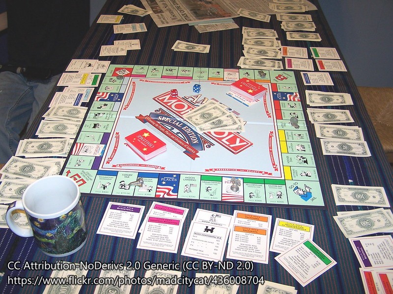
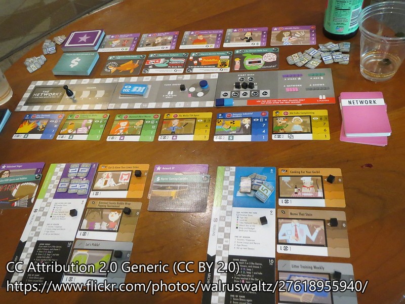
You’ve seen the layout of Monopoly: a central board, rows of cash nearby, and players’ tableaus of owned properties. In fact, the vast majority of games follow a similar layout, even when they don’t have a central board (e.g., The Networks, below).
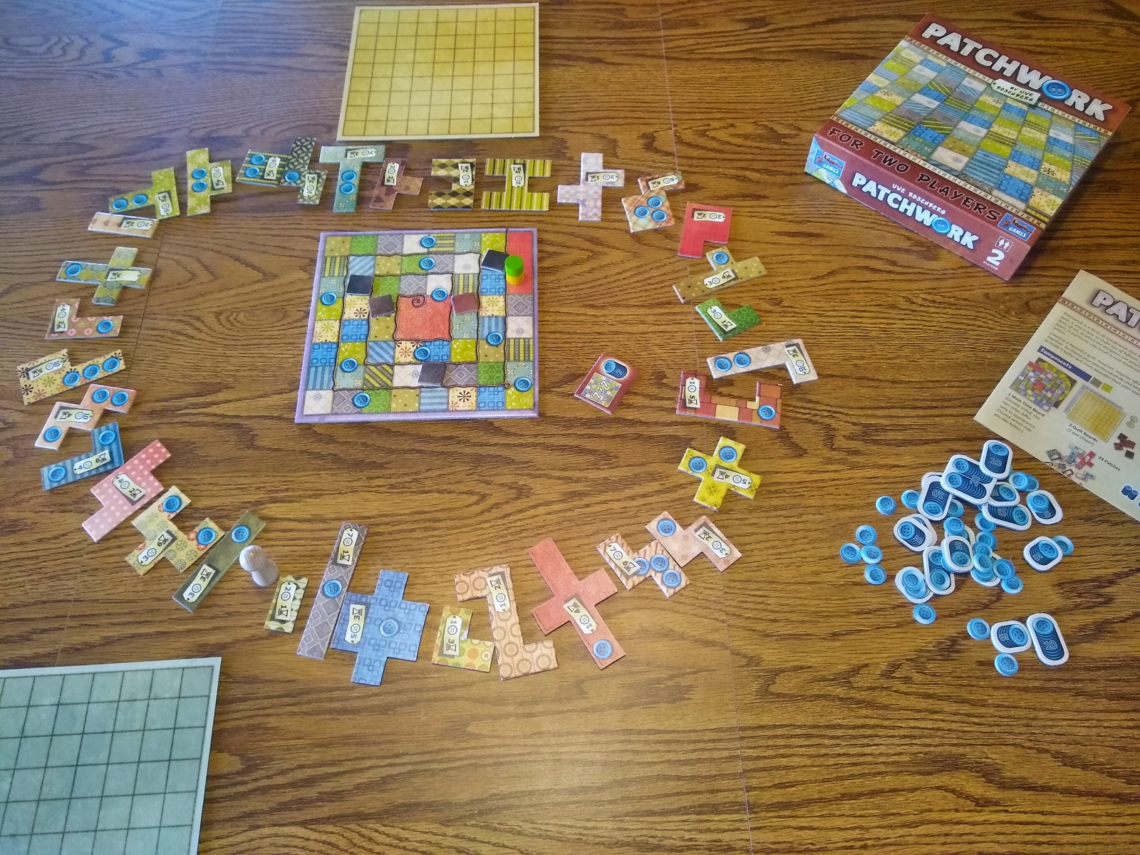
That’s why your mind might snap to attention when you walk past a table with a game like Patchwork (above) and its circular layout of tiles. “Aaah! What’s this fresh thing?” your mind might ask itself. It’s a tiny trick to draw attention, and it’s not hard to do as a designer — with a few caveats.
It needs to be meaningful
People lay out cards in rows for two simple reasons. First, it conserves table space, compared to a circular layout like Patchwork’s. Second, because our brains have neurons that reliably respond to straight lines, putting similar items into a row helps people perceive a visual hierarchy and make sense of the game’s layout.
Therefore, if you’re a game designer, you need to have a good reason to break with the good-old-fashioned layout. Otherwise, players will ignore your instructions about layout and just put the items into rows!
Mechanics
Patchwork achieves this through the game’s mechanics. As players draft chipboard patches, a pawn moves like a clock hand around the circle of remaining patches. On your turn, you only may draft from the three patches immediately clockwise from the pawn’s current position. Laying cards out in rows would interfere with the smooth progression of this mechanic.
Theme
Patchwork also integrates the clock-like circle thematically. The game is about passing time through the hobby of patchwork quilting. As such, a clock motif works well for the layout of patches. The motif also appears mechanically in the time-track mechanic that governs players’ turn order. Patchwork is just one of over 300 games that use this mechanic, including my own game about Christmas gnomes, Tomten. (Maybe I should have thought harder about using a non-traditional layout!)
In other words, Patchwork doesn’t just throw the layout in there, arbitrarily. It’s meaningful from a mechanical and thematic standpoint.
Good old Catan is another example
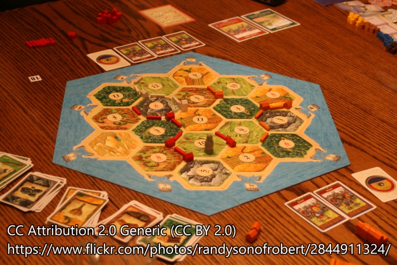
It’s not difficult to break with tradition. One easy approach is through tile placement or non-rectangular modular boards, as in good old Settlers of Catan (though the resource cards still end up in rows, as in the illustration below).
Catan’s board follows a non-rectangular format for primarily mechanical reasons. It involves spreading over geography, which is less discrete (feels more like a real geography) with hexagonal tiles than it would with square or otherwise rectangular tiles. In addition, the game includes ports (special spots on the map) for each of the five resources and for several generic resource conversions; even with the 5 resource-specific ports alone, it would have been a tad inelegant to space all the ports out on the perimeter of a 4-sided board.
Contemporary examples
I asked the good people on Reddit for examples of other games that had interesting layouts of cards/pieces. Before the moderators deleted the post (as they interpreted my post as a request for recommendations), fellow community members suggested dozens of games. In addition to games with modular boards and/or tiles, here are some of the most interesting…
Card-overlap patterns
- “Kodama is another game where you’re laying cards to add branches to a tree, earning points based on how many of a specific resource can be collected on the branch.” [A great example of mechanical and thematic integration with a non-traditional layout.]
- “Conex is a card laying game where you try to overlap cards in ways that they only touch each other in permitted ways. It makes for very cool looking card layouts.”
- “Mars Operation and Cafe both use systems of overlapping cards in creating ways to collect/use/generate resources. (Cafe is the better game).”
Circular-ish patterns
- “Racing games especially car racing games, often have non grid layouts. Pitch Car” [That’s an amazing level of table presence. Wow.]
- “Illimat uses a black cloth with white markings on it for the play space. The game box is turned upside down and placed in the middle, then rotated throughout the game to indicate the seasons.”
- “I like Marvel United everything in the middle and then building a circle with cards played around the center.”
- “Circle the Wagons combines the patchwork circle draft with the tile laying of Sprawlopolis. 2p competitive. Great game that feels like a pocket version of Cascadia.”
- “Genji (2008), a game about writing poems, lays out the cards in a circle that you travel around, a bit like a rondel.”
Random piles
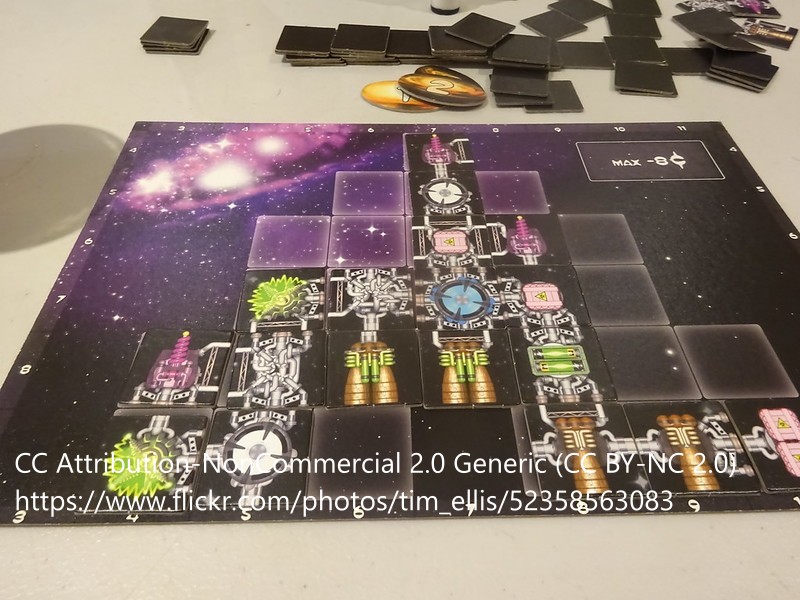
- “Galaxy Trucker. Throw all the tiles in a pile in the middle. Grab them at the same time and build a ship!”
- “Dungeon Drop has a set up that involves dropping several dozen cubes onto the table from 6-12 inches above, leading to a completely chaotic set up.”
Arbitrary paths
- “You can set up the path in any shape you like in Deep Sea Adventure” (which generally ends up being a winding path)
- “Homeworlds. During a match, the players change the layouts and connectivities of transparent, plastic pyramids in space.”
Never breaking free entirely
It’s kind of amazing that even the games above still include significant amounts of traditional component layout. For example, even though players can dump out the tiles for drafting, they place them on a traditional rectangular board with rows for tile placement. This limits the visual differentiation of the game versus traditional layouts, though it probably also makes the game a bit more approachable to players.
Notes to self
- Integrate mechanically, for example…
- Modular board
- Card/tile drafting
- Card/tile placement
- Integrate thematically, including virtually all natural themes, e.g….
- Natural geography
- Trees
- Astronavigation
- Games with random and arbitrary paths tend not to get high BGG ratings, though.
- Games with drafting and tile placement often do, above a certain weight.
- Challenges:
- Space considerations
- Maintaining visual hierarchy
