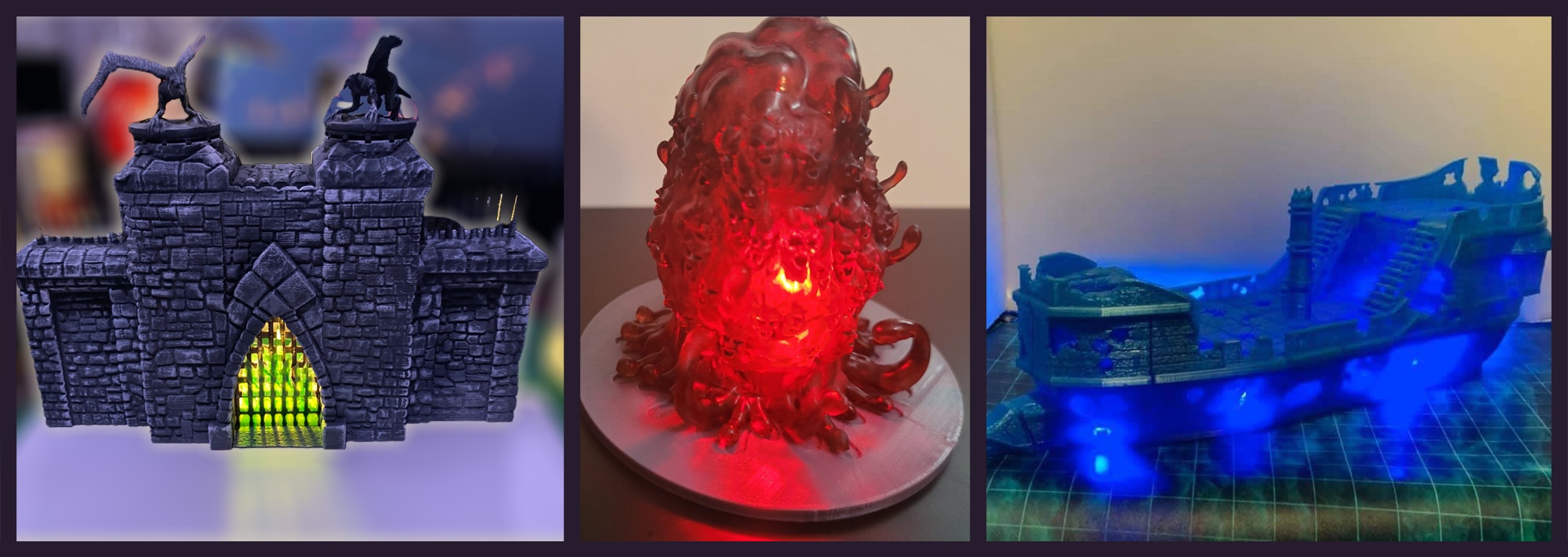
It glows, precious it does!
A few weeks ago, I mentioned LEDs as a possible method for drawing attention to your table. It turns out that Dragon Workshop has a Kickstarter called Gothic Taverns with STLs for 3D miniatures designed to house LEDs. They will make any RPG table look absolutely stunning, so I couldn’t resist contacting the designer, Chris Hunt, for more pictures and information (which he provided).
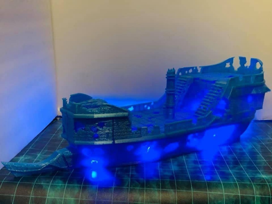
The miniatures shown above should more accurately be called “monsteratures,” I think. They are each several inches high. We’ve got a castle for our hardy adventures to invade or defend, a nasty “Elder Ooze” (the tentacles are a dead giveaway), and a ship that glows like some sort of freaky ghost pirate vessel.
Modular and highly tactile
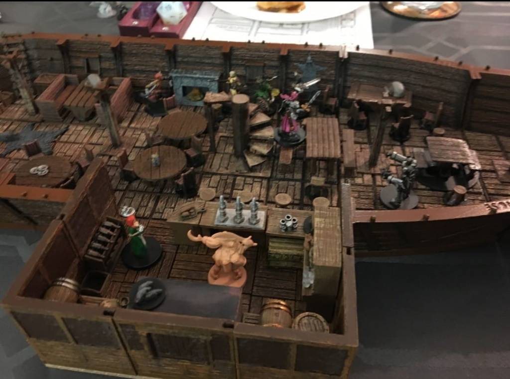
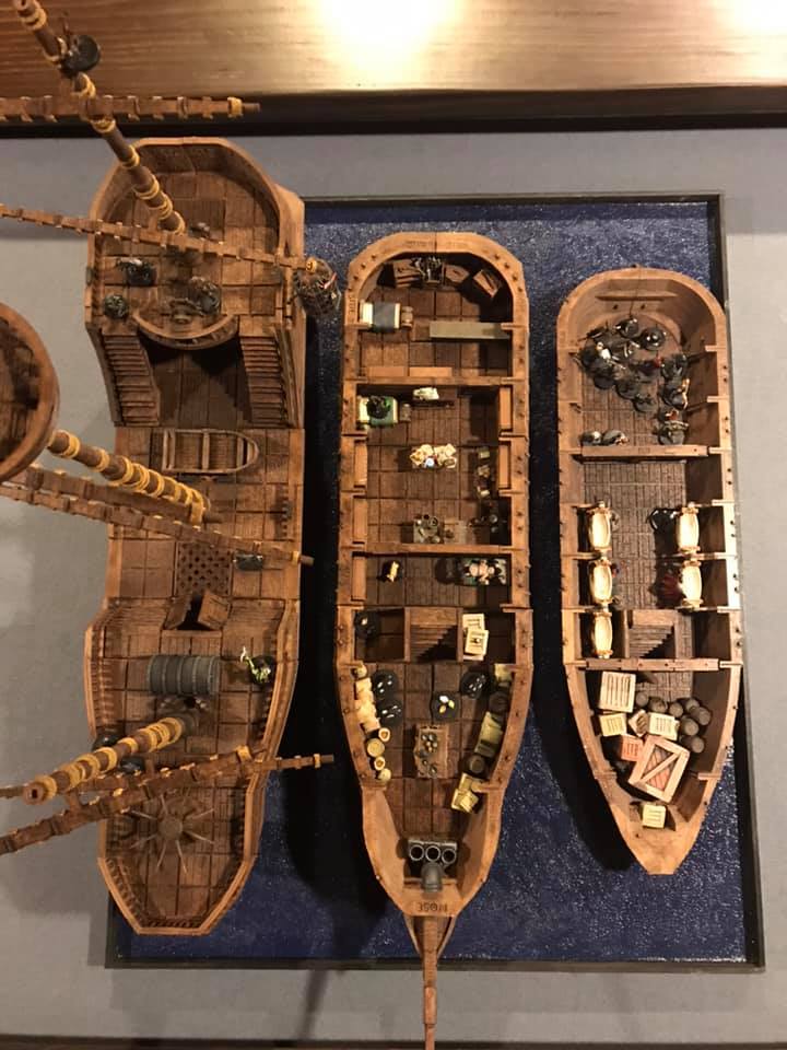
The ship is Dragon Workshop’s pride and joy. It’s modular, which means that it can be assembled differently and/or opened up as your characters battle their way into the ship.
Getting 3D-printed bits to fit properly is a challenge, so I asked Chris how he did it. Here’s his secret formula:
- Creality filament printers (eSun PLA+ or Inland PLA+)
- Elegoo resin printers (3dResinSolution Hero Tough resin)
- An absolute ton of trial and error spent on refining templates
- 26 years of experience
The modularity of his design has enabled him to market his work for a range of various ship builds. They each have an amazing level of detail. I particularly like how the resin shows off the detail and makes me really want to touch it. Chris says he’s “the kind of person that spots repeating textures,” which I think is part of why each piece looks so realistic and inviting.



Desaturated colors to the fore
The designs that Chris sells also include quite a few buildings, in which I immediately noticed the heavy use of desaturated colors. (Note that some of these models were painted by customers, not by Chris himself, or printed with colored resin. I am unsure which are which.)
Emphasis of desaturated colors just keeps coming up.
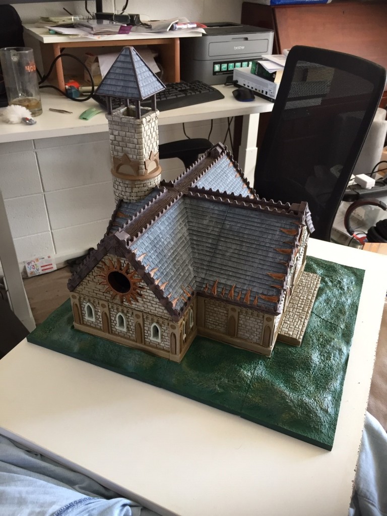

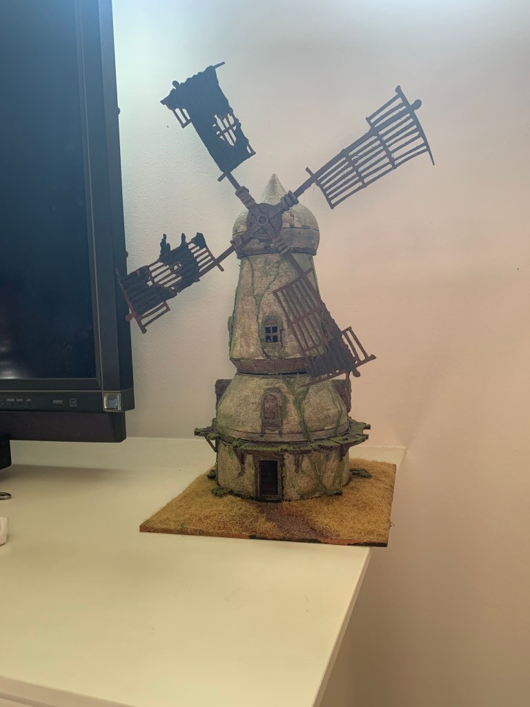
I mentally contrast this color aesthetic with the Playskool plastic bits that I had for toys as a kid, and the stuff sold today in big-box stores. Their colors were all so saturated, which I know is the go-to for designing kids toys, but I think this goes beyond adult-vs-kid marketing. Moreover, I also think it goes beyond the fact that accurately portraying weathered buildings requires use of desaturated colors.
Saturating an entire plastic figure would make the entire thing “pop.” As a result, there would be less room for drawing attention to detail. Take a look at miniatures on Amazon and sort by price. Note how, all else being equal (e.g., material, size, etc.), the miniatures with distinguishing detail command a higher price. The principle applied in 2D art, that you shouldn’t try to draw attention to everything, should also apply in the world of 3D art.
Incidentally, this is one reason why the castle is my favorite of the three illuminated monsteratures at the top of this article, also shown below for convenience. (I’ve blurred the background behind the castle, which had random other stuff on the table.) The gate pops right out because it’s illuminated while the rest of the castle is not. Yet this also makes it easier to see details throughout the castle, including in areas indirectly illuminated by the LED or by ambient lighting. The design of the castle, and the placement of the lighting, makes this possible. It is further enhanced by the choice of colors by whomever printed and painted this particular model.


Give it a strong face to draw attention
I asked Chris which miniatures make him most proud, and he said he really likes the hags and the musicians because he captured some emotion. I agree with his sentiment that the hags came out looking pretty ominous and creepy (below). I’ve previously mentioned how cards can capture attention through use of strong facial expressions, and I’m sure that I’d be keeping my eyes on those enemies if they were on my table. The musicians also look fun and frolicsome. Interestingly, even the ship below has a skull face, just going to show that you can even make just about anything more attention-grabbing by giving it a face.


All these great miniature designs have really got me jonesing for a 3D printer now. What are your favorite sources of designs and why?
