Rules affect table presence
Although most people focus on a game’s appearance when discussing table presence, the actions of players at the table also matter for attracting attention. I’ve speculated, for example, that the physical act of reaching across the table and loading the dice tower of Wingspan probably attracts more attention than, for example, simply sitting and staring at a hand of cards.
I speculate players actually playing a game also attracts attention more than players sitting and puzzling through a massive rulebook. Action versus contemplation. Moreover, I am personally not attracted toward a game where players are clearly confused.
Scythe versus Tapestry
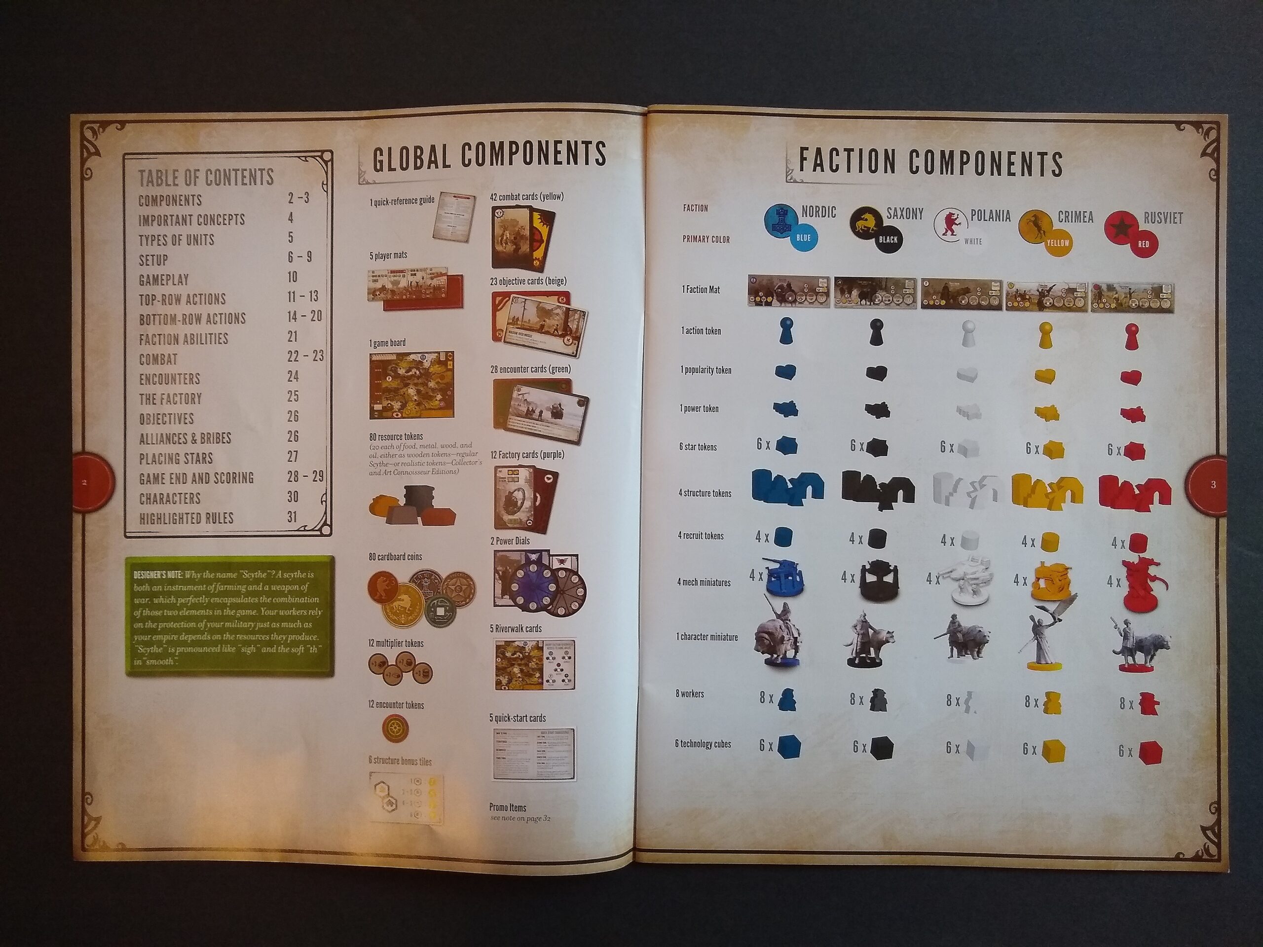
Case in point: Stonemaier invested a metric ton of energy into the rulebook for Scythe, which debuted in the base game at 32 letter-sized pages (8.5″x11″): a whopping 2992 square inches of rules. Expansions appeared, and the consolidated rulebook weighed in at 136 pages. Beans and Dice did a nice review of the book. It includes all the rules, clarifications, and many FAQs. Now, the components of Scythe have truly extraordinary table presence. But the length of the rulebook isn’t doing the game any favors. It can take players multiple games before they even understand the game’s rules, let alone master it well enough for the game to flow smoothly.
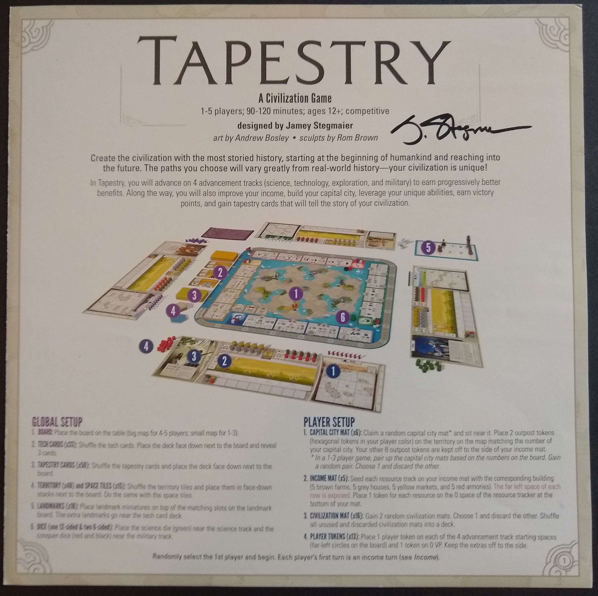
A few years ago, Jamey Stegmaier reflected on the impact of a rulebook’s length and complexity. He noted that the length of the rulebook can reduce players’ willingness or ability to sit down and play the game. His reflections influenced his design of the svelte Tapestry rulebook, which only has 4 large pages (11″x11″) totaling 484 square inches. It is far easier to teach Tapestry than Scythe, partly because Tapestry is a lighter game (3.43 vs 2.90 on BGG), and partly because Tapestry has fewer concepts that players need to learn before they can begin play.
Comparing and contrasting the two rulebooks offers a chance to examine these challenges, and it illustrates what rulebooks need to accomplish before players can get to the table.
Introductory material
Tapestry’s rulebook drives as fast as possible into the setup, which gets the players moving (and attracting attention to the table). In contrast, Scythe’s spends a lot more time giving an overview of the components and associated concepts.
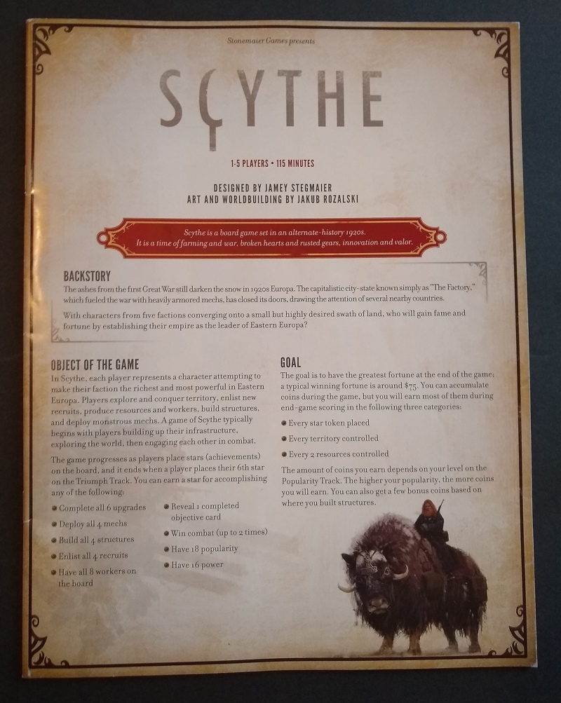
Theme: Most guides to writing a rulebook (e.g., BGDL‘s guide of guides) suggest starting with a summary of the theme. Scythe’s base rulebook starts with two long paragraphs, and Tapestry’s starts with two sentences. Because of the expansions, Scythe’s consolidated rulebook grew into a full page of theme that included discussion of what each expansion contributes.
Goals and Objectives: The base rulebooks then discuss the goals and objectives. For the consolidated Scythe rulebook, this appears after the component photos.
Components: Each of these rulebooks then follows with a summary of the components. For Scythe, this takes multiple pages, even in the base version–first to display the pictures of components, then to talk through Important Concepts related to those components.
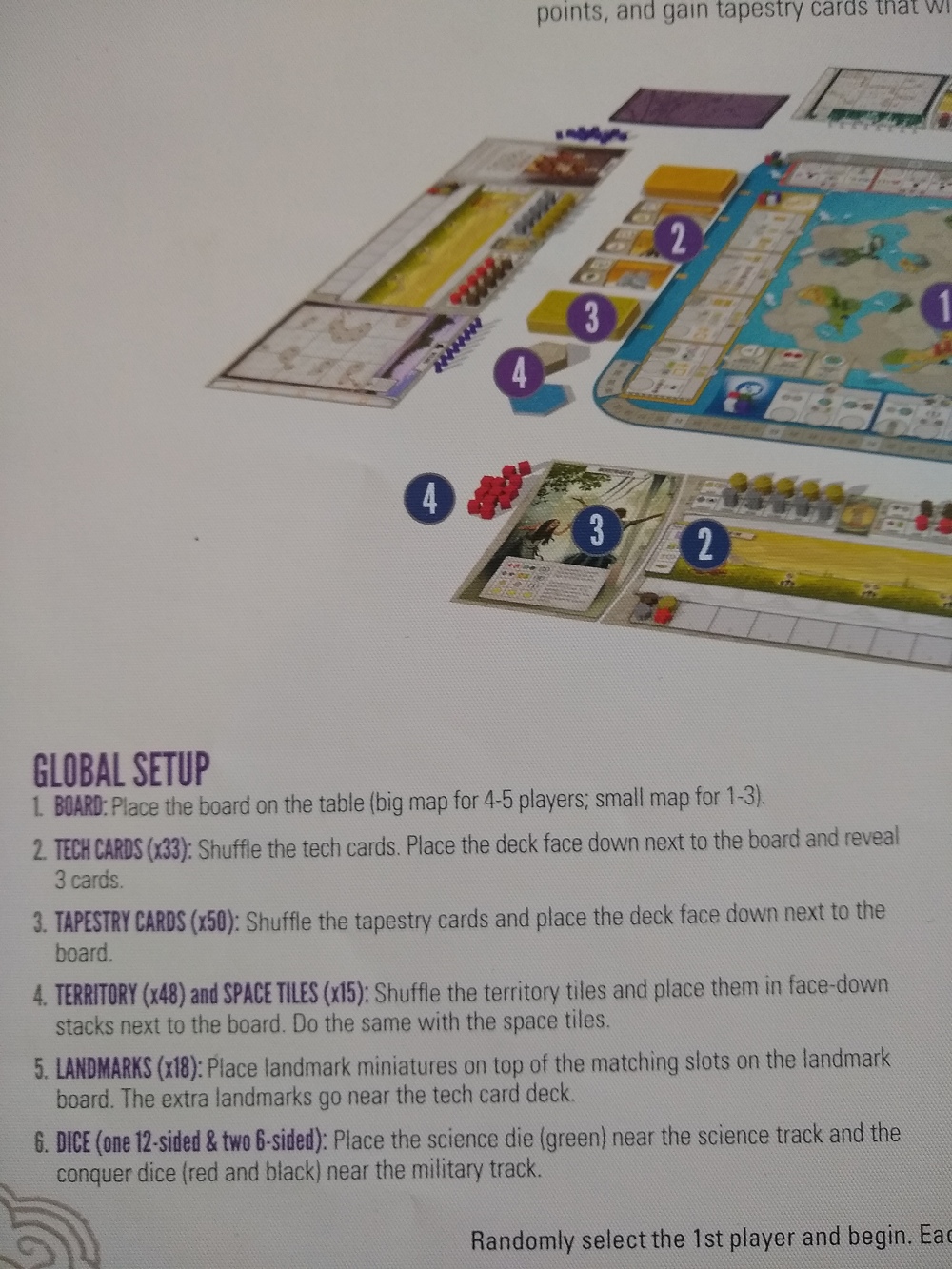
In contrast, Tapestry’s rulebook embodies a really efficient approach that I love: it shows a picture of the setup, then implicitly calls out the essential components as part of the setup instructions. That way, the players are learning the pieces as they manipulate those pieces for the first time.
Tapestry’s component-setup instructions use colored subheadings to differentiate between global components (purple in the image here) and faction-specific components (blue in the rulebook).
Overview takeaways: Of the two approaches, I like Tapestry’s better. Jamey has repeatedly stated that Scythe isn’t getting any more expansions, but if it did, then the Scythe compendium could be tweaked to get players faster into the game, like Tapestry’s rules do. For example, it could follow a sequence like the following:
- Front matter (title, illustrations, etc.)
- 1/2 page of theme, 1/2 page for table of contents
- Goals and objectives
- Setup, introducing components as you go with popouts or subsections for optional steps that depend on what expansions are in play (or, a very abbreviated components section beforehand)
- Gameplay…
Gameplay
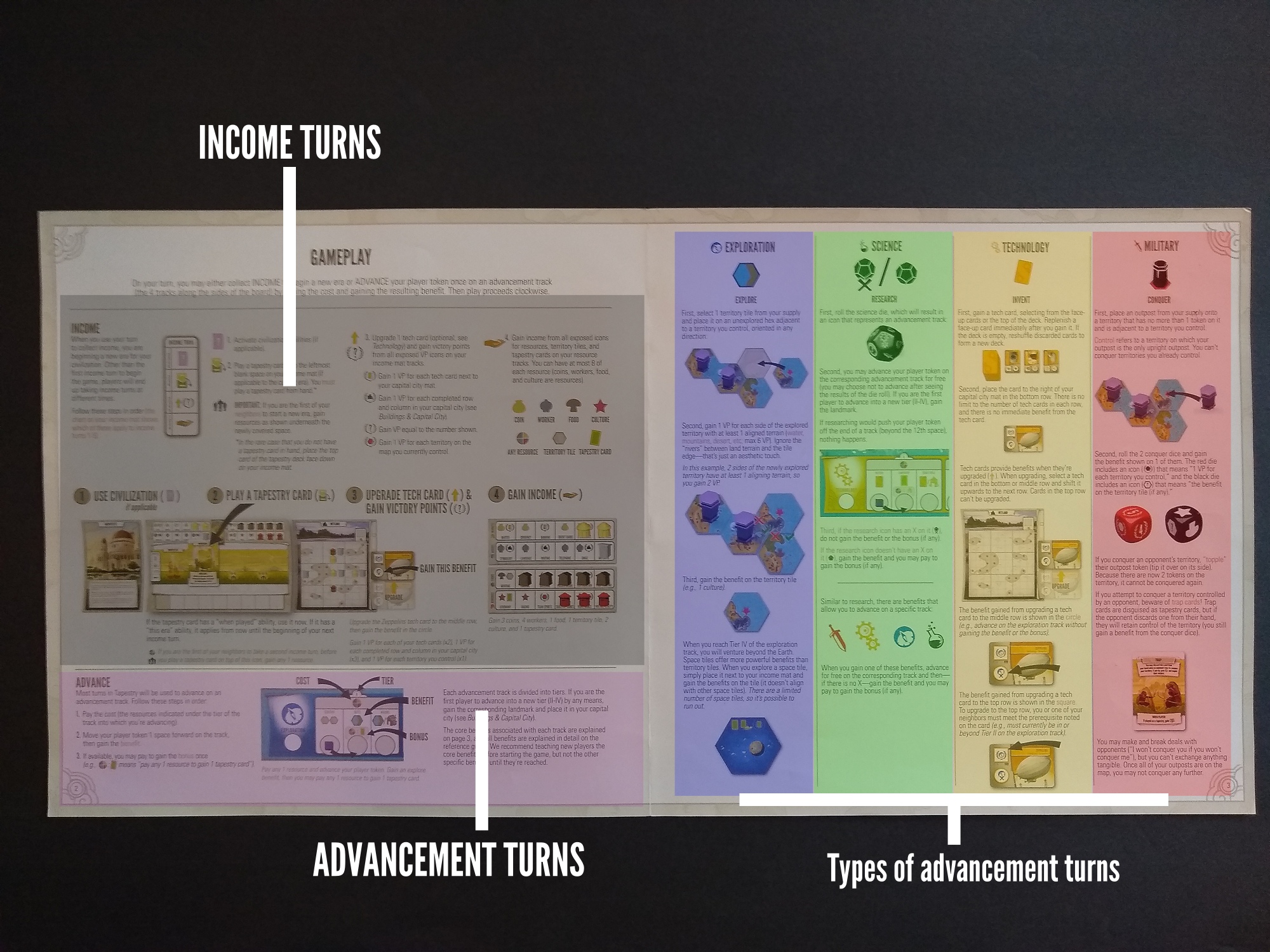
The main part of a rulebook deals with how to play the game. Providing a good visual hierarchy is essential, so that players quickly grasp the structure of the game and the available actions. Stonemaier games tend not to have rounds or phases, so there usually isn’t a lot of hierarchical structure. Wingspan is a good counter-example: it has multiple rounds, each with several turns per player. Tapestry has two types of turns, the Income turn and the Advancement turn. There are then several types of advancement turn.
- Income turn
- Advancement turn
- Exploration
- Science
- Tech
- Military
- Arts (expansion 2 — not shown below)
The rulebook can cleanly depict this conceptual hierarchy on a single 22″ x 11″ spread, as shown in the “rainbow” illustration below.
Because Scythe’s gameplay rules are longer and require many pages, that rulebook has to rely primarily on a structure of heading types to emphasize hierarchical structure. In addition, popouts indicate designer notes, examples, strategy tips, and similar attention-grabbing details.
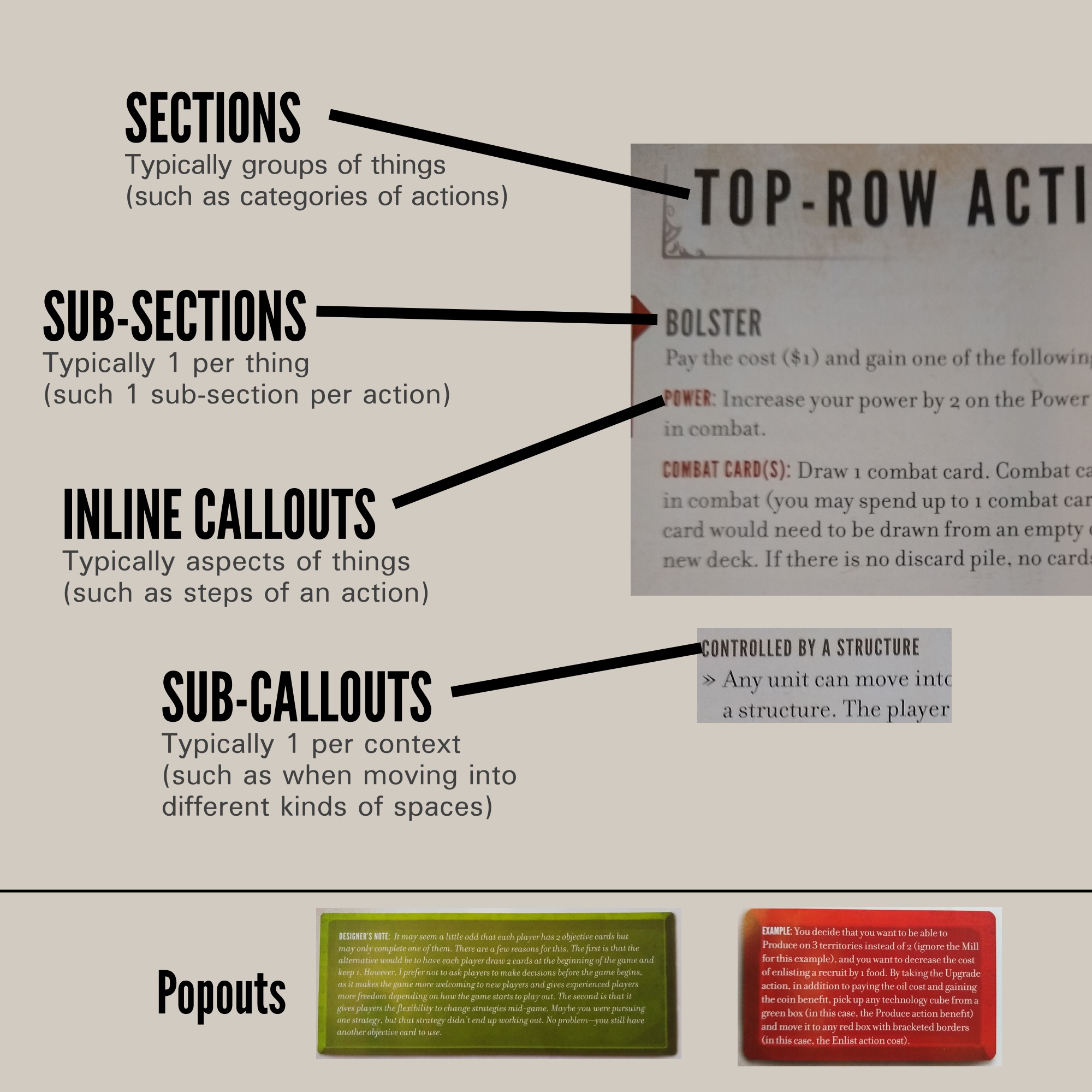
The compendium’s table of contents has a list of the book’s sections, not its sub-sections, which could be problematic for a player that seeks a specific sub-section. For example, the section on bottom-row actions spans pages 22 through 33 of the compendium, so a player looking for the Enlist action’s details might need to browse several pages to find it. However, the compendium has over 40 sections, so omitting sub-sections helped to prevent the table of contents from filling the entire page (or multiple pages).
Pushing details onto cards
Probably the biggest “trick” that Jamey used for keeping the rulebook short was pushing many details onto mats and cards. Part of this involved simply printing a non-trivial amount of text on the civ and tapestry cards. In addition, he used two visual tools that facilitate concise communication: visual function calls and meta-symbols.
Functions: As with many games, Jamey defined visual symbols representing acts. A key difference with Tapestry is that Jamey defined a lot of these symbols (over 30 by my count). Programmers might recognize each of these atomic acts as a function, whose name in this case is a visual symbol. Each of these functions also has a textual name (such as “gain farm” or “conquer”), but players primarily encounter these functions as visual symbols during the game, rather than textual symbols.
I’ve summarized 5 of these functions below. When a player encounters a symbol, he or she executes the corresponding function. Players encounter these symbols when advancing on a track of the game board (for example, when you advance to the first space on the Military track, you’ll see the fourth symbol below, which directs you to conquer a tile on the map if possible). Functions implicitly can invoke one another; for example, the second and fifth symbols below direct the player to advance on a track and perform the function indicated on that next spot of the track.
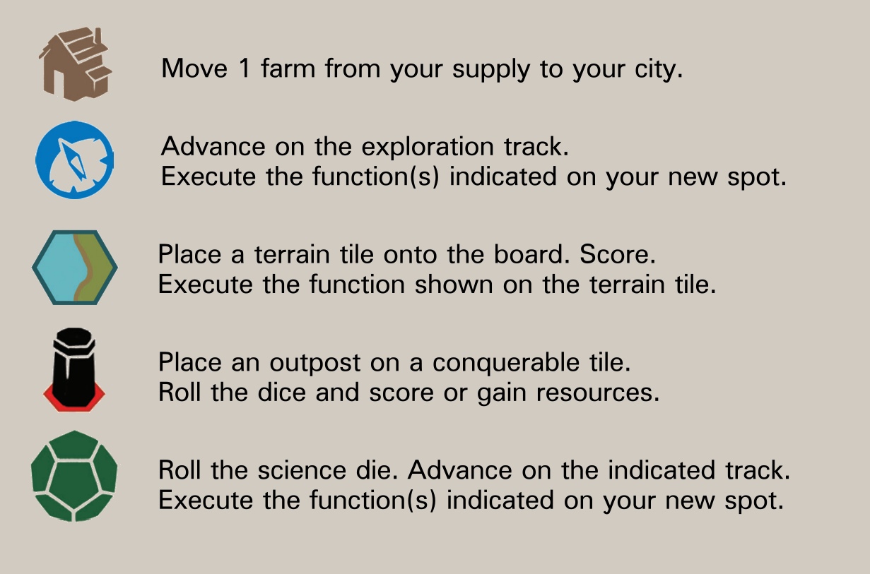
To its credit, the rulebook does NOT simply dump out a huge list of symbols and their steps. Instead, each symbol is introduced contextually within the portion of gameplay where that function most frequently appears. (See the rainbow illustration above, in this article.) For example, the “place a terrain tile” function appears in the Exploration subsection of the section on advancement turns. If Tapestry had a 136-page compendium, then I’d expect to see a page with a symbol reference, but it absolutely isn’t appropriate in the context of a 4-page rulebook.
Meta-symbols:
Players are familiar with meta-symbols, which is to say symbols that operate on other symbols. For example, a slash (/) often indicates that a player has a choice between two options (which programmers will recognize as disjunction), a plus (+) often indicates gaining something and also another thing (addition), and a colon (:) often indicates that taking an action requires paying something first (e.g., cost: benefit, which programmers may recognize as a production).
Tapestry leans heavily on two additional meta-symbols. I doubt they are entirely unique to Tapestry, particularly considering that they are such great ideas that they’re totally worth ripping off (ahem, borrowing) for use in future games.
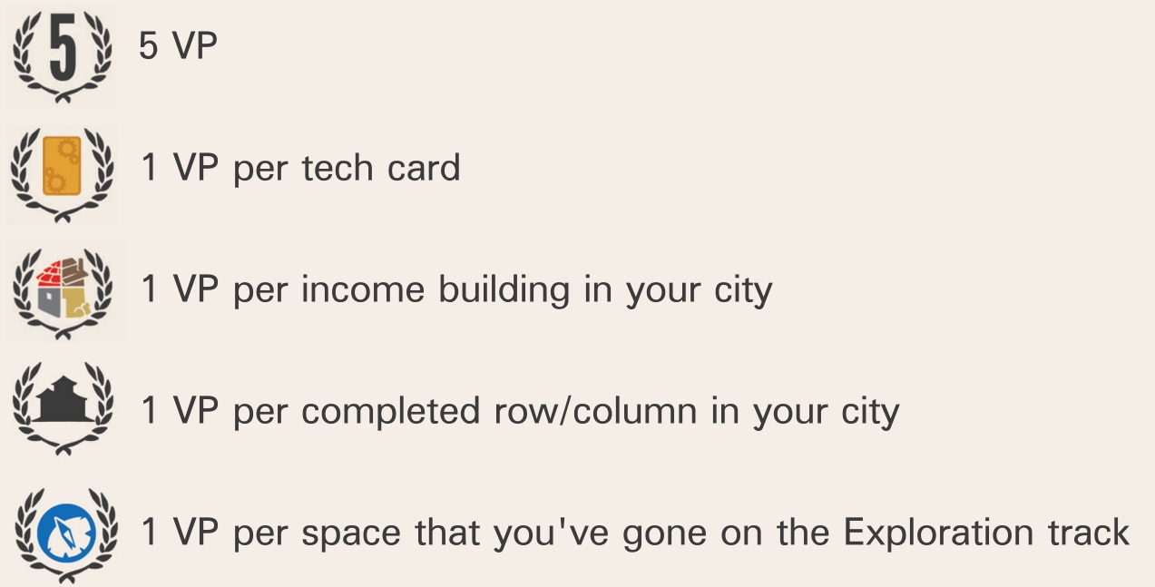
The first meta-symbol is the victory point symbol, which is a laurel wrapping another symbol; you get 1 point per instance that you have obtained of the wrapped symbol. This can just be a count implied by a literal number, or it can be a more complicated kind of count.
The second meta-symbol is what is sometimes called the “sad” symbol by players. It means, “Advance but don’t gain the benefit of the indicated function.”
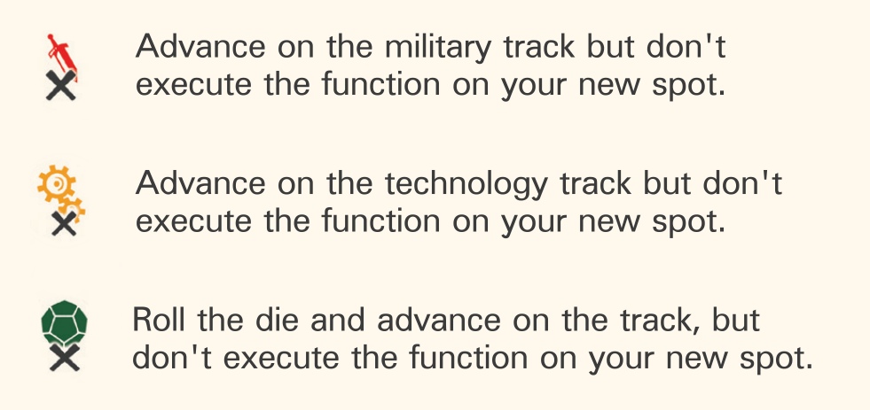
As with the underlying symbols, the Tapestry rulebook introduces these meta-symbols in the context of the portion of the game where they are relevant. In particular, the sad symbol appears on several of the tech cards. The game includes an invaluable reference sheet summarizing all of the tech cards and spaces on the board’s tracks, with a precise definition of each. Players can get started on the game and then come back to the reference sheet as needed. I’ve sometimes been able to get a new player going in just 5 minutes of instruction; such a player frequently refers to the reference sheet throughout the game.
These are some of the key differences, sensible design choices, and clever tricks that I’ve noticed in the Scythe and Tapestry rulebooks. What are your favorite rulebooks, and what clever ideas have you noticed for how they organize and present information?
3 thoughts on “Comparing the Scythe and Tapestry Rulebooks”
Comments are closed.