In Stonemaier’s Red Rising, players each vie to amass a shifting alliance of characters from the fictional Red Rising universe. Cards come in 14 different suits, corresponding to the 14 castes of characters.
A traditional 52-card deck has only 4 suits, which players distinguish based on the shape and color of the suit symbol (e.g., black club or red heart). No special effort is needed to further distinguish the suits. In games with more than a handful of suits, it’s ideal to provide both distinct colors and distinct symbols for the different suits. Color-blind players will thank you!
But differentiation becomes a real challenge when your game has 14 suits. Even players with no color-blindness will struggle at times to tell colors apart. It’s inevitable. Moreover, Stonemaier could not decrease the number of suits without losing an essential aspect of the theme.
So let’s take a walk some of my favorite card borders of Red Rising and see what Stonemaier’s graphic designer came up with.

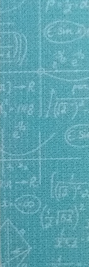
Blue represents pilots. The border includes small math equations, likely making an oblique nod to the math required for astro-navigation.
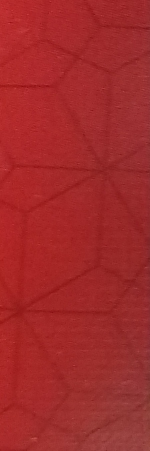
Red represents laborers, and the border includes gem facets. These correspond well to the helium gems that serve as the game’s primary resource (see picture farther below).
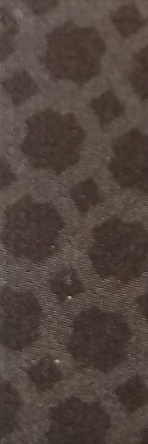
Gray represents security personnel, dovetailing well with the chainlink-like border.
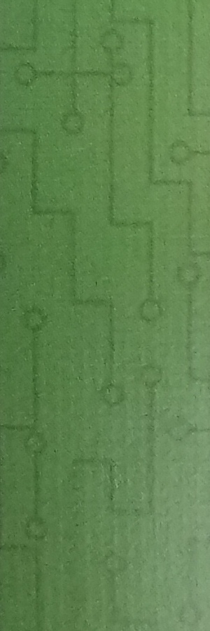
Green represents programmers, for which the border includes circuit-board lines.
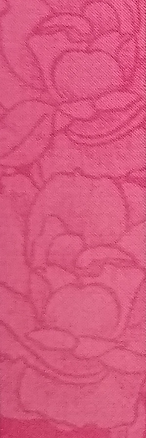
Pink represents “companions.” The border unpacks this euphemism with pink blossoming flowers.
Obsidian represents assassins–apparently very elegant assassins, as their border has a hint of silk embroidery.

Many of the other borders have less thematic correspondence. For example, the yellow doctors have a plus symbol, which is fine (matching the Red Cross symbol) but could probably have been better (e.g., with syringe-like pattern). The silver financiers have small circles that could have looked more like coins.

I notice that my favorite borders also generally have strong contrast between the linework and the background color. Red is the notable exception, which I prefer not for its appearance but rather due to the thematic connection to helium gem resources (stored in a nifty wolf box, due to the direct references and allusions to wolves in the book). Every graphic design book in the world will advise you to maintain strong contrast where you want contrast, but it’s interesting to see how it subconsiously affected my preferences for borders.
What games have borders that you’ve noticed? And what do you like or dislike about them?

2 thoughts on “How to Discern 14 Suits? Red Rising’s Borders Delight and Differentiate”