Stonemaier’s Tapestry has the best building miniatures of any Euro that I’ve ever played. They contribute hugely to the game’s table presence. They are also the heart of the game: you can’t win the game without doing a good job of filling your capital city with these miniatures. They drive your points. They drive your resources. IIRC, Jamey Stegmaier literally conceived these miniatures and then designed the game around them. It is only fitting, then, that they are extremely high-production-value and absolutely a delight to touch and to see.
And, they are many.
The original game shipped with 18 larger miniatures called landmarks (up to 2″ on each dimension), plus 100 smaller income buildings. Subsequent expansions have nearly doubled the landmark count. Tapestry now has PLENTY of landmarks. In fact, it has so many that they are somewhat hard to keep track of.
Such a situation suggests–nay, demands–some sort of categorization scheme. While one could categorize them by how you get them (track advancement vs personal objective/goal vs special cards), this is not a blog about mechanics. It is a blog about the beauty of tabletop games. Therefore, I shall categorize them according to appearance, and then I will use that aesthetic taxonomy as the framework for discussing other aspects of the game.
High-tech landmarks
Six of the game’s landmarks sport a high-tech aesthetic typified by (implied) metal plating, black-and-white coloration, and a medium-to-large size. They generally lack the kind of recognizable windows that you would expect on a contemporary commercial or residential building in current society. All include unusual shapes such as round protrusions on the Fusion Reactor and Com Tower, or the sharp angles on the Laboratory and Digital Studio. All have a very urban, industrial, technological feel.
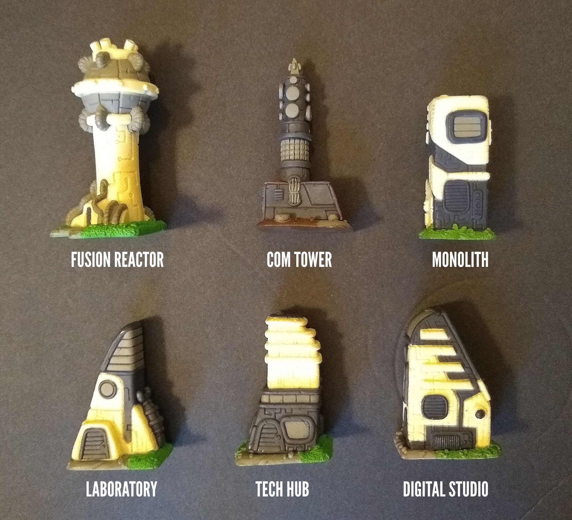
Even though a landmark is high-tech, that doesn’t mean it necessarily belongs to a late era of history in the game. True, you can only get the Fusion Reactor, Laboratory, or Tech Hub late in the game. However, you can get the Com Tower as soon as you or a neighbor invents telephone, and you can get the Digital Studio less than a third of the way through the game in some circumstances. The Monolith arrives whenever the aliens visit it upon you (via a space tile), which could conceivably happen mid-game.
Jamey took great delight in creating a game where players might mix and match accomplishments, technologies and social advances from many eras of “real” history. For example, your civilization might invent (conceive) the Radio before the Nail. Each game of Tapestry is like a different path through history. Appropriately, therefore, each landmark’s aesthetics are related but not identical to the era of history when you might obtain that landmark.
Modern landmarks
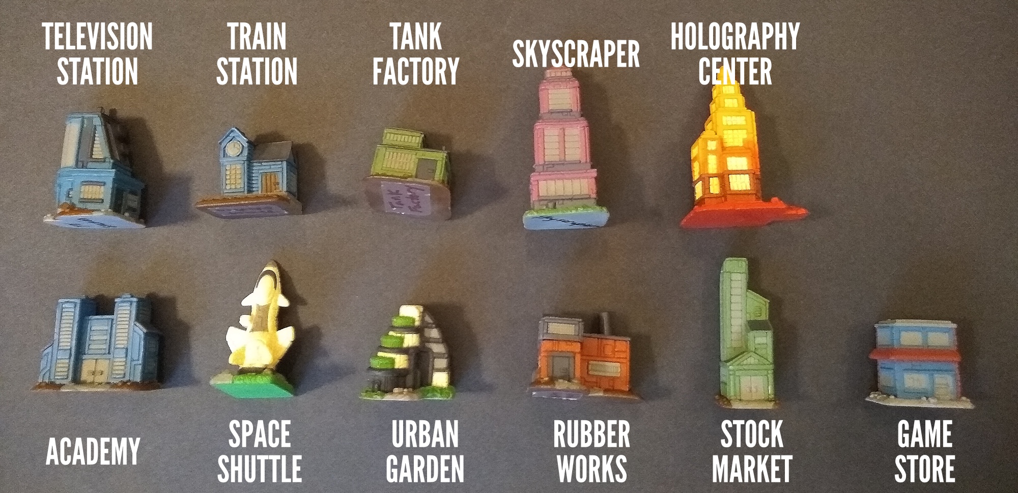
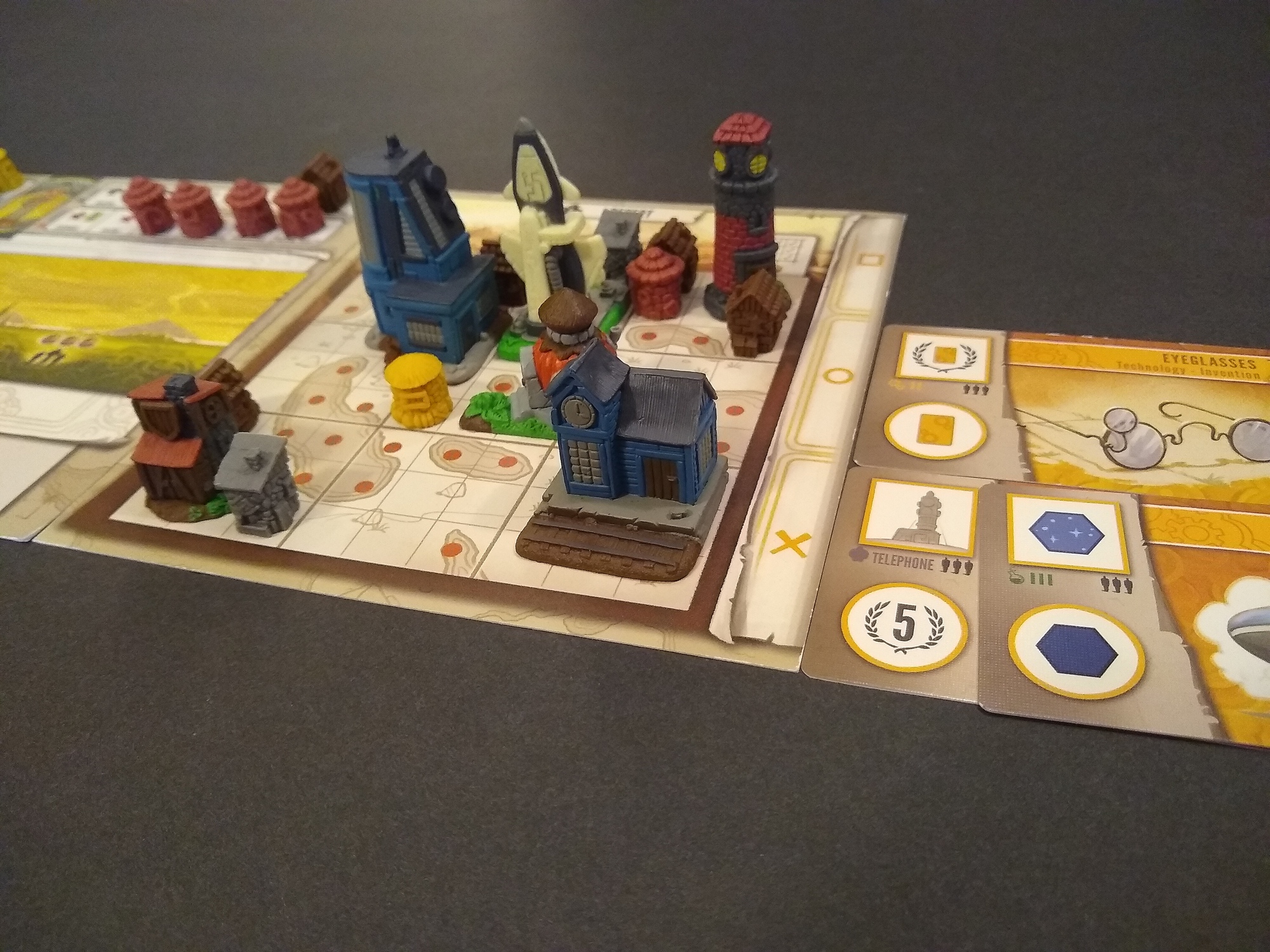
Eleven landmarks have a modern or post-modern aesthetic typified by recognizable windows, medium-to-large size, and synthetic wall materials such as concrete or metal. Except for the Holo Center, all have desaturated colors. Most feature a stacked shape, in the sense of having smaller rectangles stacked on top of larger rectangles. You could imagine any of these buildings in a modern Western city. I’m partial to trains, so I have a special affinity for the Train Station, which includes little rails outside the building.
Traditional landmarks
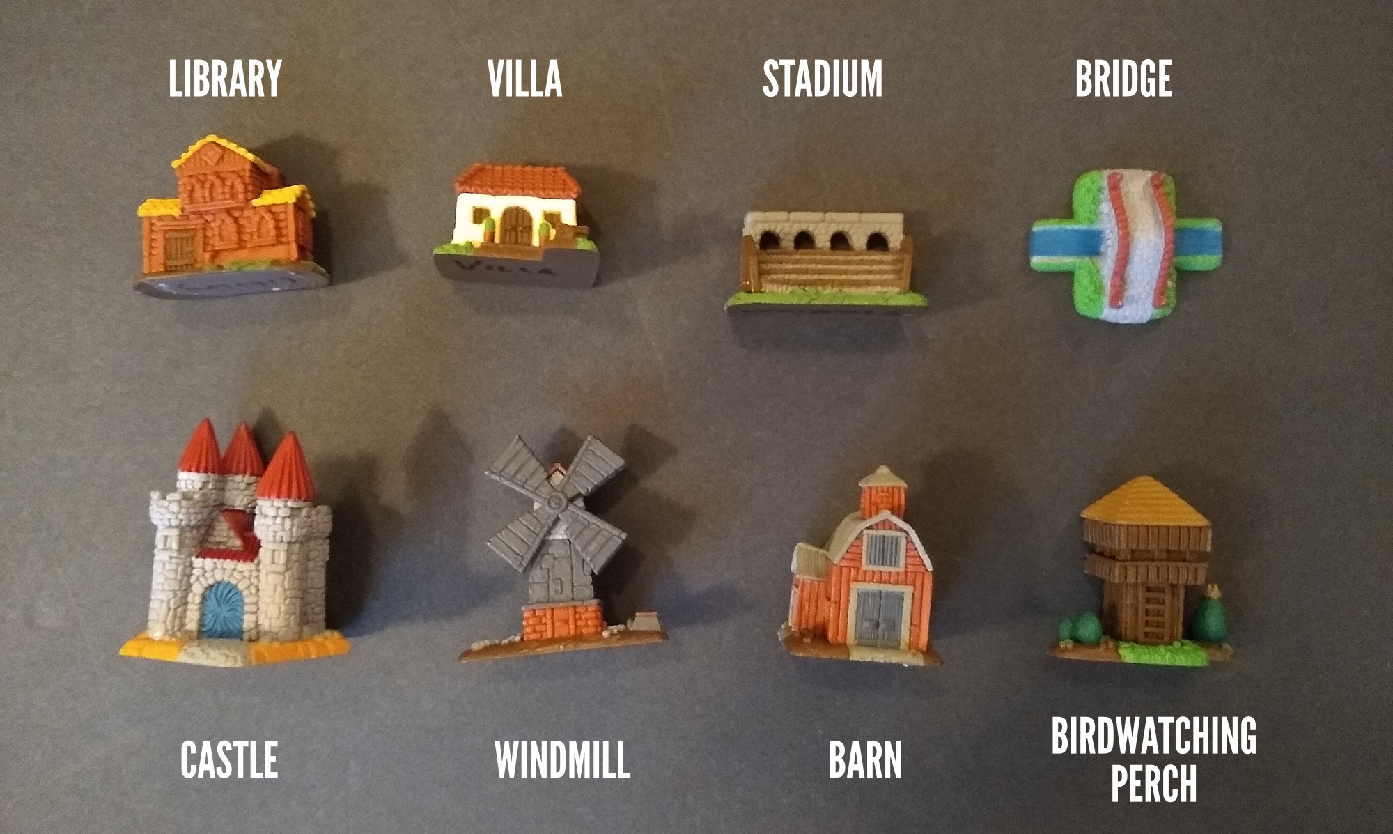
Eight landmarks have what I’ll call a traditional aesthetic. Implied building materials principally include stone as well as wood, which appears in none of the Modern or High-Tech landmarks. It is appropriate that Traditional landmarks feature little to no blue (just some water and a metal castle portcullis), as coloring an entire building blue would have been extremely expensive prior to modern times. These landmarks are all medium-to-large.
From a cognitive standpoint, Traditional landmarks stand out to me the most, among these categories in my little taxonomy.
Partly, it’s due to theme: these buildings played foundational roles in constituting the world that we recognize today. For example, libraries, in the sense of the Great Library of Alexandria and the collections of monks during the Middle Ages, played an essential role in the formation and preservation of generations’ intellectual legacy. Villas and their like are the building block of civilization’s social unit, the family. Stadiums and large gathering places such as town centers (the “agora”) allowed a direct 1-to-many form of communication essential for the formation of larger urban units such as large towns and eventually cities. Even perches (though not for birdwatching!) played an essential role in controlling and securing a society’s territory. Buildings like these helped create civilization.
Appropriately, these landmarks also demand significant attention from the players due to game mechanics. You can’t get these landmarks simply by progressing along a track. Instead, you need to complete certain goals or get your hands on a specific technology. In addition, once you have these buildings, placing them in your capital city becomes an interesting challenge because 5 have non-rectangular footprints, including the cross shape of the Bridge and the S shape of the birdwatching perch.
For all these reasons, I think these 8 landmarks add a lot of aesthetic, thematic and mechanical flavor to the game.
Simple landmarks
Six landmarks are “simple” landmarks. If we were categorizing by theme or history, these would probably be Traditional landmarks: they played key roles in the formation of civilization, and some of them (the Lighthouse, for example) appeared after early Traditional landmarks (e.g., Bridges).
In a taxonomy of aesthetics, however, these 6 simple landmarks stand out for their size and simplicity. They are all much smaller, and all occupy a simple footprint quite unlike the 5 irregular footprints among Traditional landmarks. Two of the Simple landmarks, unlike any of the categories above, don’t even have corners (instead having circular footprints). Colors are extremely desaturated, except for the apothecary’s hay roof. None has any blue at all. All of them represent buildings constructed with the simplest of materials.
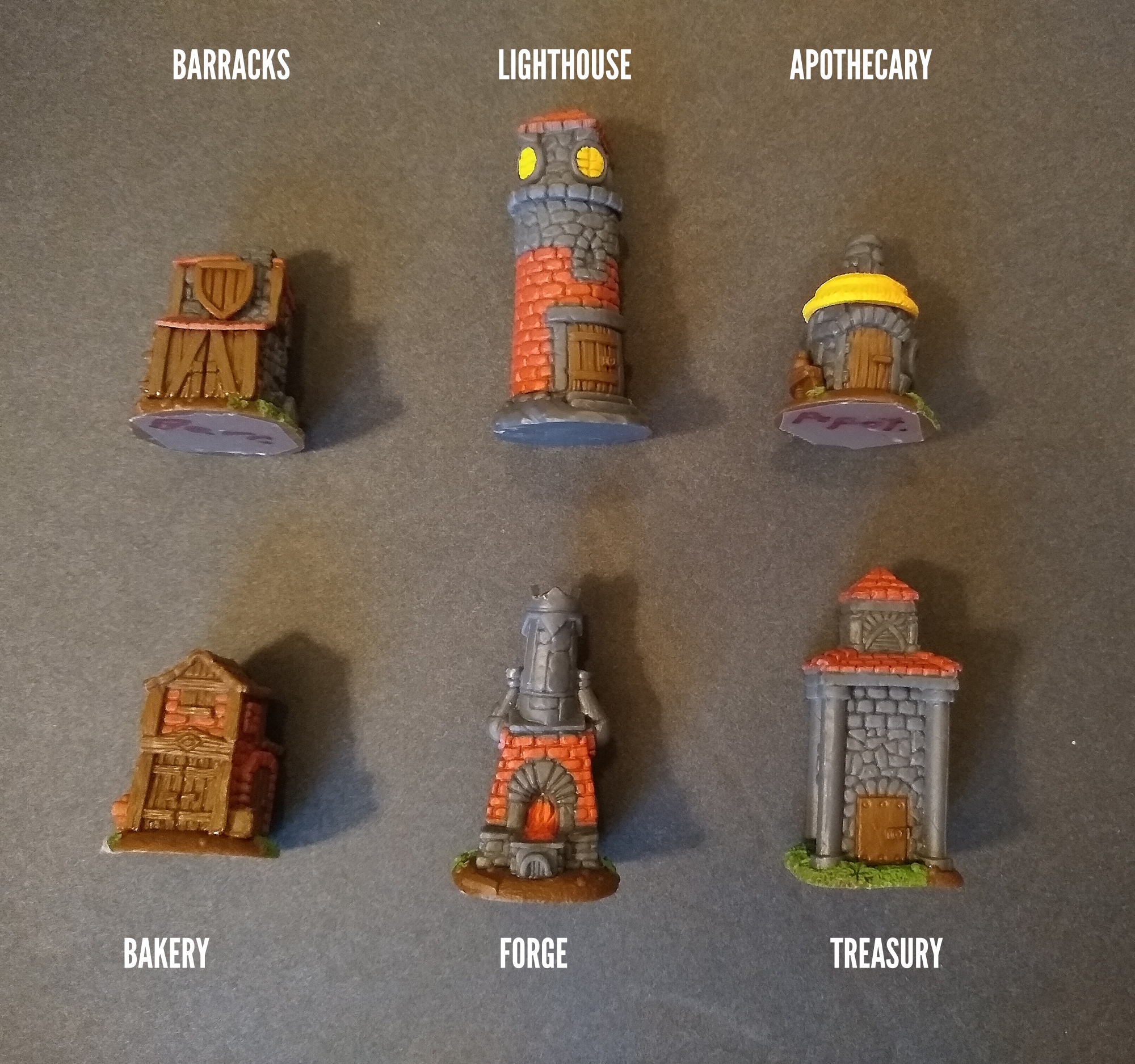
The aesthetic simplicity fits with the mechanics. All of the simple landmarks shipped in the base game, and you can get all of them by progressing a little bit on a track or by upgrading a particular tech card
This is not to say that the miniatures themselves are less fun than the others above. In fact, because of the woodwork and stone detailing, these miniatures cause much more tactile sensation than the High-Tech or Modern landmarks do. When I pick up the Traditional landmarks, I usually feel the sharp corners of the odd shapes rather than the building’s face; in contrast, with the simple landmarks, I always feel the distinctive texture of the building’s surface. Providing sensations like these is important because it adds to the gameplay experience, so much so that Stonemaier proclaims “Board games are tactile experiences” as one of their 12 design tenets.
Whimsical landmarks
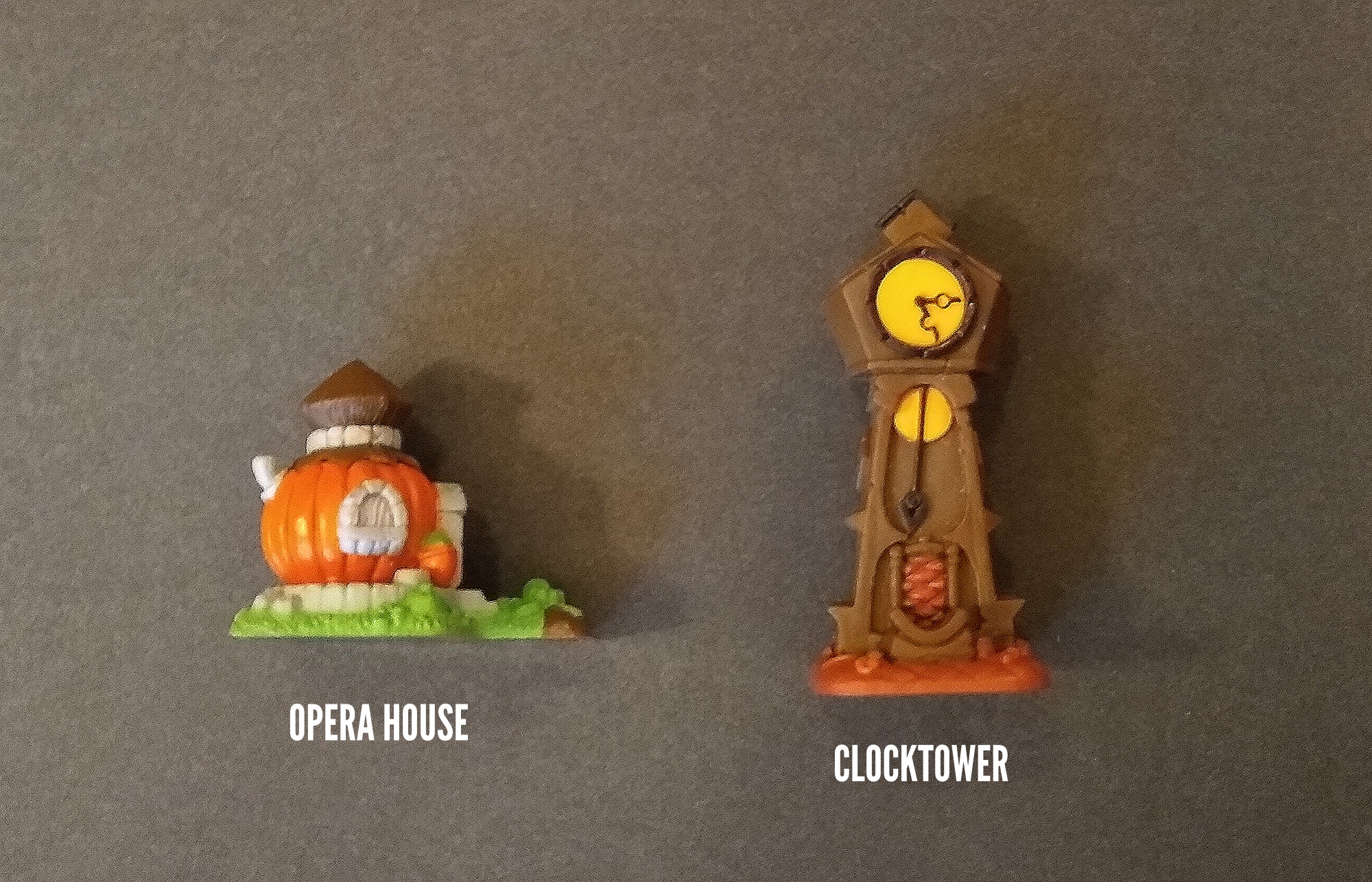
Two landmarks stand out as representing objects, rather than historical buildings. The pumpkin of the Opera House is a reference to a similar building in Stonemaier’s fun coop Charterstone, and the Clocktower echoes the imposing image on the cover of Pendulum. Both buildings have eye-catching orange/yellow combined with brown, and they are fairly small. Although you can’t place them in history, you can place them comfortably on Tapestry’s Arts track.
Income buildings
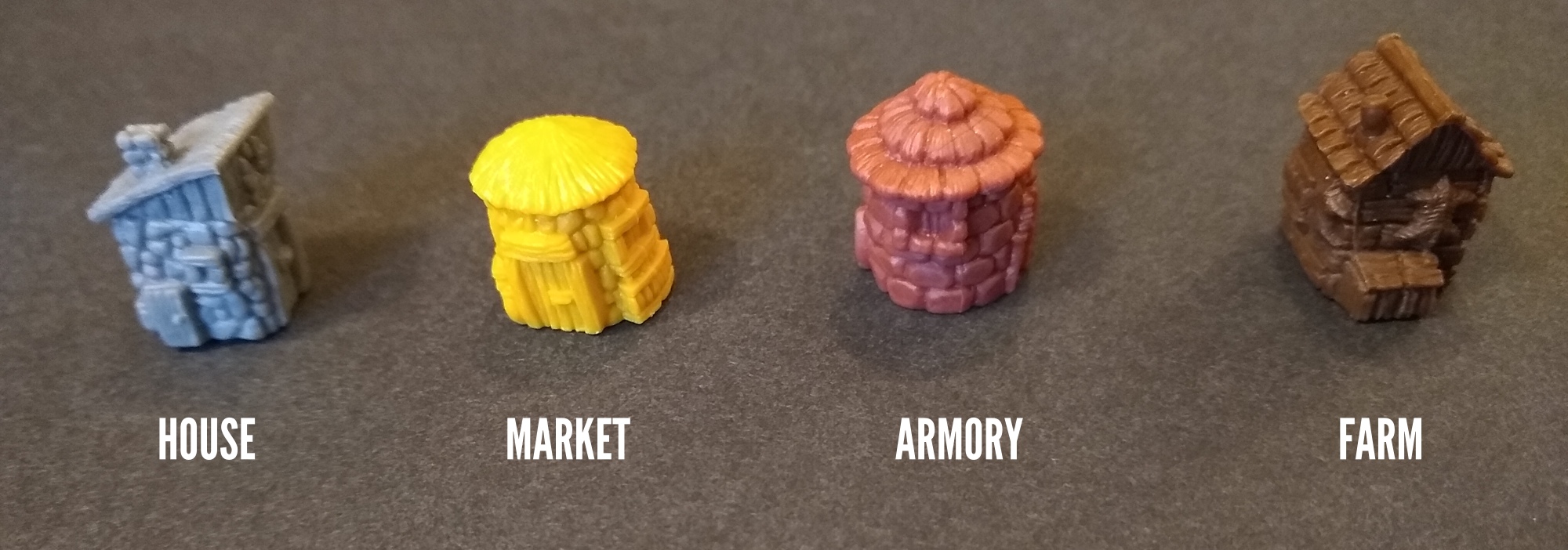
Yes, they are edifices, too! The vast majority of Tapestry’s buildings are small unicolor miniatures representing the everyday buildings central even to early civilizations.
Pro tip: You can’t win Tapestry without placing plenty of these little guys into your capital city. Doing so unlocks additional revenue every income turn, and you need them for filling in those little spots that complete districts for resources and rows/columns for points.
Appropriately, considering how important these buildings are, they have a very high level of tactile feel. In addition, they have distinctive colors matching the counters of the resources that they generate. Their shapes provide secondary differentiation to aid distinguishing among them (square-slanty-roof, round-smooth-roof, round-textured-roof, and square-peaked-roof), which helps a lot with matching them up to their iconography.
Thus concludes my aesthetic taxonomy of Tapestry miniatures. Aligned with its distinctive aesthetics, each category generally has a typical size, range of coloration, implied building materials, and loosely associated historical era.
Which buildings are your favorites and why? Do you see any subcategories among the categories that I’ve identified? And what aesthetic taxonomies do you see among the miniatures in other games that you play?
1 thought on “An Aesthetic Taxonomy of Tapestry’s Excellent Edifices”
Comments are closed.