In a previous post, I discussed how Valeria uses faces and hyperbolic shapes to establish table presence using only cards. Technically, Valeria also includes wooden tokens.
Today, we’ll go one step further and look at Wise Wizards’ Star Realms, a nice little deck-builder targeted at the 2-player count. You can buy more copies and expansions to bump up the player count. The game has no player mats, no tokens (that I recall), no game board, etc. The cards have no faces. Therefore, the graphic design and art had to accomplish quite a bit in a small amount of space.
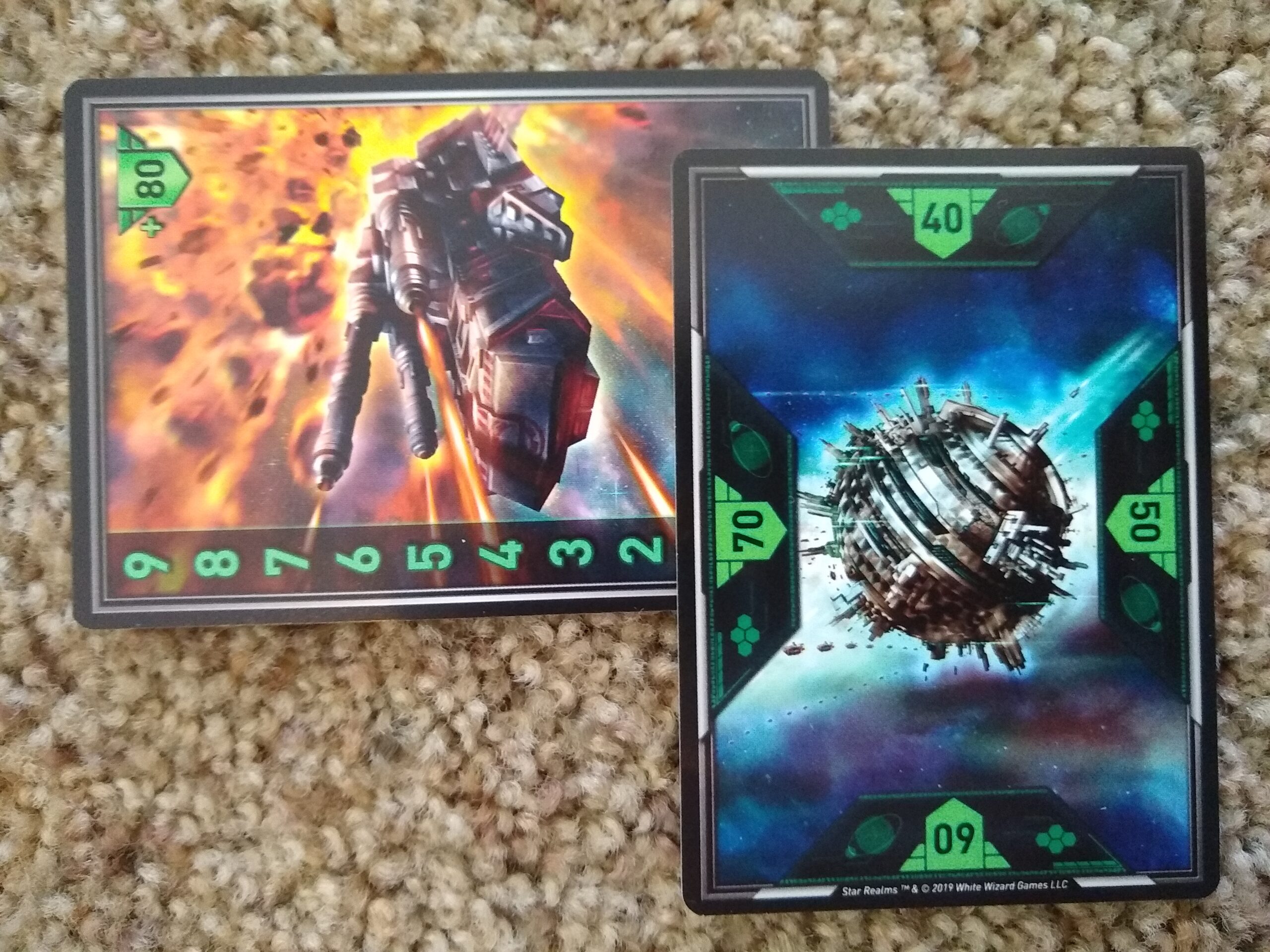
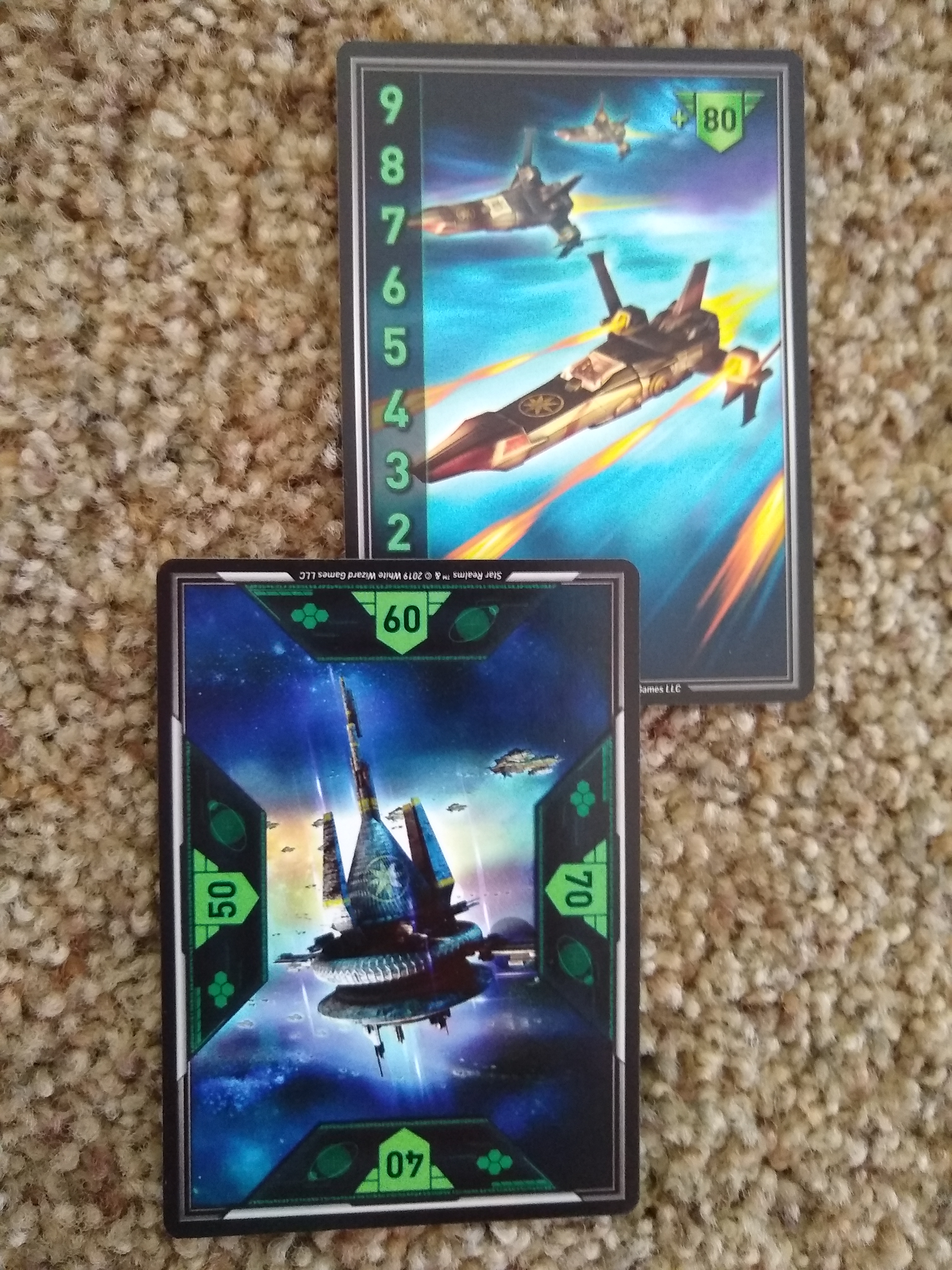
One neat thing that they did was that they allocated two cards per player to track strength, as shown in the pictures above and below. For example, the player below has a strength of 62. You can combine the two cards, which are double-sided, to track a health up to 99. I doubt that this way of tracking a statistic is unique to Star Realms, but it’s noteworthy because it means that they didn’t have to ship tokens, and they had a ton of space available for displaying art on these cards, which essentially serve as a compact form of player mat.
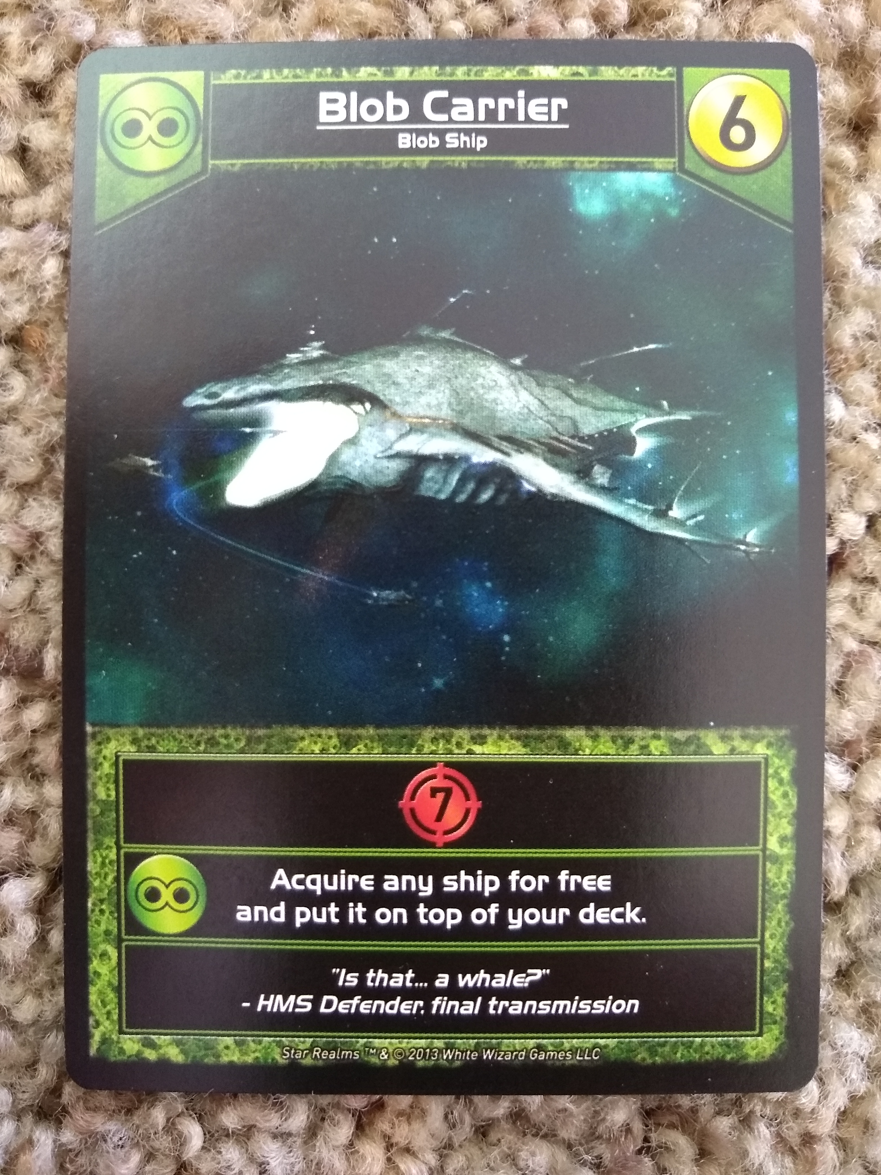
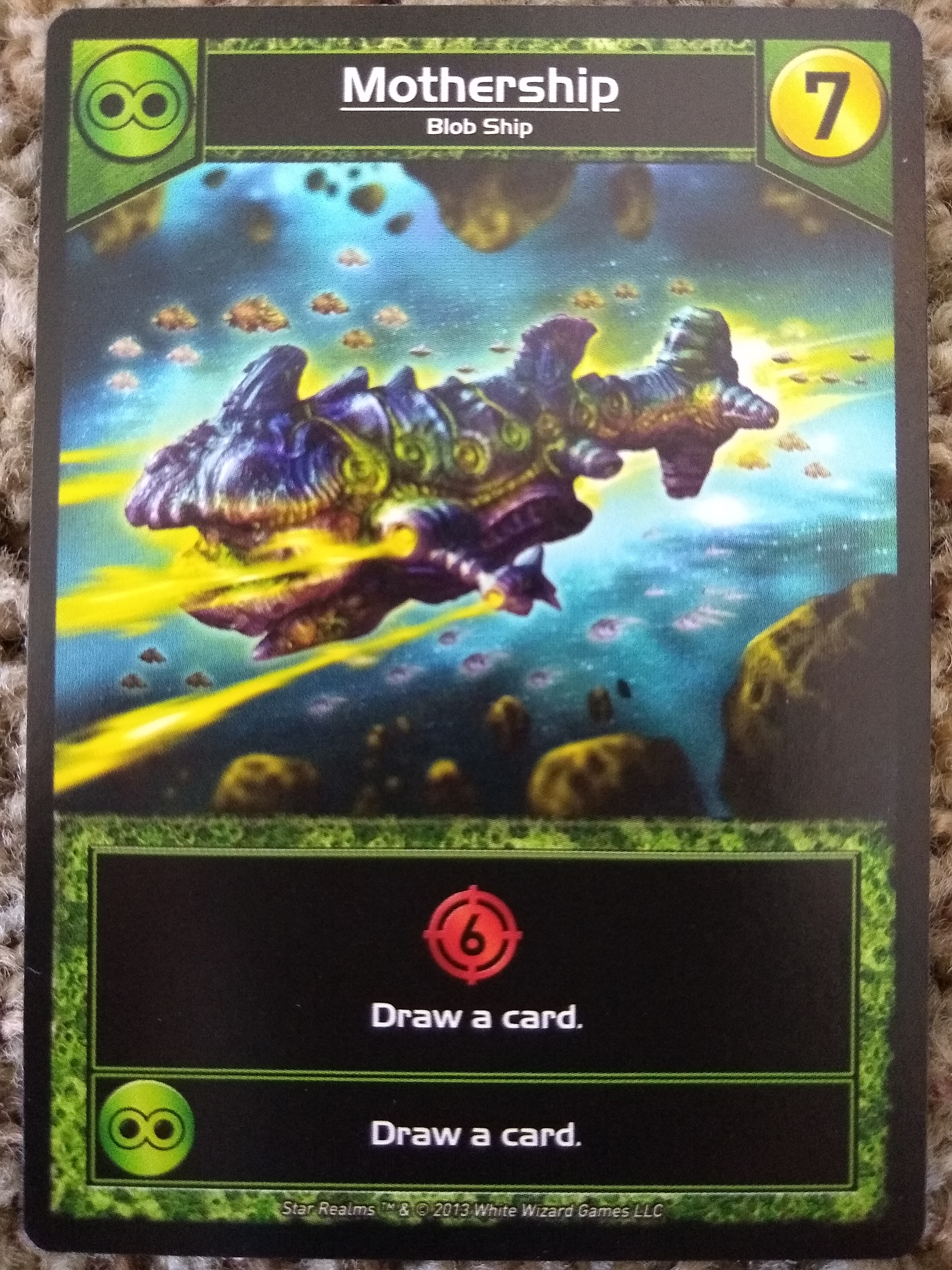
I also like how the other cards allocate a generous amount of space to game art, much like Magic cards. (No coincidence. The designers are big into Magic, and one of them contributed to designing Ascension.) This is a smart move, as the art has to carry the load of generating table presence. It’s highly saturated, so it’s not especially easy on the eyes. It also uses sharp points and edges, as well as hyperbolic shapes, to draw the eye. And the ample space on the cards makes it possible to give each class of ship a lot of personality (such as the Blob Carrier — flavor text: “Is that… a whale?” – HMS Defender, final transmission).
There are several factors for this generous space.
First, there are relatively few icons, and they together summarize virtually all of what you need to know about the card. The icons waste space on neither detail nor secondary colors; they are all black on flat color with a metallic sheen effect.
Second, that little effect text at the bottom is small (even smaller than on old Magic cards). It’s important but not important enough to deserve a bigger font. The flavor text is even smaller (and could have been made even a tad smaller still). The copyright text at the bottom is microscopic, literally nestled within the bottom border. The title text at the top could probably have even been a tad smaller, if the designer had wanted to shrink the top icons a bit.
Third, the font itself is very tight. There are no serifs in sight. The letter e is represented with a glyph that looks like an uppercase E, which facilitates readability even at small scale while seasoning the text with a bit of theme. Many of the other glyphs are narrow and geometric (I’m looking at you, letters i, o and l).
Fourth, the cards don’t have especially large borders around the popouts (even narrower than on Magic cards). The art has no border at all on the sides and simply runs to the edge of the card’s safe zone. It could have been allowed to go full bleed, for even more peripheral context to the pictures. The mini-popouts at the bottom don’t have much space for their own borders but, instead, are gathered within one single colored border that hints at the card type. The designer could have gone even further and eliminated the top border by moving the card title to the mini-popouts below (allowing the two top icons to float), but I think that would have impaired aesthetic balance and readability, so investing in a top border was a good call.
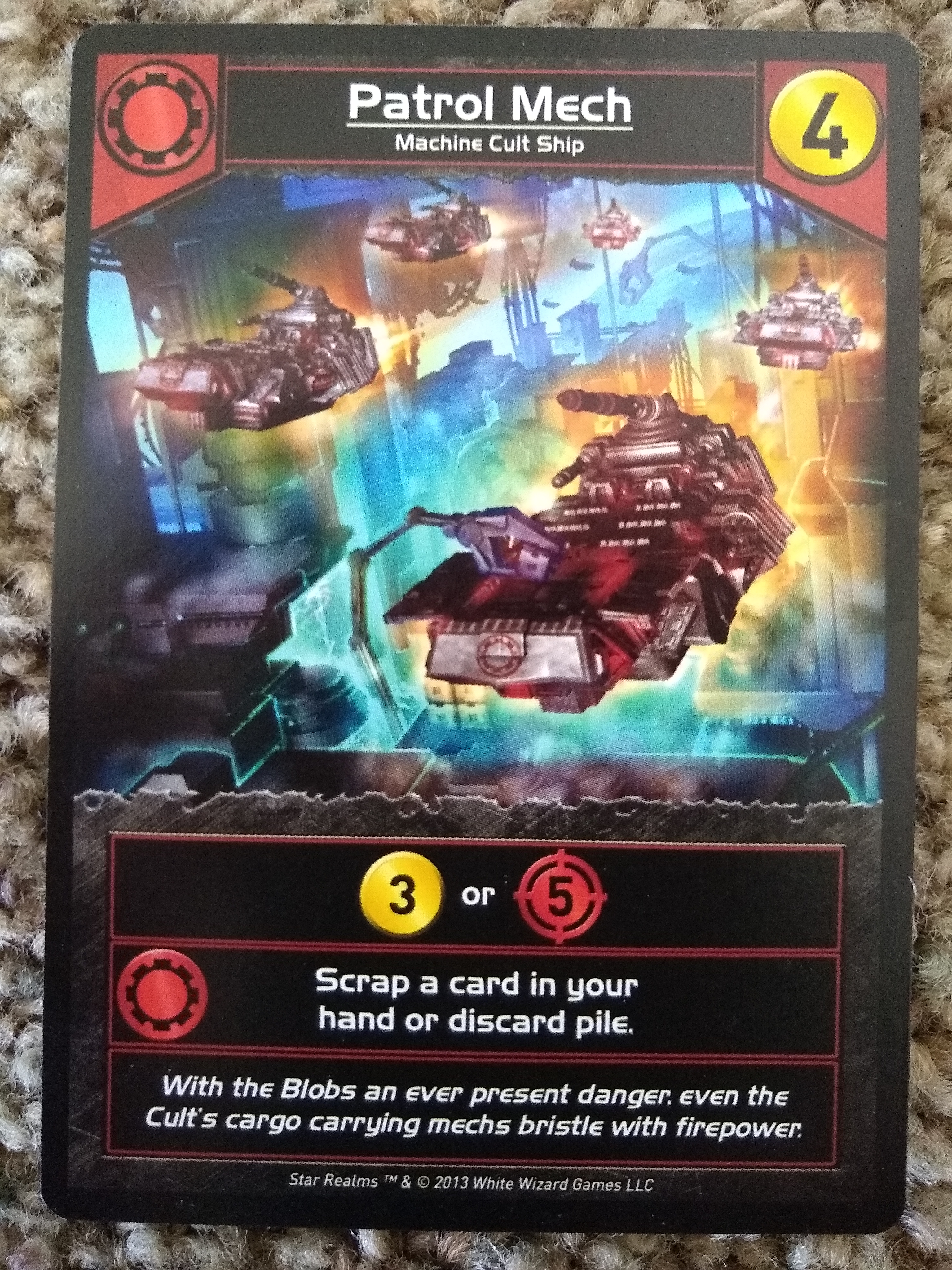
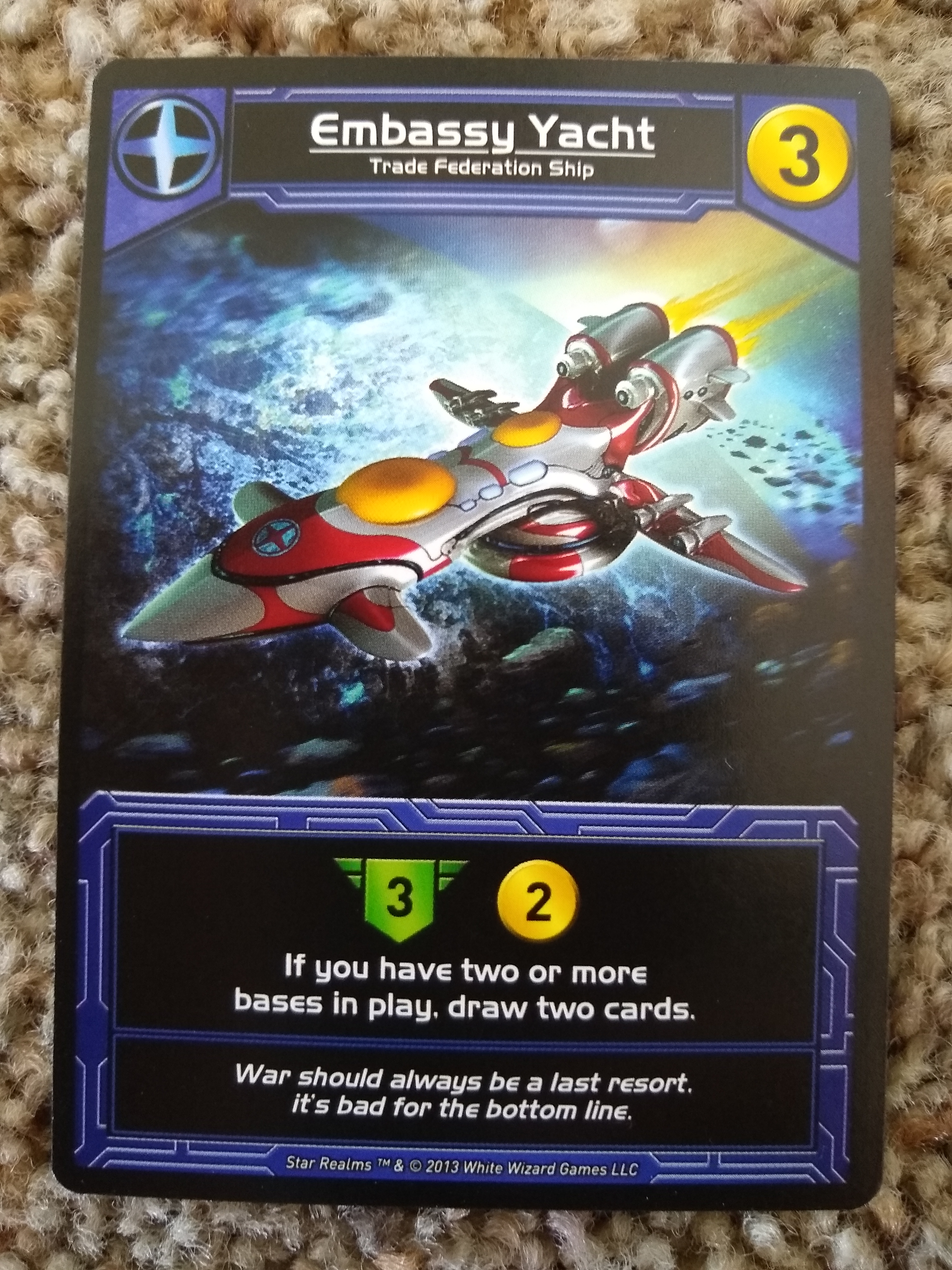
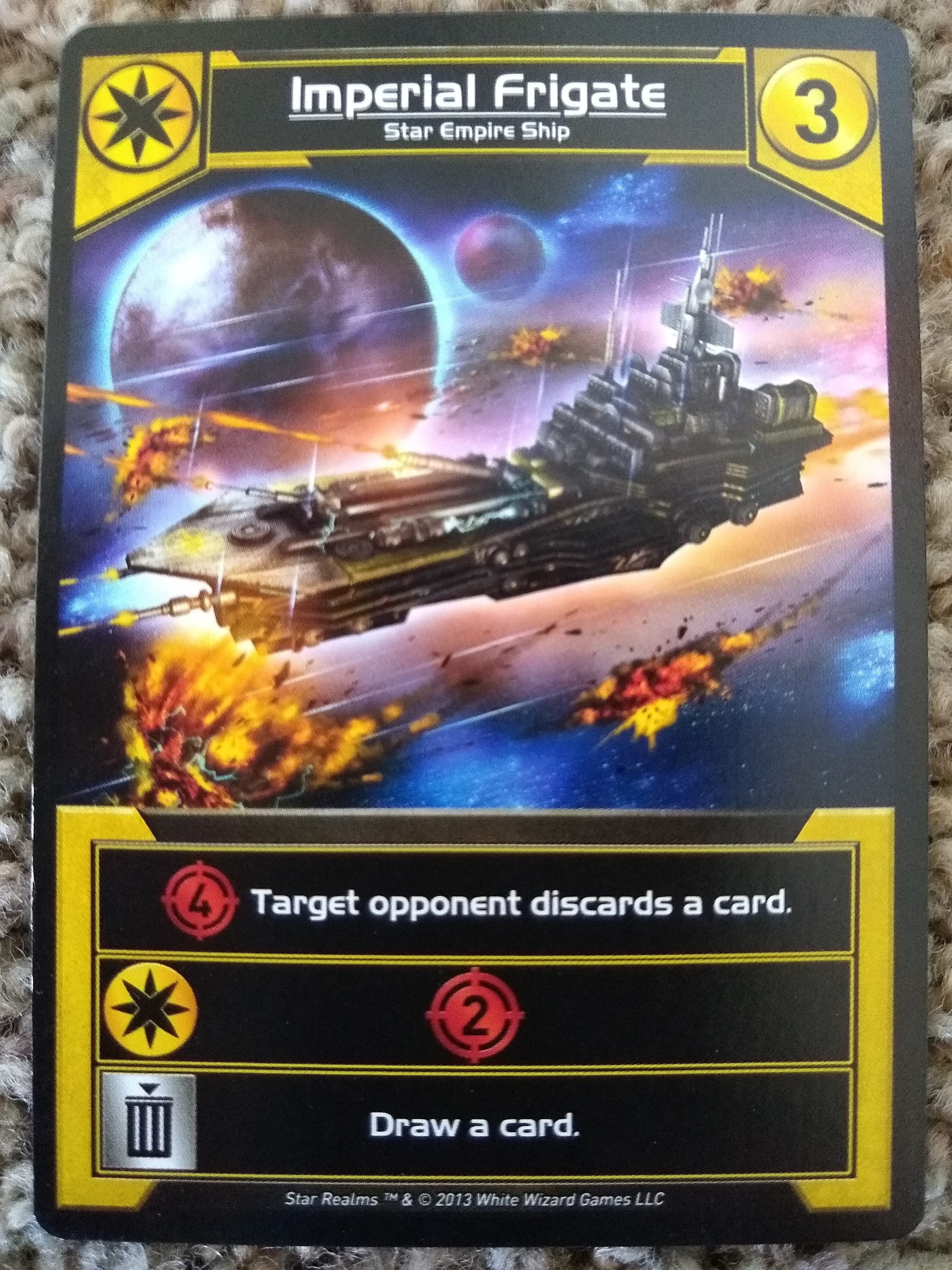
It intrigues me that the borders generally have a texture that varies by card type (good practice), except for the yellow cards. These are just a flat yellow (below), without even a sheen. Maybe it’s just so subtle that I didn’t notice it?
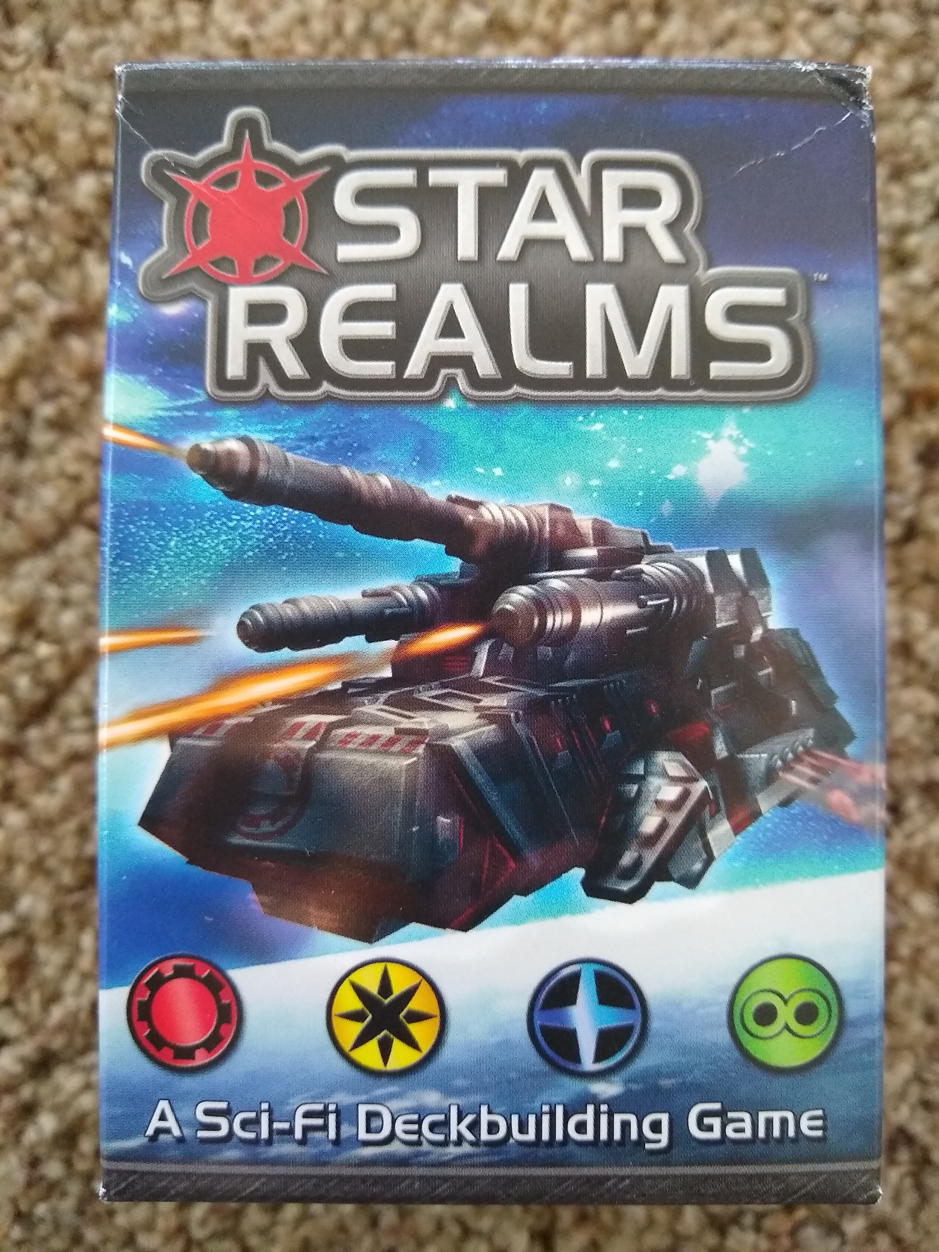
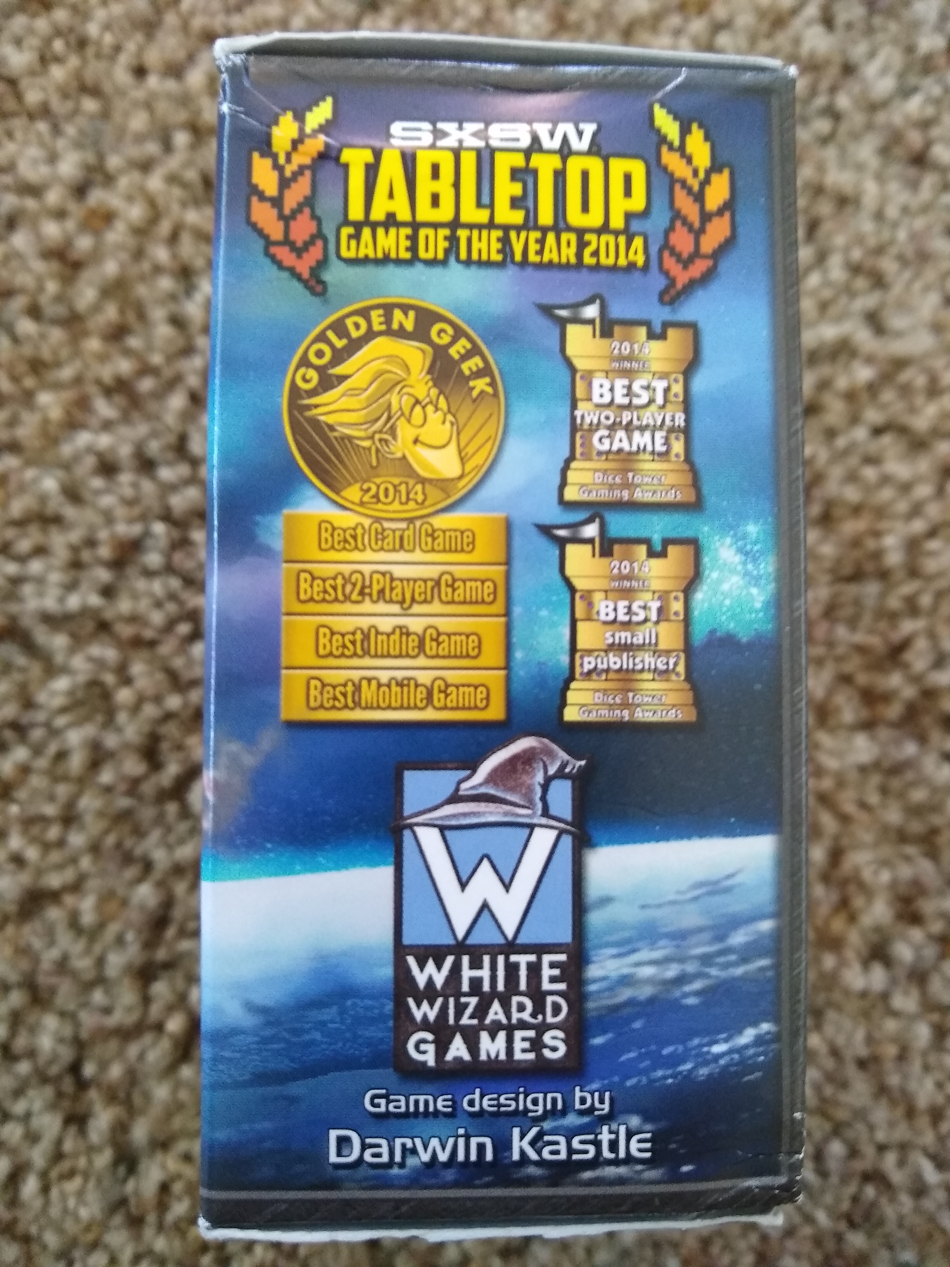
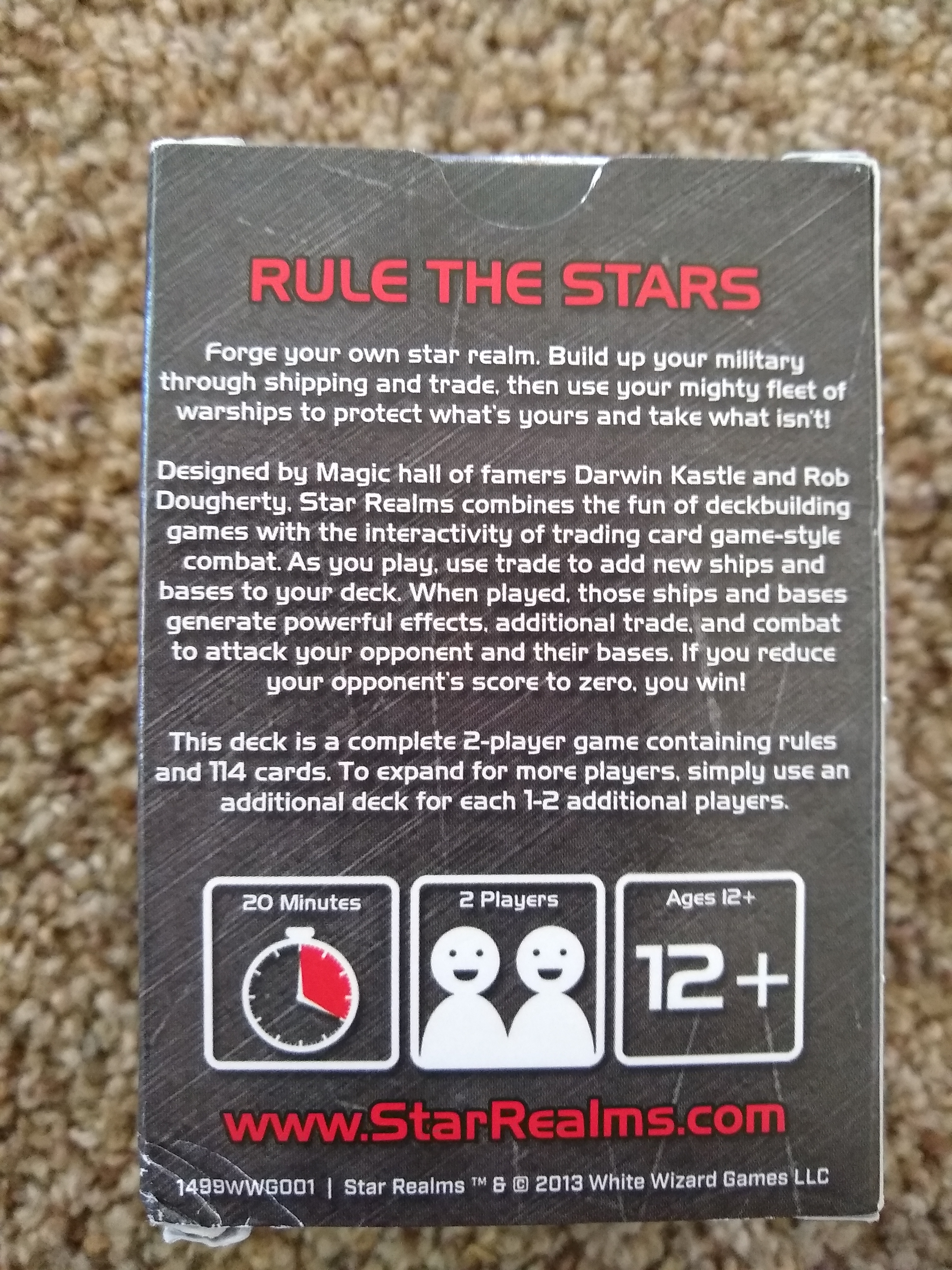
Finally, I’ll quickly note what I like about the card’s compact box (below). The cover includes the four core icons for interest, which I think generates a bit of intrigue about the game. The side highlights several awards that the game won, to provide a bit of social proof about the game’s quality. The back doesn’t waste any space on more card art (the cover does a fine job of communicating what that’s all about) and, instead, dives into the details of (a) the theme, (b) the designers’ fame, and (c) the mechanics. If I want more information, I can see the URL to find it.
What other cards-only games do you especially enjoy for their graphic design and/or art, and what tricks/techniques do they use to save space while maintaining usability?