It’s no secret that I love Stonemaier, and it’s because of how they present their products as much as for the products themselves. That includes Jamey Stegmaier’s boundless enthusiasm (both for Stonemaier’s products and for other company’s products) and it includes how other members of their team showcase products.
Wingspan’s product page, for example, has a lot to admire. In this article, I’ll also mention aspects of a few other companies’ product pages that I have found that I appreciate. I’ll include some annotated screenshots of websites below, for the purpose of criticism and comment.
Help players discover other games
The page doesn’t focus solely on Wingspan. The top menu, below, provides direct access to a few other games. These, incidentally, are NOT Stonemaier’s best-selling games. Instead, they are the games that are having a day in the sun because of recent new releases/expansions. Wingspan lights up in orange because that’s the page where I am. Interestingly, if I click on a game not of the menu, such as Red Rising, then that game does not appear on the menu (it’s a static list of 5 games). The link itself is a menu, with options for buying a copy, accessing the FAQ, viewing expansions, etc.
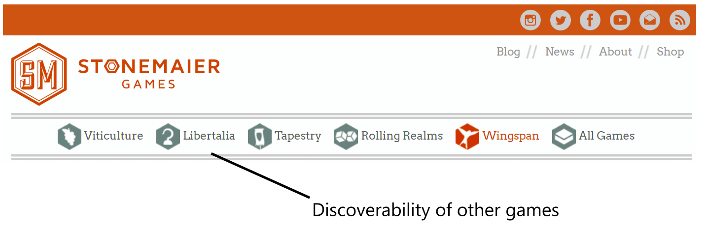
Czech Games Edition does something similar, but instead of an icon for each game, they provide a little picture of the games, and the list of games in the menu is quite comprehensive, so it needs to have a way to scroll through the menu. I think that I like the Stonemaier iconography a bit better than a game screenshot because the screenshots are kind of crowded and hard to read; the icons make me a bit curious, like I’m asking myself, “Why does Libertalia have a hook? Pirates?” (Yes. Pirates.)
Digest the product
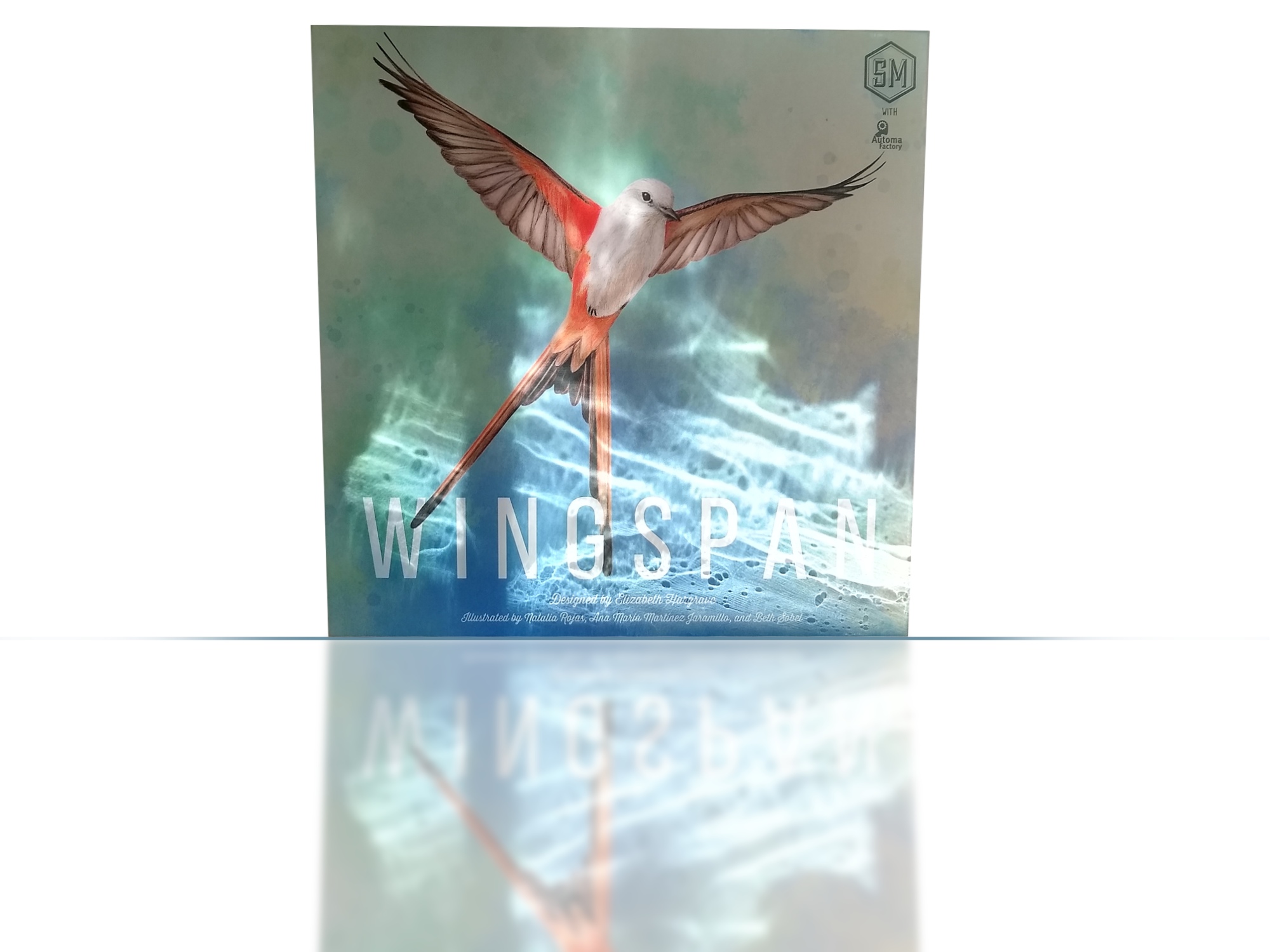
The “above the fold” section of a Stonemaier page always includes a photo of the game box. Jamey has commented somewhere in his blog that a photo of the physical package makes the product feel more real to potential customers. The sides of the box also crucially help sell the game.
The headline font is consistent across all games, even though the games themselves have very different themes. It bears some resemblance to the wordmark font of Viticulture, so perhaps Stonemaier picked that font back when Viticulture was the big kid on the block, then stuck with it. That seems to be what happened with Red Raven and Above & Below, as their entire site now uses a very similar font to that series of games.
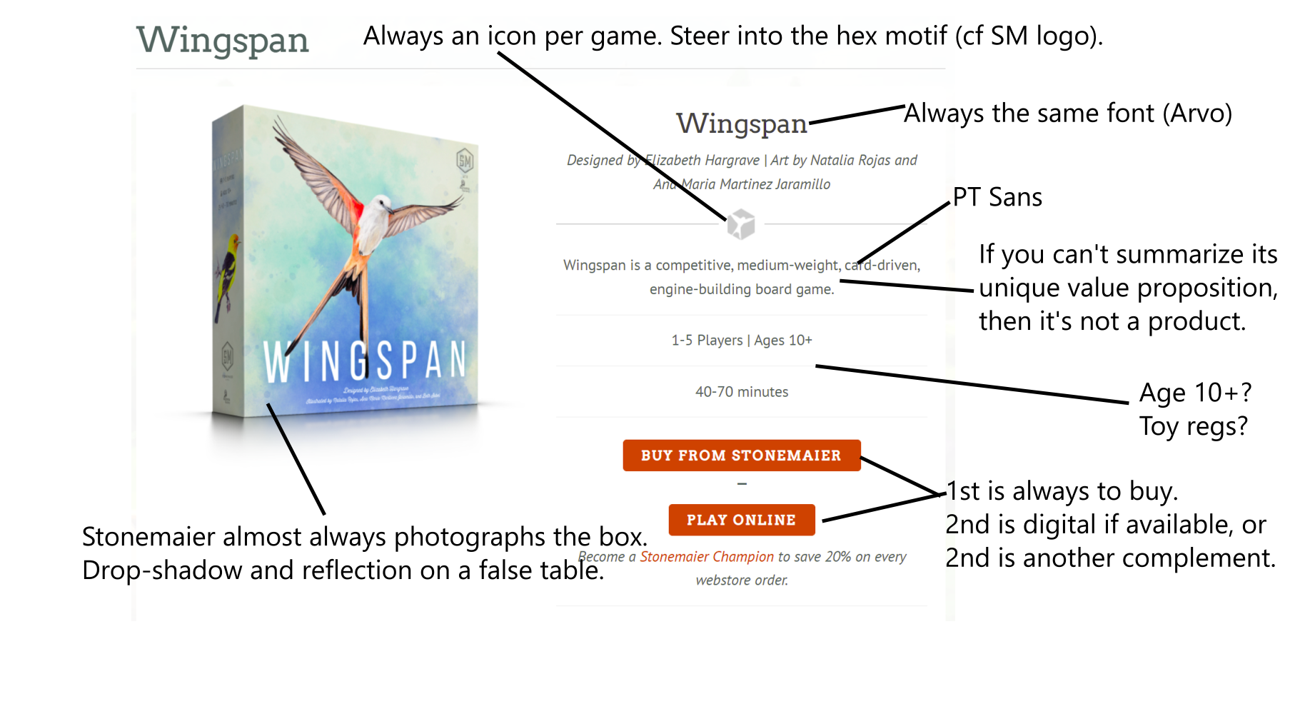
I find the second button on the Stonemaier product page quite interesting. It always points to a complement of the physical game. Whenever possible, this is the digital version of the game. For games that don’t yet have a digital edition, the button goes to another type of interactive tool that amplifies interest in the game, such as the Pirate Name Generator for Libertalia and a “Choose Your Realm” tool for Rolling Realms.
Introduce the game
Stonemaier breaks with many other websites, including some game publishers, by placing the submenu of items related to the game onto the right side of the screen. This makes sense if (a) your goal is to introduce the product and (b) you’re primarily targeting a culture that reads left-to-right. They place the product description on the left side of the menu, so that people can get an idea before diving into details.
I especially like the paragraph that begins “If you enjoy Terraforming Mars and Gizmos, we think this game will take flight at your table.” This, too, is a big difference from other game publishers. I looked through a bunch of them just now, and I can’t find any that make a habit of comparing their games to other successful games. I suppose it’s a mark of appreciation for those other games to mention them here, and it helps communicate to the players (in terms that they are familiar with) whether Stonemaier thinks Wingspan is for them. I also kind of agree on the similarities between Terraforming Mars and Wingspan (particularly TM with drafting, and if you forget the area-management aspect of TM).
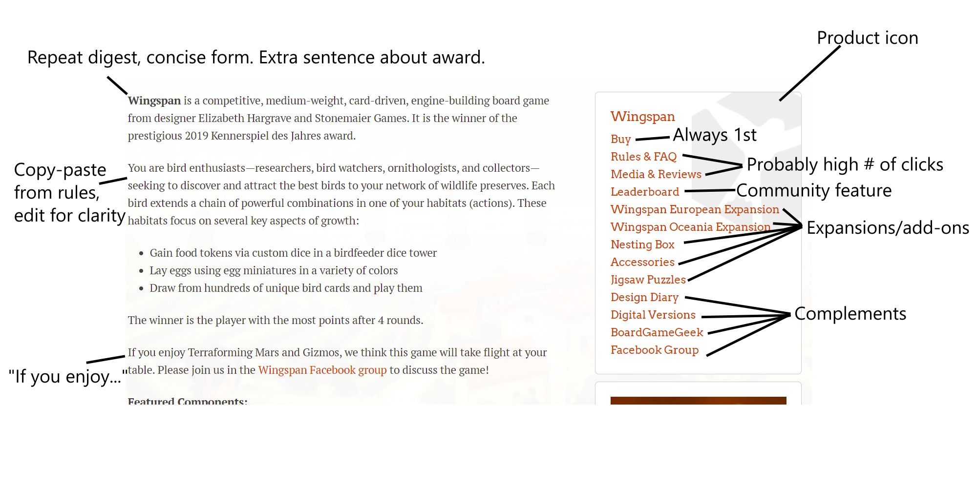
The right side of the page includes links to quite a few complements, including links to entire pages devoted to Rules/FAQs and to Media/Reviews. (This menu matches the links on the drop-down menu of the Wingspan icon in the top menu.)
I’m kind of surprised to see that most other publishers tend not to link from their product pages to reviews. Instinctively, I assume this is because they worry those reviews aren’t glowing, but upon reflection I realize it could also be because it’s extra work to maintain a page of links to reviewers when more reviews appear. Stonemaier probably only publishes links to reviews that they specifically request. Jamey has commented that he doesn’t even look at the reviews that he links to, in order to reduce the risk of implicit pressure on reviewers to give a good review. (Not having yet seen any reviews about my games, I would be too curious and would have to click!) In any case, if people take the time to review your game, you might as well be a good member of the industry community and link to their reviews.
Generate desire for the physical product
The section above focused on theme and mechanics, which are the core abstract qualities that define a game. They are the stock and trade of a game designer.
This next section focuses on aspects of the actual product itself that represents the game, consisting of physical components. This is a key area where the game publisher plays a role separate from the game designer, for it is the publisher who ultimately decides how to represent a game to the customers.
This section communicates several key points without explicitly saying them. First, this game is a good deal because you get “a lot of stuff.” I mean, A LOT of stuff. Second, some of this stuff is unique, tactile, colorful, and fun-looking. Other publishers tend to include this information, as well. For example, Days of Wonder includes a list of components and a single big photo spread for the Europe 15th Anniversary Edition of Ticket to Ride.
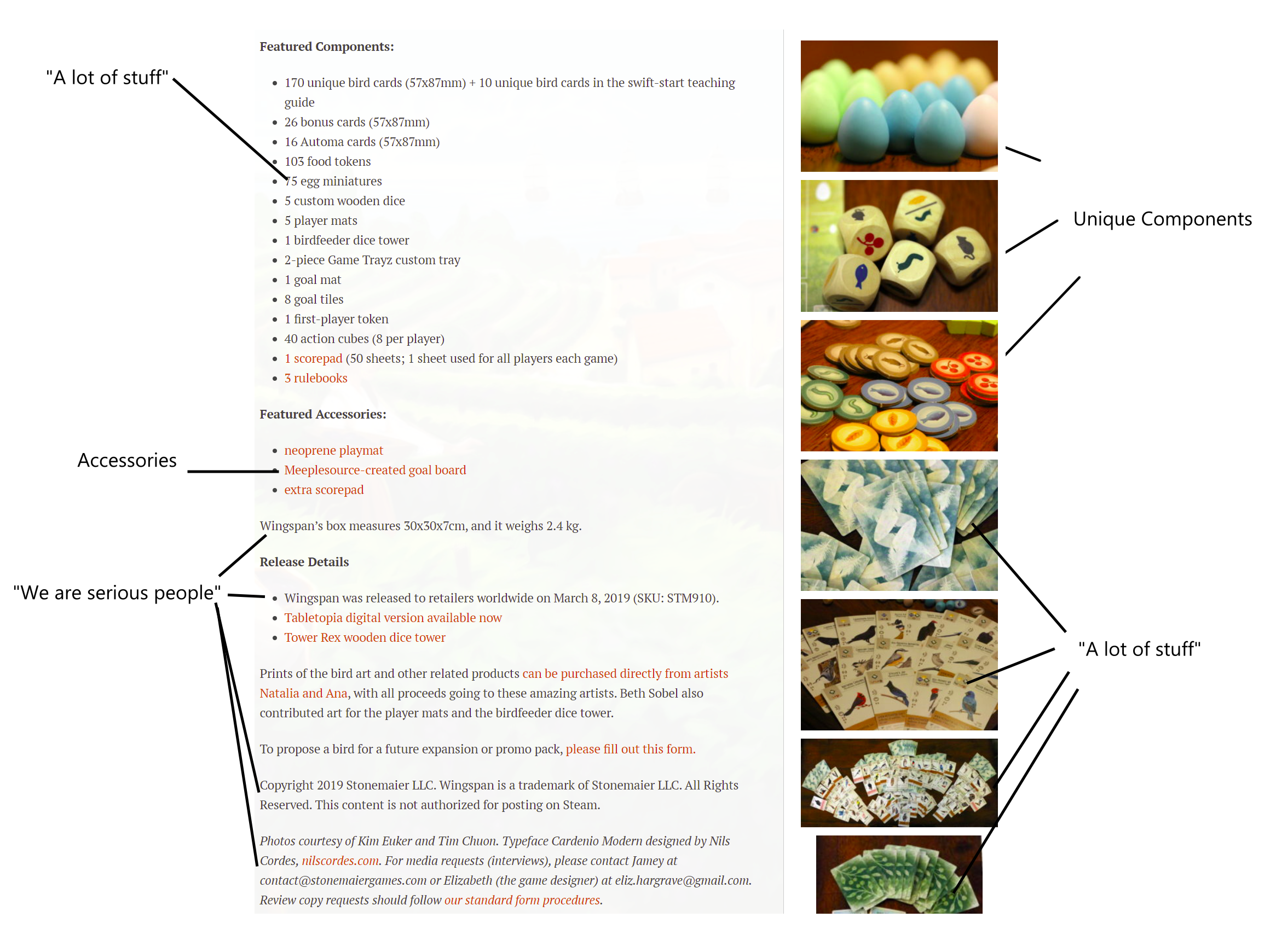
Stonemaier communicates a subtle third point with the text above: We are serious people. What I mean by that is they indicate the size and weight of the packaging, give the date of release to retailers, state copyright information, give credit to a ton of people, and give contact information for following up. Much of this information will be of some use to retailers, with whom Stonemaier increasingly deals directly due to the unreliability of distributors in getting products to stores. I think it also subtly communicates that Stonemaier itself is a company that takes its own products seriously, and it contrasts again with quite a few other publishers (some of whom don’t even include links to rulebooks on their pages).
Illustrate the beauty of the game
The page then goes way overboard with tons of additional visuals emphasizing the “lots of stuff” and “unique stuff” messages.
The big image on the top-left below is interesting. Stylistically, it’s very similar to the kind of sell sheet that designers prepare to get a pitch meeting with publishers. However, the actual content inside the image focuses on the components themselves (i.e., the contribution of the publisher rather than the designer). Content-wise, it’s much like what you’d see in a Kickstarter page.
The picture of Jamey’s cat by the box, on the right, is also interesting. Jamey once reviewed Instagram accounts of companies like his and found that those with pictures of stuff besides games (i.e., cats and other subjects from real life) tended to get a lot of clicks/shares/followers.
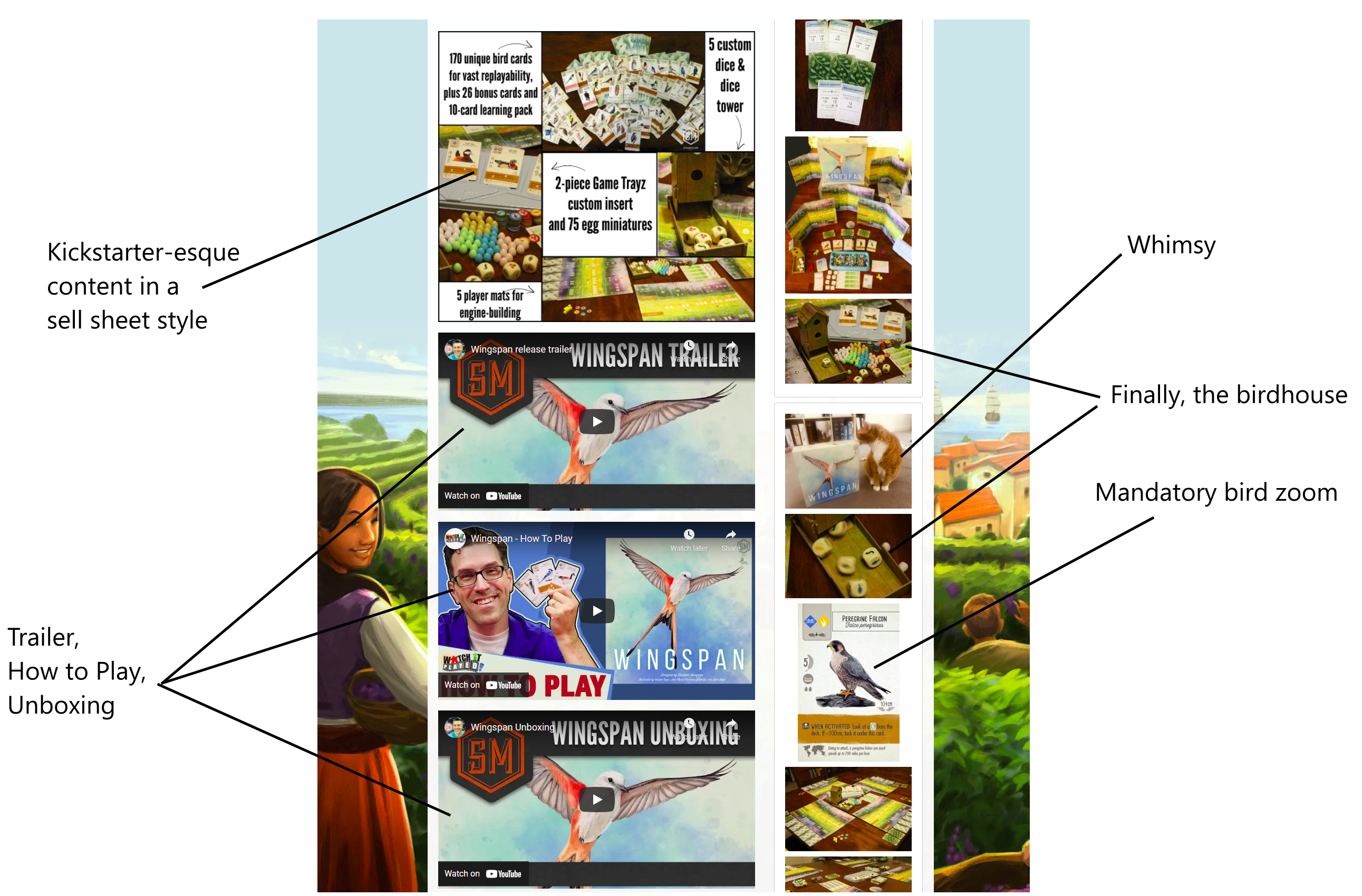
I’ll mention in passing that the background picture splashing to the sides of the screen, above, is from the latest Viticulture expansion — perhaps subtly making users aware of other products.
Build customer engagement
The page concludes with an area where readers can type comments, which Jamey personally monitors and answers. The site, internally, appears to entirely be a WordPress blog, which Stonemaier happens to use to sell products. It grew out of the blog that Jamey started a long time ago, as part of his strategy for cultivating a crowd prior to the Kickstarters of his first few products. This, too, appears to be distinctive and perhaps unique aspect of Stonemaier. Even though they have moved on from Kickstarting, they still allow players to comment directly on the product pages.
While I’m sure that Jamey has to purge truly inappropriate/hateful comments now and then, the fact that Stonemaier lets people write on their pages has the potential for many side benefits. First, it provides a direct avenue for customer engagement. Second, it allows Jamey to answer a question once rather than dealing with a million people asking the same question by email. Third, the positivity of these comments provides social proof about the products’ quality.
Notes to self
- Each game gets its own page (with subpages when eventually necessary).
- Links to other games on the header/navigation bar.
- Distinctive icon per game, linked to a motif of the publisher logo
- Photo of boxed product
- Game digest
- Link to buy
- Link to complements
- Follow with theme and mechanics
- Photos: lots of stuff, unique stuff, whimsy… BEAUTY
- We’re serious people
- Community engagement – Use WordPress?
1 thought on “How do Publishers Present Games on Websites? Wingspan as an Example”
Comments are closed.