I find myself admiring the back of your hand sometimes. I mean, your hand of cards. I mean, the back of the cards in your hand. It’s not palmistry. It’s graphic design and art.
Card backs are softer for natural themes, harder for human themes, and a mixture where needed
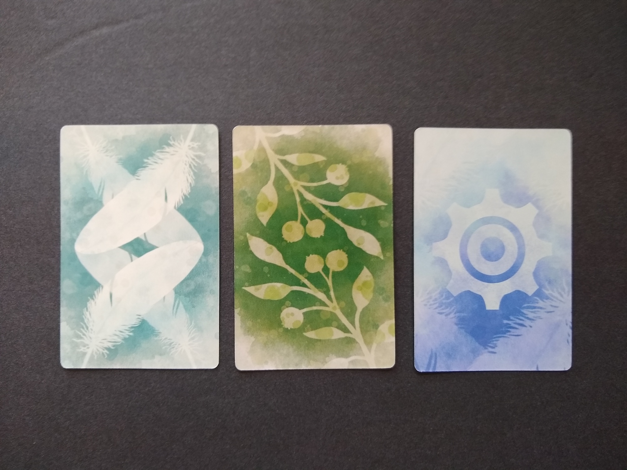
For example, the card backs for Stonemaier’s Wingspan (above) reflect the theme of the game extremely well. The feather indicates a bird card, and the bush indicates an objective card. The gear symbol on the third card stands out as the only “unnatural” motif, which perhaps makes sense because it’s an automa card (i.e., a card that controls an autonomous opponent for 1-player games). All three have the same soft edges used to render the sky in the art of the box. All three cards feel comfortable and aligned with the relaxed vibe of the game. The card backs also feel like they mutually fit well with one another.
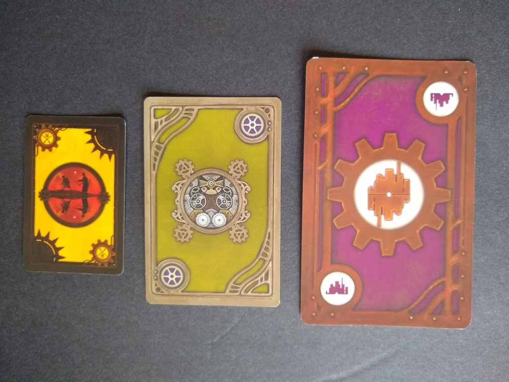
Contrast these with the cards of Stonemaier’s Scythe (below). That game involves machines fighting to define the world. The battle power card on the left has strong red tones, the automa card in the middle has a gear, and the factory card on the right has a gear and a factory. One touch that I especially like is that the second and third card have a hint of Art Nouveau to the lines and structure of the borders, which works well because the game is set in a fictionalized version of the 1920’s. All the lines in the design are strong and unnatural. The colors are also more vivid and unnatural than those of Wingspan. The colors and linework help the cards to feel like they mutually fit well with one another.
So let’s play a game. What are the three games below about, judging from the back of the cards?
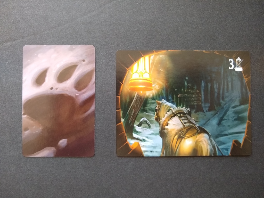

The first and the third are set in fantasy worlds. These are Merchants of the Dark Road and Lord of the Rings: Journeys. Merchants follows the pattern of relatively soft lines for the fictional setting–LOTR much less so, but these cards incorporate stylized linework that could have appeared in the dwarf/human/goblin cultures of the movie series. The colors are generally desaturated and natural except in the areas that depict the impact of civilizations (e.g., the money bag, ring, and evil creature in the LOTR cards).
Sidenote: Huge kudos to Elf Creek for putting Andrew Bosley’s art on the back of the Merchants cards. Holy cow, that guy is a great artist.
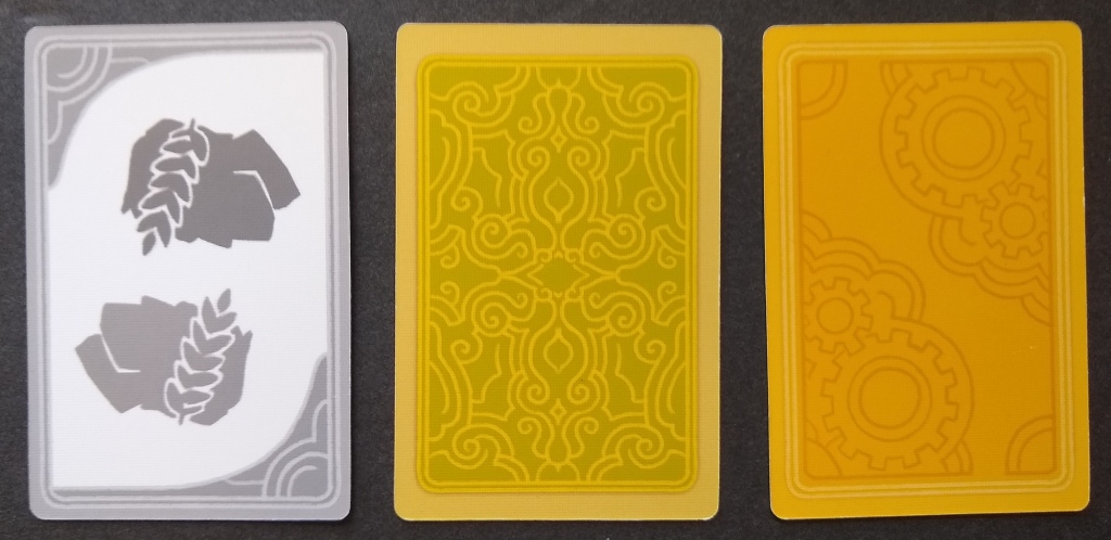
The middle set of cards above, from Stonemaier’s civilization game Tapestry, follow the pattern of clean linework for human-made settings. The middle card depicts a tapestry, which is in fact what that type of card is called within the game Tapestry. The third is a tech invention card and appropriately combines gears with clouds (symbolizing imagination). The left card is a bit of an outlier — this automa card is black-and-white, and it also depicts two human faces instead of an abstract pattern.
Card backs are usually color, not black-and-white
Merchants and LOTR each feel like their cards all belong together (respectively). The black-and-white Tapestry automa card breaks the rule by not feeling like it is part of the same game. This isn’t necessarily a criticism, as it helps with sorting the cards out, but Scythe illustrated that it’s still possible for an automa card to fit in.

In fact, I only have one other game in my collection with black-and-white card backs: R&R’s Hanabe, which is about the timing of a fireworks show in Japan. Consistent with the theme, this card combines the clean lines of Japanese pagodas with the slightly softer shapes of fireworks. I guess they might have opted for black-and-white in order to contrast better with the colorful fronts of the cards, which also depict fireworks, while avoiding the need to commission additional artwork for the back of the cards.
Card backs have become softer over time, including for human-centric themes
I also find, as a very general and rough rule of thumb, that games have trended over time toward softer art and desaturated colors. This is apparent, for example, in the sequence of games below, all of which are largely focused on humanity’s impact on the world.
- #1: The first is Steve Jackson’s Illuminati (2013 edition, which still looks a lot like the version that I first played in the 1980’s), which is about the worst of humanity and has hyperbolically strong colors and lines.
- #2 top: The next image shows Pandemic (2012 edition), with fairly hard lines as well even though the topic of disease is a somewhat naturalistic theme.
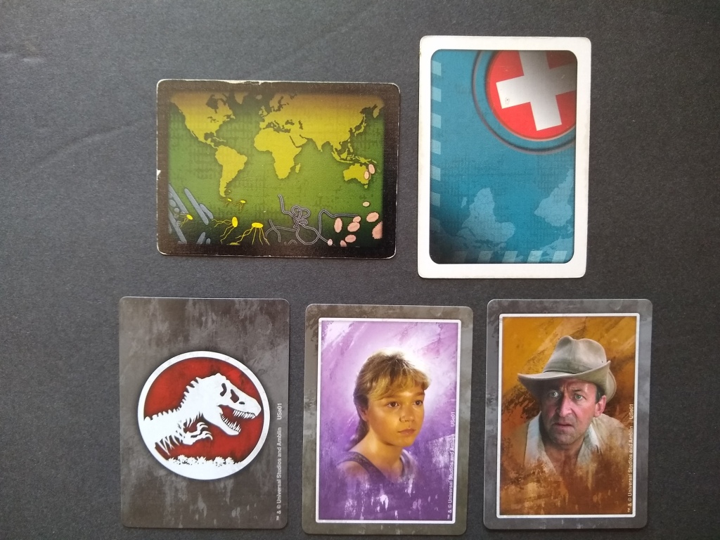
- #2 bottom: The same image also shows Jurassic Park (2018), which is about dinosaurs and has some sort of soft blurry thing going on around the dinosaur and human images. (Each player has a personal deck of cards, with corresponding card backs.)
- #3: Red Rising (2021) is entirely about futuristic human factions, much like Illuminati. Yet the card backs are far more desaturated, with far softer line work.
I could have included photos of more games like Acquire (1964), Power Grid (2000’s) and Terraforming Mars (2016), but you probably get my drift.

Apples to oranges? One could quibble that although these games all deal quite a bit with humanity, they differ by amount of natural theme and by publisher.
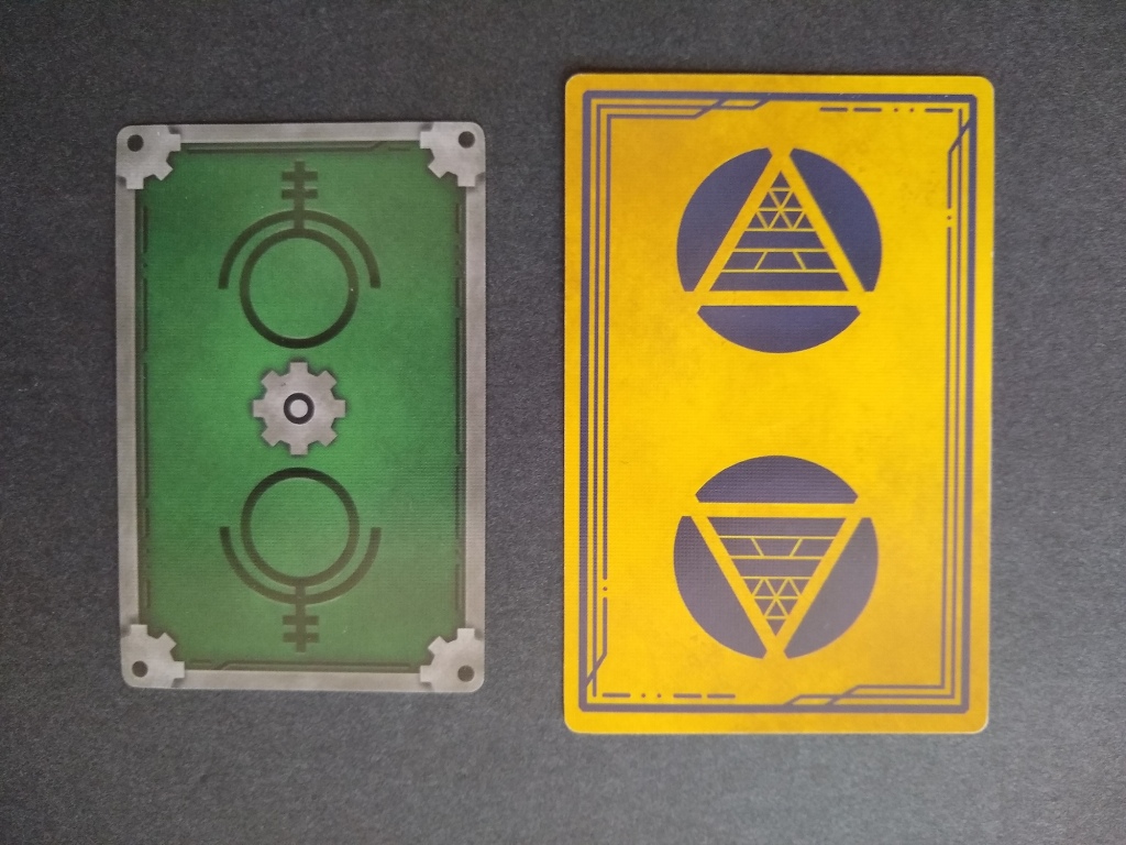
So below, let’s test the trend by comparing the old Settlers of Catan (top pair of cards) to the newer family edition (bottom). The left pair are resource cards, and the top has very sharp lines depicting little rivers as well as mountains, as well as a rich deep blue for the ocean; the bottom has replaced these with softer lines on the terrain types, swapped out the saturated blue for a washed out brown, and replaced the hard white border with a meandering edge connoting parchment or perhaps weathered stone. On the right, the development card’s punchy image of a sailing ship has been replaced by a softly rising/setting sun, while the border and background have softed much like the resource cards.
Keep in mind that the righthand cards represent human effects (such as militaries, monopolies and building construction), yet the new symbol chosen is a nice soft sun. Yes, I know that might be a military card in your hand, or even a victory point, but the sunshine is just so relaxing, so I’m not going to worry.

There are always exceptions to any rule. I don’t play many war games, and I suspect that there are plenty of Amerithrash games out there (no, I don’t consider them trash) that break with this pattern. Nonetheless, I find that over time, games have trended toward softer card backs, particularly among Euros that deal with humanity-centric themes.
Card backs rarely have text
Another pattern that I see among these cards is a near absence of text, which helps limit the need for localization. An interesting exception was Jurassic Park, which appears to be unique among these games in including copyright information on the card backs.
A handful of other games in my collection include the name of the publisher on the back, such as Forbidden Desert (below). They really wanted you to know that this is a Gamewright game. Make sure you remember that. You’ll be tested later. Forbidden Desert also bends the rule that cards should look like they’re from the same game, in having a border around the lefthand technology cards and no border around the righthand sandstorm cards. This seems reasonable, considering the disparate topic of these cards (human-centric vs nature-centric), though I might have omitted the border, in order to enhance aesthetic consistency.

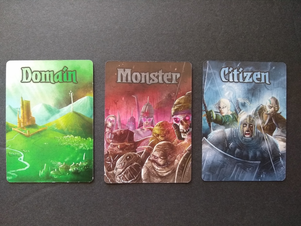
Most games also don’t need to use words to distinguish among the card types. Valeria happens to break with this pattern (below). I actually think that they could have done just fine omitting the name of the card type, as you’re probably a smart person and could have inferred from the images that the cards are about buildings, monsters and heroes.
A final game that sort of breaks the rule is Grey Fox’s Deception: Murder in Hong Kong, which has question marks on the back. The card deck with the red question mark is about red things, the blue is about blue things, and the black is about black things. This might have been a good place to more fully break with the pattern and put a word on each card, like Daily Magic did with Valeria, in order to help players infer what each card type means.

Summing up, I observe the following general patterns, albeit with some exceptions…
- Different types of cards within a game have card backs that feel like they belong together, stylistically speaking.
- Games with natural themes have softer linework/art and relatively desaturated colors.
- Games about the artificial world of civilizations/humanity/machines have hard linework/art and relatively vivid/saturated colors.
- Games have trended toward softness, even for human-centric themes.
- Games rarely have black-and-white card backs.
- Card backs rarely have text.
What other rules of thumb have you observed, or exceptions to the patterns above?
3 thoughts on “Back Handed Compliments: What We Can Learn from the Back of Cards”
Comments are closed.