As the game design, graphic design and art of Cartref approach completion, I have started designing the cover. Once finished, I’ll adapt this cover for use on the BGG WIP thread, the BGG game-database entry, the Kickstarter placeholder, this website, and the box on TGC. Which leads me to consider some options for the graphic design of the cover art.
A key question is how boxes present the title of the game. Basic graphic design principles guide many aspects of this decision: balance, contrast, hierarchy, etc. Yet, as when designing corporate logos, many options remain. As far as game titles, are there any general rules? What does it take to fit in? What would it take to stand out?
Bare wordmarks
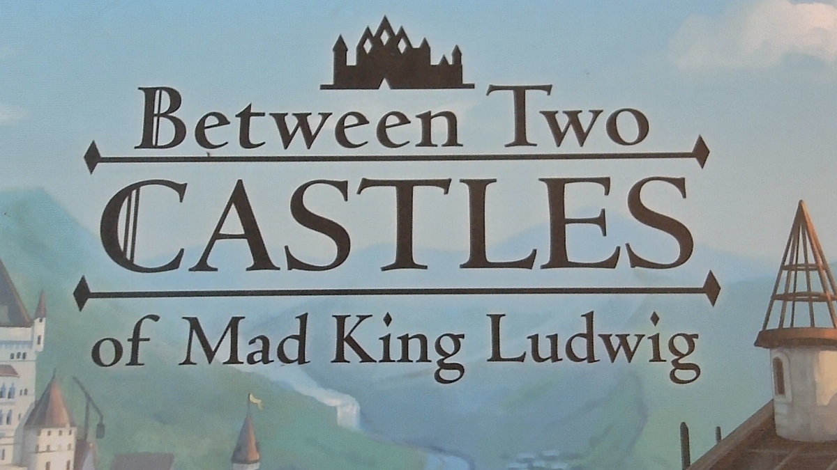
Textual/typographic presentations of the title, with minimal graphics or embellishments, are called wordmarks. And they are quite commonly used for games. Examples include the 7 below — though Between Two Castles of Mad King Ludwig is a bit of an outlier in having an illustrative symbol as part of the otherwise pure-wordmark logo. Other games with simple wordmarks overlaid directly on images include Wingspan, Deception, Acquire, Murder Mystery games, Pit, Tapestry, Loki, Brass: Birmingham, Gloomhaven, Star Wars: Rebellion, Great Western Trail, Here to Slay, Patchwork, and probably more other games than I could possibly count.
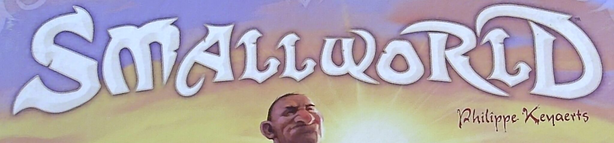
One general rule that I observe is that some publishers have a favorite way of presenting titles. Stonemaier, for example, uses wordmarks on both games above, as well as Tapestry, Red Rising, Rolling Realms, Wingspan and Libertalia. (Counter-example: Viticulture.) Another publisher that favors wordmarks is Days of Wonder, who did this on Smallworld, Five Tribes, Heat, Ticket to Ride, and Splendor.
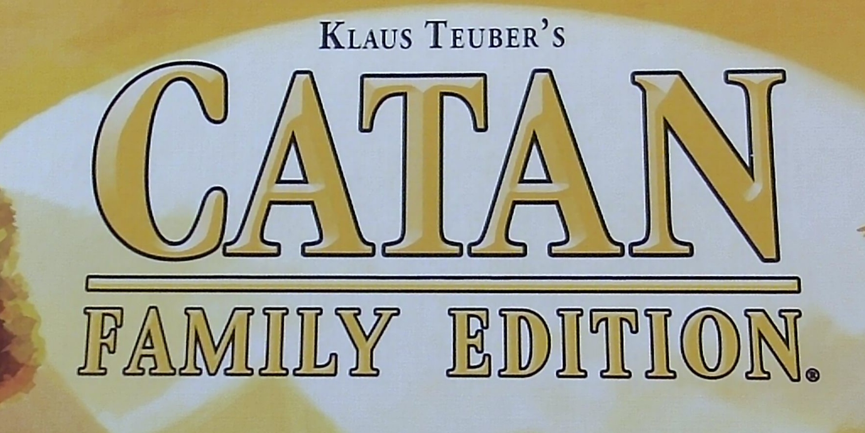
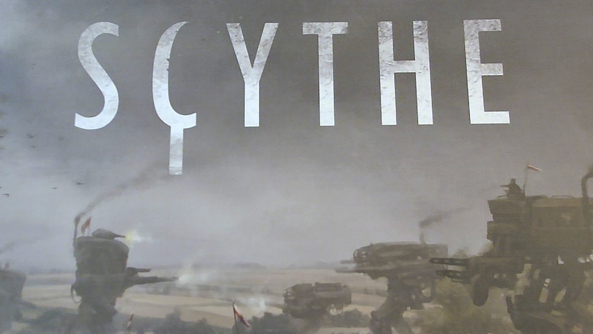
Another general rule that I observe is that if a publisher uses a wordmark, then they almost always customize the letters. In some cases, they tweak just one letter to reflect the theme; examples include the C of Scythe (which is a scythe) and the o of Rolling Realms (which is a die). Catan could easily have done this by turning an A into a house token, but all games by this publisher use wordmarks without stylized letters. It’s part of the publisher’s branding.
In most cases, this stylization feels fine in light of the theme, yet still quite arbitrary. Some are better than others! To illustrate:
- Between Two Castles has vertical bars in the B and C, consistent with fonts that people commonly associate with medieval typography (accurately nor not!) Placing “Castles” in big text between bars makes it stand out — a useful effect in light of “Between Two Cities” in Stonemaier’s catalog.
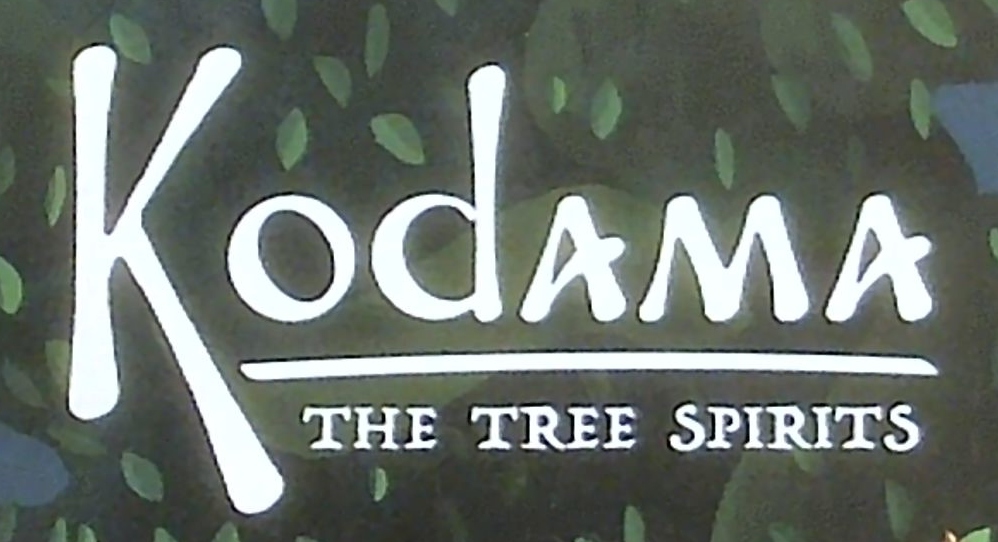
- It’s unclear why the K of Kodama needs to be long, or why the letters A are uppercase, or why these letters A swoop upward. Spirits, I guess? The letters glow lightly, which might be a better clue that we’re dealing with spirits here.
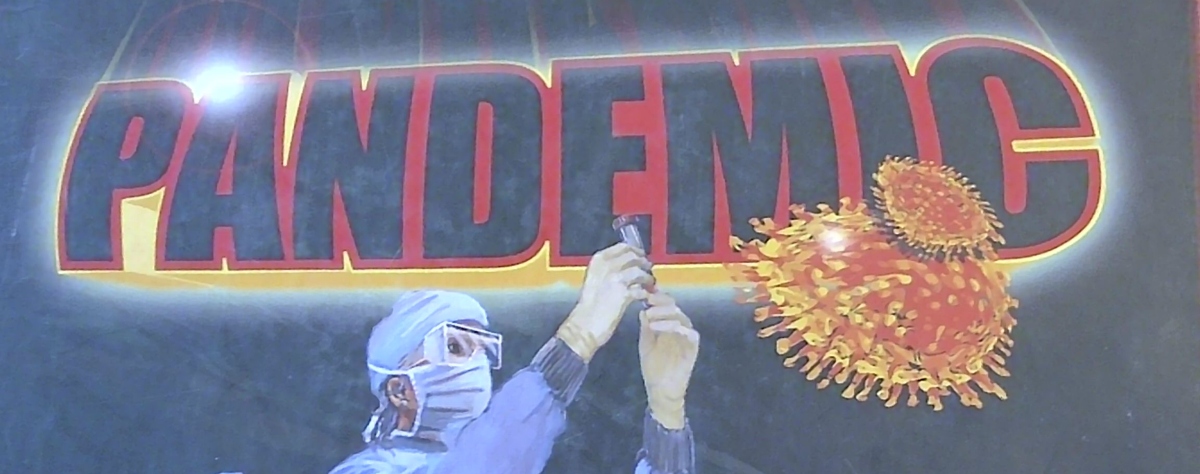
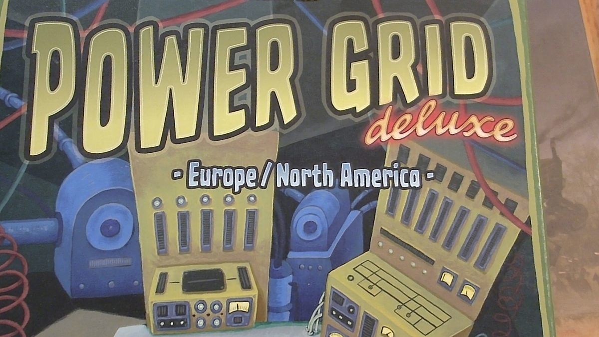
- “Pandemic” and “Power Grid” are big and bold. I don’t know why.
- For Pandemic, I don’t know why there’s a starburst over the A (or is the light just glistening off the A?) The virus/pathogen could have been developed into a symbol, but sadly it wasn’t incorporated into subsequent expansions and spinoffs — a waste of a great motif.
- For Power Grid, the winding path of the text into the distance feels quite organic — i.e., the exact opposite of a carefully engineered power grid. On the other hand, the text is yellow, which seems dandy for a game about electricity.
- Scythe has an excellent C. The rest of the letters are very plain sans-serif, perhaps to make the C stand out all the more.
- Smallworld’s text has fuzzy little whisps for serifs. Some of the whisps look like blades, which seems appropriate for a game that is fundamentally about genocide. Some of the whisps (like the one at the top-right of the D) feel less like daggers. Each letter also has cuts into it, and I’m not sure why that is.
A third general rule, carried over from general graphic design, is that a wordmark needs strong value contrast against the background image to be readable. Between Two Castles of Mad King Ludwig, Kodama, and Scythe achieve this without breaking a sweat. The other 4 required stroking, glow, or shadow around the letters to achieve adequate contrast.
Titles on popouts
Less commonly, publishers present the title against a frame (popout), which in turn sits on top of the primary cover art.
Using a popout presents an opportunity, a challenge, and some requirements.
The opportunity is to integrate the frame with the game. This goes beyond simple logo design, as for a company, because of the need to think about theme and mechanics, the latter of which is specific to game design. (Well, some companies have mechanics, but you know what I mean.)
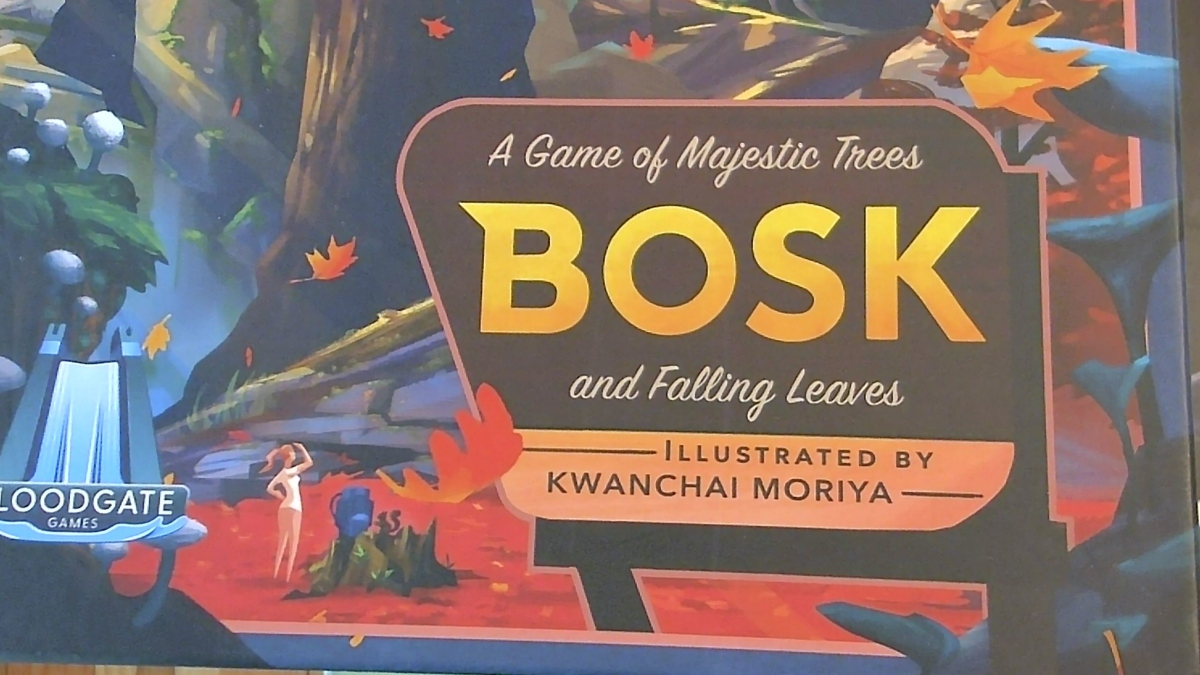
- Bosk is outstanding in this regard, as the popout feels extremely reminiscent of a national park sign.
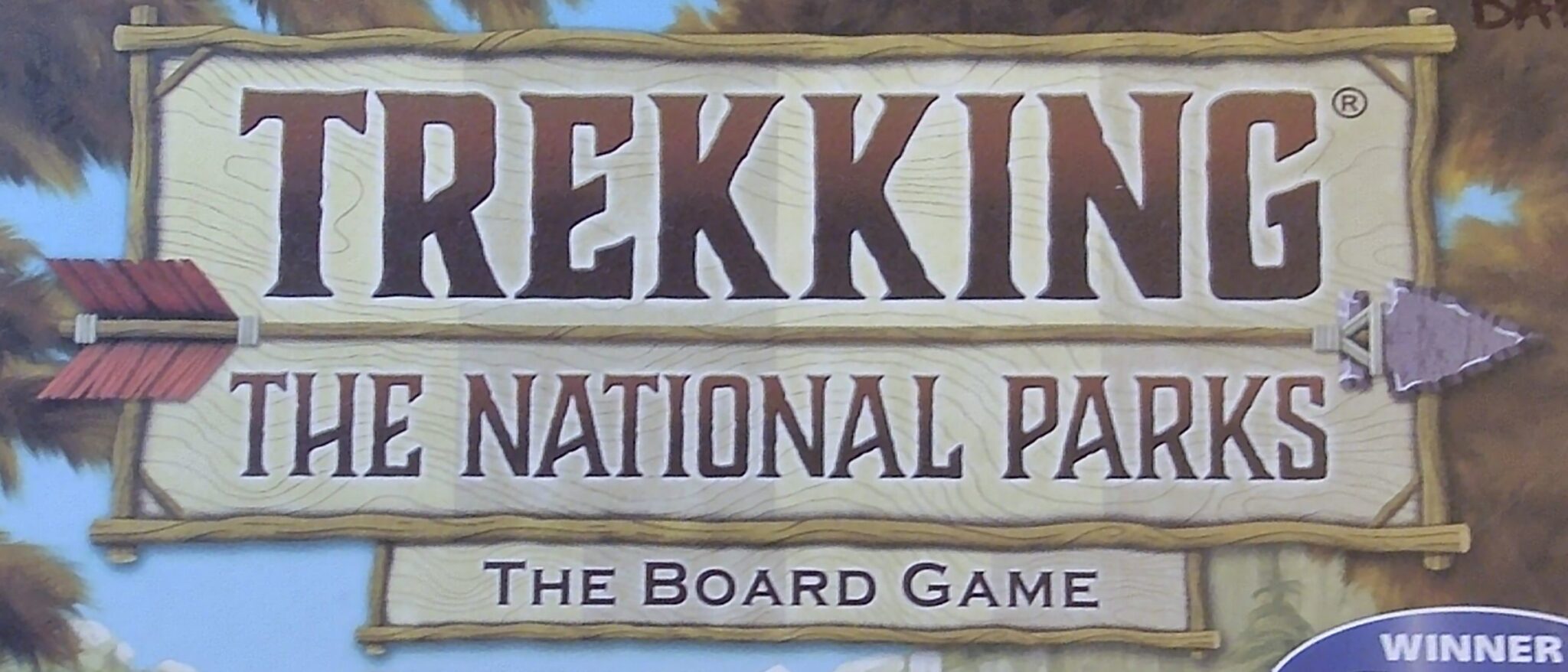
- Trekking the National Parks is good, in terms of incorporating wood and arrows into the frame. Personally, I think Bosk did it better, and Trekking predated Bosk, so the option was available at the time.
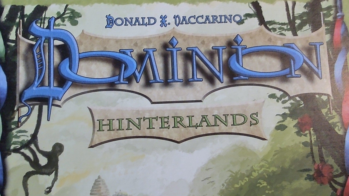
- Dominion is ok, as the background vaguely resembles a banner of some sort like you’d see announcing a royal person’s ownership of land.
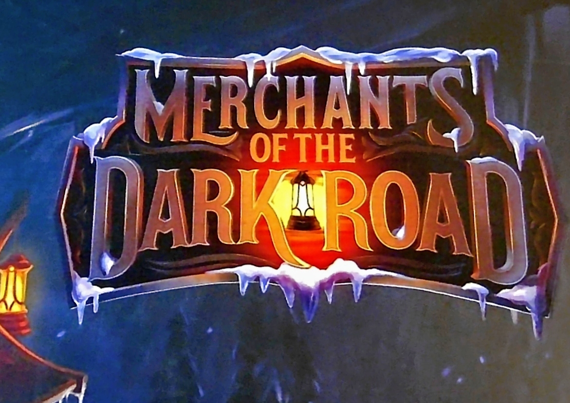
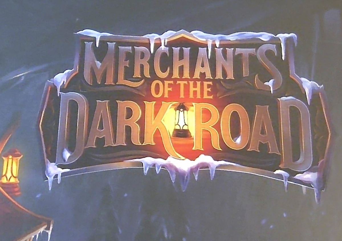
- Merchants of the Dark Road is really cool, both figuratively and thematically. Cold, ice, darkness and light figure prominently into the game’s theme and mechanics.
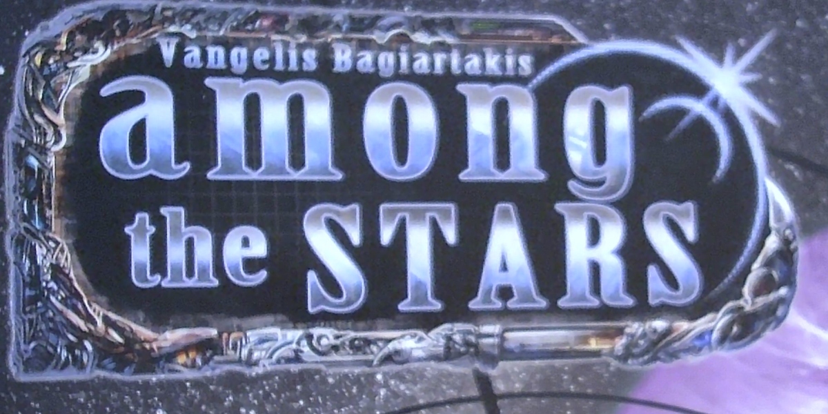
- Among the Stars doesn’t make much sense to me. The metallic gleam of the frame is probably supposed to echo the space station stuff that appears in the game, but its excessive detail or texture makes it look too much like jewelry.
The challenge is the same as the opportunity! If the frame doesn’t effectively echo the rest of the game, then the opportunity is lost, and the frame can distract rather than contribute.
The requirements for good framing are as for wordmarks (appropriate typography, contrast, etc) and, in addition, there’s an extra layer of contrast that needs consideration. That is, as in general graphic design, the letters need to contrast with the frame, and the frame needs to contrast with the image.
These contrast treatments require consistency, as well. For example, the word “Dominion” has a drop-shadow against the banner, and the banner has a drop-shadow against the image. They don’t both have to be drop-shadows, of course, but they do need to feel consistent. For example, it would feel inconsistent to use glow and stroking as in Pandemic for the contrast between “Dominion” and its frame, then to use a drop-shadow of the frame against the image.
Titles on full-bleed backgrounds
I use the word “popout” for frames that pop out from the background, as in the examples above. In general, they accomplish this by contrasting on all edges of the popout with the background image. (As far as I know, I’m the only one who uses the word “popout” to mean this kind of frame.)
Another option is a frame that bleeds all the way to the edge of the box, in essence carving out an area of the box for displaying the title.
Full-bleed backgrounds offer some advantages over the other two options above.
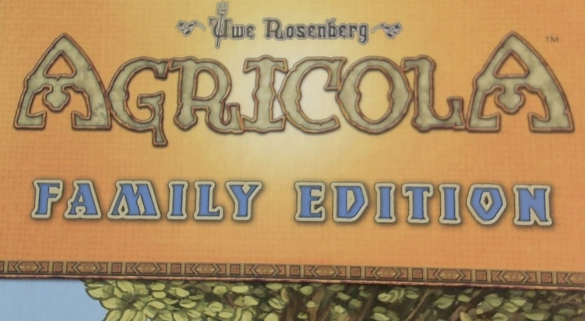
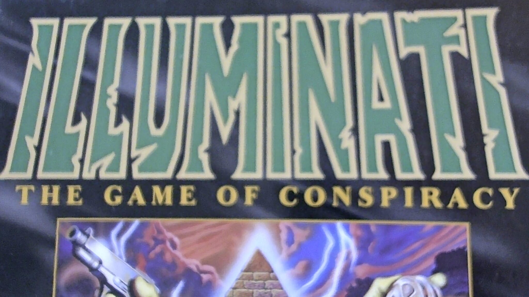
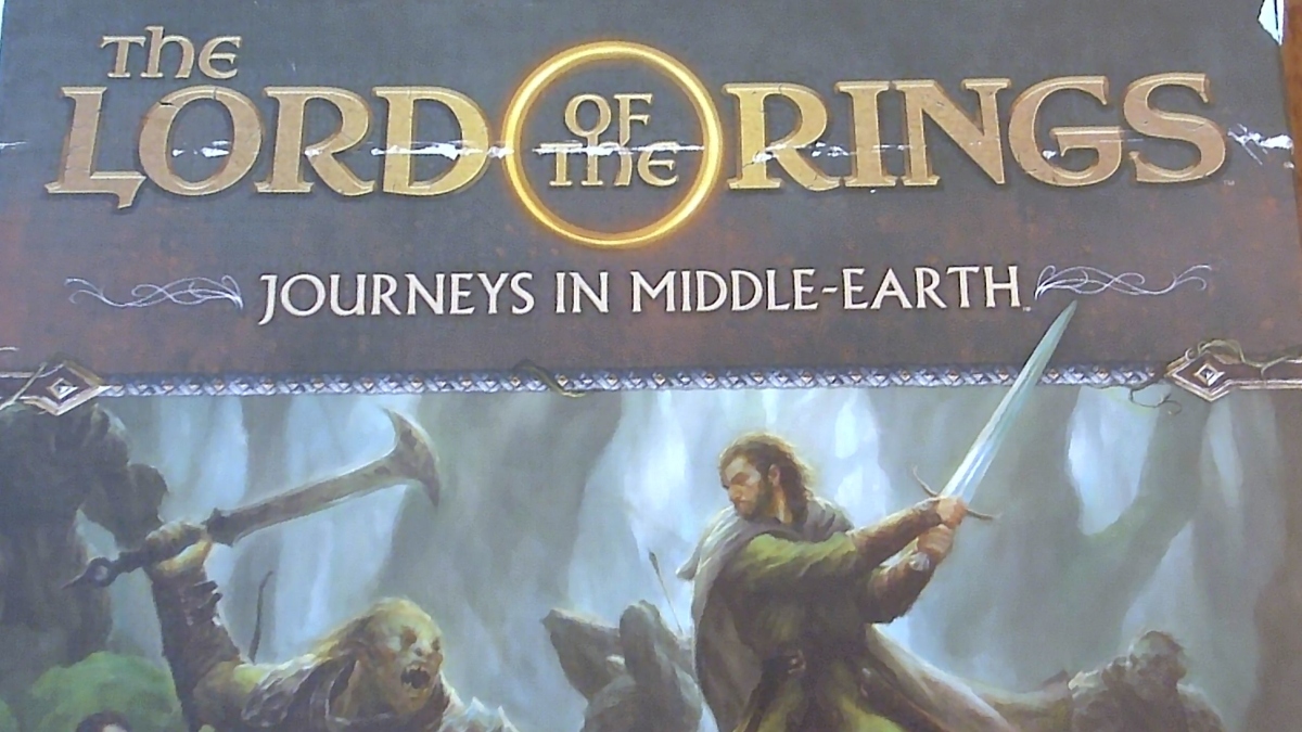
- This approach is simple and easy. For one thing, there’s less need to do something clever with the frame. In the case of Agricola and Lord of the Rings (LOTR), a nice little border suffices. In the case of Illuminati and LOTR, a very simple background fills the space. Agricola just has a glowing gradient in the background.
- Full-bleed backgrounds create a lot of space for the text. There’s plenty of room for a subtitle (or edition identifier, as in Agricola). The wordmark can incorporate nifty graphics, as in LOTR’s ring.
- Finally, this approach creates an opportunity to save money, as the cover illustration takes up less space, and smaller art is usually less expensive than bigger art (all else being equal!!!!) There’s still a need, of course, for appropriate handling of the title’s text.
I have the sense that full-bleed backgrounds are falling out of favor with game publishers. Although Agricola Family Edition is only 7 years old, the original is now 16 years old. Illuminati was originally from the 1980’s. LOTR is only 4 years old, though.
It’s hard to stand out
The generalizations above explain how to fit in among other games. And, most games do a very good job of blending in. Very few of them actually pop out of my bookshelf. Most of the games have an adequately enticing image, nice title, etc etc etc. They largely blend together.
From the standpoint of a publisher, of course, this is absolutely horrible. You want your game to leap off the shelf!
Examples from other areas of design
The way that graphic designers stand out in many print media is by breaking the rules. Doing something that doesn’t immediately fit into one of the neat categories in a viewer’s mind. Doing something fresh.
I keep a few books on hand that illustrate how to do this well.
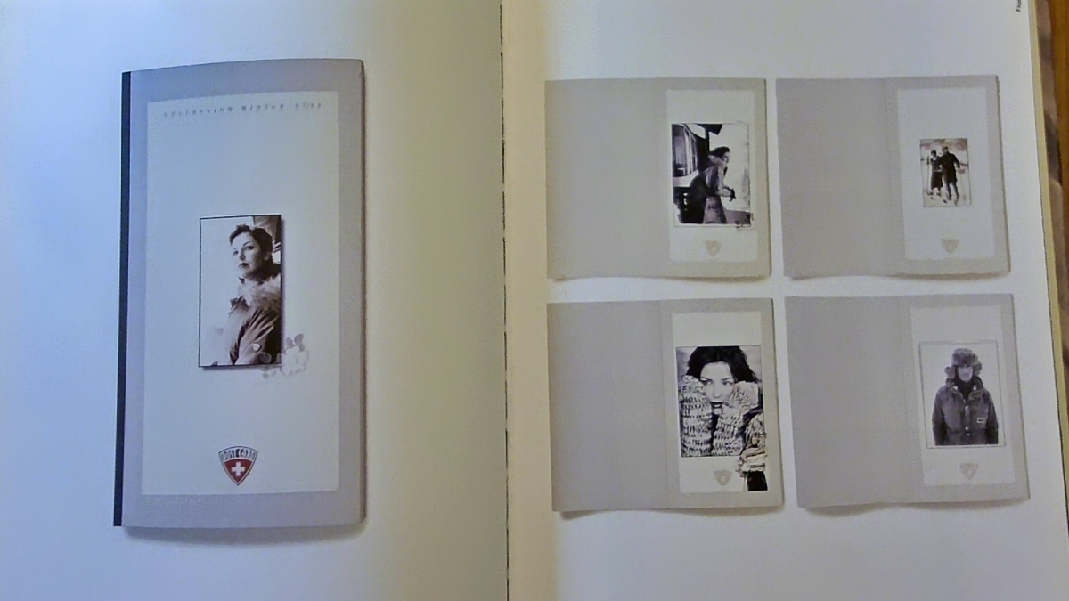
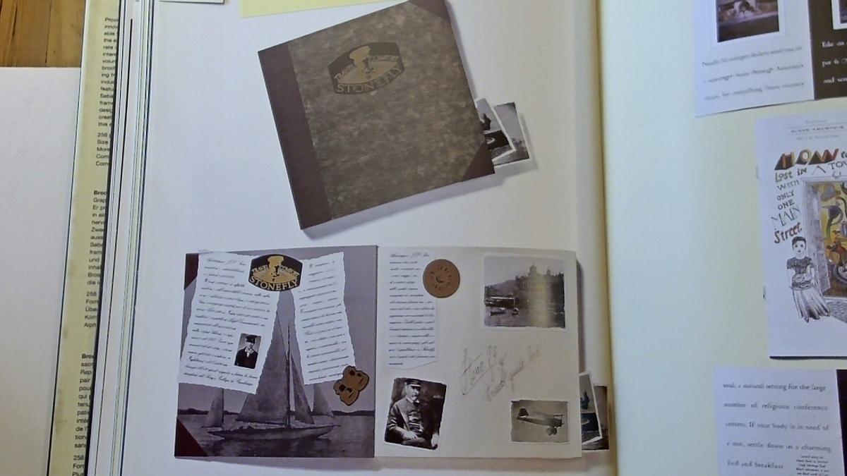
One is a book of old brochures (Graphis Brochures 3 – An International Compilation of Brochure Design #3, ISBN 9781888001495). I’ve photographed two spreads here, for educational purposes to illustrate how awesome such a book can be for getting the juices flowing. The book contains hundreds of such brochures, and I’m not sure the book is worth its weight in gold, but it’s definitely worth its weight in copper.
Notice the minimalism of the first image below; I’ll come back to it later.
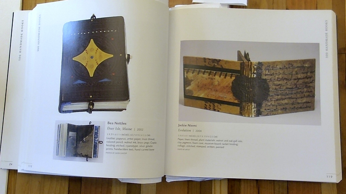
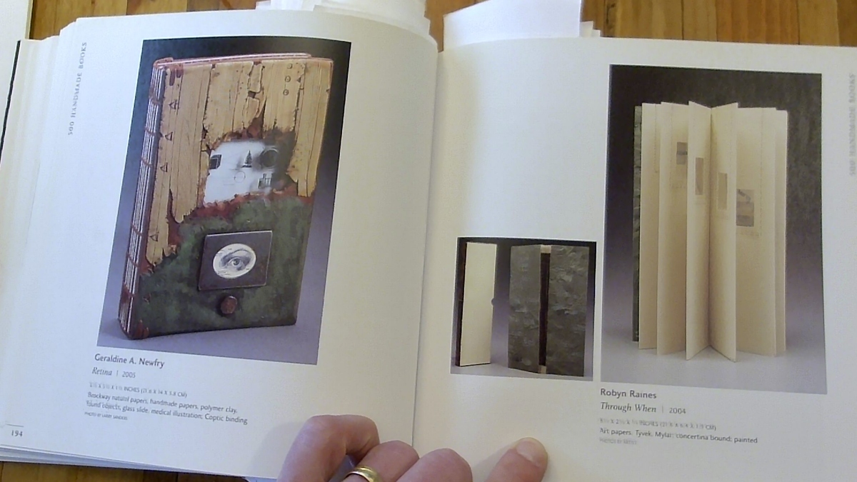
Another book that I keep on hand presents designs of handmade books (500 Handmade Books: Inspiring Interpretations of a Timeless Form, ISBN 978-1579908775). Here are two more of my photographs, again for educational purposes. Of all the books on my shelf, this one may very well be the one that I treasure the most. It’s absolutely inspirational. I would love for the deluxe edition of the Emblem rulebook to be as thematic, unique and exquisite as the books pictured in this book of books.
Notice the naturalistic material and appearance of these books; I’ll come back to this later.
Making a game stand out
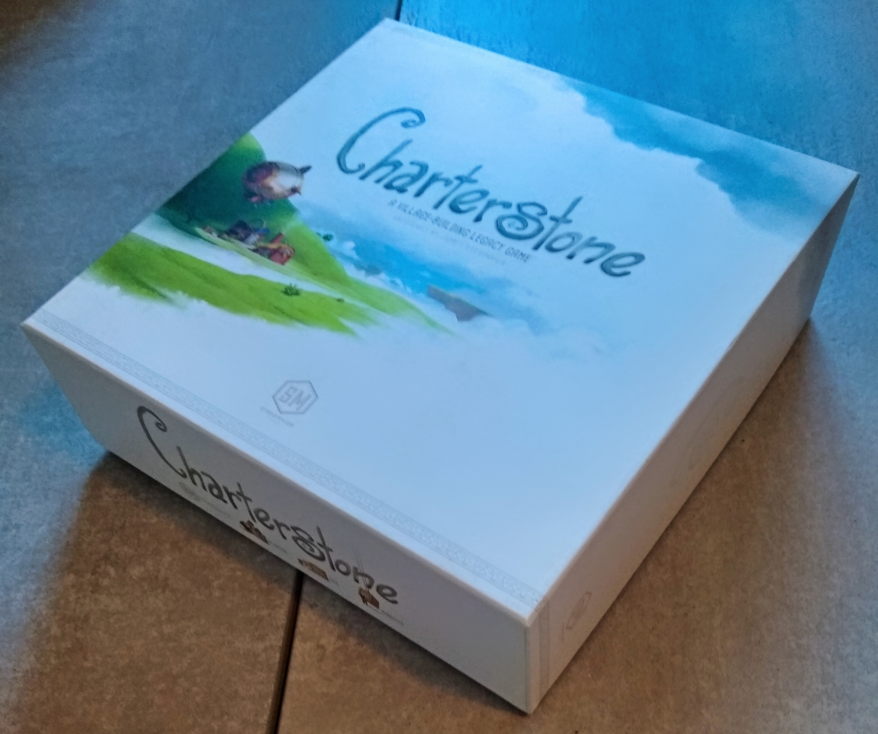
One technique to make a design stand out, as demonstrated by the first brochure photo above, is absolute minimalism. Stonemaier took this approach to make the box for Charterstone stand out, which succeeded better than simply dropping the wordmark onto a full-bleed image. Furnace and T.I.M.E. Stories also had memorably white boxes, while 7th Continent is mysteriously black. Charterstone, TIME Stories and 7th Continent all have a lot of surprises, mechanically speaking, as the story is revealed during gameplay. Thus, the big monochrome areas of the boxes can be interpreted as connoting mystery. Well done.
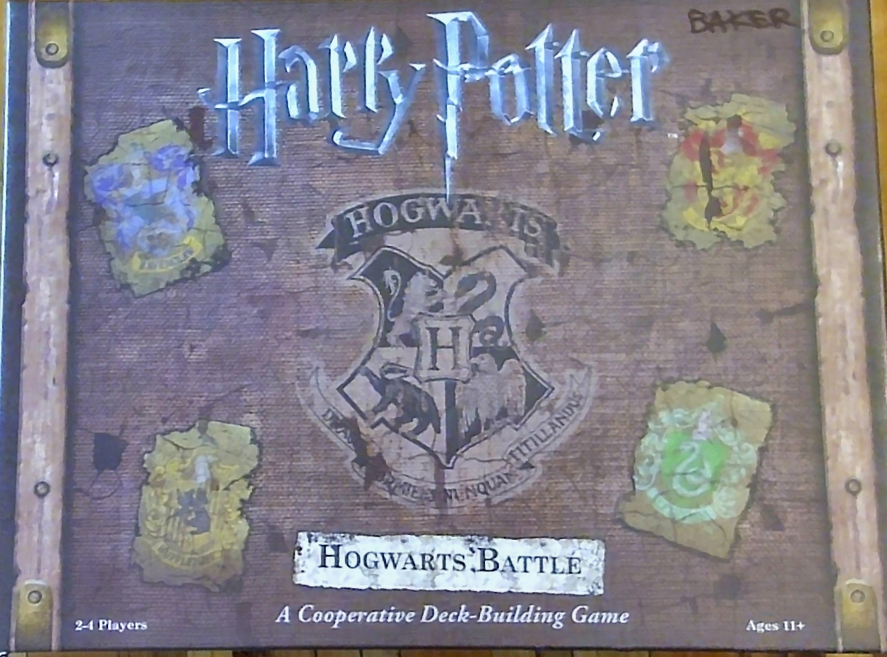
Big brown naturalistic materials, vaguely reminiscent of the handmade books above, also have appeared in a few games. One example is Harry Potter, whose box really stands out on the shelf because it looks a bit like a treasure chest. I say a bit because the middle texture looks like canvas, not wood, and yet the sides look like brass brackets on a wooden box. The eroded stickers are a nice touch. The monochrome illustration emblazoned dead center is awesome, and the subtitle is in a highly thematic popout. Too bad the subtitle is so far from the title, which in turn seems to hover over the entire box in a totally different stylization.
Notes to self
- Want to blend in?
- Lay a wordmark directly on top of a full-bleed illustration.
- To especially blend in, don’t customize the lettering at all.
- Oh, gee, that sounds exactly like what I did for Gnomadic Gardeners. The next edition will need improvements in more ways than one.
- Want to stand out?
- Customizing the lettering is a start.
- Even rarer seems to be a highly thematic popout, combined with a highly stylized wordmark.
- Perhaps best of all is to lead hard into more innovative approaches from non-game graphic design source books, such as aggressive and meaningful use of whitespace or use of monochrome/desaturated/naturalistic palettes and textures.