Like many of you, I got into modern Euro games via Settlers of Catan. The idea of putting out little houses (settlements) and big houses (cities) on random-income-generating properties felt somewhat familiar, as I had played tons of Monopoly as a child. What felt new and fresh was connecting those properties on a map via roads. (As I’ve previously written, I also grew up with a love of maps.)
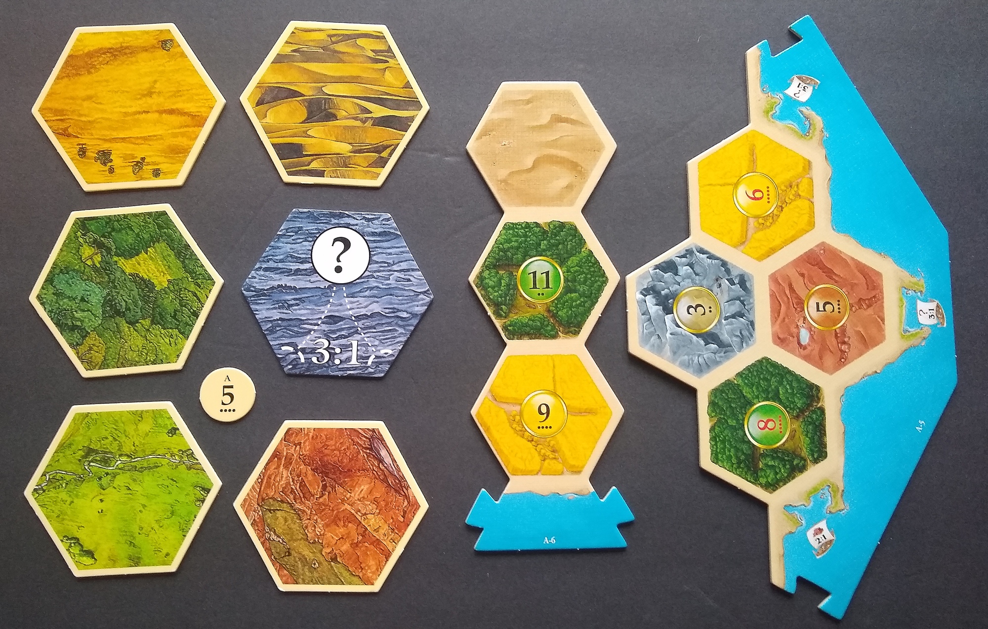
This article will compare two editions of Catan. On the left, above, is my ancient copy of the first edition from over 20 years ago. On the left is a copy of the 2012 family edition, which I purchased this year for use with some friends who are starting to get into Euro games. I’d read that the new edition improved usability, and I was not disappointed.
One big improvement is the switch to a modular board, which vastly simplifies setup. Given the hassle of setting up the original, I’ve sworn that I will never design a game that requires players to put out tiles and roll-chits before playing. The new map still provides enough different ways to assemble the map that I don’t anticipate any lack of replayability, particularly considering that I only play maybe 5 games of Catan per year anyway.
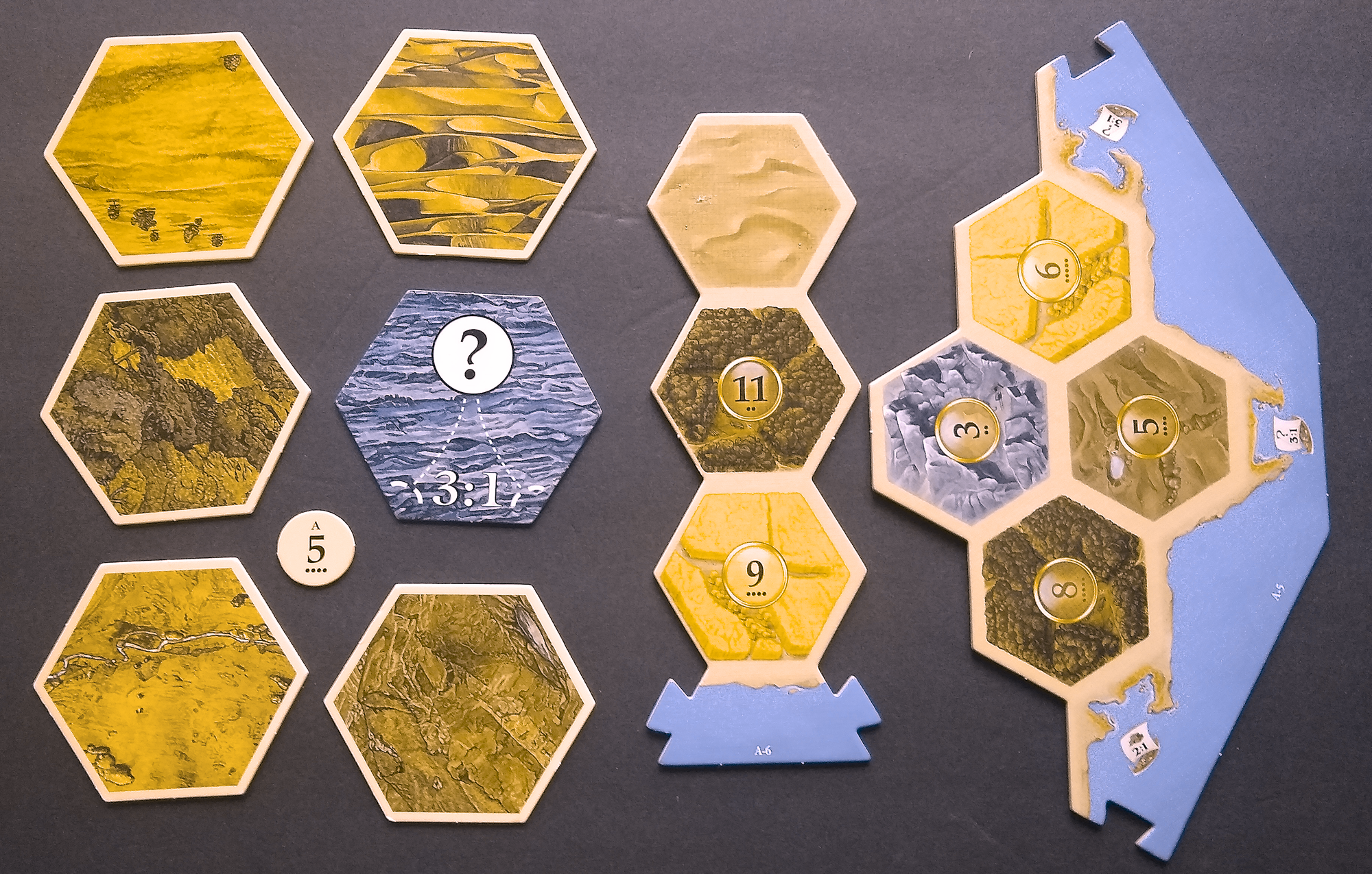
Another big improvement is that the new tiles are much more colorblind-friendly, as illustrated by the simulation below (generated courtesy of the Pilestone color-blindness simulator). Here’s a game: Using the image below, try to guess which tile is which, then check your answers using the picture above. When I played the game, I got three of the old tiles wrong and got all of the new tiles correct.
The family edition includes updates to the resource cards. I question the switch to a hex in the center of the card. The hex shape refers to a location that produces resources. In contrast, the circle shape corresponds to the production of a resource, as a circle is the shape used for the die roll on the map. I think that the instance of a resource, in your hand, is more closely associated with an instance of production than it is associated with the location of production. Therefore, I personally would have retained a circular shape containing a picture of the resource. I would have switched to a consistent background color for that central circle–the orange behind the ore and the pickaxe always seemed out of place on the old cards, as the other four resources have a desaturated background and no tool visible.

The new development cards are color-coded according to type, which I find really handy. The new art improves table presence in two ways: it incorporates faces (well-known to attract viewers’ gaze), and it greatly reduces the amount of background detail (which I had found extremely busy and unpleasant to look at, especially on the resource-generating cards). They could have used a white digit in the victory points symbol, to improve contrast and readability.

The smaller cards and tiles make the game less expensive and playable on a smaller table. The size change ironically could make the game present on more tables yet reduce its table presence.
The new tokens are the same size as the old tokens, despite the smaller tiles. Consequently, the roads now comfortably cover the edge of a tile, leaving a very small gap adequate for picking up and manipulating objects. In contrast, the road segments on the old edition had twice as big of a gap to the adjoining settlement/city, even though (thematically) they were supposed to be roads connecting communities. Who would build a road in real life between two cities, yet not make it long enough to reach the cities?
Some may argue that switching to plastic bits reduces table presence. Wood was inarguably more thematic, considering the game’s setting in a pseudo-colonial era of history. I think the darker, richer color of the plastic makes the tokens stand out more against the tiles, which slightly increases my desire to look at the game and might therefore enhance table presence overall. However, my wood pieces are ancient and perhaps faded, while the plastic’s colorants are new and might pop less in 2 decades (if we’re still playing Catan!)

The new reference cards nicely incorporate the card colors, making the lookup easier. For consistency, they should have incorporated the new symbol for victory points (see the development cards above). I might also have included the rule notes from the old cards (regarding longest road, city replacing settlement, and largest army).

Overall, the family edition illustrates a number of ways to improve usability without greatly harming table presence. Are there any additional changes that you would have liked to see, which would either improve usability or table presence?
1 thought on “Let’s Compare the Classic Catan to This Fairly Fresh Family Version”
Comments are closed.